Bootstrap intros section
Use one of the stunning, full-page intros to make your website outstanding.
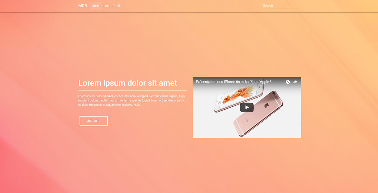
1. App intro
3. Call to Action Buttons intro
5. Classic Register Form intro
6. Video Intro
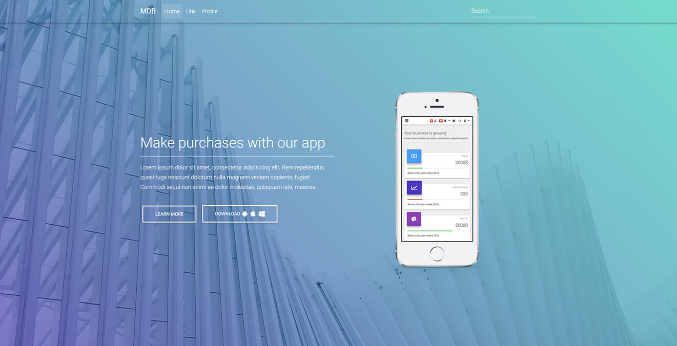
App intro
.intro-2 {
    background: url("https://mdbootstrap.com/img/Photos/Others/architecture.jpg")no-repeat center center;
    background-size: cover;
}
.btn .fa {
    margin-left: 3px;
}
.top-nav-collapse {
    background-color: #424f95 !important;
}
.navbar:not(.top-nav-collapse) {
    background: transparent !important;
}
@media (max-width: 768px) {
    .navbar:not(.top-nav-collapse) {
        background: #424f95 !important;
    }
}
h6 {
    line-height: 1.7;
}
.hm-gradient .full-bg-img {
    background: -moz-linear-gradient(45deg, rgba(42, 27, 161, 0.6), rgba(29, 210, 177, 0.6) 100%);
    background: -webkit-linear-gradient(45deg, rgba(42, 27, 161, 0.6), rgba(29, 210, 177, 0.6) 100%);
    background: -webkit-gradient(linear, 45deg, from(rgba(42, 27, 161, 0.6)), to(rgba(29, 210, 177, 0.6)));
    background: -o-linear-gradient(45deg, rgba(42, 27, 161, 0.6), rgba(29, 210, 177, 0.6) 100%);
    background: linear-gradient(45deg, rgba(42, 27, 161, 0.6), rgba(29, 210, 177, 0.6) 100%);
}
@media (max-width: 450px) {
    .margins {
        margin-right: 1rem;
        margin-left: 1rem;
    }
}
@media (max-width: 740px) {
    .full-height,
    .full-height body,
    .full-height header,
    .full-height header .view {
        height: 1020px;
    }
}
<html lang="en" class="full-height">
<!--Main Navigation-->
<header>

    <!--Navbar-->
    <navbar SideClass="navbar navbar-toggleable-md navbar-dark fixed-top">
        <logo>
            <a class="logo navbar-brand" href="#" ripple-radius><strong>MDB</strong></a>
        </logo>
        <links>
            <ul class="navbar-nav mr-auto">
                <li class="nav-item active" ripple-radius>
                    <a class="nav-link" href="#">Home <span class="sr-only">(current)</span></a>
                </li>
                <li class="nav-item" ripple-radius>
                    <a class="nav-link" href="#">Link</a>
                </li>
                <li class="nav-item" ripple-radius>
                    <a class="nav-link" href="#">Profile</a>
                </li>
            </ul>
            <form class="form-inline" ripple-radius>
                <input class="form-control mr-sm-2" type="text" placeholder="Search" aria-label="Search">
            </form>
        </links>
    </navbar>

    <!--Intro Section-->
    <section class="view intro-2 hm-gradient">
        <div class="full-bg-img">
            <div class="container flex-center">
                <div class="row flex-center pt-5 mt-3">
                    <div class="col-md-6 text-center text-md-left margins">
                        <div class="white-text">
                            <h1 class="h1-responsive wow fadeInLeft" data-wow-delay="0.3s">Make purchases with our app </h1>
                                <hr class="hr-light wow fadeInLeft" data-wow-delay="0.3s">
                                <h6 class="wow fadeInLeft" data-wow-delay="0.3s">Lorem ipsum dolor sit amet, consectetur adipisicing elit. Rem repellendus quasi fuga nesciunt dolorum nulla magnam veniam sapiente, fugiat! Commodi sequi non animi ea dolor molestiae iste.</h6>
                                <br>
                                <a class="btn btn-outline-white wow fadeInLeft" data-wow-delay="0.3s" ripple-radius>Learn more</a>
                                <a class="btn btn-outline-white wow fadeInLeft" data-wow-delay="0.3s" ripple-radius>Download
                                    <i class="fa fa-android left right" aria-hidden="true"></i>
                                    <i class="fa fa-apple left" aria-hidden="true"></i>
                                    <i class="fa fa-windows" aria-hidden="true"></i>
                                </a>
                        </div>
                    </div>

                    <div class="col-md-6 wow fadeInRight d-flex justify-content-center" data-wow-delay="0.3s">
                        <img src="https://mdbootstrap.com/img/Mockups/Transparent/Small/iphone-admin.png" alt="" class="img-responsive">
                    </div>
                </div>
            </div>
        </div>
    </section>

</header>
<!--Main Navigation-->
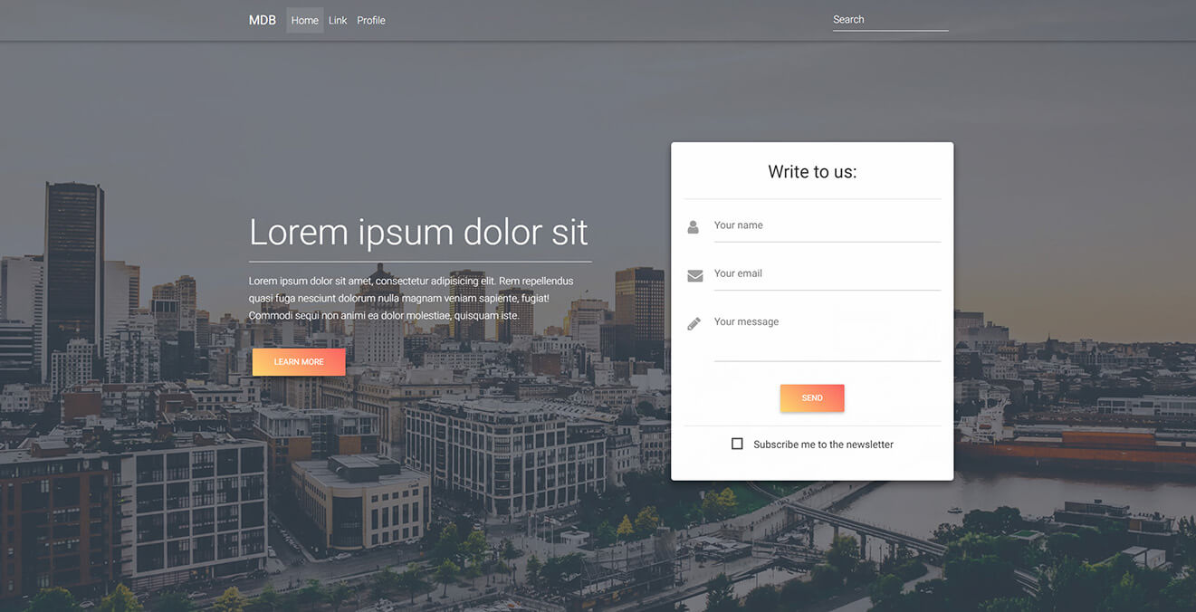
Contact Form intro
.intro-2 {
    background: url("https://mdbootstrap.com/img/Photos/Others/img%20(46).jpg")no-repeat center center;
    background-size: cover;
}
.top-nav-collapse {
    background-color: #ff8a65 !important;
}
.navbar:not(.top-nav-collapse) {
    background: transparent !important;
}
@media (max-width: 768px) {
    .navbar:not(.top-nav-collapse) {
        background: #ff8a65 !important;
    }
}
.md-form .prefix {
    font-size: 1.5rem;
    margin-top: 1rem;
}
.card {
    border-radius: .3rem;
    .card-body {
        padding: 1.25rem;
        h3 {
            font-weight: 400;
            padding: .7rem;
        }
    }
}
h6 {
    line-height: 1.7;
}
@media (max-width: 740px) {
    .full-height,
    .full-height body,
    .full-height header,
    .full-height header .view {
        height: 1150px;
    }
}
<html lang="en" class="full-height">
<!--Main Navigation-->
<header>

    <!--Navbar-->
    <navbar SideClass="navbar navbar-toggleable-md navbar-dark fixed-top">
        <logo>
            <a class="logo navbar-brand" href="#" ripple-radius><strong>MDB</strong></a>
        </logo>
        <links>
            <ul class="navbar-nav mr-auto">
                <li class="nav-item active" ripple-radius>
                    <a class="nav-link" href="#">Home <span class="sr-only">(current)</span></a>
                </li>
                <li class="nav-item" ripple-radius>
                    <a class="nav-link" href="#">Link</a>
                </li>
                <li class="nav-item" ripple-radius>
                    <a class="nav-link" href="#">Profile</a>
                </li>
            </ul>
            <form class="form-inline" ripple-radius>
                <input class="form-control mr-sm-2" type="text" placeholder="Search" aria-label="Search">
            </form>
        </links>
    </navbar>

    <!--Intro Section-->
    <section class="view intro-2 hm-stylish-strong">
        <div class="full-bg-img">
            <div class="container flex-center">
                <div class="d-flex align-items-center">
                    <div class="row flex-center pt-5 mt-3">
                        <div class="col-md-6 text-center text-md-left mb-5">
                            <div class="white-text">
                                <h1 class="display-4 wow fadeInLeft" data-wow-delay="0.3s">Lorem ipsum</h1>
                                <hr class="hr-light wow fadeInLeft" data-wow-delay="0.3s">
                                <h6 class="wow fadeInLeft" data-wow-delay="0.3s">Lorem ipsum dolor sit amet, consectetur adipisicing elit. Rem repellendus quasi fuga nesciunt dolorum nulla magnam veniam sapiente, fugiat! Commodi sequi non animi ea dolor molestiae, quisquam iste.</h6>
                                <br>
                                <a class="btn deep-orange lighten-2 wow fadeInLeft" data-wow-delay="0.3s" ripple-radius>Learn more</a>
                            </div>
                        </div>

                        <div class="col-md-6 col-xl-5 offset-xl-1">
                            <!--Form-->
                            <div class="card wow fadeInRight" data-wow-delay="0.3s">
                                <div class="card-body z-depth-2">
                                    <!--Header-->
                                    <div class="text-center">
                                        <h3>Write to us:</h3>
                                        <hr>
                                    </div>

                                    <!--Body-->
                                    <div class="md-form">
                                        <i class="fa fa-user prefix grey-text"></i>
                                        <input type="text" id="form3" class="form-control" mdbActive>
                                        <label for="form3">Your name</label>
                                    </div>
                                    <div class="md-form">
                                        <i class="fa fa-envelope prefix grey-text"></i>
                                        <input type="text" id="form2" class="form-control" mdbActive>
                                        <label for="form2">Your email</label>
                                    </div>

                                    <!--Textarea with icon prefix-->
                                    <div class="md-form">
                                        <i class="fa fa-pencil prefix grey-text"></i>
                                        <textarea type="text" id="form8" class="md-textarea" mdbActive></textarea>
                                        <label for="form8">Your message</label>
                                    </div>

                                    <div class="text-center">
                                        <button class="btn deep-orange lighten-2" ripple-radius>Send</button>
                                        <hr>
                                        <fieldset class="form-group">
                                            <input type="checkbox" id="checkbox1">
                                            <label for="checkbox1">Subscribe me to the newsletter</label>
                                        </fieldset>
                                    </div>

                                </div>
                            </div>
                            <!--/.Form-->
                        </div>
                    </div>
                </div>
            </div>
        </div>
    </section>

</header>
<!--Main Navigation-->
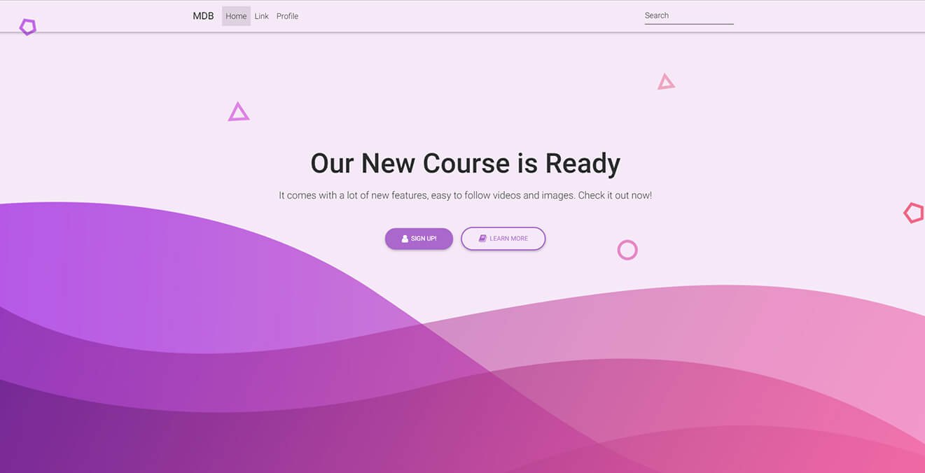
Call to Action Buttons intro
.top-nav-collapse {
    background-color: #f8bbd0 !important;
}
.navbar:not(.top-nav-collapse) {
    background: transparent !important;
}
@media (max-width: 768px) {
    .navbar:not(.top-nav-collapse) {
        background: #f8bbd0 !important;
    }
}
@media (max-width: 740px) {
    .full-height,
    .full-height body,
    .full-height header,
    .full-height header .view {
        height: 700px;
    }
}
<html lang="en" class="full-height">
<!--Main Navigation-->
<header>

    <!--Navbar-->
    <navbar SideClass="navbar navbar-toggleable-md navbar-light fixed-top">
        <logo>
            <a class="logo navbar-brand" href="#" ripple-radius><strong>MDB</strong></a>
        </logo>
        <links>
            <ul class="navbar-nav mr-auto">
                <li class="nav-item active" ripple-radius>
                    <a class="nav-link" href="#">Home <span class="sr-only">(current)</span></a>
                </li>
                <li class="nav-item" ripple-radius>
                    <a class="nav-link" href="#">Link</a>
                </li>
                <li class="nav-item" ripple-radius>
                    <a class="nav-link" href="#">Profile</a>
                </li>
            </ul>
            <form class="form-inline" ripple-radius>
                <input class="form-control mr-sm-2" type="text" placeholder="Search" aria-label="Search">
            </form>
        </links>
    </navbar>

    <!-- Intro Section -->
    <div class="view hm-purple-slight jarallax" data-jarallax='{"speed": 0.2}' style="background-image: url('https://mdbootstrap.com/img/Photos/Others/gradient2.png');">
        <div class="full-bg-img">
            <div class="container flex-center">
                <div class="row pt-5 mt-3">
                    <div class="col-md-12 wow fadeIn mb-3">
                        <div class="text-center">
                            <ul>
                                <li>
                                    <h1 class="display-4 mb-3 wow fadeInUp">Our New Course is Ready</h1></li>
                                <li>
                                    <h5 class="mb-5 wow fadeInUp" data-wow-delay="0.2s">It comes with a lot of new features, easy to follow videos and images. Check it out now!</h5>
                                </li>
                                <li class="wow fadeInUp" data-wow-delay="0.4s">
                                    <a class="btn btn-secondary btn-rounded" ripple-radius><i class="fa fa-user left"></i> Sign up!</a>
                                    <a class="btn btn-outline-secondary btn-rounded" ripple-radius><i class="fa fa-book left"></i> Learn more</a>
                                </li>
                            </ul>
                        </div>
                    </div>
                </div>
            </div>
        </div>
    </div>

</header>
<!--Main Navigation-->
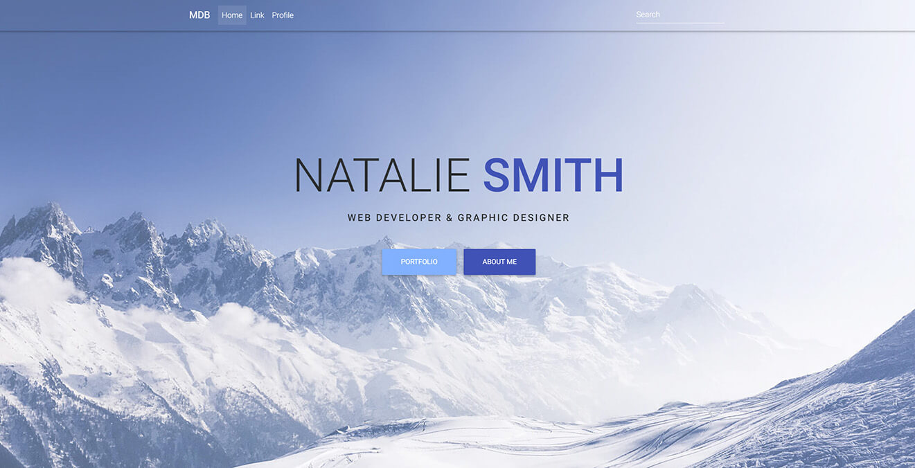
Parallax Effect intro
.top-nav-collapse {
    background-color: #82b1ff !important;
}
.navbar:not(.top-nav-collapse) {
    background: transparent !important;
}
@media (max-width: 768px) {
    .navbar:not(.top-nav-collapse) {
        background: #82b1ff !important;
    }
}
h1 {
    font-weight: 500;
}
h5 {
    letter-spacing: 2px;
    text-transform: uppercase;
    font-weight: 500;
}
@media (max-width: 740px) {
    .full-height,
    .full-height body,
    .full-height header,
    .full-height header .view {
        height: 700px;
    }
}
<html lang="en" class="full-height">
<!--Main Navigation-->
<header>

    <!--Navbar-->
    <navbar SideClass="navbar navbar-toggleable-md navbar-dark fixed-top">
        <logo>
            <a class="logo navbar-brand" href="#" ripple-radius><strong>MDB</strong></a>
        </logo>
        <links>
            <ul class="navbar-nav mr-auto">
                <li class="nav-item active" ripple-radius>
                    <a class="nav-link" href="#">Home <span class="sr-only">(current)</span></a>
                </li>
                <li class="nav-item" ripple-radius>
                    <a class="nav-link" href="#">Link</a>
                </li>
                <li class="nav-item" ripple-radius>
                    <a class="nav-link" href="#">Profile</a>
                </li>
            </ul>
            <form class="form-inline" ripple-radius>
                <input class="form-control mr-sm-2" type="text" placeholder="Search" aria-label="Search">
            </form>
        </links>
    </navbar>

    <!-- Intro Section -->
      <div class="view hm-white-light jarallax" data-jarallax='{"speed": 0.2}' style="background-image: url(https://mdbootstrap.com/img/Photos/Others/img%20%2844%29.jpg); background-attachment: fixed">
        <div class="full-bg-img">
            <div class="container flex-center">
                <div class="row pt-5 mt-3">
                    <div class="col-md-12 mb-3">
                        <div class="intro-info-content text-center">
                            <h1 class="display-3 mb-3 wow fadeInDown" data-wow-delay="0.3s">NATALIE <a class="indigo-text font-bold">SMITH</a></h1>
                            <h5 class="mb-4 mt-1 wow fadeInDown" data-wow-delay="0.3s">Web developer & graphic designer</h5>
                            <a class="btn light-blue lighten-2 btn-lg wow fadeInDown" data-wow-delay="0.3s" ripple-radius>portfolio</a>
                            <a class="btn btn-indigo btn-lg wow fadeInDown" data-wow-delay="0.3s" ripple-radius>About me</a>
                        </div>
                    </div>
                </div>
            </div>
        </div>
    </div>

</header>
<!--Main Navigation-->
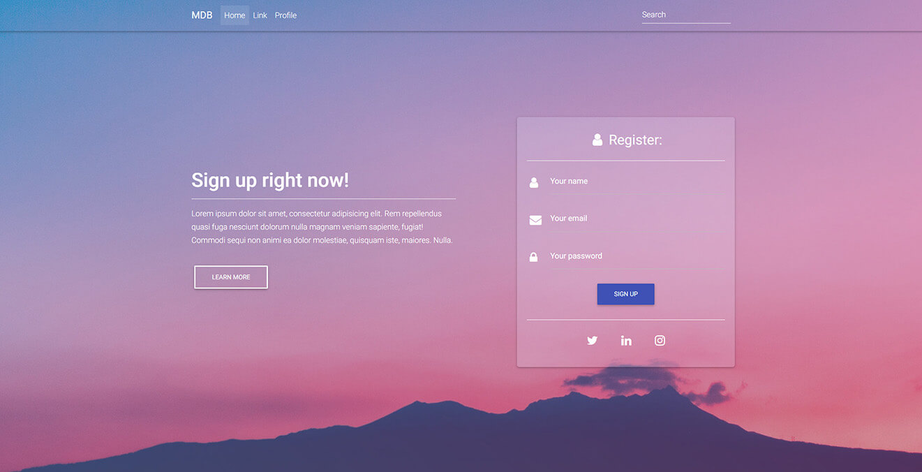
Classic Register Form intro
.intro-2 {
    background: url("http://mdbootstrap.com/img/Photos/Others/img%20(42).jpg")no-repeat center center;
    background-size: cover;
}
.top-nav-collapse {
    background-color: #3f51b5 !important;
}
.navbar:not(.top-nav-collapse) {
    background: transparent !important;
}
@media (max-width: 768px) {
    .navbar:not(.top-nav-collapse) {
        background: #3f51b5 !important;
    }
}
.hm-gradient .full-bg-img {
    background: -webkit-linear-gradient(45deg, rgba(83, 125, 210, 0.4), rgba(178, 30, 123, 0.4) 100%);
    background: -webkit-gradient(linear, 45deg, from(rgba(29, 236, 197, 0.4)), to(rgba(96, 0, 136, 0.4)));
    background: linear-gradient(45deg, rgba(29, 236, 197, 0.4), rgba(96, 0, 136, 0.4) 100%);
}
.card {
    border-radius: .3rem;
    background-color: rgba(229, 228, 255, 0.2);
    .card-body {
        padding: 1.25rem;
        h3 {
            font-weight: 400;
            padding: .7rem;
        }
    }
}
 .md-form .prefix {
    font-size: 1.5rem;
    margin-top: 1rem;
}
.md-form label {
    color: #ffffff;
}
h6 {
    line-height: 1.7;
}
@media (max-width: 740px) {
    .full-height,
    .full-height body,
    .full-height header,
    .full-height header .view {
        height: 1040px;
    }
}
<html lang="en" class="full-height">
<!--Main Navigation-->
<header>

    <!--Navbar-->
    <navbar SideClass="navbar navbar-toggleable-md navbar-dark fixed-top">
        <logo>
            <a class="logo navbar-brand" href="#" ripple-radius><strong>MDB</strong></a>
        </logo>
        <links>
            <ul class="navbar-nav mr-auto">
                <li class="nav-item active" ripple-radius>
                    <a class="nav-link" href="#">Home <span class="sr-only">(current)</span></a>
                </li>
                <li class="nav-item" ripple-radius>
                    <a class="nav-link" href="#">Link</a>
                </li>
                <li class="nav-item" ripple-radius>
                    <a class="nav-link" href="#">Profile</a>
                </li>
            </ul>
            <form class="form-inline" ripple-radius>
                <input class="form-control mr-sm-2" type="text" placeholder="Search" aria-label="Search">
            </form>
        </links>
    </navbar>

    <!--Intro Section-->
    <section class="view intro-2 hm-gradient">
        <div class="full-bg-img">
            <div class="container flex-center">
                <div class="d-flex align-items-center content-height">
                    <div class="row flex-center pt-5 mt-3">
                        <div class="col-md-6 text-center text-md-left mb-5">
                            <div class="white-text">
                                <h1 class="h1-responsive wow fadeInLeft" data-wow-delay="0.3s">Sign up right now! </h1>
                                <hr class="hr-light wow fadeInLeft" data-wow-delay="0.3s">
                                <h6 class="wow fadeInLeft" data-wow-delay="0.3s">Lorem ipsum dolor sit amet, consectetur adipisicing elit. Rem repellendus quasi fuga nesciunt dolorum nulla magnam veniam sapiente, fugiat! Commodi sequi non animi ea dolor molestiae, quisquam iste, maiores. Nulla.</h6>
                                <br>
                                <a class="btn btn-outline-white wow fadeInLeft" data-wow-delay="0.3s" ripple-radius>Learn more</a>
                            </div>
                        </div>

                        <div class="col-md-6 col-xl-5 offset-xl-1">
                            <!--Form-->
                            <div class="card wow fadeInRight" data-wow-delay="0.3s">
                                <div class="card-body">
                                    <!--Header-->
                                    <div class="text-center">
                                        <h3 class="white-text"><i class="fa fa-user white-text"></i> Register:</h3>
                                        <hr class="hr-light">
                                    </div>

                                    <!--Body-->
                                    <div class="md-form">
                                        <i class="fa fa-user prefix white-text"></i>
                                        <input type="text" id="form3" class="form-control" mdbActive>
                                        <label for="form3">Your name</label>
                                    </div>
                                    <div class="md-form">
                                        <i class="fa fa-envelope prefix white-text"></i>
                                        <input type="text" id="form2" class="form-control" mdbActive>
                                        <label for="form2">Your email</label>
                                    </div>

                                    <div class="md-form">
                                        <i class="fa fa-lock prefix white-text"></i>
                                        <input type="password" id="form4" class="form-control" mdbActive>
                                        <label for="form4">Your password</label>
                                    </div>

                                    <div class="text-center">
                                        <button class="btn btn-indigo" ripple-radius>Sign up</button>
                                         <hr class="hr-light mb-3 mt-4">

                                            <div class="inline-ul text-center d-flex justify-content-center">
                                                <a class="icons-sm tw-ic"><i class="fa fa-twitter white-text"></i></a>
                                                <a class="icons-sm li-ic"><i class="fa fa-linkedin white-text"> </i></a>
                                                <a class="icons-sm ins-ic"><i class="fa fa-instagram white-text"> </i></a>
                                            </div>
                                    </div>

                                </div>
                            </div>
                            <!--/.Form-->
                        </div>
                    </div>
                </div>
            </div>
        </div>
    </section>

</header>
<!--Main Navigation-->
Video intro
.top-nav-collapse {
    background-color: #7d8488 !important;
}
.navbar:not(.top-nav-collapse) {
    background: transparent !important;
}
@media (max-width: 768px) {
    .navbar:not(.top-nav-collapse) {
        background: #7d8488 !important;
    }
}
.hm-gradient .full-bg-img {
    background: -moz-linear-gradient(45deg, rgba(242, 34, 50, 0.5), rgba(255, 187, 54, 0.6) 100%);
    background: -webkit-linear-gradient(45deg, rgba(242, 34, 50, 0.5), rgba(255, 187, 54, 0.6) 100%);
    background: linear-gradient(45deg, rgba(29, 236, 197, 0.4), rgba(96, 0, 136, 0.4) 100%);
}
.view video {
    height: 100vh;
}
@media (max-width: 740px) {
    .full-height,
    .full-height body,
    .full-height header,
    .full-height header .view {
        height: 700px;
    }
}
<html lang="en" class="full-height">
<!--Main Navigation-->
<header>

    <!--Navbar-->
    <navbar SideClass="navbar navbar-toggleable-md navbar-dark fixed-top">
        <logo>
            <a class="logo navbar-brand" href="#" ripple-radius><strong>MDB</strong></a>
        </logo>
        <links>
            <ul class="navbar-nav mr-auto">
                <li class="nav-item active" ripple-radius>
                    <a class="nav-link" href="#">Home <span class="sr-only">(current)</span></a>
                </li>
                <li class="nav-item" ripple-radius>
                    <a class="nav-link" href="#">Link</a>
                </li>
                <li class="nav-item" ripple-radius>
                    <a class="nav-link" href="#">Profile</a>
                </li>
            </ul>
            <form class="form-inline" ripple-radius>
                <input class="form-control mr-sm-2" type="text" placeholder="Search" aria-label="Search">
            </form>
        </links>
    </navbar>

    <!--Intro Section-->
    <section class="view intro-video">
       <video poster="https://mdbootstrap.com/img/Photos/Others/background.jpg" playsinline autoplay muted loop>
            <source src="https://mdbootstrap.com/img/video/animation.mp4" type="video/mp4">
        </video>
        <div class="hm-gradient">
            <div class="full-bg-img">
                <div class="container flex-center">
                    <div class="row pt-5 mt-3">
                        <div class="col-lg-6 wow fadeIn mb-5 text-center text-lg-left">
                            <div class="white-text">
                                <h1 class="h1-responsive font-bold wow fadeInLeft" data-wow-delay="0.3s">Lorem ipsum dolor sit amet</h1>
                                <hr class="hr-light wow fadeInLeft" data-wow-delay="0.3s">
                                <p class="wow fadeInLeft" data-wow-delay="0.3s">Lorem ipsum dolor sit amet, consectetur adipisicing elit. Rem repellendus quasi fuga nesciunt dolorum nulla magnam veniam sapiente, fugiat! Commodi sequi non animi ea dolor molestiae, quisquam iste, maiores. Nulla.</p>
                                <br>
                                <a class="btn btn-outline-white wow fadeInLeft" data-wow-delay="0.3s" ripple-radius>Just do it!</a>
                            </div>
                        </div>

                        <div class="col-lg-6 wow fadeIn">
                            <div class="embed-responsive embed-responsive-16by9 wow fadeInRight">
                                <iframe class="embed-responsive-item" src="https://www.youtube.com/embed/IQyauRAxvjI" allowfullscreen></iframe>
                            </div>
                        </div>
                    </div>
                </div>
            </div>
        </div>
    </section>

</header>
<!--Main Navigation-->
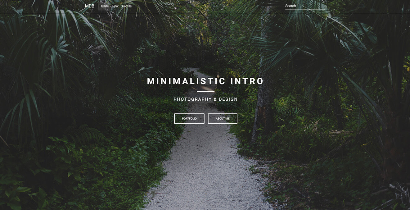
Minimalist intro
.top-nav-collapse {
    background-color: #78909c !important;
}
.navbar:not(.top-nav-collapse) {
    background: transparent !important;
}
@media (max-width: 768px) {
    .navbar:not(.top-nav-collapse) {
        background: #78909c !important;
    }
}
h1 {
    letter-spacing: 8px;
    font-weight: 500;
    text-transform: uppercase;
}
h5 {
    letter-spacing: 3px;
    font-weight: 300;
    text-transform: uppercase;
}
hr {
    width: 80px;
    border-top: 3px solid #fff;
}
@media (max-width: 740px) {
    .full-height,
    .full-height body,
    .full-height header,
    .full-height header .view {
        height: 700px;
    }
}
<html lang="en" class="full-height">
<!--Main Navigation-->
<header>

    <!--Navbar-->
    <navbar SideClass="navbar navbar-toggleable-md navbar-dark fixed-top">
        <logo>
            <a class="logo navbar-brand" href="#" ripple-radius><strong>MDB</strong></a>
        </logo>
        <links>
            <ul class="navbar-nav mr-auto">
                <li class="nav-item active" ripple-radius>
                    <a class="nav-link" href="#">Home <span class="sr-only">(current)</span></a>
                </li>
                <li class="nav-item" ripple-radius>
                    <a class="nav-link" href="#">Link</a>
                </li>
                <li class="nav-item" ripple-radius>
                    <a class="nav-link" href="#">Profile</a>
                </li>
            </ul>
            <form class="form-inline" ripple-radius>
                <input class="form-control mr-sm-2" type="text" placeholder="Search" aria-label="Search">
            </form>
        </links>
    </navbar>

    <!-- Intro Section -->
      <div class="view hm-black-light" data-jarallax='{"speed": 0.2}' style="background-image: url(https://mdbootstrap.com/img/Photos/Others/img%20%2848%29.jpg);">
        <div class="full-bg-img">
            <div class="container flex-center">
                <div class="row pt-5 mt-3">
                    <div class="col-md-12">
                        <div class="text-center">
                            <h1 class="h1-reponsive mb-2 white-text wow fadeInDown" data-wow-delay="0.3s"><strong>Minimalist intro</strong></h1>
                            <hr class="wow fadeInDown" data-wow-delay="0.4s">
                            <h5 class="mb-4 white-text wow fadeInDown" data-wow-delay="0.4s"><strong>Photography & design</strong></h5>
                            <a class="btn btn-outline-white wow fadeInDown" data-wow-delay="0.4s" ripple-radius>portfolio</a>
                            <a class="btn btn-outline-white wow fadeInDown" data-wow-delay="0.4s" ripple-radius>About me</a>
                        </div>
                    </div>
                </div>
            </div>
        </div>
    </div>

</header>
<!--Main Navigation-->