Angular Bootstrap Intro sections
Angular intro sections - Bootstrap 4 & Material Design
Use one of the stunning, full-page intros to make your website outstanding.
Examples
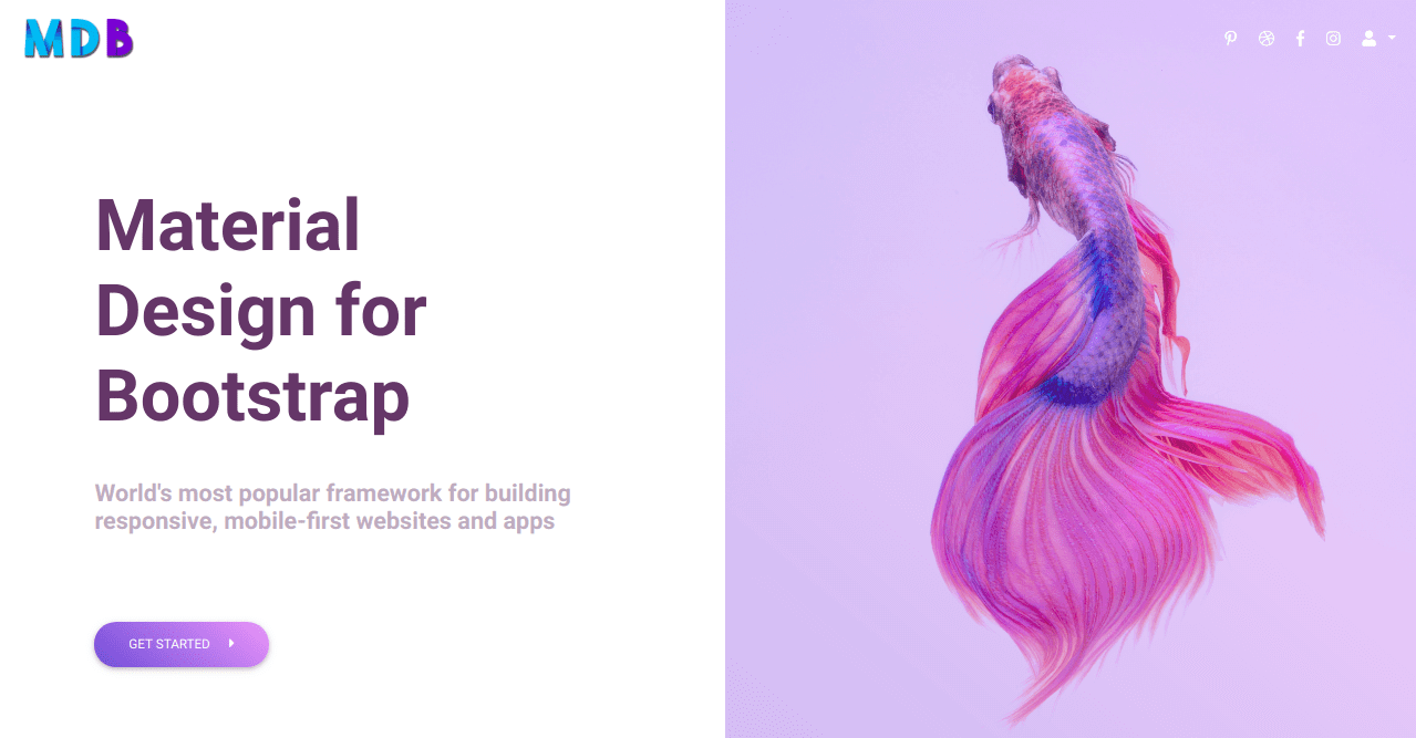
1. App intro
3. Call to Action Buttons intro
Half page intro MDB Pro component
        <!-- Main navigation -->
        <header>

          <!--Navbar-->
          <mdb-navbar SideClass="navbar navbar-expand-lg navbar-dark scrolling-navbar fixed-top transparent z-depth-0"
                      [containerInside]="false">

            <mdb-navbar-brand>
              <a class="navbar-brand" href="#">
                <img src="https://mdbootstrap.com/img/logo/mdb-transparent.png" height="30" alt="">
              </a>
            </mdb-navbar-brand>

            <!-- Collapsible content -->
            <links>

              <!-- Links -->
              <ul class="navbar-nav ml-auto">
                <li class="nav-item">
                  <a class="nav-link" href="#">
                    <i class="fab fa-pinterest-p"></i>
                  </a>
                </li>
                <li class="nav-item">
                  <a class="nav-link" href="#">
                    <i class="fab fa-dribbble"></i>
                  </a>
                </li>
                <li class="nav-item">
                  <a class="nav-link" href="#">
                    <i class="fab fa-facebook-f"></i>
                  </a>
                </li>
                <li class="nav-item">
                  <a class="nav-link" href="#">
                    <i class="fab fa-instagram"></i>
                  </a>
                </li>

                <!-- Dropdown -->
                <li class="nav-item dropdown" dropdown>
                  <a dropdownToggle mdbWavesEffect type="button" class="nav-link dropdown-toggle waves-light" mdbWavesEffect>
                    <mdb-icon fas icon="user"></mdb-icon>
                    <span class="caret"></span></a>
                  <div *dropdownMenu class="dropdown-menu dropdown dropdown-primary dropdowm-menu-right" role="menu">
                    <a class="dropdown-item waves-light" mdbWavesEffect href="#">Action</a>
                    <a class="dropdown-item waves-light" mdbWavesEffect href="#">Another action</a>
                    <a class="dropdown-item waves-light" mdbWavesEffect href="#">Something else here</a>
                    <div class="divider dropdown-divider"></div>
                    <a class="dropdown-item waves-light" mdbWavesEffect href="#">Separated link</a>
                  </div>
                </li>

              </ul>
              <!-- Links -->

            </links>
            <!-- Collapsible content -->

          </mdb-navbar>
          <!--/.Navbar-->

          <!-- Intro -->
          <section class="view">

            <div class="row">

              <div class="col-md-6">

                <div class="d-flex flex-column justify-content-center align-items-center h-100">
                  <h1 class="heading display-3">Material Design for Bootstrap</h1>
                  <h4 class="subheading font-weight-bold">World's most popular framework for building responsive, mobile-first
                    websites and apps</h4>
                  <div class="mr-auto">
                    <button type="button" class="btn btn-lily btn-margin btn-rounded">Get started <i
                      class="fas fa-caret-right ml-3"></i></button>
                  </div>
                </div>

              </div>

              <div class="col-md-6">

                <div class="view">
                  <img src="https://images.pexels.com/photos/325045/pexels-photo-325045.jpeg" class="img-fluid"
                       alt="smaple image">
                  <div class="mask flex-center hm-gradient">
                  </div>
                </div>

              </div>

            </div>

          </section>
          <!-- Intro -->

        </header>
        <!-- Main navigation -->

        <div style="height: 150vh"></div>
        .navbar {
          background: linear-gradient(40deg, rgba(0,51,199,.3), rgba(209,149,249,.3));
        }
        .navbar:not(.top-nav-collapse) {
          background: transparent;
        }
        .navbar .navbar-brand img {
          height: 40px;
          margin: 10px;
        }
        .hm-gradient {
          background: linear-gradient(40deg, rgba(0,51,199,.3), rgba(209,149,249,.3));
        }
        .heading {
          margin: 0 6rem;
          font-weight: 700;
          color: #5d4267;
        }
        .subheading {
          margin: 2.5rem 6rem;
          color: #bcb2c0;
        }
        .btn.btn-margin {
          margin-left: 6rem;
          margin-top: 3rem;
        }
        .btn.btn-lily {
          background: linear-gradient(40deg, rgba(0,51,199,.7), rgba(209,149,249,.7));
        }
        .title {
          margin-top: 6rem;
          margin-bottom: 2rem;
          color: #5d4267;
        }
        .subtitle {
          color: #bcb2c0;
          margin-left: 20%;
          margin-right: 20%;
          margin-bottom: 6rem;
        }
        .dropdown-menu {
          left: unset !important;
          right: 0 ;
        }
App intro MDB Pro component
<!-- Main navigation -->
<header>
<!--Navbar-->
<mdb-navbar SideClass="navbar navbar-expand-lg navbar-dark fixed-top scrolling-navbar">
<mdb-navbar-brand>
<a class="logo navbar-brand waves-light" mdbWavesEffect href="#"><strong>MDB</strong></a>
</mdb-navbar-brand>
<links>
<ul class="navbar-nav mr-auto">
<li class="nav-item active waves-light" mdbWavesEffect>
<a class="nav-link" href="#">Home <span class="sr-only">(current)</span></a>
</li>
<li class="nav-item waves-light" mdbWavesEffect>
<a class="nav-link" href="#">Link</a>
</li>
<li class="nav-item waves-light" mdbWavesEffect>
<a class="nav-link" href="#">Profile</a>
</li>
</ul>
<form class="form-inline">
<div class="md-form my-0">
<input class="form-control mr-sm-2" type="text" placeholder="Search" aria-label="Search">
</div>
</form>
</links>
</mdb-navbar>
<!-- Full Page Intro -->
<div class="view" style="background-image: url('https://mdbootstrap.com/img/Photos/Others/architecture.jpg'); background-repeat: no-repeat; background-size: cover; background-position: center center;">
<!-- Mask & flexbox options-->
<div class="mask rgba-gradient d-flex justify-content-center align-items-center">
<!-- Content -->
<div class="container">
<!--Grid row-->
<div class="row">
<!--Grid column-->
<div class="col-md-6 white-text text-center text-md-left mt-xl-5 mb-5 wow fadeInLeft" data-wow-delay="0.3s">
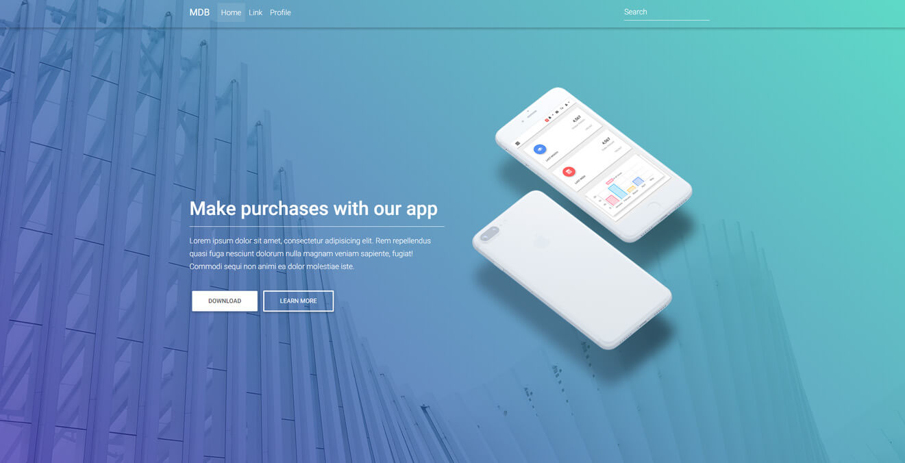
<h1 class="h1-responsive font-weight-bold mt-sm-5">Make purchases with our app </h1>
<hr class="hr-light">
<h6 class="mb-4">Lorem ipsum dolor sit amet, consectetur adipisicing elit. Rem repellendus quasi
fuga nesciunt
dolorum nulla magnam veniam sapiente, fugiat! Commodi sequi non animi ea dolor molestiae
iste.</h6>
<a mdbBtn color="white" mdbWavesEffect>Download</a>
<a mdbBtn color="white" outline="true" mdbWavesEffect>Learn more</a>
</div>
<!--Grid column-->
<!--Grid column-->
<div class="col-md-6 col-xl-5 mt-xl-5 wow fadeInRight" data-wow-delay="0.3s">
<img src="https://mdbootstrap.com/img/Mockups/Transparent/Small/admin-new.png" alt="" class="img-fluid">
</div>
<!--Grid column-->
</div>
<!--Grid row-->
</div>
<!-- Content -->
</div>
<!-- Mask & flexbox options-->
</div>
<!-- Full Page Intro -->
</header>
<!-- Main navigation -->
        /* Required for full background image */

        html,
        body,
        header,
        .view {
          min-height: 100vh;
        }

        @media (max-width: 740px) {
          html,
          body,
          header,
          .view {
            height: 1000px;
          }
        }
        @media (min-width: 800px) and (max-width: 850px) {
          html,
          body,
          header,
          .view {
            height: 600px;
          }
        }

        .btn .fa {
          margin-left: 3px;
        }

        .top-nav-collapse {
          background-color: #424f95 !important;
        }

        .navbar:not(.top-nav-collapse) {
          background: transparent !important;
        }

        @media (max-width: 991px) {
          .navbar:not(.top-nav-collapse) {
            background: #424f95 !important;
          }
        }

        .btn-white {
          color: black !important;
        }

        h6 {
          line-height: 1.7;
        }

        .rgba-gradient {
          background: -moz-linear-gradient(45deg, rgba(42, 27, 161, 0.7), rgba(29, 210, 177, 0.7) 100%);
          background: -webkit-linear-gradient(45deg, rgba(42, 27, 161, 0.7), rgba(29, 210, 177, 0.7) 100%);
          background: -webkit-gradient(linear, 45deg, from(rgba(42, 27, 161, 0.7)), to(rgba(29, 210, 177, 0.7)));
          background: -o-linear-gradient(45deg, rgba(42, 27, 161, 0.7), rgba(29, 210, 177, 0.7) 100%);
          background: linear-gradient(to 45deg, rgba(42, 27, 161, 0.7), rgba(29, 210, 177, 0.7) 100%);
          background: -webkit-linear-gradient(45deg, rgba(42, 27, 161, 0.7), rgba(29, 210, 177, 0.7) 100%)
        }

        .view.mask {
          overflow: auto !important;
        }
Contact Form intro MDB Pro component
<!-- Main navigation -->
<header>
<!--Navbar-->
<mdb-navbar SideClass="navbar navbar-expand-lg navbar-dark fixed-top scrolling-navbar">
<mdb-navbar-brand>
<a class="logo navbar-brand waves-light" mdbWavesEffect href="#"><strong>MDB</strong></a>
</mdb-navbar-brand>
<links>
<ul class="navbar-nav mr-auto">
<li class="nav-item active waves-light" mdbWavesEffect>
<a class="nav-link" href="#">Home <span class="sr-only">(current)</span></a>
</li>
<li class="nav-item waves-light" mdbWavesEffect>
<a class="nav-link" href="#">Link</a>
</li>
<li class="nav-item waves-light" mdbWavesEffect>
<a class="nav-link" href="#">Profile</a>
</li>
</ul>
<form class="form-inline">
<div class="md-form my-0">
<input class="form-control mr-sm-2" type="text" placeholder="Search" aria-label="Search">
</div>
</form>
</links>
</mdb-navbar>
<!-- Navbar -->
<!-- Full Page Intro -->
<div class="view" style="background-image: url('https://mdbootstrap.com/img/Photos/Others/images/89.jpg'); background-repeat: no-repeat; background-size: cover; background-position: center center;">
<!-- Mask & flexbox options-->
<div class="mask rgba-indigo-strong d-flex justify-content-center align-items-center">
<!-- Content -->
<div class="container">
<!--Grid row-->
<div class="row pt-lg-5 mt-lg-5">
<!--Grid column-->
<div class="col-md-6 mb-5 mt-md-0 mt-5 white-text text-center text-md-left wow fadeInLeft" data-wow-delay="0.3s">
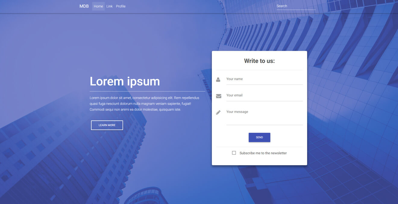
<h1 class="display-4 font-weight-bold">Lorem ipsum</h1>
<hr class="hr-light">
<h6 class="mb-3">Lorem ipsum dolor sit amet, consectetur adipisicing elit. Rem repellendus quasi
fuga
nesciunt dolorum nulla magnam veniam sapiente, fugiat! Commodi sequi non animi ea
dolor molestiae, quisquam iste.</h6>
<a mdbBtn color="white" outline="true" mdbWavesEffect>Learn more</a>
</div>
<!--Grid column-->
<!--Grid column-->
<div class="col-md-6 col-xl-5 mb-4">
<!--Form-->
<mdb-card class="wow fadeInRight" data-wow-delay="0.3s">
<mdb-card-body class="z-depth-2">
<!--Header-->
<div class="text-center">
<h3 class="dark-grey-text">
<strong>Write to us:</strong>
</h3>
<hr>
</div>
<!--Body-->
<div class="md-form">
<i class="fas fa-user prefix grey-text"></i>
<input type="text" id="form3" class="form-control" mdbInput>
<label for="form3">Your name</label>
</div>
<div class="md-form">
<i class="fas fa-envelope prefix grey-text"></i>
<input type="text" id="form2" class="form-control" mdbInput>
<label for="form2">Your email</label>
</div>
<!--Textarea with icon prefix-->
<div class="md-form">
<i class="fas fa-pencil-alt prefix grey-text"></i>
<textarea type="text" id="form8" class="md-textarea form-control" mdbInput></textarea>
<label for="form8">Your message</label>
</div>
<div class="text-center mt-3">
<button mdbBtn color="indigo" mdbWavesEffect>Send</button>
<hr>
<mdb-checkbox>Subscribe me to the
newsletter</mdb-checkbox>
</div>
</mdb-card-body>
</mdb-card>
<!--/.Form-->
</div>
<!--Grid column-->
</div>
<!--Grid row-->
</div>
<!-- Content -->
</div>
<!-- Mask & flexbox options-->
</div>
<!-- Full Page Intro -->
</header>
<!-- Main navigation -->
          /* Required for full background image */

          html,
          body,
          header,
          .view {
            min-height: 100vh;
          }

          @media (max-width: 740px) {
            html,
            body,
            header,
            .view {
              height: 1100px;
            }
          }
          @media (min-width: 800px) and (max-width: 850px) {
            html,
            body,
            header,
            .view {
              height: 700px;
            }
          }

          .top-nav-collapse {
            background-color: #39448c !important;
          }

          .navbar:not(.top-nav-collapse) {
            background: transparent !important;
          }

          @media (max-width: 991px) {
            .navbar:not(.top-nav-collapse) {
              background: #39448c !important;
            }
          }

          h6 {
            line-height: 1.7;
          }
Call to Action Buttons intro MDB Pro component
<!-- Main navigation -->
<header>
<!--Navbar-->
<mdb-navbar SideClass="navbar navbar-expand-lg navbar-light fixed-top scrolling-navbar">
<mdb-navbar-brand>
<a class="logo navbar-brand waves-light" mdbWavesEffect href="#"><strong>MDB</strong></a>
</mdb-navbar-brand>
<links>
<ul class="navbar-nav mr-auto">
<li class="nav-item active waves-light" mdbWavesEffect>
<a class="nav-link" href="#">Home <span class="sr-only">(current)</span></a>
</li>
<li class="nav-item waves-light" mdbWavesEffect>
<a class="nav-link" href="#">Link</a>
</li>
<li class="nav-item waves-light" mdbWavesEffect>
<a class="nav-link" href="#">Profile</a>
</li>
</ul>
<form class="form-inline">
<div class="md-form my-0">
<input class="form-control mr-sm-2" type="text" placeholder="Search" aria-label="Search">
</div>
</form>
</links>
</mdb-navbar>
<!-- Navbar -->
<!-- Full Page Intro -->
<div class="view" style="background-image: url('https://mdbootstrap.com/img/Photos/Others/gradient2.png'); background-repeat: no-repeat; background-size: cover; background-position: center center;">
<!-- Mask & flexbox options-->
<div class="mask rgba-purple-slight d-flex justify-content-center align-items-center">
<!-- Content -->
<div class="container">
<!--Grid row-->
<div class="row wow fadeIn">
<!--Grid column-->
<div class="col-md-12 text-center">
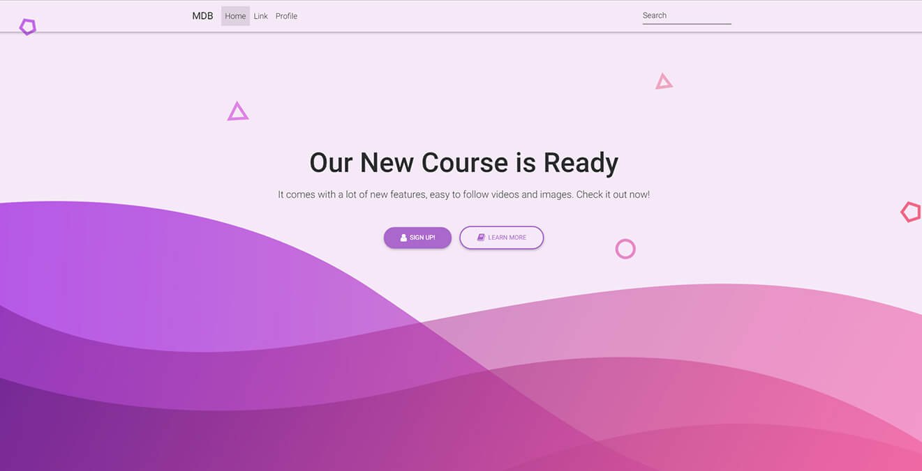
<h1 class="display-4 font-weight-bold mb-0 pt-md-5 pt-5 wow fadeInUp">Our New Course is Ready</h1>
<h5 class="pt-md-5 pt-sm-2 pt-5 pb-md-5 pb-sm-3 pb-5 wow fadeInUp" data-wow-delay="0.2s">It comes
with a lot of new features, easy to follow videos and images. Check it out now!</h5>
<div class="wow fadeInUp" data-wow-delay="0.4s">
<a mdbBtn color="purple" rounded="true" mdbWavesEffect><i class="fas fa-user left"></i> Sign up!</a>
<a mdbBtn color="purple" rounded="true" outline="true" mdbWavesEffect><i class="fas fa-book left"></i>
Learn more</a>
</div>
</div>
<!--Grid column-->
</div>
<!--Grid row-->
</div>
<!-- Content -->
</div>
<!-- Mask & flexbox options-->
</div>
<!-- Full Page Intro -->
</header>
<!-- Main navigation -->
          /* Required for full background image */

          html,
          body,
          header,
          .view {
            min-height: 100vh;
          }

          @media (max-width: 740px) {
            html,
            body,
            header,
            .view {
              height: 100vh;
            }
          }

          .top-nav-collapse {
            background-color: #f8bbd0 !important;
          }

          .navbar:not(.top-nav-collapse) {
            background: transparent !important;
          }

          @media (max-width: 991px) {
            .navbar:not(.top-nav-collapse) {
              background: #f8bbd0 !important;
            }
          }
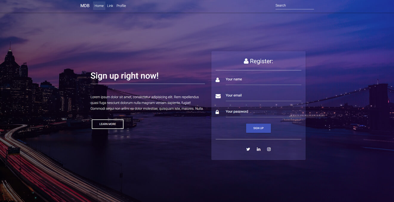
Classic Register Form intro MDB Pro component
<!-- Main navigation -->
<header>
  <!--Navbar-->
  <mdb-navbar SideClass="navbar navbar-expand-lg navbar-dark fixed-top scrolling-navbar">
    <mdb-navbar-brand>
      <a class="logo navbar-brand waves-light" mdbWavesEffect href="#"><strong>MDB</strong></a>
    </mdb-navbar-brand>
    <links>
      <ul class="navbar-nav mr-auto">
        <li class="nav-item active waves-light" mdbWavesEffect>
          <a class="nav-link" href="#">Home <span class="sr-only">(current)</span></a>
        </li>
        <li class="nav-item waves-light" mdbWavesEffect>
          <a class="nav-link" href="#">Link</a>
        </li>
        <li class="nav-item waves-light" mdbWavesEffect>
          <a class="nav-link" href="#">Profile</a>
        </li>
      </ul>
      <form class="form-inline">
        <div class="md-form my-0">
          <input class="form-control mr-sm-2" type="text" placeholder="Search" aria-label="Search">
        </div>
      </form>
    </links>
  </mdb-navbar>
  <!-- Full Page Intro -->
  <div class="view" style="background-image: url('http://mdbootstrap.com/img/Photos/Others/images/91.jpg'); background-repeat: no-repeat; background-size: cover; background-position: center center;">
    <!-- Mask & flexbox options-->
    <div class="mask rgba-gradient d-flex justify-content-center align-items-center">
      <!-- Content -->
      <div class="container">
        <!--Grid row-->
        <div class="row mt-5">
          <!--Grid column-->
          <div class="col-md-6 mb-5 mt-md-0 mt-5 white-text text-center text-md-left">
            <h1 class="h1-responsive font-weight-bold wow fadeInLeft" data-wow-delay="0.3s">Sign up right now! </h1>
            <hr class="hr-light wow fadeInLeft" data-wow-delay="0.3s">
            <h6 class="mb-3 wow fadeInLeft" data-wow-delay="0.3s">Lorem ipsum dolor sit amet, consectetur adipisicing
              elit. Rem repellendus quasi fuga
              nesciunt dolorum nulla magnam veniam sapiente, fugiat! Commodi sequi non animi ea
              dolor molestiae, quisquam iste, maiores. Nulla.</h6>
            <a mdbBtn color="white" outline="true" mdbWavesEffect class="wow fadeInLeft" data-wow-delay="0.3s">Learn
              more</a>
          </div>
          <!--Grid column-->
          <!--Grid column-->
          <div class="col-md-6 col-xl-5 mb-4">
            <!--Form-->
            <mdb-card class="wow fadeInRight" data-wow-delay="0.3s">
              <mdb-card-body>
                <!--Header-->
                <div class="text-center">
                  <h3 class="white-text">
                    <i class="fas fa-user white-text"></i> Register:</h3>
                  <hr class="hr-light">
                </div>
                <!--Body-->
                <div class="md-form">
                  <i class="fas fa-user prefix white-text active"></i>
                  <input type="text" id="form3" class="text-white form-control" mdbInput>
                  <label for="form3" class="text-white">Your name</label>
                </div>
                <div class="md-form">
                  <i class="fas fa-envelope prefix white-text active"></i>
                  <input type="email" id="form2" class="text-white form-control" mdbInput>
                  <label for="form2" class="text-white">Your email</label>
                </div>
                <div class="md-form">
                  <i class="fas fa-lock prefix text-white active"></i>
                  <input type="password" id="form4" class="text-white form-control" mdbInput>
                  <label for="form4" class="text-white">Your password</label>
                </div>
                <div class="text-center mt-4">
                  <button mdbBtn color="indigo" mdbWavesEffect>Sign up</button>
                  <hr class="hr-light mb-3 mt-4">
                  <div class="inline-ul text-center d-flex justify-content-center">
                    <a class="p-2 m-2 tw-ic">
                      <i class="fab fa-twitter white-text"></i>
                    </a>
                    <a class="p-2 m-2 li-ic">
                      <i class="fab fa-linkedin-in white-text"> </i>
                    </a>
                    <a class="p-2 m-2 ins-ic">
                      <i class="fab fa-instagram white-text"> </i>
                    </a>
                  </div>
                </div>
              </mdb-card-body>
            </mdb-card>
            <!--/.Form-->
          </div>
          <!--Grid column-->
        </div>
        <!--Grid row-->
      </div>
      <!-- Content -->
    </div>
    <!-- Mask & flexbox options-->
  </div>
  <!-- Full Page Intro -->
</header>
<!-- Main navigation -->
<!--Main Layout-->
<main>
  <div class="container">
    <!--Grid row-->
    <div class="row py-5">
      <!--Grid column-->
      <div class="col-md-12 text-center">
        <p>Lorem ipsum dolor sit amet, consectetur adipiscing elit, sed do eiusmod tempor incididunt ut labore et
          dolore magna aliqua. Ut enim ad minim veniam, quis nostrud exercitation ullamco laboris nisi ut aliquip ex ea
          commodo consequat. Duis aute irure dolor in reprehenderit in voluptate velit esse cillum dolore eu fugiat
          nulla pariatur. Excepteur sint occaecat cupidatat non proident, sunt in culpa qui officia deserunt mollit
          anim id est laborum.</p>
      </div>
      <!--Grid column-->
    </div>
    <!--Grid row-->
  </div>
</main>
        html,
        body,
        header,
        .view {
          min-height: 100vh;
        }

        @media (max-width: 740px) {
          html,
          body,
          header,
          .view {
            min-height: 1000px;
          }
        }
        @media (min-width: 800px) and (max-width: 850px) {
          html,
          body,
          header,
          .view {
            min-height: 650px;
          }
        }

        .top-nav-collapse {
          background-color: #3f51b5 !important;
        }

        .navbar:not(.top-nav-collapse) {
          background: transparent !important;
        }

        @media (max-width: 991px) {
          .navbar:not(.top-nav-collapse) {
            background: #3f51b5 !important;
          }
        }

        .rgba-gradient {
          background: -webkit-linear-gradient(45deg, rgba(0, 0, 0, 0.7), rgba(72, 15, 144, 0.4) 100%);
          background: -webkit-gradient(linear, 45deg, from(rgba(0, 0, 0, 0.7), rgba(72, 15, 144, 0.4) 100%));
          background: linear-gradient(to 45deg, rgba(0, 0, 0, 0.7), rgba(72, 15, 144, 0.4) 100%);
        }

        .card {
          background-color: rgba(126, 123, 215, 0.2);
        }

        .md-form label {
          color: #ffffff;
        }

        h6 {
          line-height: 1.7;
        }
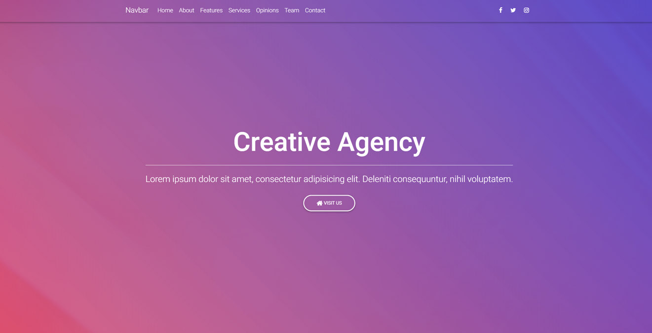
Video background intro MDB Pro component
<!-- Main navigation -->
<header>

  <mdb-navbar SideClass="navbar navbar-expand-lg navbar-dark fixed-top scrolling-navbar">
    <mdb-navbar-brand>
      <a class="logo navbar-brand waves-light" mdbWavesEffect href="#"><strong>MDB</strong></a>
    </mdb-navbar-brand>
    <links>
      <ul class="navbar-nav mr-auto">
        <li class="nav-item">
          <a class="nav-link" href="#home">Home
            <span class="sr-only">(current)</span>
          </a>
        </li>
        <li class="nav-item">
          <a class="nav-link" href="#about" data-offset="90">About</a>
        </li>
        <li class="nav-item">
          <a class="nav-link" href="#features" data-offset="90">Features</a>
        </li>
        <li class="nav-item">
          <a class="nav-link" href="#services" data-offset="90">Services</a>
        </li>
        <li class="nav-item">
          <a class="nav-link" href="#opinions" data-offset="30">Opinions</a>
        </li>
        <li class="nav-item">
          <a class="nav-link" href="#team" data-offset="90">Team</a>
        </li>
        <li class="nav-item">
          <a class="nav-link" href="#contact" data-offset="90">Contact</a>
        </li>
      </ul>

      <ul class="navbar-nav nav-flex-icons">
        <li class="nav-item">
          <a class="nav-link">
            <i class="fab fa-facebook-f light-green-text-2"></i>
          </a>
        </li>
        <li class="nav-item">
          <a class="nav-link">
            <i class="fab fa-twitter light-green-text-2"></i>
          </a>
        </li>
        <li class="nav-item">
          <a class="nav-link">
            <i class="fab fa-instagram light-green-text-2"></i>
          </a>
        </li>
      </ul>
    </links>
  </mdb-navbar>

  <!-- Full Page Intro -->
  <div id="intro-section" class="view">

    <video class="video-intro" poster="https://mdbootstrap.com/img/Photos/Others/background.jpg" playsinline autoplay
      muted loop>
      <source src="https://mdbootstrap.com/img/video/animation.mp4" type="video/mp4">
    </video>

    <!-- Mask & flexbox options-->
    <div class="mask rgba-gradient d-flex justify-content-center align-items-center">

      <!-- Content -->
      <div class="container px-md-3 px-sm-0">

        <!--Grid row-->
        <div class="row wow fadeIn">

          <!--Grid column-->
          <div class="col-md-12 mb-4 white-text text-center wow fadeIn">

            <h3 class="display-3 font-weight-bold white-text mb-0 mt-5 pt-md-5 pt-5">Creative Agency</h3>
            <hr class="hr-light my-4 w-75">
            <h4 class="subtext-header mt-2 mb-4">Lorem ipsum dolor sit amet, consectetur adipisicing elit
              deleniti consequuntur nihil.</h4>
            <a href="#!" mdbBtn color="white" rounded="true" outline="true" mdbWavesEffect>
              <i class="fas fa-home"></i> Visit us
            </a>

          </div>
          <!--Grid column-->

        </div>
        <!--Grid row-->

      </div>
      <!-- Content -->

    </div>
    <!-- Mask & flexbox options-->

  </div>
  <!-- Full Page Intro -->

</header>
<!-- Main navigation -->
        /* Required for full background image */

        html,
        body,
        header,
        #intro-section,
         {
          height: 100vh !important;
        }

        @media (max-width: 740px) {
          html,
          body,
          header,
          #intro-section {
            min-height: 100vh;
          }
        }

        .top-nav-collapse {
          background-color: #563e91 !important;
        }

        .navbar:not(.top-nav-collapse) {
          background: transparent !important;
        }

        @media (max-width: 991px) {
          .navbar:not(.top-nav-collapse) {
            background: #563e91 !important;
          }
        }

        .rgba-gradient {
          background: -moz-linear-gradient(45deg, rgba(213, 15, 61, 0.6), rgba(13, 17, 198, 0.69) 100%);
          background: -webkit-linear-gradient(45deg, rgba(213, 15, 61, 0.6), rgba(13, 17, 198, 0.69) 100%);
          background: linear-gradient(45deg, rgba(213, 15, 61, 0.6), rgba(13, 17, 198, 0.69) 100%);
        }

        .view.mask {
          overflow: auto !important;
        }
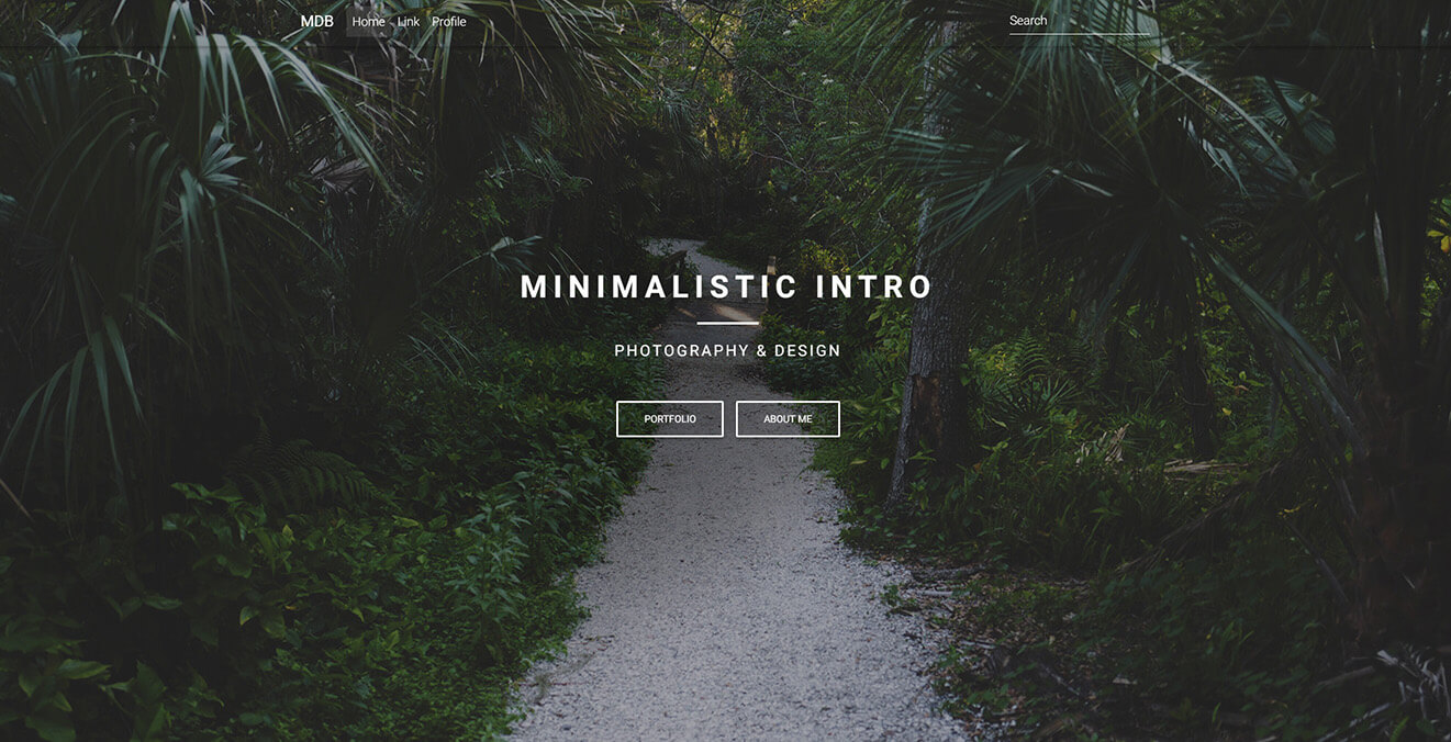
Minimalist intro MDB Pro component
<!-- Main navigation -->
<header>
  <!--Navbar-->
  <mdb-navbar SideClass="navbar navbar-expand-lg navbar-dark fixed-top scrolling-navbar">
    <mdb-navbar-brand>
      <a class="logo navbar-brand waves-light" mdbWavesEffect href="#"><strong>MDB</strong></a>
    </mdb-navbar-brand>
    <links>
      <ul class="navbar-nav mr-auto">
        <li class="nav-item active waves-light" mdbWavesEffect>
          <a class="nav-link" href="#">Home <span class="sr-only">(current)</span></a>
        </li>
        <li class="nav-item waves-light" mdbWavesEffect>
          <a class="nav-link" href="#">Link</a>
        </li>
        <li class="nav-item waves-light" mdbWavesEffect>
          <a class="nav-link" href="#">Profile</a>
        </li>
      </ul>
      <form class="form-inline">
        <div class="md-form my-0">
          <input class="form-control mr-sm-2" type="text" placeholder="Search" aria-label="Search">
        </div>
      </form>
    </links>
  </mdb-navbar>
  <!-- Full Page Intro -->
  <div class="view jarallax" style="background-image: url('https://mdbootstrap.com/img/Photos/Others/img%20%2848%29.jpg'); background-repeat: no-repeat; background-size: cover; background-position: center center;">
    <!-- Mask & flexbox options-->
    <div class="mask rgba-black-light d-flex justify-content-center align-items-center">
      <!-- Content -->
      <div class="container">
        <!--Grid row-->
        <div class="row">
          <!--Grid column-->
          <div class="col-md-12 mb-4 white-text text-center">
            <h1 class="h1-reponsive white-text text-uppercase font-weight-bold mb-0 pt-md-5 pt-5 wow fadeInDown"
              data-wow-delay="0.3s"><strong>Minimalist intro</strong></h1>
            <hr class="hr-light my-4 wow fadeInDown" data-wow-delay="0.4s">
            <h5 class="text-uppercase mb-4 white-text wow fadeInDown" data-wow-delay="0.4s"><strong>Photography
                & design</strong></h5>
            <a mdbBtn color="white" outline="true" mdbWavesEffect class="wow fadeInDown" data-wow-delay="0.4s">portfolio</a>
            <a mdbBtn color="white" outline="true" mdbWavesEffect class="wow fadeInDown" data-wow-delay="0.4s">About me</a>
          </div>
          <!--Grid column-->
        </div>
        <!--Grid row-->
      </div>
      <!-- Content -->
    </div>
    <!-- Mask & flexbox options-->
  </div>
  <!-- Full Page Intro -->
</header>
<!-- Main navigation -->
Lorem ipsum dolor sit amet consectetur adipisicing elit. Aperiam qui ipsam itaque officiis ipsum et recusandae
voluptatem tenetur. Quibusdam dolorem in totam quis necessitatibus blanditiis mollitia, inventore rem recusandae quo?
        /* Required for full background image */

        html,
        body,
        header,
        .view {
          min-height: 100vh !important;
        }

        @media (max-width: 740px) {
          html,
          body,
          header,
          .view {
            height: 100vh;
          }
        }

        .top-nav-collapse {
          background-color: #78909c !important;
        }

        .navbar:not(.top-nav-collapse) {
          background: transparent !important;
        }

        @media (max-width: 991px) {
          .navbar:not(.top-nav-collapse) {
            background: #78909c !important;
          }
        }

        h1 {
          letter-spacing: 8px;
        }

        h5 {
          letter-spacing: 3px;
        }

        .hr-light {
          border-top: 3px solid #fff;
          width: 80px;
        }
Angular Intros - API
In this section you will find informations about required modules and available inputs, outputs, methods and events of Angular intros sections.
Modules used
In order to speed up your application, you can choose to import only the modules you actually need, instead of importing the entire MDB Angular library. Remember that importing the entire library, and immediately afterwards a specific module, is bad practice, and can cause application errors.
// MDB Angular Pro
import { InputsModule, CardsFreeModule, WavesModule, ButtonsModule } from 'ng-uikit-pro-standard'