Vue Bootstrap Gallery
Vue Gallery - Bootstrap 4 & Material Design
Vue Bootstrap gallery is a great UI element perfect for introducing vistors to a number of images, videos or other media files.
Easy to construct in a form of a lightbox gallery, multi item carousel or slides with caption.
Examples of Vue Bootstrap gallery use:
- Most popular paintings on a museum website
- Landscape photos in traveling blog
- Best pieces of work in a portfolio
All of the above can be easily created by following those examples:
Gallery with image filtering MDB Pro component
.jpg)

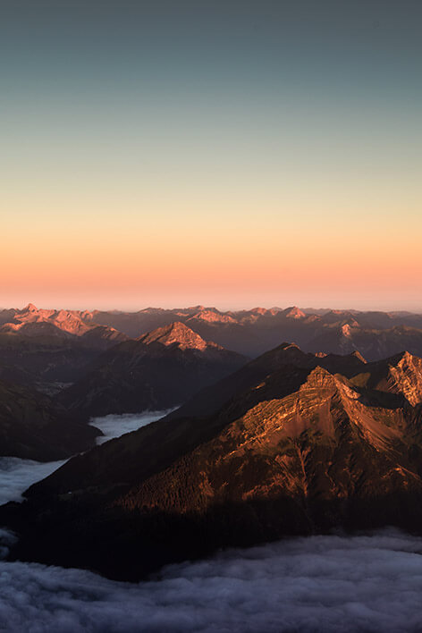
.jpg)
.jpg)

        <template>
          <mdb-container class="mt-5">
            <mdb-row>
              <mdb-col md="12" class="d-flex justify-content-center mb-5">
                <mdb-btn @click.native="show = 'all'" outline="black" class="filter" dark-waves>All</mdb-btn>
                <mdb-btn @click.native="show = '1'" outline="black" class="filter" dark-waves>Mountains</mdb-btn>
                <mdb-btn @click.native="show = '2'" outline="black" class="filter" dark-waves>Sea</mdb-btn>
              </mdb-col>
            </mdb-row>
            <div class="gallery" id="gallery">
              <!-- Grid column -->

              <transition @enter="enter" @after-enter="afterEnter" @before-leave="beforeLeave">
                <div v-if="show === 'all' || show === '2'" class="mb-3 pics all 2 animation" style="">
                  <img class="img-fluid" src="https://mdbootstrap.com/img/Photos/Horizontal/Nature/4-col/img%20(73).jpg" alt="Card image cap">
                </div>
              </transition>
              <!-- Grid column -->

              <!-- Grid column -->
              <transition @enter="enter" @after-enter="afterEnter" @before-leave="beforeLeave">
                <div v-if="show === 'all' || show === '1'" class="mb-3 pics all 1 animation" style="">
                  <img class="img-fluid" src="https://mdbootstrap.com/img/Photos/Vertical/mountain1.jpg" alt="Card image cap">
                </div>
              </transition>
              <!-- Grid column -->

              <!-- Grid column -->
              <transition @enter="enter" @after-enter="afterEnter" @before-leave="beforeLeave">
                <div v-if="show === 'all' || show === '1'" class="mb-3 pics all 1 animation" style="">
                  <img class="img-fluid" src="https://mdbootstrap.com/img/Photos/Vertical/mountain2.jpg" alt="Card image cap">
                </div>
              </transition>
              <!-- Grid column -->

              <!-- Grid column -->
              <transition @enter="enter" @after-enter="afterEnter" @before-leave="beforeLeave">
                <div v-if="show === 'all' || show === '2'" class="mb-3 pics all 2 animation" style="">
                  <img class="img-fluid" src="https://mdbootstrap.com/img/Photos/Horizontal/Nature/4-col/img%20(35).jpg" alt="Card image cap">
                </div>
              </transition>
              <!-- Grid column -->

              <!-- Grid column -->
              <transition @enter="enter" @after-enter="afterEnter" @before-leave="beforeLeave">
                <div v-if="show === 'all' || show === '2'" class="mb-3 pics all 2 animation" style="">
                  <img class="img-fluid" src="https://mdbootstrap.com/img/Photos/Horizontal/Nature/4-col/img%20(18).jpg" alt="Card image cap">
                </div>
              </transition>
              <!-- Grid column -->

              <!-- Grid column -->
              <transition @enter="enter" @after-enter="afterEnter" @before-leave="beforeLeave">
                <div v-if="show === 'all' || show === '1'" class="mb-3 pics all 1 animation" style="">
                  <img class="img-fluid" src="https://mdbootstrap.com/img/Photos/Vertical/mountain3.jpg" alt="Card image cap">
                </div>
              </transition>
              <!-- Grid column -->
            </div>
          </mdb-container>
        </template>
        <script>
          import { mdbContainer, mdbRow, mdbCol, mdbIcon, mdbBtn, mdbLightbox, mdbCarousel, mdbCarouselItem, mdbCarouselCaption, mdbCard, mdbModal, mdbModalHeader, mdbModalTitle, mdbModalBody, mdbModalFooter, mdbNavItem } from "mdbvue";
          export default {
            name: "GalleryPage",
            data() {
              return {
                show: 'all'
              };
            },
            methods: {
              enter(el) {
                el.style.opacity = 0;
              },
              afterEnter(el) {
                el.style.opacity = 1;
              },
              beforeLeave(el) {
                el.style.opacity = 0;
              }
            },
            components: {
              mdbContainer,
              mdbRow,
              mdbCol,
              mdbIcon,
              mdbBtn,
              mdbLightbox,
              mdbCarousel,
              mdbCarouselItem,
              mdbCarouselCaption,
              mdbCard,
              mdbModal,
              mdbModalHeader,
              mdbModalTitle,
              mdbModalBody,
              mdbModalFooter,
              mdbNavItem
            }
          }
        </script>
        <!-- Add "scoped" attribute to limit CSS to this component only -->
        <style scoped>
          .gallery {
            -webkit-column-count: 3;
            -moz-column-count: 3;
            column-count: 3;
            -webkit-column-width: 33%;
            -moz-column-width: 33%;
            column-width: 33%; }
          .gallery .pics {
            -webkit-transition: all 350ms ease;
            transition: all 350ms ease; }
          .gallery .animation {
            -webkit-transform: scale(1);
            -ms-transform: scale(1);
            transform: scale(1); }

          @media (max-width: 450px) {
            .gallery {
              -webkit-column-count: 1;
              -moz-column-count: 1;
              column-count: 1;
              -webkit-column-width: 100%;
              -moz-column-width: 100%;
              column-width: 100%;
            }
          }

          @media (max-width: 400px) {
            .btn.filter {
              padding-left: 1.1rem;
              padding-right: 1.1rem;
            }
          }
        </style>
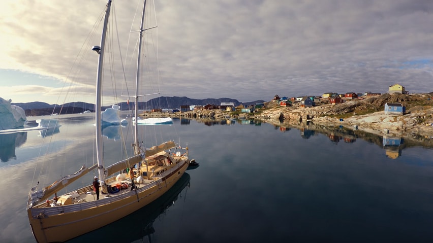
Lightbox gallery MDB Pro component
.jpg)
.jpg)
.jpg)
.jpg)
.jpg)
.jpg)
.jpg)
.jpg)
.jpg)
        <template>
          <mdb-container class="mt-5">
            <mdb-container>
              <mdb-row class="mdb-lightbox no-margin">
                <mdb-col md="4" @click.native="showLightbox(0)">
                  <figure>
                    <img src="https://mdbootstrap.com/img/Photos/Horizontal/Nature/4-col/img%20(117).jpg" class="img-fluid" alt="">
                  </figure>
                </mdb-col>
                <mdb-col md="4" @click.native="showLightbox(1)">
                  <figure>
                    <img src="https://mdbootstrap.com/img/Photos/Horizontal/Nature/4-col/img%20(98).jpg" class="img-fluid" alt="">
                  </figure>
                </mdb-col>
                <mdb-col md="4" @click.native="showLightbox(2)">
                  <figure>
                    <img src="https://mdbootstrap.com/img/Photos/Horizontal/Nature/4-col/img%20(131).jpg" class="img-fluid" alt="">
                  </figure>
                </mdb-col>
                <mdb-col md="4" @click.native="showLightbox(3)">
                  <figure>
                    <img src="https://mdbootstrap.com/img/Photos/Horizontal/Nature/4-col/img%20(123).jpg" class="img-fluid" alt="">
                  </figure>
                </mdb-col>
                <mdb-col md="4" @click.native="showLightbox(4)">
                  <figure>
                    <img src="https://mdbootstrap.com/img/Photos/Horizontal/Nature/4-col/img%20(118).jpg" class="img-fluid" alt="">
                  </figure>
                </mdb-col>
                <mdb-col md="4" @click.native="showLightbox(5)">
                  <figure>
                    <img src="https://mdbootstrap.com/img/Photos/Horizontal/Nature/4-col/img%20(128).jpg" class="img-fluid" alt="">
                  </figure>
                </mdb-col>
                <mdb-col md="4" @click.native="showLightbox(6)">
                  <figure>
                    <img src="https://mdbootstrap.com/img/Photos/Horizontal/Nature/4-col/img%20(132).jpg" class="img-fluid" alt="">
                  </figure>
                </mdb-col>
                <mdb-col md="4" @click.native="showLightbox(7)">
                  <figure>
                    <img src="https://mdbootstrap.com/img/Photos/Horizontal/Nature/4-col/img%20(115).jpg" class="img-fluid" alt="">
                  </figure>
                </mdb-col>
                <mdb-col md="4" @click.native="showLightbox(8)">
                  <figure>
                    <img src="https://mdbootstrap.com/img/Photos/Horizontal/Nature/4-col/img%20(133).jpg" class="img-fluid" alt="">
                  </figure>
                </mdb-col>
              </mdb-row>
            </mdb-container>
            <mdb-lightbox
              :visible="visible"
              :imgs="imgs"
              :index="index"
              @hide="handleHide"
            ></mdb-lightbox>
          </mdb-container>
        </template>
        <script>
        import { mdbContainer, mdbRow, mdbCol, mdbIcon, mdbBtn, mdbLightbox, mdbCarousel, mdbCarouselItem, mdbCarouselCaption, mdbCard, mdbModal, mdbModalHeader, mdbModalTitle, mdbModalBody, mdbModalFooter, mdbNavItem } from "mdbvue";
        export default {
          name: "GalleryPage",
          data() {
            return {
              imgs: [
                'https://mdbootstrap.com/img/Photos/Horizontal/Nature/12-col/img%20(117).jpg',
                'https://mdbootstrap.com/img/Photos/Horizontal/Nature/12-col/img%20(98).jpg',
                'https://mdbootstrap.com/img/Photos/Horizontal/Nature/12-col/img%20(131).jpg',
                'https://mdbootstrap.com/img/Photos/Horizontal/Nature/12-col/img%20(123).jpg',
                'https://mdbootstrap.com/img/Photos/Horizontal/Nature/12-col/img%20(118).jpg',
                'https://mdbootstrap.com/img/Photos/Horizontal/Nature/12-col/img%20(128).jpg',
                'https://mdbootstrap.com/img/Photos/Horizontal/Nature/12-col/img%20(132).jpg',
                'https://mdbootstrap.com/img/Photos/Horizontal/Nature/12-col/img%20(115).jpg',
                'https://mdbootstrap.com/img/Photos/Horizontal/Nature/12-col/img%20(133).jpg'
              ],
              visible: false,
              index: 0
            };
          },
          methods: {
            showLightbox(index) {
              this.index = index;
              this.visible = true;
            },
            handleHide() {
              this.visible = false;
            }
          },
          components: {
            mdbContainer,
            mdbRow,
            mdbCol,
            mdbIcon,
            mdbBtn,
            mdbLightbox,
            mdbCarousel,
            mdbCarouselItem,
            mdbCarouselCaption,
            mdbCard,
            mdbModal,
            mdbModalHeader,
            mdbModalTitle,
            mdbModalBody,
            mdbModalFooter,
            mdbNavItem
          }
        }
        </script>
        <!-- Add "scoped" attribute to limit CSS to this component only -->
        <style scoped>
          @media (min-width: 768px) {
            .carousel-multi-item-2 .col-md-3 {
              float: left;
              width: 25%;
              max-width: 100%; } }

            .carousel-multi-item-2 .card img {
              border-radius: 2px; }

            figure {
              cursor: pointer;
            }
        </style>
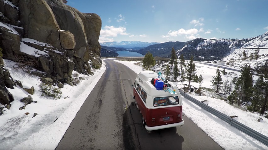
Lightbox gallery with gutters MDB Pro component
.jpg)
.jpg)
.jpg)
.jpg)
.jpg)
.jpg)
.jpg)
.jpg)
.jpg)
        <template>
          <mdb-container class="mt-5">
            <mdb-container>
              <mdb-row class="mdb-lightbox">
                <mdb-col md="4" @click.native="showLightbox2(0)">
                  <figure>
                    <img src="https://mdbootstrap.com/img/Photos/Lightbox/Thumbnail/img%20(145).jpg" class="img-fluid" alt="">
                  </figure>
                </mdb-col>
                <mdb-col md="4" @click.native="showLightbox2(1)">
                  <figure>
                    <img src="https://mdbootstrap.com/img/Photos/Lightbox/Thumbnail/img%20(150).jpg" class="img-fluid" alt="">
                  </figure>
                </mdb-col>
                <mdb-col md="4" @click.native="showLightbox2(2)">
                  <figure>
                    <img src="https://mdbootstrap.com/img/Photos/Lightbox/Thumbnail/img%20(152).jpg" class="img-fluid" alt="">
                  </figure>
                </mdb-col>
                <mdb-col md="4" @click.native="showLightbox2(3)">
                  <figure>
                    <img src="https://mdbootstrap.com/img/Photos/Lightbox/Thumbnail/img%20(42).jpg" class="img-fluid" alt="">
                  </figure>
                </mdb-col>
                <mdb-col md="4" @click.native="showLightbox2(4)">
                  <figure>
                    <img src="https://mdbootstrap.com/img/Photos/Lightbox/Thumbnail/img%20(151).jpg" class="img-fluid" alt="">
                  </figure>
                </mdb-col>
                <mdb-col md="4" @click.native="showLightbox2(5)">
                  <figure>
                    <img src="https://mdbootstrap.com/img/Photos/Lightbox/Thumbnail/img%20(40).jpg" class="img-fluid" alt="">
                  </figure>
                </mdb-col>
                <mdb-col md="4" @click.native="showLightbox2(6)">
                  <figure>
                    <img src="https://mdbootstrap.com/img/Photos/Lightbox/Thumbnail/img%20(148).jpg" class="img-fluid" alt="">
                  </figure>
                </mdb-col>
                <mdb-col md="4" @click.native="showLightbox2(7)">
                  <figure>
                    <img src="https://mdbootstrap.com/img/Photos/Lightbox/Thumbnail/img%20(147).jpg" class="img-fluid" alt="">
                  </figure>
                </mdb-col>
                <mdb-col md="4" @click.native="showLightbox2(8)">
                  <figure>
                    <img src="https://mdbootstrap.com/img/Photos/Lightbox/Thumbnail/img%20(149).jpg" class="img-fluid" alt="">
                  </figure>
                </mdb-col>
              </mdb-row>
            </mdb-container>
            <mdb-lightbox
              :visible="visible2"
              :imgs="imgs2"
              :index="index2"
              @hide="handleHide2">
            </mdb-lightbox>
          </mdb-container>
        </template>
        <script>
        import { mdbContainer, mdbRow, mdbCol, mdbIcon, mdbBtn, mdbLightbox, mdbCarousel, mdbCarouselItem, mdbCarouselCaption, mdbCard, mdbModal, mdbModalHeader, mdbModalTitle, mdbModalBody, mdbModalFooter, mdbNavItem } from "mdbvue";
        export default {
          name: "GalleryPage",
          data() {
            return {
              imgs2: [
                'https://mdbootstrap.com/img/Photos/Lightbox/Original/img%20(145).jpg',
                'https://mdbootstrap.com/img/Photos/Lightbox/Original/img%20(150).jpg',
                'https://mdbootstrap.com/img/Photos/Lightbox/Original/img%20(152).jpg',
                'https://mdbootstrap.com/img/Photos/Lightbox/Original/img%20(42).jpg',
                'https://mdbootstrap.com/img/Photos/Lightbox/Original/img%20(151).jpg',
                'https://mdbootstrap.com/img/Photos/Lightbox/Original/img%20(40).jpg',
                'https://mdbootstrap.com/img/Photos/Lightbox/Original/img%20(148).jpg',
                'https://mdbootstrap.com/img/Photos/Lightbox/Original/img%20(147).jpg',
                'https://mdbootstrap.com/img/Photos/Lightbox/Original/img%20(149).jpg'
              ],
              visible2: false,
              index2: 0
            };
          },
          methods: {
            showLightbox2(index2) {
              this.index2 = index2;
              this.visible2 = true;
            },
            handleHide2() {
              this.visible2 = false;
            }
          },
          components: {
            mdbContainer,
            mdbRow,
            mdbCol,
            mdbIcon,
            mdbBtn,
            mdbLightbox,
            mdbCarousel,
            mdbCarouselItem,
            mdbCarouselCaption,
            mdbCard,
            mdbModal,
            mdbModalHeader,
            mdbModalTitle,
            mdbModalBody,
            mdbModalFooter,
            mdbNavItem
          }
        }
        </script>
        <!-- Add "scoped" attribute to limit CSS to this component only -->
        <style scoped>
          @media (min-width: 768px) {
            .carousel-multi-item-2 .col-md-3 {
              float: left;
              width: 25%;
              max-width: 100%; } }

            .carousel-multi-item-2 .card img {
              border-radius: 2px; }

            figure {
              cursor: pointer;
            }
        </style>
Multi item carousel gallery MDB Pro component
.jpg)
.jpg)
.jpg)
.jpg)
.jpg)
.jpg)
.jpg)
.jpg)
.jpg)
.jpg)
.jpg)
.jpg)
        <template>
          <mdb-container class="mt-5">
            <mdb-carousel :interval="8000" showControls multi slide leftIcon="angle-left fa-3x pr-3" rightIcon="angle-right fa-3x pl-3" :floating="false">
              <mdb-carousel-item>
                <mdb-row>
                  <mdb-col md="3" class="mb-3">
                    <mdb-card>
                      <img class="img-fluid" src="https://mdbootstrap.com/img/Photos/Horizontal/Nature/4-col/img%20(38).jpg"
                  alt="Card image cap"/>
                    </mdb-card>
                  </mdb-col>
                  <mdb-col md="3" class="mb-3">
                    <mdb-card>
                      <img class="img-fluid" src="https://mdbootstrap.com/img/Photos/Horizontal/Nature/4-col/img%20(19).jpg"
                  alt="Card image cap"/>
                    </mdb-card>
                  </mdb-col>
                  <mdb-col md="3" class="mb-3">
                    <mdb-card>
                      <img class="img-fluid" src="https://mdbootstrap.com/img/Photos/Horizontal/Nature/4-col/img%20(42).jpg"
                  alt="Card image cap"/>
                    </mdb-card>
                  </mdb-col>
                  <mdb-col md="3" class="mb-3">
                    <mdb-card>
                      <img class="img-fluid" src="https://mdbootstrap.com/img/Photos/Horizontal/Nature/4-col/img%20(8).jpg"
                  alt="Card image cap"/>
                    </mdb-card>
                  </mdb-col>
                </mdb-row>
              </mdb-carousel-item>
              <mdb-carousel-item>
                <mdb-row>
                  <mdb-col md="3" class="mb-3">
                    <mdb-card>
                      <img class="img-fluid" src="https://mdbootstrap.com/img/Photos/Horizontal/Nature/4-col/img%20(53).jpg"
                  alt="Card image cap"/>
                    </mdb-card>
                  </mdb-col>
                  <mdb-col md="3" class="mb-3">
                    <mdb-card>
                      <img class="img-fluid" src="https://mdbootstrap.com/img/Photos/Horizontal/Nature/4-col/img%20(25).jpg"
                  alt="Card image cap"/>
                    </mdb-card>
                  </mdb-col>
                  <mdb-col md="3" class="mb-3">
                    <mdb-card>
                      <img class="img-fluid" src="https://mdbootstrap.com/img/Photos/Horizontal/Nature/4-col/img%20(47).jpg"
                  alt="Card image cap"/>
                    </mdb-card>
                  </mdb-col>
                  <mdb-col md="3" class="mb-3">
                    <mdb-card>
                      <img class="img-fluid" src="https://mdbootstrap.com/img/Photos/Horizontal/Nature/4-col/img%20(26).jpg"
                  alt="Card image cap"/>
                    </mdb-card>
                  </mdb-col>
                </mdb-row>
              </mdb-carousel-item>
              <mdb-carousel-item>
                <mdb-row>
                  <mdb-col md="3" class="mb-3">
                    <mdb-card>
                      <img class="img-fluid" src="https://mdbootstrap.com/img/Photos/Horizontal/Nature/4-col/img%20(64).jpg"
                  alt="Card image cap"/>
                    </mdb-card>
                  </mdb-col>
                  <mdb-col md="3" class="mb-3">
                    <mdb-card>
                      <img class="img-fluid" src="https://mdbootstrap.com/img/Photos/Horizontal/Nature/4-col/img%20(51).jpg"
                  alt="Card image cap"/>
                    </mdb-card>
                  </mdb-col>
                  <mdb-col md="3" class="mb-3">
                    <mdb-card>
                      <img class="img-fluid" src="https://mdbootstrap.com/img/Photos/Horizontal/Nature/4-col/img%20(59).jpg"
                  alt="Card image cap"/>
                    </mdb-card>
                  </mdb-col>
                  <mdb-col md="3" class="mb-3">
                    <mdb-card>
                      <img class="img-fluid" src="https://mdbootstrap.com/img/Photos/Horizontal/Nature/4-col/img%20(63).jpg"
                  alt="Card image cap"/>
                    </mdb-card>
                  </mdb-col>
                </mdb-row>
              </mdb-carousel-item>
            </mdb-carousel>
          </mdb-container>
        </template>
        <script>
          import { mdbContainer, mdbRow, mdbCol, mdbIcon, mdbBtn, mdbLightbox, mdbCarousel, mdbCarouselItem, mdbCarouselCaption, mdbCard, mdbModal, mdbModalHeader, mdbModalTitle, mdbModalBody, mdbModalFooter, mdbNavItem } from "mdbvue";
          export default {
            name: "GalleryPage",
            data() {
              return {
              };
            },
            components: {
              mdbContainer,
              mdbRow,
              mdbCol,
              mdbIcon,
              mdbBtn,
              mdbLightbox,
              mdbCarousel,
              mdbCarouselItem,
              mdbCarouselCaption,
              mdbCard,
              mdbModal,
              mdbModalHeader,
              mdbModalTitle,
              mdbModalBody,
              mdbModalFooter,
              mdbNavItem
            }
          }
        </script>
        <!-- Add "scoped" attribute to limit CSS to this component only -->
        <style scoped>
          @media (min-width: 768px) {
            .carousel-multi-item-2 .col-md-3 {
              float: left;
              width: 25%;
              max-width: 100%; } }

            .carousel-multi-item-2 .card img {
              border-radius: 2px; }

            figure {
              cursor: pointer;
            }
        </style>
Gallery with modals MDB Pro component


        <template>
          <mdb-container class="mt-5">
            <mdb-row>
              <!-- Grid column -->
              <mdb-col lg="4" md="12" class="mb-4">
                <a @click="showModal = true"><img class="img-fluid z-depth-1" src="https://mdbootstrap.com/img/screens/yt/screen-video-1.jpg" alt="video" data-toggle="modal" data-target="#modal1"></a>
                <mdb-modal size="lg" :show="showModal" @close="showModal = false">
                  <mdb-modal-body class="mb-0 p-0">
                    <div class="embed-responsive embed-responsive-16by9 z-depth-1-half">
                      <iframe class="embed-responsive-item" src="https://www.youtube.com/embed/A3PDXmYoF5U"
                        allowfullscreen></iframe>
                    </div>
                  </mdb-modal-body>
                  <mdb-modal-footer class="justify-content-center">
                    <span class="mr-4">Spread the word!</span>
                    <a class="btn-floating btn-sm btn-fb"><i class="fab fa-facebook"></i></a>
                    <!--Twitter-->
                    <a class="btn-floating btn-sm btn-tw"><i class="fab fa-twitter"></i></a>
                    <!--Google +-->
                    <a class="btn-floating btn-sm btn-gplus"><i class="fab fa-google-plus"></i></a>
                    <!--Linkedin-->
                    <a class="btn-floating btn-sm btn-ins"><i class="fab fa-linkedin-in"></i></a>
                    <mdb-btn outline="primary" rounded size="md" class="ml-4" @click.native="showModal = false">Close</mdb-btn>
                  </mdb-modal-footer>
                </mdb-modal>
              </mdb-col>
              <!-- Grid column -->
              <!-- Grid column -->
              <mdb-col lg="4" md="6" class="mb-4">
                <a @click="showModal2 = true"><img class="img-fluid z-depth-1" src="https://mdbootstrap.com/img/screens/yt/screen-video-2.jpg" alt="video" data-toggle="modal" data-target="#modal1"></a>
                <mdb-modal size="lg" :show="showModal2" @close="showModal2 = false">
                  <mdb-modal-body class="mb-0 p-0">
                    <div class="embed-responsive embed-responsive-16by9 z-depth-1-half">
                      <iframe class="embed-responsive-item" src="https://www.youtube.com/embed/wTcNtgA6gHs"
                        allowfullscreen></iframe>
                    </div>
                  </mdb-modal-body>
                  <mdb-modal-footer class="justify-content-center">
                    <span class="mr-4">Spread the word!</span>
                    <a class="btn-floating btn-sm btn-fb"><i class="fab fa-facebook"></i></a>
                    <!--Twitter-->
                    <a class="btn-floating btn-sm btn-tw"><i class="fab fa-twitter"></i></a>
                    <!--Google +-->
                    <a class="btn-floating btn-sm btn-gplus"><i class="fab fa-google-plus"></i></a>
                    <!--Linkedin-->
                    <a class="btn-floating btn-sm btn-ins"><i class="fab fa-linkedin-in"></i></a>
                    <mdb-btn outline="primary" rounded size="md" class="ml-4" @click.native="showModal2 = false">Close</mdb-btn>
                  </mdb-modal-footer>
                </mdb-modal>
              </mdb-col>
              <!-- Grid column -->
              <!-- Grid column -->
              <mdb-col lg="4" md="6" class="mb-4">
                <a @click="showModal3 = true"><img class="img-fluid z-depth-1" src="https://mdbootstrap.com/img/screens/yt/screen-video-3.jpg" alt="video" data-toggle="modal" data-target="#modal1"></a>
                <mdb-modal size="lg" :show="showModal3" @close="showModal3 = false">
                  <mdb-modal-body class="mb-0 p-0">
                    <div class="embed-responsive embed-responsive-16by9 z-depth-1-half">
                      <iframe class="embed-responsive-item" src="https://www.youtube.com/embed/vlDzYIIOYmM"
                        allowfullscreen></iframe>
                    </div>
                  </mdb-modal-body>
                  <mdb-modal-footer class="justify-content-center">
                    <span class="mr-4">Spread the word!</span>
                    <a class="btn-floating btn-sm btn-fb"><i class="fab fa-facebook"></i></a>
                    <!--Twitter-->
                    <a class="btn-floating btn-sm btn-tw"><i class="fab fa-twitter"></i></a>
                    <!--Google +-->
                    <a class="btn-floating btn-sm btn-gplus"><i class="fab fa-google-plus"></i></a>
                    <!--Linkedin-->
                    <a class="btn-floating btn-sm btn-ins"><i class="fab fa-linkedin-in"></i></a>
                    <mdb-btn outline="primary" rounded size="md" class="ml-4" @click.native="showModal3 = false">Close</mdb-btn>
                  </mdb-modal-footer>
                </mdb-modal>
              </mdb-col>
              <!-- Grid column -->
              <!-- Grid column -->
              <mdb-col lg="4" md="6" class="mb-4">
                <a @click="showModal4 = true"><img class="img-fluid z-depth-1" src="https://mdbootstrap.com/img/screens/yt/screen-video-4.jpg" alt="video" data-toggle="modal" data-target="#modal1"></a>
                <mdb-modal size="lg" :show="showModal4" @close="showModal4 = false">
                  <mdb-modal-body class="mb-0 p-0">
                    <div class="embed-responsive embed-responsive-16by9 z-depth-1-half">
                      <iframe class="embed-responsive-item" src="https://www.youtube.com/embed/vlDzYIIOYmM"
                        allowfullscreen></iframe>
                    </div>
                  </mdb-modal-body>
                  <mdb-modal-footer class="justify-content-center">
                    <span class="mr-4">Spread the word!</span>
                    <a class="btn-floating btn-sm btn-fb"><i class="fab fa-facebook"></i></a>
                    <!--Twitter-->
                    <a class="btn-floating btn-sm btn-tw"><i class="fab fa-twitter"></i></a>
                    <!--Google +-->
                    <a class="btn-floating btn-sm btn-gplus"><i class="fab fa-google-plus"></i></a>
                    <!--Linkedin-->
                    <a class="btn-floating btn-sm btn-ins"><i class="fab fa-linkedin-in"></i></a>
                    <mdb-btn outline="primary" rounded size="md" class="ml-4" @click.native="showModal4 = false">Close</mdb-btn>
                  </mdb-modal-footer>
                </mdb-modal>
              </mdb-col>
              <!-- Grid column -->
              <!-- Grid column -->
              <mdb-col lg="4" md="6" class="mb-4">
                <a @click="showModal4 = true"><img class="img-fluid z-depth-1" src="https://mdbootstrap.com/img/screens/yt/screen-video-5.jpg" alt="video" data-toggle="modal" data-target="#modal1"></a>
                <mdb-modal size="lg" :show="showModal4" @close="showModal4 = false">
                  <mdb-modal-body class="mb-0 p-0">
                    <div class="embed-responsive embed-responsive-16by9 z-depth-1-half">
                      <iframe class="embed-responsive-item" src="https://www.youtube.com/embed/vlDzYIIOYmM"
                        allowfullscreen></iframe>
                    </div>
                  </mdb-modal-body>
                  <mdb-modal-footer class="justify-content-center">
                    <span class="mr-4">Spread the word!</span>
                    <a class="btn-floating btn-sm btn-fb"><i class="fab fa-facebook"></i></a>
                    <!--Twitter-->
                    <a class="btn-floating btn-sm btn-tw"><i class="fab fa-twitter"></i></a>
                    <!--Google +-->
                    <a class="btn-floating btn-sm btn-gplus"><i class="fab fa-google-plus"></i></a>
                    <!--Linkedin-->
                    <a class="btn-floating btn-sm btn-ins"><i class="fab fa-linkedin-in"></i></a>
                    <mdb-btn outline="primary" rounded size="md" class="ml-4" @click.native="showModal4 = false">Close</mdb-btn>
                  </mdb-modal-footer>
                </mdb-modal>
              </mdb-col>
              <!-- Grid column -->
              <!-- Grid column -->
              <mdb-col lg="4" md="6" class="mb-4">
                <a @click="showModal6 = true"><img class="img-fluid z-depth-1" src="https://mdbootstrap.com/img/screens/yt/screen-video-6.jpg" alt="video" data-toggle="modal" data-target="#modal1"></a>
                <mdb-modal size="lg" :show="showModal6" @close="showModal6 = false">
                  <mdb-modal-body class="mb-0 p-0">
                    <div class="embed-responsive embed-responsive-16by9 z-depth-1-half">
                      <iframe class="embed-responsive-item" src="https://www.youtube.com/embed/vlDzYIIOYmM"
                        allowfullscreen></iframe>
                    </div>
                  </mdb-modal-body>
                  <mdb-modal-footer class="justify-content-center">
                    <span class="mr-4">Spread the word!</span>
                    <a class="btn-floating btn-sm btn-fb"><i class="fab fa-facebook"></i></a>
                    <!--Twitter-->
                    <a class="btn-floating btn-sm btn-tw"><i class="fab fa-twitter"></i></a>
                    <!--Google +-->
                    <a class="btn-floating btn-sm btn-gplus"><i class="fab fa-google-plus"></i></a>
                    <!--Linkedin-->
                    <a class="btn-floating btn-sm btn-ins"><i class="fab fa-linkedin-in"></i></a>
                    <mdb-btn outline="primary" rounded size="md" class="ml-4" @click.native="showModal6 = false">Close</mdb-btn>
                  </mdb-modal-footer>
                </mdb-modal>
              </mdb-col>
              <!-- Grid column -->
            </mdb-row>
          </mdb-container>
        </template>
        <script>
          import { mdbContainer, mdbRow, mdbCol, mdbIcon, mdbBtn, mdbLightbox, mdbCarousel, mdbCarouselItem, mdbCarouselCaption, mdbCard, mdbModal, mdbModalHeader, mdbModalTitle, mdbModalBody, mdbModalFooter, mdbNavItem } from "mdbvue";
          export default {
            name: "GalleryPage",
            data() {
              return {
                showModal: false,
                showModal2: false,
                showModal3: false,
                showModal4: false,
                showModal5: false,
                showModal6: false
              };
            },
            components: {
              mdbContainer,
              mdbRow,
              mdbCol,
              mdbIcon,
              mdbBtn,
              mdbLightbox,
              mdbCarousel,
              mdbCarouselItem,
              mdbCarouselCaption,
              mdbCard,
              mdbModal,
              mdbModalHeader,
              mdbModalTitle,
              mdbModalBody,
              mdbModalFooter,
              mdbNavItem
            }
          }
        </script>
        <!-- Add "scoped" attribute to limit CSS to this component only -->
        <style scoped>
          @media (min-width: 768px) {
            .carousel-multi-item-2 .col-md-3 {
              float: left;
              width: 25%;
              max-width: 100%; } }

            .carousel-multi-item-2 .card img {
              border-radius: 2px; }

            figure {
              cursor: pointer;
            }
        </style>
Video gallery
        <template>
          <container>
            <carousel :interval="8000" showControls showIndicators full>
              <carousel-item video src="https://mdbootstrap.com/img/video/Tropical.mp4" alt="First slide" auto loop>
              </carousel-item>
              <carousel-item video src="https://mdbootstrap.com/img/video/forest.mp4" alt="Second slide" auto loop>
              </carousel-item>
              <carousel-item video src="https://mdbootstrap.com/img/video/Agua-natural.mp4" alt="Third slide" auto loop>
              </carousel-item>
            </carousel>
          </container>
        </template>
        <script>
          import { Carousel, CarouselItem, CarouselCaption, Container, Row, Fa } from 'mdbvue';
          export default {
            name: 'VideoCarouselPage',
            components: {
              Carousel,
              CarouselItem,
              CarouselCaption,
              Container,
              Row,
              Fa
            }
          }
        </script>
Gallery with photo titles MDB Pro component
.jpg)
.jpg)
.jpg)
.jpg)
.jpg)
.jpg)
.jpg)
        <template>
          <mdb-container class="mt-5">
            <mdb-container>
              <mdb-row class="mdb-lightbox no-margin">
                <mdb-col md="4" @click.native="showLightbox3(0)">
                  <figure>
                    <img src="https://mdbootstrap.com/img/Photos/Horizontal/Nature/4-col/img%20(121).jpg" class="img-fluid" alt="">
                    <h3 class="text-center my-3">Photo title</h3>
                  </figure>
                </mdb-col>
                <mdb-col md="4" @click.native="showLightbox3(1)">
                  <figure>
                    <img src="https://mdbootstrap.com/img/Photos/Horizontal/Nature/4-col/img%20(96).jpg" class="img-fluid" alt="">
                    <h3 class="text-center my-3">Photo title</h3>
                  </figure>
                </mdb-col>
                <mdb-col md="4" @click.native="showLightbox3(2)">
                  <figure>
                    <img src="https://mdbootstrap.com/img/Photos/Horizontal/Nature/4-col/img%20(104).jpg" class="img-fluid" alt="">
                    <h3 class="text-center my-3">Photo title</h3>
                  </figure>
                </mdb-col>
                <mdb-col md="4" @click.native="showLightbox3(3)">
                  <figure>
                    <img src="https://mdbootstrap.com/img/Photos/Horizontal/Nature/4-col/img%20(45).jpg" class="img-fluid" alt="">
                    <h3 class="text-center my-3">Photo title</h3>
                  </figure>
                </mdb-col>
                <mdb-col md="4" @click.native="showLightbox3(4)">
                  <figure>
                    <img src="https://mdbootstrap.com/img/Photos/Horizontal/Nature/4-col/img%20(122).jpg" class="img-fluid" alt="">
                    <h3 class="text-center my-3">Photo title</h3>
                  </figure>
                </mdb-col>
                <mdb-col md="4" @click.native="showLightbox3(5)">
                  <figure>
                    <img src="https://mdbootstrap.com/img/Photos/Horizontal/Nature/4-col/img%20(116).jpg" class="img-fluid" alt="">
                    <h3 class="text-center my-3">Photo title</h3>
                  </figure>
                </mdb-col>
                <mdb-col md="4" @click.native="showLightbox3(6)">
                  <figure>
                    <img src="https://mdbootstrap.com/img/Photos/Horizontal/Nature/4-col/img%20(125).jpg" class="img-fluid" alt="">
                    <h3 class="text-center my-3">Photo title</h3>
                  </figure>
                </mdb-col>
                <mdb-col md="4" @click.native="showLightbox3(7)">
                  <figure>
                    <img src="https://mdbootstrap.com/img/Photos/Horizontal/Nature/4-col/img%20(115).jpg" class="img-fluid" alt="">
                    <h3 class="text-center my-3">Photo title</h3>
                  </figure>
                </mdb-col>
                <mdb-col md="4" @click.native="showLightbox3(8)">
                  <figure>
                    <img src="https://mdbootstrap.com/img/Photos/Horizontal/Nature/4-col/img%20(119).jpg" class="img-fluid" alt="">
                    <h3 class="text-center my-3">Photo title</h3>
                  </figure>
                </mdb-col>
              </mdb-row>
            </mdb-container>
            <mdb-lightbox
              :visible="visible3"
              :imgs="imgs3"
              :index="index3"
              @hide="handleHide3">
            </mdb-lightbox>
          </mdb-container>
        </template>
        <script>
          import { mdbContainer, mdbRow, mdbCol, mdbIcon, mdbBtn, mdbLightbox, mdbCarousel, mdbCarouselItem, mdbCarouselCaption, mdbCard, mdbModal, mdbModalHeader, mdbModalTitle, mdbModalBody, mdbModalFooter, mdbNavItem } from "mdbvue";
          export default {
            name: "GalleryPage",
            data() {
              return {
                imgs3: [
                  'https://mdbootstrap.com/img/Photos/Horizontal/Nature/12-col/img%20(121).jpg',
                  'https://mdbootstrap.com/img/Photos/Horizontal/Nature/12-col/img%20(96).jpg',
                  'https://mdbootstrap.com/img/Photos/Horizontal/Nature/12-col/img%20(104).jpg',
                  'https://mdbootstrap.com/img/Photos/Horizontal/Nature/12-col/img%20(45).jpg',
                  'https://mdbootstrap.com/img/Photos/Horizontal/Nature/12-col/img%20(122).jpg',
                  'https://mdbootstrap.com/img/Photos/Horizontal/Nature/12-col/img%20(116).jpg',
                  'https://mdbootstrap.com/img/Photos/Horizontal/Nature/12-col/img%20(125).jpg',
                  'https://mdbootstrap.com/img/Photos/Horizontal/Nature/12-col/img%20(115).jpg',
                  'https://mdbootstrap.com/img/Photos/Horizontal/Nature/12-col/img%20(119).jpg'
                ],
                visible3: false,
                index3: 0
              };
            },
            methods: {
              showLightbox3(index3) {
                this.index3 = index3;
                this.visible3 = true;
              },
              handleHide3() {
                this.visible3 = false;
              }
            },
            components: {
              mdbContainer,
              mdbRow,
              mdbCol,
              mdbIcon,
              mdbBtn,
              mdbLightbox,
              mdbCarousel,
              mdbCarouselItem,
              mdbCarouselCaption,
              mdbCard,
              mdbModal,
              mdbModalHeader,
              mdbModalTitle,
              mdbModalBody,
              mdbModalFooter,
              mdbNavItem
            }
          }
        </script>
        <!-- Add "scoped" attribute to limit CSS to this component only -->
        <style scoped>
          @media (min-width: 768px) {
            .carousel-multi-item-2 .col-md-3 {
              float: left;
              width: 25%;
              max-width: 100%; } }

            .carousel-multi-item-2 .card img {
              border-radius: 2px; }

            figure {
              cursor: pointer;
            }
        </style>
Gallery with slides and captions MDB Pro component
.jpg)
.jpg)
.jpg)
        <template>
          <mdb-container class="mt-5">
            <mdb-carousel :interval="8000" showControls showIndicators full>
              <mdb-carousel-item img src="https://mdbootstrap.com/img/Photos/Slides/img%20(105).jpg" mask="black-light" alt="First slide">
                <mdb-carousel-caption title="This is the first title" text="First text"></mdb-carousel-caption>
              </mdb-carousel-item>
              <mdb-carousel-item img src="https://mdbootstrap.com/img/Photos/Slides/img%20(115).jpg" mask="black-light" alt="Second slide">
                <mdb-carousel-caption title="This is the second title" text="Second text"></mdb-carousel-caption>
              </mdb-carousel-item>
              <mdb-carousel-item img src="https://mdbootstrap.com/img/Photos/Slides/img%20(108).jpg" mask="black-light" alt="Third slide">
                <mdb-carousel-caption title="This is the third title" text="Third text"></mdb-carousel-caption>
              </mdb-carousel-item>
            </mdb-carousel>
          </mdb-container>
        </template>
        <script>
          import { mdbContainer, mdbRow, mdbCol, mdbIcon, mdbBtn, mdbLightbox, mdbCarousel, mdbCarouselItem, mdbCarouselCaption, mdbCard, mdbModal, mdbModalHeader, mdbModalTitle, mdbModalBody, mdbModalFooter, mdbNavItem } from "mdbvue";
          export default {
            name: "GalleryPage",
            data() {
              return {
              };
            },
            components: {
              mdbContainer,
              mdbRow,
              mdbCol,
              mdbIcon,
              mdbBtn,
              mdbLightbox,
              mdbCarousel,
              mdbCarouselItem,
              mdbCarouselCaption,
              mdbCard,
              mdbModal,
              mdbModalHeader,
              mdbModalTitle,
              mdbModalBody,
              mdbModalFooter,
              mdbNavItem
            }
          }
        </script>
Warning: file_get_contents(common/gs.html): failed to open stream: No such file or directory in /var/www/html/legacy/vue/5.8.3/index.php on line 143