Vue Bootstrap Inputs
Vue Inputs - Bootstrap 4 & Material Design
Vue Bootstrap input is a special field which is used in order to receive data from the user. Used mostly in a variety of web-based forms. You can use material design version or default bootstrap style.
Vue live previewBinding value
Vue Input behaves just like a regular input - bind the value with
v-modelor listen to theinputandchangeevents it emits.
Default input
Default styling for Bootstrap Input component
            <template>
              <div class="form-group">
                <label for="example1">Default input</label>
                <input type="text" id="example1" class="form-control">
              </div>
            </template>
Material input
Material Design styling for Bootstrap Input component
            <template>
              <mdb-input label="Material input" v-model="value" />
            </template>
            <script>
              import { mdbInput } from 'mdbvue';
              export default {
                name: "Input",
                components: {
                  mdbInput
                },
                data() {
                  return {
                    value: ''
                  };
                }
              }
            </script>
Input sizing
Inputs are provided in 3 sizes: small - sm, medium (default) - md and large - lg. Use prop size to monipualte them.
Default input
              <template>
                <div>
                  <div class="form-group">
                    <label for="example1">Large input</label>
                    <input type="text" id="example1" class="form-control form-control-lg">
                  </div>
                  <div class="form-group">
                    <label for="example2">Medium input</label>
                    <input type="text" id="example2" class="form-control form-control-md">
                  </div>
                  <div class="form-group">
                    <label for="example3">Small input</label>
                    <input type="text" id="example3" class="form-control form-control-sm">
                  </div>
                </div>
              </template>
Material input
            <template>
              <div>
                <mdb-input label="Large input" size="lg" />
                <mdb-input label="Medium input" size="md" />
                <mdb-input label="Small input" size="sm" />
              </div>
            </template>
            <script>
              import { mdbInput } from 'mdbvue';
              export default {
                name: "Input",
                components: {
                  mdbInput
                }
              }
            </script>
Icon prefixes
You can add icons to your inputs. Just use prop icon with icon name.
Default input
              <template>
                <div class="input-group">
                  <div class="input-group-prepend">
                    <span class="input-group-text" id="basic-addon">
                      <i class="fas fa-user prefix"></i>
                    </span>
                  </div>
                  <input type="text" class="form-control" placeholder="Username" aria-label="Username" aria-describedby="basic-addon">
                </div>
              </template>
Material input
            <template>
              <mdb-input label="Username" icon="user" />
            </template>
            <script>
              import { mdbInput } from 'mdbvue';
              export default {
                name: "Input",
                components: {
                  mdbInput
                }
              }
            </script>
Placeholder
To describe what the input stands for we use labels or placeholders. To set placeholder use it as a prop.
Default input
              <template>
                <div class="form-group">
                  <input type="email" class="form-control" placeholder="Your e-mail" />
                </div>
              </template>
Material input
            <template>
              <mdb-input type="email" placeholder="Your e-mail" />
            </template>
            <script>
              import { mdbInput } from 'mdbvue';
              export default {
                name: "Input",
                components: {
                  mdbInput
                }
              }
            </script>
Label
Label set up is the same as placeholder's. Jus set appropriate prop label.
Default input
              <template>
                <div class="form-group">
                  <label for="exampleInput">Your e-mail</label>
                  <input type="email" id="exampleInput" class="form-control" />
                </div>
              </template>
Material input
            <template>
              <mdb-input type="email" placeholder="Your e-mail" />
            </template>
            <script>
              import { mdbInput } from 'mdbvue';
              export default {
                name: "Input",
                components: {
                  mdbInput
                }
              }
            </script>
Disabled
To prevent user interaqctions add boolean disabled prop.
Default input
              <template>
                <div class="form-group">
                  <label for="exampleDisabled" class="disabled">Disabled input</label>
                  <input type="text" id="exampleDisabled" class="form-control" placeholder="Disabled input" disabled>
                </div>
              </template>
Material input
            <template>
              <mdb-input placeholder="Disabled input" label="Disabled input" disabled />
            </template>
            <script>
              import { mdbInput } from 'mdbvue';
              export default {
                name: "Input",
                components: {
                  mdbInput
                }
              }
            </script>
Numeric input
Default input
              <template>
                <mdb-input type="number" :min="0" :max="10" v-model="number" outline/>
              </template>
            <script>
              import { mdbInput } from 'mdbvue';
              export default {
                name: "Input",
                components: {
                  mdbInput
                },
                data() {
                  return {
                    number: 5
                  };
                }
              }
            </script>
Material input
                <template>
                  <mdb-input type="number" v-model="value"/>
                <template>
                <script>
                  import { mdbInput } from 'mdbvue';
                  export default {
                    name: "Input",
                    components: {
                      mdbInput
                    },
                    data() {
                      return {
                        value: 3
                      };
                    }
                  }
                </script>
Help text
Block-level help text in forms can be created using
.form-text (previously known as
.help-block in v3).
Help text below inputs can be styled with
.form-text. This class includes
display: block and adds some top margin for easy spacing from the inputs above it.
While using material inputs pass a string with a desired text to a small property.
Default input
              <template>
                <div class="form-group">
                  <label for="exampleHelpText">Default input</label>
                  <input type="text" id="exampleHelpText" class="form-control" placeholder="Default input">
                  <small id="passwordHelpBlock" class="form-text text-muted">
                    Your password must be 8-20 characters long, contain letters and numbers, and must not contain spaces,
                    special characters,
                    or emoji.
                  </small>
                </div>
              </template>
Material input
            <template>
              <mdb-input small="Your password must be 8-20 characters long, contain letters and numbers, and must not contain spaces,
              special characters, or emoji." placeholder="Material input" label="Material input" />
            </template>
            <script>
              import { mdbInput } from 'mdbvue';
              export default {
                name: "Input",
                componens: {
                  mdbInput
                }
              }
            </script>
Character counter MDB Pro component
Use a character counter in fields where a character restriction is in place.
Input field
        <template>
          <mdb-input type="text" label="Input text" counter />
        </template>
        <script>
          import { mdbInput } from 'mdbvue';
          export default {
            name: "Input",
            components: {
              mdbInput
            }
          }
        </script>
Outline inputs - Material 2.0
New Material 2.0 styles of inputs
Input field
        <template>
          <mdb-input type="text" label="Basic example" outline />
        </template>
        <script>
          import { mdbInput } from "mdbvue";

          export default {
            name: "InputsPage",
            components: {
              mdbInput
            }
          };
        </script>
Large outline input
            <template>
              <mdb-input type="text" size="lg" label="Basic example" outline />
            </template>
            <script>
              import { mdbInput } from "mdbvue";

              export default {
                name: "InputsPage",
                components: {
                  mdbInput
                }
              };
            </script>
Small outline input
            <template>
              <mdb-input size="sm" type="text" label="Basic example" outline />
            </template>
            <script>
              import { mdbInput } from "mdbvue";

              export default {
                name: "InputsPage",
                components: {
                  mdbInput
                }
              };
            </script>
Prefix
        <template>
          <mdb-input type="email" label="E-mail address" icon="envelope" small="We'll never share your email with anyone." outline />
        </template>
        <script>
          import { mdbInput } from "mdbvue";

          export default {
            name: "InputsPage",
            components: {
              mdbInput
            }
          };
        </script>
Disabled
        <template>
          <mdb-input type="text" label="Disabled input" outline disabled />
        </template>
        <script>
          import { mdbInput } from "mdbvue";

          export default {
            name: "InputsPage",
            components: {
              mdbInput
            }
          };
        </script>
Textarea
        <template>
            <mdb-input type="textarea" label="Outline textarea" outline :rows="3" />
        </template>
        <script>
          import { mdbInput } from "mdbvue";

          export default {
            name: "InputsPage",
            components: {
              mdbInput
            }
          };
        </script>
Inputs with background and animated border - Material 2.0
New Material 2.0 styles of inputs
Input field
        <template>
          <mdb-input type="text" label="Example label" bg />
        </template>
        <script>
          import { mdbInput } from "mdbvue";

          export default {
            name: "InputsPage",
            components: {
              mdbInput
            }
          };
        </script>
Large input with background
            <template>
              <mdb-input type="text" label="Large input" bg size="lg" />
            </template>
            <script>
              import { mdbInput } from "mdbvue";

              export default {
                name: "InputsPage",
                components: {
                  mdbInput
                }
              };
            </script>
Small input with background
            <template>
              <mdb-input type="text" label="Small input" bg size="sm" />
            </template>
            <script>
              import { mdbInput } from "mdbvue";

              export default {
                name: "InputsPage",
                components: {
                  mdbInput
                }
              };
            </script>
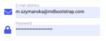
A fix for default background color of input in the browser
When you use a browser, sometimes you safe your e-mail address and the password on the page. On any website where you have a form and you safed your data, Chrome is auto-filling the email and password fields and changes the background color to a pale yellow or blue color.
To avoid this default behavior of the browser, you can use a solution below:
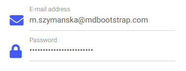
Basic solution
In our basic example we want to remove blue background and black text and change to transparent background and grey text.
Here you can find a snippet with working example. It works with outline inputs too.
        <style>
          @-webkit-keyframes autofill {
          to {
          color: #666;
          background: transparent; } }

          @keyframes autofill {
          to {
          color: #666;
          background: transparent; } }

          input:-webkit-autofill {
          -webkit-animation-name: autofill;
          animation-name: autofill;
          -webkit-animation-fill-mode: both;
          animation-fill-mode: both; }
        </style>
Note: If you need other background and text colors, don't hesitate to create your own color options. Below, you can see whole white form.
Input - API
In this section you will find advanced information about the Input component. You will learn which modules are required in this component, what are the possibilities of configuring the component, and what events and methods you can use to work with it.
Import statement
import { mdbInput } from 'mdbvue';
API Reference: Properties
| Name | Type | Default | Description | Example |
|---|---|---|---|---|
active |
Boolean | false |
Focus input when the page loads |
<mdb-input active ... />
|
basic |
Boolean | false |
Sets default design |
<mdb-input basic ... />
|
bg |
Boolean | false |
Sets design to animated border one with background |
<mdb-input bg ... />
|
class |
String | |
Override or extend the styles applied to the component. |
<mdb-input class="example-class" ... />
|
disabled |
Boolean | false |
Disables input component |
<mdb-input disabled ... />
|
id |
String | The id of the input element. Required |
<mdb-input required ... />
|
|
icon |
String | Adds icon on the left site of the input |
<mdb-input icon="envelope" ... />
|
|
label |
String | Add description to the component label |
<mdb-input label="Example label" ... />
|
|
name |
String | Add name of the input element |
<mdb-input name="name" ... />
|
|
placeholder
|
String | Add content to the component placeholder |
<mdb-input placeholder="Example placeholder" ... />
|
|
required |
Boolean | false | Determines that the input has to have value |
<mdb-input required ... />
|
type |
String | text |
The input component type atribute |
<mdb-input type="text" ... />
|
validation |
Boolean | false |
Enables default validation |
<mdb-input validation ... />
|
customValidation
|
Boolean | false |
Enables custom validation |
<mdb-input customValidation ... />
|
isValid |
Boolean | false |
Custom validation check |
<mdb-input :isValid="true" ... />
|
validFeedback
|
[String, Boolean] | false |
Valid feedback label |
<mdb-input validFeedback="Correct" ... />
|
invalidFeedback
|
[String, Boolean] | false |
Invalid feedback label |
<mdb-input :invalidFeedback="Incorrect" ... />
|
outline |
Boolean | |
Changes material select to outline style |
<mdb-input outline ... />
|
small |
String | |
Adds small text below input |
<mdb-input small="Must be 8-20 characters long." ...
              />
|
min |
Number | |
Sets minimum value to component with type property set to
number
|
<mdb-input type="number" :min="2" ... />
|
max |
Number | |
Sets maximum value to component with type property set to
number
|
<mdb-input type="number" :max="10" ... />
|
step |
Number | |
Sets value of default incrementation (reserved for components with type="number")
|
<mdb-input type="number" :step="0.3" ... />
|
API mdbNumericInput: Properties
We ecourage you to use our default mdb-input with property
type="number" - this way you get access to more properties and
events.
| Name | Type | Default | Description | Example |
|---|---|---|---|---|
emptyValue |
Number | 0 |
Default input value |
<mdb-numeric-input :emptyValue="5" ... />
|
max |
Number | |
Maximal input value |
<mdb-numeric-input :max="10" ... />
|
min |
Number | |
Minimal input value |
<mdb-numeric-input :min="0" ... />
|
minus |
Boolean | false |
Applies negative values |
<mdb-numeric-input minus ... />
|
placeholder |
String | '' |
Applies input's placeholder |
<mdb-numeric-input placeholder="Number" ... />
|
separator |
String | ',' |
Input's value separation symbol |
<mdb-numeric-input separator="." ... />
|
API Reference: Events
| Name | Description | Example |
|---|---|---|
v-on:input |
Used to listen to input event, returns Event |
<mdb-input @input="hanelOnInput" />
|
v-on:change |
Emitted on input's native change event, meaning when
the field looses focus, but also then the value is changed
dynamically.
|
<mdb-input @change="hanelOnChange" />
|
v-on:focus |
Emitted on input's native focus event, meaning when the
field gains focus.
|
<mdb-input @focus="onFocus" />
|
v-on:blur |
Emitted on input's native blur event, meaning when the
field looses focus.
|
<mdb-input @blur="onBlur" />
|
API Reference: Directives
| Name | Description | Example |
|---|---|---|
v-model |
Vue.js's directive for emulating input element's two-way data
binding. It is syntactic sugar for chaining together
value prop and input event listener.
|
<mdb-input v-model="inputText" />
|
Inputs - examples & customization
A form within a card
        <template>
          <mdb-card>
            <mdb-card-body>
              <mdb-card-title class="text-center">Sign up</mdb-card-title>
              <form class="grey-text">
                <mdb-input type="text" @input="handleInput" id="name" label="Your name" icon="user" />
                <mdb-input type="email" @input="handleInput" id="email" label="Your email" icon="envelope" />
                <mdb-input type="email" @input="handleInput" id="confEmail" label="Confirm your email" icon="exclamation-triangle" />
                <mdb-input type="password" @input="handleInput" id="passwd" label="Your password" icon="lock" />
              </form>
              <div class="text-center py-4 mt-3">
                <mdb-btn color="cyan">Register</mdb-btn>
              </div>
            </mdb-card-body>
          </mdb-card>
        </template>
        <script>
          import { mdbInput, mdbCard, mdbCardBody, mdbCardTitle, mdbBtn } from "mdbvue";
          export default {
            name: "CardForm",
            components: {
              mdbBtn,
              mdbCard,
              mdbCardBody,
              mdbCardTitle,
              mdbInput
            },
            methods: {
              handleInput(val) {
                console.log(val);
              }
            }
          }
        </script>