Vue Modal events
Vue Bootstrap Modal Events
Vue Bootstrap modal events are emitted by the component on consecutive stages of its life cycle. Use them to hook in custom handlers and orchestrate modals in a wider user experience context.
"show" modal event
This event is fired just before the modal is open.
        <template>
          <div>
            <!-- trigger modal button -->
            <mdb-btn rounded color="default" @click="show = true">launch success modal <mdb-icon icon="eye" class="ml-1"/></mdb-btn>
            <!-- Central Modal Medium Success -->
            <mdb-modal :show="show" @show="handleShow" @close="show = false" success>
              <mdb-modal-header>
                <mdb-modal-title>Success Modal</mdb-modal-title>
              </mdb-modal-header>
              <mdb-modal-body  class="text-center">
                <mdb-icon icon="check" size="4x" class="mb-3 animated rotateIn"/>
                <p>Lorem ipsum dolor sit amet, consectetur adipisicing elit. Impedit iusto nulla aperiam blanditiis ad consequatur in dolores culpa, dignissimos, eius non possimus fugiat. Esse ratione fuga, enim, ab officiis totam.</p>
              </mdb-modal-body>
              <mdb-modal-footer center>
                <mdb-btn color="success" @click="show = false">Get it now <mdb-icon icon="gem" far class="ml-1" color="white"/></mdb-btn>
                <mdb-btn outline="success" @click="show = false">No, thanks</mdb-btn>
              </mdb-modal-footer>
            </mdb-modal>
          </div>
        </template>
        <script>
          import {  mdbRow, mdbIcon, mdbBtn, mdbModal, mdbModalHeader, mdbModalTitle, mdbModalBody, mdbModalFooter } from 'mdbvue';
          export default {
            name:'ModalEventsPage',
            components: {
              mdbIcon,
              mdbBtn,
              mdbModal,
              mdbModalHeader,
              mdbModalTitle,
              mdbModalBody,
              mdbModalFooter
            },
            data() {
              return {
                show: false,
              };
            },
            methods: {
              handleShow() {
                /* eslint-disable no-alert*/
                alert('show!');
              }
            }
          }
        </script>
"shown" modal event
This event is fired after the modal is shown.
Modal Info
Lorem ipsum dolor sit amet, consectetur adipisicing elit. Nesciunt vero illo error eveniet cum.
<template>
<div>
<!-- trigger modal button -->
<mdb-btn rounded color="default" @click="shown = true">launch info modal <mdb-icon icon="eye" class="ml-1"/></mdb-btn>
<!-- Central Info Modal -->
<mdb-modal :show="shown" @shown="handleShown" @close="shown = false" info>
<mdb-modal-header>
<mdb-modal-title>Info Modal</mdb-modal-title>
</mdb-modal-header>
<mdb-modal-body>
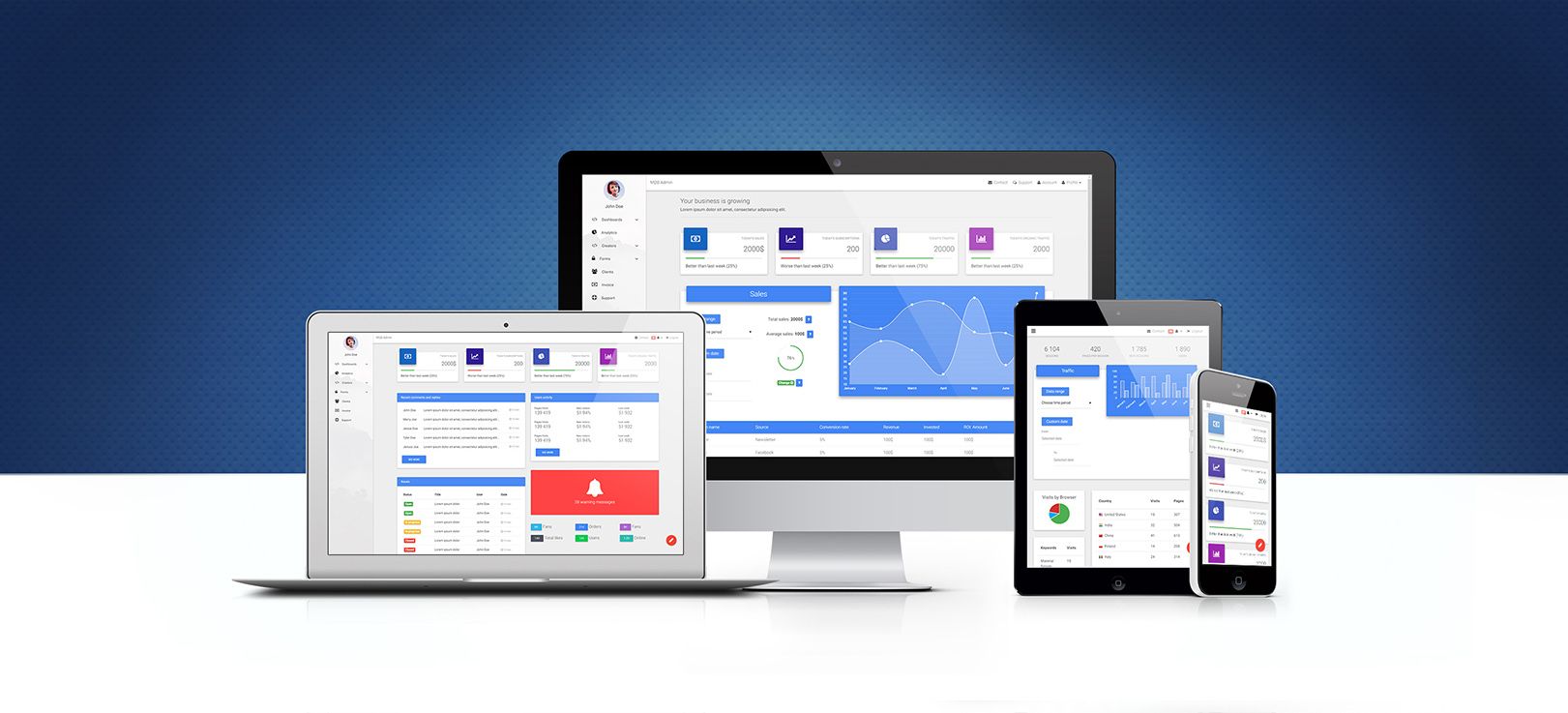
<img src="https://mdbootstrap.com/wp-content/uploads/2016/11/admin-dashboard-bootstrap.jpg" alt="modal" class="img-fluid"/>
<p class="text-center">
Lorem ipsum dolor sit amet, consectetur adipisicing elit. Nesciunt vero illo error eveniet cum.
</p>
</mdb-modal-body>
<mdb-modal-footer center>
<mdb-btn color="info" @click="shown = false">Get it now <mdb-icon icon="gem" far class="ml-1" color="white"/></mdb-btn>
<mdb-btn outline="info" @click="shown = false">No, thanks</mdb-btn>
</mdb-modal-footer>
</mdb-modal>
</div>
</template>
        <script>
        import {  mdbRow, mdbIcon, mdbBtn, mdbModal, mdbModalHeader, mdbModalTitle, mdbModalBody, mdbModalFooter } from 'mdbvue';
        export default {
          name:'ModalEventsPage',
          components: {
            mdbIcon,
            mdbBtn,
            mdbModal,
            mdbModalHeader,
            mdbModalTitle,
            mdbModalBody,
            mdbModalFooter
          },
          data() {
            return {
              shown: false,
            };
          },
          methods: {
            handleShown() {
              /* eslint-disable no-alert*/
              alert('shown!');
            }
          }
        }
      </script>
"hide" modal event
This event is fired just before the modal is hidden.
        <template>
          <div>
            <!-- trigger modal button -->
            <mdb-btn rounded color="default" @click="hide = true">launch danger modal <mdb-icon icon="eye" class="ml-1"/></mdb-btn>
            <!-- Central Danger Modal -->
            <mdb-modal :show="hide" @hide="handleHide" @close="hide = false" danger>
              <mdb-modal-header>
                <mdb-modal-title>Danger Modal</mdb-modal-title>
              </mdb-modal-header>
              <mdb-modal-body>
                <mdb-row>
                  <mdb-col col="3" class="text-center"><mdb-icon icon="shopping-cart" size="4x"/></mdb-col>
                  <mdb-col col="9">
                    <p>Lorem ipsum dolor sit amet, consectetur adipisicing elit. Fuga, molestiae provident temporibus sunt earum.</p>
                    <h2><mdb-badge>v52gs1</mdb-badge></h2>
                  </mdb-col>
                </mdb-row>
              </mdb-modal-body>
              <mdb-modal-footer center>
                <mdb-btn color="danger" @click="hide = false">Get it now <mdb-icon icon="gem" far class="ml-1" color="white"/></mdb-btn>
                <mdb-btn outline="danger" @click="hide = false">No, thanks</mdb-btn>
              </mdb-modal-footer>
            </mdb-modal>
          </div>
        </template>
        <script>
          import { mdbRow, mdbIcon, mdbBtn, mdbModal, mdbModalHeader, mdbModalTitle, mdbModalBody, mdbModalFooter, mdbCol, mdbBadge } from 'mdbvue';
          export default {
            name:'ModalEventsPage',
            components: {
              mdbRow,
              mdbIcon,
              mdbBtn,
              mdbModal,
              mdbModalHeader,
              mdbModalTitle,
              mdbModalBody,
              mdbModalFooter,
              mdbCol,
              mdbBadge
            },
            data() {
              return {
                hide: false,
              };
            },
            methods: {
              handleHide() {
                /* eslint-disable no-alert*/
                alert('hide!');
              }
            }
          }
        </script>
.jpg)
"close" modal event
You may have noticed, that modals emit one more event, which is close. It is fired whenever any of the modal closing mechanisms (overlay or close button click, or a user-defined one) is triggered and used to handle the state-based (boolean data object property) modal life cycle.
Vue Modal events - API
In this section with short summary of life cycle events available to each modal.
Modal components import statement
In order to use the component make sure you have imported it properly.
import { mdbModal, mdbModalBody, mdbModalHeader, mdbModalFooter } from 'mdbvue';
Modal Events
Modal window emits events, upon hearing which a wider UX context may react. Here they are:
| Name | Description |
|---|---|
show |
Emitter right before modal window appears |
shown |
Fired once modal is fully present |
hide |
Can be heard when modal is about to disappear |
hidden |
Goes off once modal is gone. Note: to actually hear the event, the listener must be placed outside of the modal window, which by the time of listening is already gone |