Topic: How to make a filterable select / dropdown

I'm considering using MDB for a project. I always end up needing a "filterable select", i.e. a select where you can start typing in an input field and the options (fetched via Ajax) will be updated in the select. Kind of thing.
Looking at the Material Select http://mdbootstrap.com/javascript/material-select/ the only way to update it is to destroy and re-create. Will this work (nicely) ?
I'd like to avoid having to completely hacking it.
If anyone has done anything like this I'd be glad to see an example.
Thanks!
Add comment

Hello ,
You can solve this by a method which was posted by Brunnodev on 8 Dec 2016.
Regards

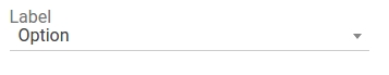
Hi, i remembered reading this post yesterday because i were looking for a filtered select input. I ended up using Select2 but tweaked a bit the CSS to look a bit closer to MDBootstrap's PRO select and thought to share the results.
You can check the screenshots bellow:
 the CSS:
the CSS:
.md-select2 {
  width: 100%;
}

.select2-container {
  margin-top: 1.74rem;
}
// single select remove borders - no round corners
.select2-container--default .select2-selection--single {
  border-top: 0;
  border-left: 0;
  border-right: 0;
  border-bottom: 1px solid #ccc;
  background-color: transparent;
  border-radius: 0;
}

.select2-dropdown, .select2-dropdown--above {
  border-radius: 0;
  padding: 1rem;
  border: 0;
  box-shadow: 0 2px 5px 0 rgba(0, 0, 0, .16), 0 2px 10px 0 rgba(0, 0, 0, .12);
}

.select2-container--default .select2-results__option[aria-selected=true] {
  background-color: #fff;
}

.select2-container--default .select2-results__option--highlighted[aria-selected] {
  background-color: #eee;
  color: rgba(0, 0, 0, .87);
}

.select2-results__option {
  color: #4285F4;
}

// multiple select remove borders - no round corners
.select2-container--default .select2-selection--multiple {
  border-top: 0;
  border-left: 0;
  border-right: 0;
  border-bottom: 1px solid #ccc;
  background-color: transparent;
  border-radius: 0;
  height: 40px;
}

// single select remove focus
.select2-container *:focus {
  outline: none;
}
// multiple select remove focus
.select2-container--default.select2-container--focus .select2-selection--multiple {
  border: 0;
}
// multiple select choices style
.select2-container--default .select2-selection--multiple .select2-selection__choice {
  background-color: #fff;
}
.select2-selection__choice__remove {
  color: #381fa8!important;
}
                <label>Label</label>
                <select class="mdb-select md-select2">
                    <option value="1">Option</option>
                    <option value="2">Option</option>
                    <option value="3">Option</option>
                    <option value="4">Option</option>
                    <option value="5">Option</option>
                </select>

FREE CONSULTATION
Hire our experts to build a dedicated project. We'll analyze your business requirements, for free.
Status
Specification of the issue
- ForumUser: Pro
- Premium support: No
- Technology: General Bootstrap questions
- MDB Version: -
- Device: -
- Browser: -
- OS: -
- Provided sample code: No
- Provided link: No
Tags