Topic: Navbar Dropdown

Expected behavior
 Actual behavior
 Resources (screenshots, code snippets etc.)

Hi,
in MDB pro when you put this dropdown code: dropdown-menu dropdown-primary you should have blue background color on hover in your dropdown component. And if I understand correctly, you use a template like this: https://mdbootstrap.com/snippets/jquery/marta-szymanska/1818927?
And about Angular or React package, please look at their documentation here: https://mdbootstrap.com/docs/angular/, https://mdbootstrap.com/docs/react/ or create a ticket on this support forum with the "Angular" or "React" label as a technology you want to choose.
Best, Marta
In my understanding, the "basic example" was not supposed to be pasted in a MDB Pro package, there's no "MDB Pro" red sign for it. Just take a look at my previous message more carefully and you will see that I'm using "Full background image template" -- So, you already know my code.
I already had bought two PRO packages (Angular and React), could you please tell me if they include the needed files in order to get navbar dropdown working accordingly? If yes, which ones?
Hi,
this blue hover effect is not a button, it's just a background color and shadow for dropdown-item. Anyway, I pasted your code above to the snippet where is the newest version - 4.13.0 of MDB Pro package and there is a "button" effect as you want: https://mdbootstrap.com/snippets/jquery/marta-szymanska/1804931. I still don't know where is the problem, maybe I should see your project? Or your demo website? You can paste a link to your demo down below or send me your .ZIP project to m.szymanska@mdbootstrap.com. Maybe you missed some files? I need to see your code to try to help you.
Best, Marta
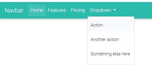
Hi, Marta. I'm trying to get the same result showed in the example (with buttons on hover), but my code fails as you can see. I'm using the "Full Background Image Template" with its default styles and JS files. Here is what I have for the Navbar:
<!--Navbar-->
<nav class="navbar navbar-expand-lg navbar-dark primary-color">

  <!-- Navbar brand -->
  <a class="navbar-brand" href="#">Navbar</a>

  <!-- Collapse button -->
  <button class="navbar-toggler" type="button" data-toggle="collapse" data-target="#basicExampleNav"
    aria-controls="basicExampleNav" aria-expanded="false" aria-label="Toggle navigation">
    <span class="navbar-toggler-icon"></span>
  </button>

  <!-- Collapsible content -->
  <div class="collapse navbar-collapse" id="basicExampleNav">

    <!-- Links -->
    <ul class="navbar-nav mr-auto">
      <li class="nav-item active">
        <a class="nav-link" href="#">Home
          <span class="sr-only">(current)</span>
        </a>
      </li>
      <li class="nav-item">
        <a class="nav-link" href="#">Features</a>
      </li>
      <li class="nav-item">
        <a class="nav-link" href="#">Pricing</a>
      </li>

      <!-- Dropdown -->
      <li class="nav-item dropdown">
        <a class="nav-link dropdown-toggle" id="navbarDropdownMenuLink" data-toggle="dropdown" aria-haspopup="true"
          aria-expanded="false">Dropdown</a>
        <div class="dropdown-menu dropdown-primary" aria-labelledby="navbarDropdownMenuLink">
          <a class="dropdown-item" href="#">Action</a>
          <a class="dropdown-item" href="#">Another action</a>
          <a class="dropdown-item" href="#">Something else here</a>
        </div>
      </li>

    </ul>
    <!-- Links -->

    <form class="form-inline">
      <div class="md-form my-0">
        <input class="form-control mr-sm-2" type="text" placeholder="Search" aria-label="Search">
      </div>
    </form>
  </div>
  <!-- Collapsible content -->

</nav>
<!--/.Navbar-->
FREE CONSULTATION
Hire our experts to build a dedicated project. We'll analyze your business requirements, for free.
Answered
- ForumUser: Priority
- Premium support: Yes
- Technology: MDB jQuery
- MDB Version: 4.13.0
- Device: Desktop
- Browser: Chrome/Explorer
- OS: Windows 10
- Provided sample code: No
- Provided link: No
davi priority commented 4 years ago
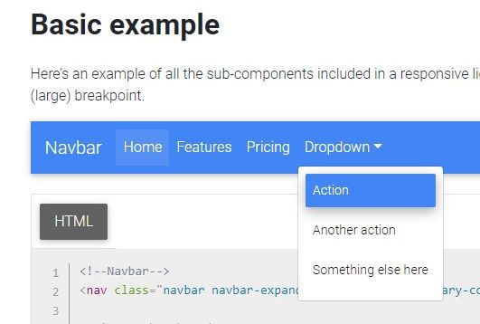
The Basic NavBar Example doesn't show buttons when mouse over on the dropdown options. This resource is very important for accessibility.
Marta Wierzbicka staff commented 4 years ago
Hi,
I'm not sure what you mean. You can use dropdown with primary color on hover or with default grey color on hover. Would you explain what we should do with dropdown according to your opinion?
Best, Marta