Topic: Dropdown in Nav behaviour difference between MDB Angular and Bootstrap

Expected behavior Dropdon menu in collapse nav bar should expand the nav area when menu is shown instead of displaying as an overlay
Actual behavior Basically it seems that the dropdown always displays an overlay for the menu items even when the nav bar is collapsed.
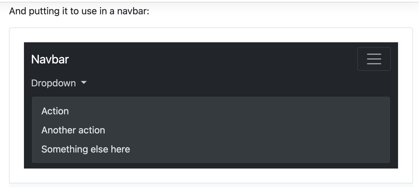
I need the dropdown to behave the same as the bootstrap example. i.e. when the nav bar is collapsed the dropdown menu displays within the nav bar when expanded and not over it:
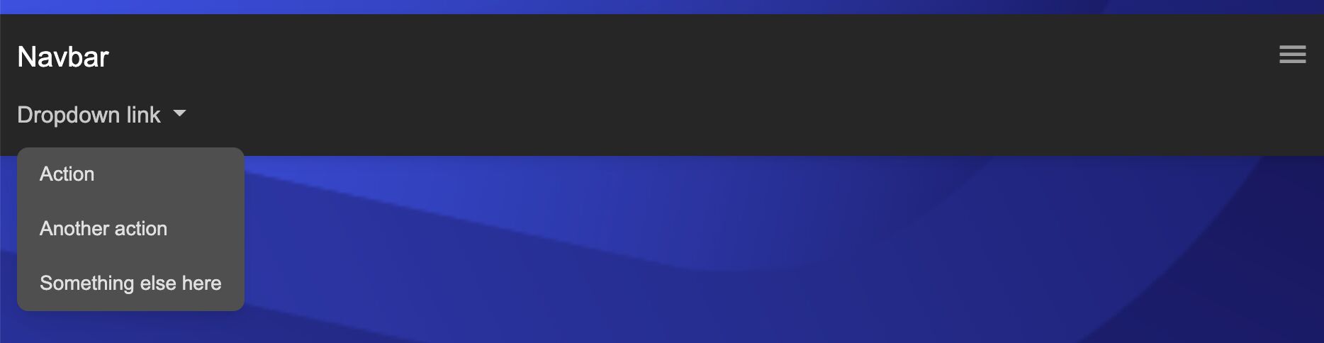
E.g. mdbootstrap angular dropdown in nav:
Bootstrap example with dropdown in nav bar:
This is the mark-up used for the mdbootstrap dropdown: Navbar
<!-- Toggle button -->
<button
  class="navbar-toggler"
  type="button"
  (click)="navbarNavDarkDropdown.toggle()"
  data-bs-toggle="collapse"
  data-bs-target="#navbarNavDarkDropdown"
  aria-controls="navbarNavDarkDropdown"
  aria-expanded="false"
  aria-label="Toggle navigation"
>
  <i class="material-icons" data-icon="menu"></i>
</button>

<!-- Collapsible wrapper -->
<div
  class="collapse navbar-collapse"
  id="navbarNavDarkDropdown"
  mdbCollapse
  #navbarNavDarkDropdown="mdbCollapse"
>
  <!-- Left links -->
  <ul class="navbar-nav">
    <li mdbDropdown class="nav-item dropdown" id="navbarDropdownMenuLink">
      <a
        class="nav-link dropdown-toggle"
        href="javascript:void(0)"
        id="navbarDarkDropdownMenuLink"
        role="button"
        mdbDropdownToggle
        data-bs-toggle="dropdown"
        aria-expanded="false"
      >
        Dropdown link
      </a>
      <ul
        mdbDropdownMenu
        class="dropdown-menu dropdown-menu-dark"
        aria-labelledby="navbarDarkDropdownMenuLink"
      >
        <li><a class="dropdown-item" href="#">Action</a></li>
        <li><a class="dropdown-item" href="#">Another action</a></li>
        <li><a class="dropdown-item" href="#">Something else here</a></li>
      </ul>
    </li>
  </ul>
</div>
<!-- Collapsible wrapper -->
How do I get the same behaviour from the MDBootstrap angular components as for the pure bootstrap components.
Resources (screenshots, code snippets etc.)

I'm afraid that the implementation of such a feature is not possible in our dropdown component. We deliberately render the dropdown menu at the end of the document body to avoid problems when the menu is displayed under other elements.
FREE CONSULTATION
Hire our experts to build a dedicated project. We'll analyze your business requirements, for free.
Answered
- ForumUser: Priority
- Premium support: Yes
- Technology: MDB Angular
- MDB Version: MDB5 2.0.0
- Device: Mobile
- Browser: Chrome
- OS: MacOs
- Provided sample code: No
- Provided link: No