Topic: ¿How to solve Intros with navbar transparent? ¿Why when scrolling hasn't change color as expected in demos?

*_Expected behavior_*That navbar turns into gray or another color when scroll.https://mdbootstrap.com/docs/angular/sections/intros/
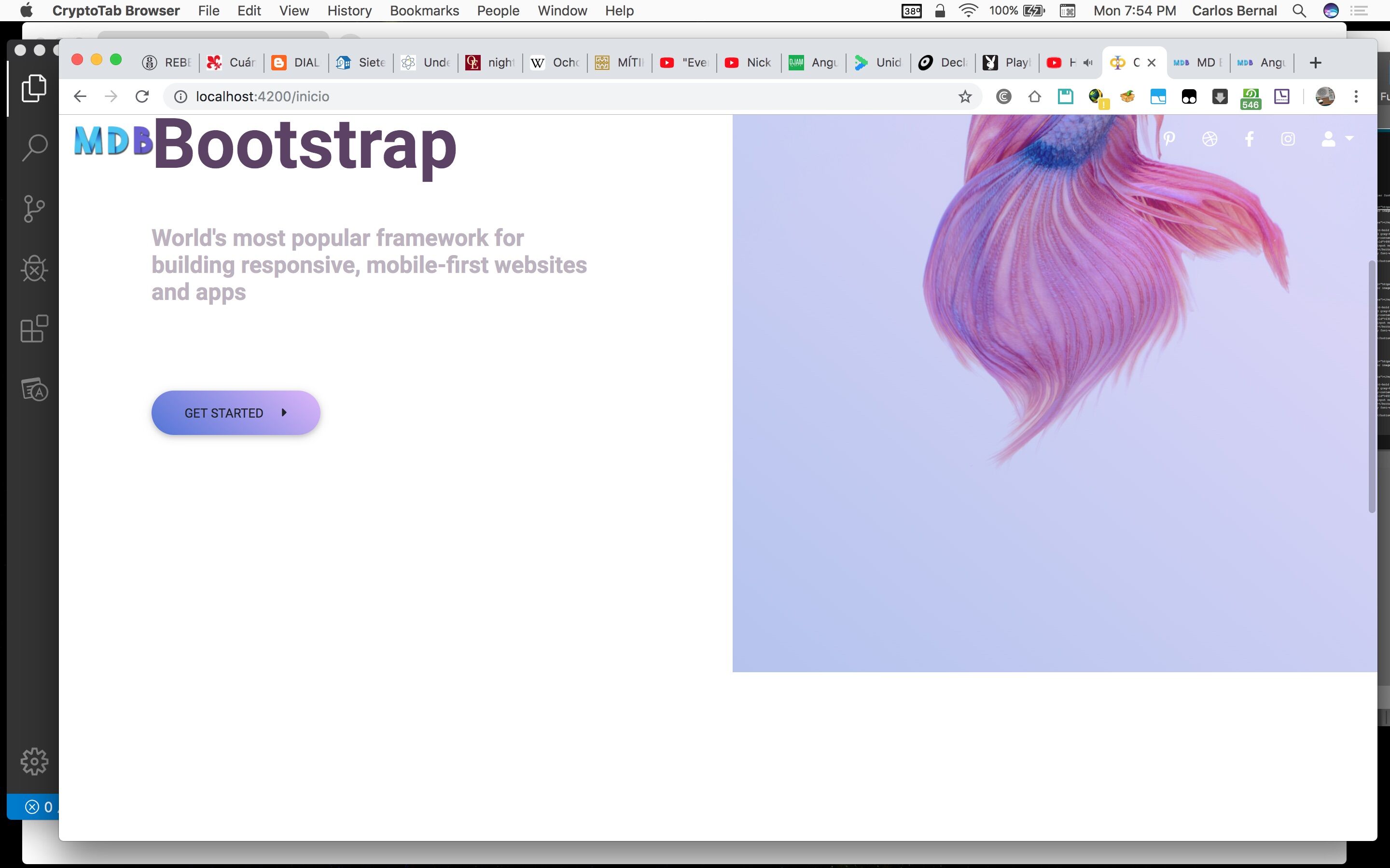
*_Actual behavior_*Using MDB Pro I took the samples and code in the section https://mdbootstrap.com/docs/angular/sections/intros/but when I have tried it, the navbar is always transparent, i tried all samples and no one works as was shown in live previews.
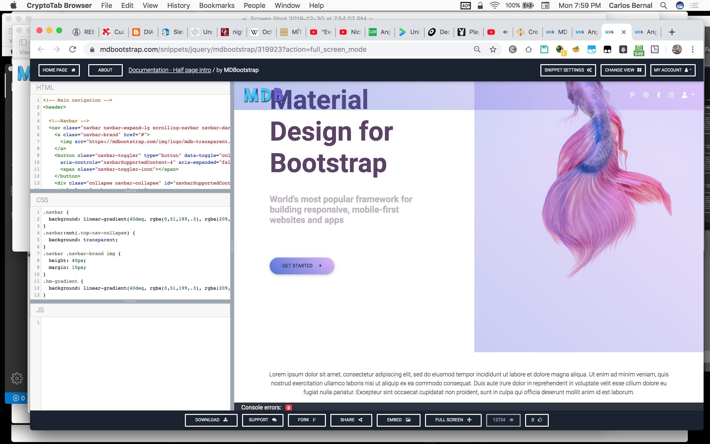
 Resources (screenshots, code snippets etc.)https://mdbootstrap.com/snippets/jquery/mdbootstrap/319923?action=full_screen_modehttps://mdbootstrap.com/docs/angular/sections/intros/
HTML
<mdb-navbar-brand>
  <a class="navbar-brand" href="#">
    <img src="https://mdbootstrap.com/img/logo/mdb-transparent.png" height="30" alt="">
  </a>
</mdb-navbar-brand>

<!-- Collapsible content -->
<links>

  <!-- Links -->
  <ul class="navbar-nav ml-auto">
    <li class="nav-item">
      <a class="nav-link" href="#">
        <mdb-icon fab icon="pinterest-p"></mdb-icon>
      </a>
    </li>
    <li class="nav-item">
      <a class="nav-link" href="#">
        <mdb-icon fab icon="dribbble"></mdb-icon>
      </a>
    </li>
    <li class="nav-item">
      <a class="nav-link" href="#">
        <mdb-icon fab icon="facebook-f"></mdb-icon>
      </a>
    </li>
    <li class="nav-item">
      <a class="nav-link" href="#">
        <mdb-icon fab icon="instagram"></mdb-icon>
      </a>
    </li>

    <!-- Dropdown -->
    <li class="nav-item dropdown" dropdown>
      <a dropdownToggle mdbWavesEffect type="button" class="nav-link dropdown-toggle waves-light" mdbWavesEffect>
        <mdb-icon fas icon="user"></mdb-icon>
        <span class="caret"></span></a>
      <div *dropdownMenu class="dropdown-menu dropdown dropdown-primary dropdowm-menu-right" role="menu">
        <a class="dropdown-item waves-light" mdbWavesEffect href="#">Action</a>
        <a class="dropdown-item waves-light" mdbWavesEffect href="#">Another action</a>
        <a class="dropdown-item waves-light" mdbWavesEffect href="#">Something else here</a>
        <div class="divider dropdown-divider"></div>
        <a class="dropdown-item waves-light" mdbWavesEffect href="#">Separated link</a>
      </div>
    </li>

  </ul>
  <!-- Links -->

</links>
<!-- Collapsible content -->
<div class="row">

  <div class="col-md-6">

    <div class="d-flex flex-column justify-content-center align-items-center h-100">
      <h1 class="heading display-3">Material Design for Bootstrap</h1>
      <h4 class="subheading font-weight-bold">World's most popular framework for building responsive, mobile-first
        websites and apps</h4>
      <div class="mr-auto">
        <button type="button" mdbBtn color="lily" rounded="true" class="btn-margin">Get started <i
          class="fas fa-caret-right ml-3"></i></button>
      </div>
    </div>

  </div>

  <div class="col-md-6">

    <div class="view">
      <img src="https://images.pexels.com/photos/325045/pexels-photo-325045.jpeg" class="img-fluid"
           alt="smaple image">
      <div class="mask flex-center hm-gradient">
      </div>
    </div>

  </div>

</div>
SCSS
.navbar { background: linear-gradient(40deg, rgba(0,51,199,.3), rgba(209,149,249,.3)); } .navbar:not(.top-nav-collapse) { background: transparent; } .navbar .navbar-brand img { height: 40px; margin: 10px; } .hm-gradient { background: linear-gradient(40deg, rgba(0,51,199,.3), rgba(209,149,249,.3)); } .heading { margin: 0 6rem; font-weight: 700; color: #5d4267; } .subheading { margin: 2.5rem 6rem; color: #bcb2c0; } .btn.btn-margin { margin-left: 6rem; margin-top: 3rem; } .btn.btn-lily { background: linear-gradient(40deg, rgba(0,51,199,.7), rgba(209,149,249,.7)); } .title { margin-top: 6rem; margin-bottom: 2rem; color: #5d4267; } .subtitle { color: #bcb2c0; margin-left: 20%; margin-right: 20%; margin-bottom: 6rem; } .dropdown-menu { left: unset !important; right: 0 ; }
Arkadiusz Idzikowski staff commented 6 years ago
Did you paste the full html code here? Because header and navbar opening tags are missing.
Where did you add those styles in your app?
Carlos Ernesto Bernal Hernández free commented 6 years ago
Thank you, your guide helps. I did it and then the problem was solved!
FREE CONSULTATION
Hire our experts to build a dedicated project. We'll analyze your business requirements, for free.
Resolved
- ForumUser: Free
- Premium support: No
- Technology: MDB Angular
- MDB Version: 8.8.1
- Device: MacBook
- Browser: Chrome
- OS: MacOS
- Provided sample code: No
- Provided link: Yes
Arkadiusz Idzikowski staff commented 6 years ago
Please make sure to copy all the scss code from the example to your global styles.scss file. I just checked this example and it looks like everything works correctly with full htmls/scss code.
Carlos Ernesto Bernal Hernández free commented 6 years ago
I post the code, the same in preview, that brings from page. https://mdbootstrap.com/docs/angular/sections/intros/ I reviewed installation of Angular mdbootstrap from 0, and same result