Topic: md-form radios
citcobank
free
asked 6 years ago
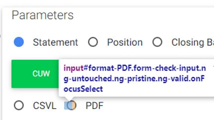
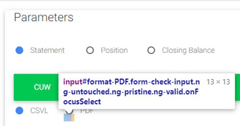
Expected behavior CSS Alignment maintained between md-form and basic form for inline radio buttons
Actual behavior Label being pushed up by use of class="md-form"
Resources (screenshots, code snippets etc.)
<form
class="md-form"
#reportForm="ngForm"
novalidate
>
<div class="form-group">
    <span
        class="form-check form-check-inline"
    >
        <input
            type="radio"
            class="form-check-input"
            value="A"
            id="type-A"
            name="type-A"
            mdbInput
        >
        <label class="form-check-label" for="type-A">
            A
        </label>

        <input
            type="radio"
            class="form-check-input"
            value="B"
            id="type-B"
            name="type-B"
            mdbInput
        >
        <label class="form-check-label" for="type-B">
            B
        </label>
    </span>
</div>

<div class="form-group">
    <div class="btn-group" role="group" aria-label="Company group">
    <button
            mdbBtn
            type="button"
            [color]="'success'"
        >
            ABC
        </button>

        <button
            mdbBtn
            type="button"
            [color]="'success'"
        >
            BCD
        </button>

        <button
            mdbBtn
            type="button"
            [color]="'success'"
        >
            CDE
        </button>
    </div>
</div>

<div class="form-group">
    <div class="form-check form-check-inline">
        <input
            class="form-check-input"
            type="radio"
            value="C"
            id="format-C"
            name="format-C"
            mdbInput
        >
        <label class="form-check-label" for="format-C">
            C
        </label>
    </div>

    <div class="form-check form-check-inline">
        <input
            class="form-check-input"
            type="radio"
            value="D"
            id="format-D"
            name="format-D"
            mdbInput
        >
        <label class="form-check-label" for="format-D">
            D
        </label>
    </div>
</div>

<button
    type="submit"
    class="btn btn-primary"
>
    Create Report
</button>

<button
    type="button"
    class="btn btn-secondary ml-2"
>
    Reset
</button>


FREE CONSULTATION
Hire our experts to build a dedicated project. We'll analyze your business requirements, for free.
Status
Opened
Specification of the issue
- ForumUser: Free
- Premium support: No
- Technology: MDB Angular
- MDB Version: 8.8.2
- Device: PC
- Browser: Chrome
- OS: Windows
- Provided sample code: No
- Provided link: No
Arkadiusz Idzikowski staff commented 6 years ago
Can you provide more details about the problem here? Material forms have different margin/padding values and if we change that it will affect the styles of all inputs.
citcobank free commented 6 years ago
I'm not sure what sort of detail you need? The use of md-form class is pushing radios out of line by adjusting the behaviour of the opaque element from default form behaviour.
Spacing should not be impacted by switching to material
citcobank free commented 6 years ago
Worked it out:form.md-form > .form-group (or .form-row) > .form-check.form-check-inline
.form-group should not be there
Edit: this makes the visible alignment break less obvious but does not address the underlying change in behaviour of the invisible field
Arkadiusz Idzikowski staff commented 6 years ago
We will take a closer look on that.