Topic: mdb-auto-completer outline version with label

Hello All,
So I am trying to use the mdb-auto-completer input on my form but I need it to be the Material Design 2.0 outline version of the input to match the rest of my form. I have been able to successfully add the md-outline class to my parent div and get an outline around my input.
The problem I have found is the mdb-auto-completer component does not have a label and I can't seem to be able to add a label to the tag or the input. So this leaves me with an outline label that has no input label like the rest of the outline inputs do. Also if I add a label using the normal input way of using a label tag below the input, the label just overlaps the placeholder texts and never moves up and out of the way when clicked, as the other inputs do.
Code without label:
            <div class="md-form md-outline">
              <input
                type="text"
                class="completer-input form-control mdb-autocomplete"
                [ngModel]="searchText | async"
                (ngModelChange)="searchText.next($event)"
                [mdbAutoCompleter]="auto"
                placeholder="Choose your color"
              />
              <mdb-auto-completer #auto="mdbAutoCompleter" textNoResults="I have found no results :(">
                <mdb-option *ngFor="let option of results | async" [value]="option">
                  {{ option }}
                </mdb-option>
              </mdb-auto-completer>
            </div>
Code with label:
            <div class="md-form md-outline">
              <input
                type="text"
                id="auto1"
                class="completer-input form-control mdb-autocomplete"
                [ngModel]="searchText | async"
                (ngModelChange)="searchText.next($event)"
                [mdbAutoCompleter]="auto"
                placeholder="Choose your color"
              />
              <label for="auto1">Example label</label>
              <mdb-auto-completer #auto="mdbAutoCompleter" textNoResults="I have found no results :(">
                <mdb-option *ngFor="let option of results | async" [value]="option">
                  {{ option }}
                </mdb-option>
              </mdb-auto-completer>
            </div>
Input with label tag:
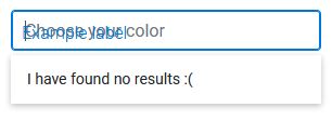
Any help adding a label to the mdb-auto-completer component would be awesome! Thank you!

You need to add mdbInput directive to the input element:
  <input
    mdbInput
    type="text"
    class="completer-input form-control mdb-autocomplete"
    [ngModel]="searchText | async"
    (ngModelChange)="searchText.next($event)"
    [mdbAutoCompleter]="auto"
    placeholder="Choose your color"
  />
FREE CONSULTATION
Hire our experts to build a dedicated project. We'll analyze your business requirements, for free.
Resolved
- ForumUser: Priority
- Premium support: Yes
- Technology: MDB Angular
- MDB Version: 9.4.0
- Device: PC
- Browser: Firefox
- OS: Window 10
- Provided sample code: Yes
- Provided link: No