Topic: Mega menu scss styles

*_Expected behavior_*Full width menu.Working scss styles and good looking menu.
*_Actual behavior_*No full width menu with not working scss styles.
Resources (screenshots, code snippets etc.)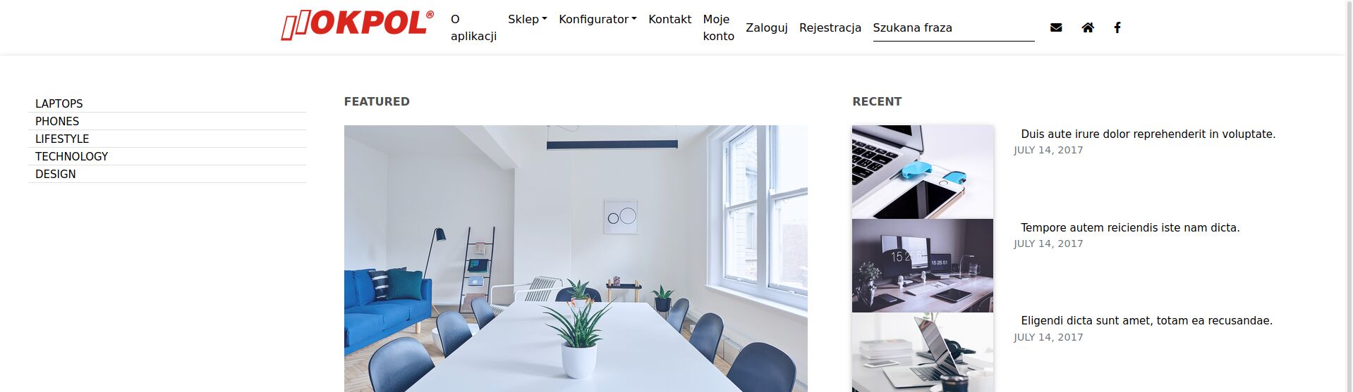
brand" routerLink="/">
{{ 'HOME.shop' | translate}} Laptops Phones Lifestyle Technology Design Featured
Lorem ipsum dolor sit amet, consectetur isum adipisicing elit. By Anna Doe - July 15, 2017
Recent
Duis aute irure dolor reprehenderit in voluptate. July 14, 2017
Tempore autem reiciendis iste nam dicta. July 14, 2017
Eligendi dicta sunt amet, totam ea recusandae. July 14, 2017
<!-- Links -->
<ul class="navbar-nav mr-auto">
<!-- Dropdown -->
<li class="nav-item dropdown mega-dropdown" mdbDropdown>
<a mdbDropdownToggle class="nav-link dropdown-toggle">{{ 'HOME.configurator' | translate}}</a>
<div class="dropdown-menu mega-menu row z-depth-1">
<div class="row">
<div class="col-md-5 col-xl-3 sub-menu mt-5 mb-5 pl-4">
<ul class="list-unstyled mx-4 pl-0 dark-grey-text">
<li class="sub-title text-uppercase mt-sm">
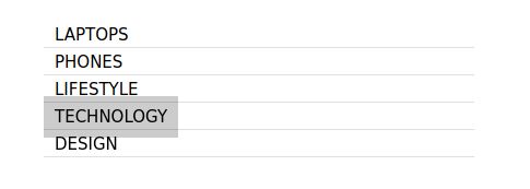
<a class="menu-item" href="">Laptops</a>
</li>
<li class="sub-title text-uppercase">
<a class="menu-item" href="">Phones</a>
</li>
<li class="sub-title text-uppercase">
<a class="menu-item" href="">Lifestyle</a>
</li>
<li class="sub-title text-uppercase">
<a class="menu-item" href="">Technology</a>
</li>
<li class="sub-title text-uppercase">
<a class="menu-item" href="">Design</a>
</li>
</ul>
</div>
<div class="col-md-7 col-xl-9">
<div class="row">
<div class="col-xl-6 mt-5 mb-4 pr-5 clearfix d-none d-block">
<h6 class="sub-title p-sm mb-4 text-uppercase font-weight-bold dark-grey-text">Featured</h6>
<!--Featured image-->
<div class="view overlay pb-3">
<img src="https://mdbootstrap.com/img/Photos/Horizontal/Work/6-col/img%20(42).jpg"
class="img-fluid z-depth-1" alt="First sample image">
<div class="mask rgba-white-slight flex-center">
<p></p>
</div>
</div>
<h4 class="mb-2">
<a class="news-title" href="">Lorem ipsum dolor sit amet, consectetur isum adipisicing elit.</a>
</h4>
<p class="font-small text-uppercase text-muted">By
<a class="m-sm" href="#!">Anna Doe</a> - July 15, 2017</p>
</div>
<div class="col-xl-6 mt-5 mb-4 pr-5 clearfix d-none d-xl-block">
<h6 class="sub-title p-sm mb-4 text-uppercase font-weight-bold dark-grey-text">Recent</h6>
<div class="news-single">
<div class="row">
<div class="col-md-4">
<!--Image-->
<div class="view overlay z-depth-1">
<img src="https://mdbootstrap.com/img/Photos/Horizontal/Work/6-col/img%20(43).jpg"
class="img-fluid" alt="Minor sample post image">
<div class="mask rgba-white-slight flex-center">
<p></p>
</div>
</div>
</div>
<div class="col-md-8">
<a class="news-title smaller mb-1" href="">Duis aute irure dolor reprehenderit in
voluptate.</a>
<p class="font-small text-uppercase text-muted">July 14, 2017</p>
</div>
</div>
</div>
<div class="news-single">
<div class="row">
<div class="col-md-4">
<!--Image-->
<div class="view overlay z-depth-1">
<img src="https://mdbootstrap.com/img/Photos/Horizontal/Work/6-col/img%20(44).jpg"
class="img-fluid" alt="Minor sample post image">
<div class="mask rgba-white-slight flex-center">
<p></p>
</div>
</div>
</div>
<div class="col-md-8">
<a class="news-title smaller mb-1" href="">Tempore autem reiciendis iste nam dicta.</a>
<p class="font-small text-uppercase text-muted">July 14, 2017</p>
</div>
</div>
</div>
<div class="news-single">
<div class="row">
<div class="col-md-4">
<!--Image-->
<div class="view overlay z-depth-1">
<img src="https://mdbootstrap.com/img/Photos/Horizontal/Work/6-col/img%20(41).jpg"
class="img-fluid" alt="Minor sample post image">
<div class="mask rgba-white-slight flex-center">
<p></p>
</div>
</div>
</div>
<div class="col-md-8">
<a class="news-title smaller mb-1" href="">Eligendi dicta sunt amet, totam ea recusandae.</a>
<p class="font-small text-uppercase text-muted">July 14, 2017</p>
</div>
</div>
</div>
</div>
</div>
</div>
</div>
</div>
</li>
</ul>
<!-- Links -->
<!-- Links -->
<ul class="navbar-nav nav-flex-icons ml-auto">
<li class="nav-item">
<a class="nav-link" routerLink="{{ 'LINK.contact' | translate}}">{{ 'HOME.contact' | translate}}</a>
</li>
<ng-template [ngIf]="id == null">
<li class="nav-item">
<a class="nav-link" routerLink="{{ 'LINK.login' | translate}}">{{ 'HOME.login' | translate}}</a>
</li>
</ng-template>
<ng-template [ngIf]="id != null">
<li class="nav-item">
<a class="nav-link"
routerLink="{{ 'LINK.myAccount' | translate}}/{{id}}">{{ 'HOME.myAccount' | translate}}</a>
</li>
</ng-template>
</ul>
<ul class="navbar-nav nav-flex-icons ml-auto">
<!-- Search form -->
<form class="form-inline" #searchForm="ngForm" (ngSubmit)="onSubmit()">
<div class="md-form my-0">
<input class="form-control mr-sm-2" type="text" placeholder="{{ 'HOME.search' | translate}}"
aria-label="Search">
</div>
</form>
</ul>
<ul class="navbar-nav nav-flex-icons ml-auto">
<li class="nav-item">
<a class="nav-link" href="{{ 'LINK.mailTo' | translate}}">
<mdb-icon fas icon="envelope" aria-hidden="true"></mdb-icon>
</a>
</li>
<li class="nav-item">
<a class="nav-link" href="//{{ 'LINK.website' | translate}}">
<mdb-icon fas icon="home" aria-hidden="true"></mdb-icon>
</a>
</li>
<li class="nav-item">
<a class="nav-link" href="#">
<mdb-icon fab icon="facebook-f" aria-hidden="true"></mdb-icon>
</a>
</li>
</ul>FREE CONSULTATION
Hire our experts to build a dedicated project. We'll analyze your business requirements, for free.
Opened
- ForumUser: Free
- Premium support: No
- Technology: MDB Angular
- MDB Version: 9.3.1
- Device: PC
- Browser: Mozilla Firefox
- OS: Linux Ubuntu 20.04
- Provided sample code: No
- Provided link: No
Arkadiusz Idzikowski staff commented 5 years ago
Did you copy the styles from the
SCSStab to your globalstyles.scssfile?mardem free commented 5 years ago
It doesn't resolve the problem.
Arkadiusz Idzikowski staff commented 5 years ago
We need more information about used HTML/Ts/Scss code (and how it is used, especially scss styles) to reproduce this problem on our end.
mardem free commented 5 years ago
HTML file:
{{ 'HOME.about' | translate}} {{ 'HOME.shop' | translate}} Laptops Phones Lifestyle Technology Design Featured
Lorem ipsum dolor sit amet, consectetur isum adipisicing elit. By Anna Doe - July 15, 2017 Recent Duis aute irure dolor reprehenderit in voluptate. July 14, 2017 Tempore autem reiciendis iste nam dicta. July 14, 2017 Eligendi dicta sunt amet, totam ea recusandae. July 14, 2017 {{ 'HOME.configurator' | translate}} Laptops Phones Lifestyle Technology Design Featured Lorem ipsum dolor sit amet, consectetur isum adipisicing elit. By Anna Doe - July 15, 2017 Recent Duis aute irure dolor reprehenderit in voluptate. July 14, 2017 Tempore autem reiciendis iste nam dicta. July 14, 2017 Eligendi dicta sunt amet, totam ea recusandae. July 14, 2017 {{ 'HOME.contact' | translate}} {{ 'HOME.myAccount' | translate}}TS file: import { Component, OnInit } from '@angular/core';
@Component({ selector: 'app-footer', templateUrl: './footer.component.html', styleUrls: ['./footer.component.scss'] }) export class FooterComponent implements OnInit {
constructor() { }
ngOnInit(): void { }
}
Scss file: .navbar .mega-dropdown { position: static !important; }
.navbar .dropdown-menu.mega-menu { width: 100%; border: none; border-radius: 0; }
.navbar .dropdown-menu.mega-menu a { padding: 0 0 0 0; }
.navbar .dropdown-menu.mega-menu a.news-title { font-weight: 500; font-size: 1.1rem; line-height: 1.5; -webkit-transition: .2s; transition: .2s; color: #4f4f4f !important; }
.navbar .dropdown-menu.mega-menu a.news-title:hover { color: #2196f3 !important; }
.navbar .dropdown-menu.mega-menu a.news-title.smaller { font-weight: 400; font-size: 1rem; line-height: 1.4; }
.navbar .dropdown-menu.mega-menu .sub-menu a.menu-item { color: #4f4f4f !important; }
.navbar .dropdown-menu.mega-menu .sub-menu a.menu-item:hover { color: #4f4f4f !important; }
.navbar .dropdown-menu.mega-menu .news-single { margin-bottom: 1.2rem; border-bottom: 1px solid #e0e0e0; }
.navbar .dropdown-menu.mega-menu .sub-title { padding-bottom: 0.5rem; margin-bottom: 1rem; border-bottom: 1px solid #e0e0e0; }
.navbar .dropdown-menu.mega-menu .p-sm { padding-bottom: 0; }
.navbar .dropdown-menu.mega-menu .m-sm { margin-bottom: -5px; font-size: 0.85rem; color: #2196f3 !important; }
.navbar .dropdown-menu.mega-menu .m-sm:hover { color: #2196f3 !important; }
.navbar .dropdown-menu.mega-menu .mt-sm { margin-top: -3px; }
.navbar .dropdown-menu.mega-menu .font-small { font-size: 0.85rem; }
Arkadiusz Idzikowski staff commented 5 years ago
Please add your code to the first post and use our code formatting. The code you provided has broken formatting and is unreadable.
We tested mega menu on this example from the documentation and it works correctly on our end: https://mdbootstrap.com/docs/angular/navigation/mega-menu/#v-2.
Please make sure to copy all the HTML/TS/Scss code (scss should be added to the styles.scss file).
mardem free commented 5 years ago
I've prepared mega menu one more time. Now I change a little bit my way of working. I copy and paste code from MDB without any changes and then I am introducing customization. After this it works correctly.
One more question, is it possible to make mega menu wider? I have more link in the first bar and it looks ugly .
Arkadiusz Idzikowski staff commented 5 years ago
It should have 100% width by default. Can you provide more details about this problem?
mardem free commented 5 years ago
I want edit my post and add code with your code editor but there is problem because formatter cut the code off. I can't also add picture with the problem. You can see it on the first picture, menu isn't from left to right, there are white places on both sides. Therefore all header space is not used.
Arkadiusz Idzikowski staff commented 5 years ago
If you want to remove the margins and paddings on the left and right side you would need to modify the HTML code of the example. As you can see, the first 'div' with class 'sub-menu' has class 'pl-4', and it's child element 'ul' has class 'mx-4'. After removing these classes, the content will be moved to the left border of the mega menu. The 'div' on the right has 'pr-5' class which is responsible for adding right padding.