Topic: Outline input bug
JackZeled0n
pro
asked 6 years ago
Actual behavior
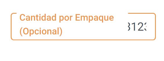
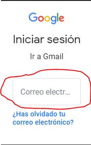
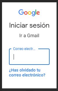
When I do the screen very small the label take a part of the input.
My code
 <div class="col-md-6 margin-bottom-inputs">
    <div class="md-form">
          <input type="text" id="categoria" class="input-modal-sm" readonly
            value={{productoSeleccionado.CantidadEmpaque}}>
         <label for="categoria">Cantidad por Empaque</label>
     </div>
</div>
Resources (screenshots, code snippets etc.)
This way look the input

Damian Gemza
staff
answered 6 years ago
Thanks for your report, Jack. We'll think about implementing such feature in the future.
As for now, please add the below styles to the global styles.scss stylesheet to resolve your problem.
@media all and (max-width: 300px) {
  .md-form.md-outline label {
    width: 100px;
    overflow: hidden;
    text-overflow: ellipsis;
    white-space: nowrap;
  }
}
Best Regards,
Damian
Arkadiusz Idzikowski
staff
answered 6 years ago
You didn't use mdbInput directive and md-outline class. Please try this code:
<div class="col-md-6 margin-bottom-inputs">
  <!-- Small outline input -->
  <div class="md-form md-outline">
    <input
      id="form-sm"
      class="form-control"
      type="text"
      value="Test value"
      mdbInput
    />
    <label for="form-sm">Cantidad por Empaque</label>
  </div>
</div>
JackZeled0n pro commented 6 years ago
I did it and doesn't work.
This happens when the space between the inputs it's to small and the label it's to long.
Arkadiusz Idzikowski staff commented 6 years ago
At first I checked that on mobile devices, but I see that this problem occur when screen width is around 200px or less. We will take a closer look at that but I'm afraid we can't do much about it.
How would you like this input to behave in such case?
FREE CONSULTATION
Hire our experts to build a dedicated project. We'll analyze your business requirements, for free.
Resolved
- ForumUser: Pro
- Premium support: No
- Technology: MDB Angular
- MDB Version: 7.5.1
- Device: Laptop
- Browser: Chrome
- OS: W10
- Provided sample code: No
- Provided link: No

