Topic: Admin Template Side Menu

Hi,
I dowloaded the example templates and experimented wit desktop and mobile browsers
I noticed that in the Admin Template the Side Menu disappears on lower screensizes (phone and tablet) Is this the expected behavior? how do users access the menu items on mobile devices?
thank you in advance for any clue

Hi!
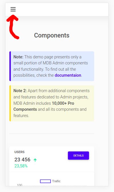
Yes, that's the default behavior of Side Nav. You can open it using (i.e.) hamburger menu, that will only be displayed on small screens and trigger a Side Nav.
Check this simple example - https://mdbootstrap.com/snippets/jquery/piotr-glejzer/33892
You can also see it on the demo page of the admin template package (screen below) :)
Best regards
FREE CONSULTATION
Hire our experts to build a dedicated project. We'll analyze your business requirements, for free.
Opened
- ForumUser: Free
- Premium support: No
- Technology: General Bootstrap questions
- MDB Version: -
- Device: ALL
- Browser: all
- OS: windows
- Provided sample code: No
- Provided link: No