Topic: Column Break - Grid Layout session has mistakenly added different example

Expected behavior
 Actual behavior
 Resources (screenshots, code snippets etc.)

Hi,
- we will fix that bug in our documentation, thanks for noticing this.
- when a device has
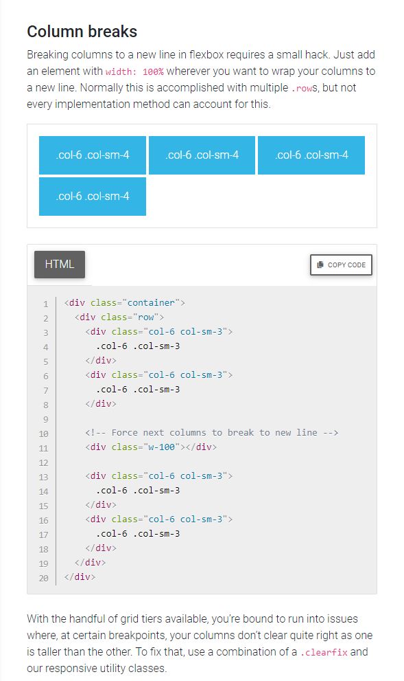
min-width: 576pxthere will be three four-column elements but also when the device hasmin-width: 768pxthen will appear additional div withwidth: 100%anddisplay: blockthat causes a break between second and third element within a row.
Best, Marta
May be misunderstood my question.
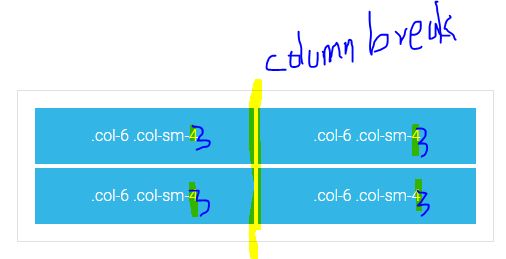
Why there written '4' (.col .col-sm-4) instead of '3'? Because in the code example its written as '3', but in the visual example it's 4'.
Why the column break is not working after second div? It should not keep 3 divs in one row. It should break the column after 2 divs.
Hi,
these blue blocks are documentation examples to show how the grid works. With class .col-example within a div class="col" we overwrite the default padding size. When you put an element inside this div you will have proper padding between elements that are next to each other.
Best, Marta
FREE CONSULTATION
Hire our experts to build a dedicated project. We'll analyze your business requirements, for free.
Answered
- ForumUser: Free
- Premium support: No
- Technology: MDB jQuery
- MDB Version: 4.13.0
- Device: computer
- Browser: chrome
- OS: win 10
- Provided sample code: No
- Provided link: No