Topic: Slim nav - not adjusting/ mobile not working?

Expected behavior
I have a double navigation with fixed slim SideNav and Navbar. When the button/menu-item is clicked, the sidenav must collapse, only showing a small part of it. On the other hand, as that happens, the navbar must adjust and so the content of the page ( like you show in the picture ).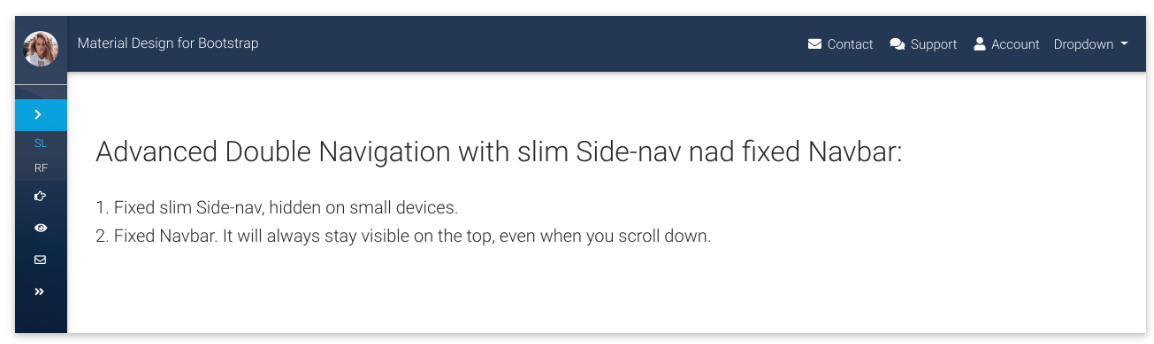
Actual behavior
I used the code you provided at the bottom of the page (with the slim navbar) and because you use hidden, it appears like this:
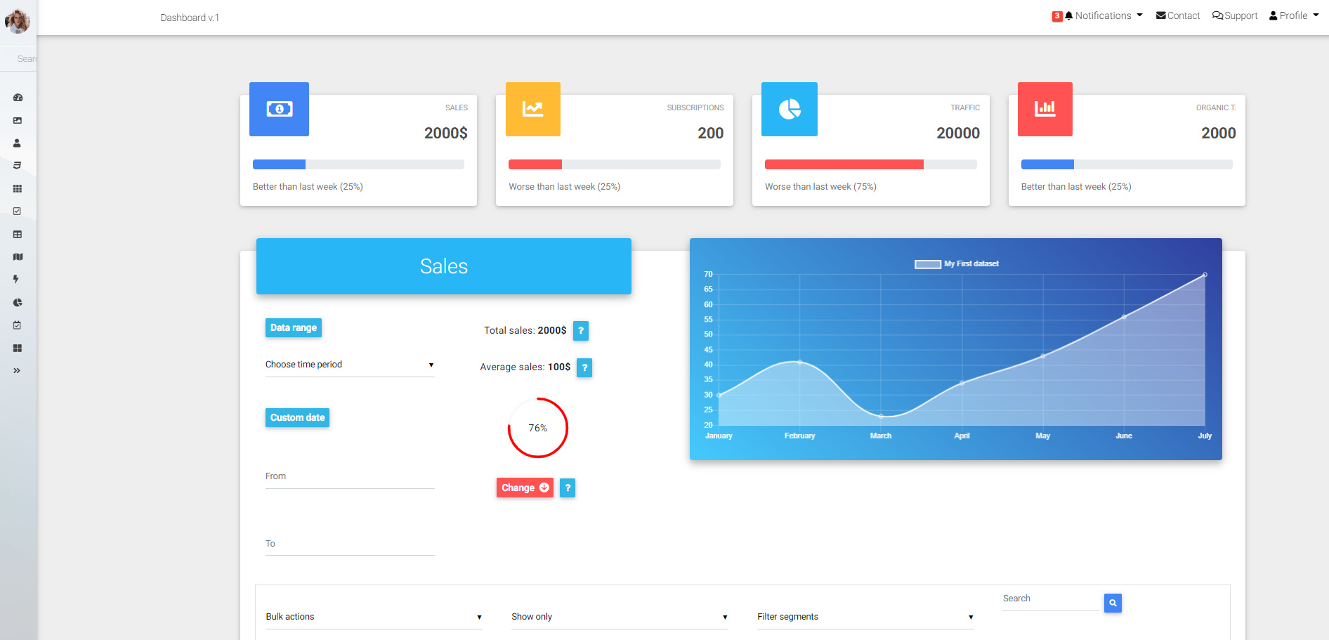
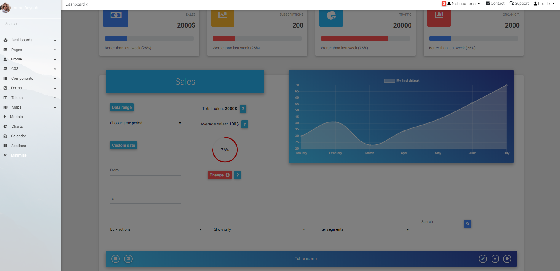 So, I removed the hidden option and now it seems to not have a dark overlay. The problem is, when you collapse the side bar, nothing is adjusted (not the navbar nor the content of the page). In the first picture, you can see it adjusted.
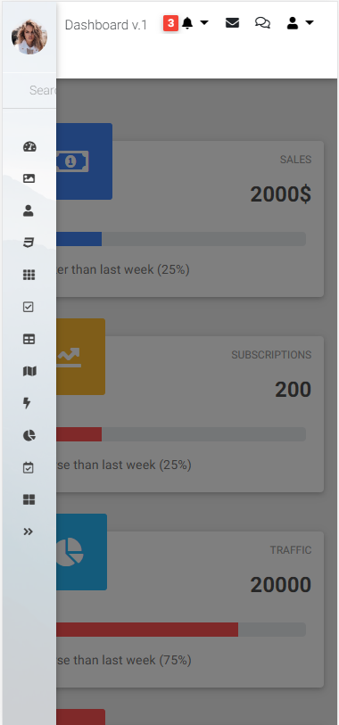
What happens as well, is that when you are in a mobile device, the same dark overlay appears and I can't work on the content. It doesn't have a normal functionality.
I'm using the code provided, so I don't understand why it's not working properly. Any suggestions?
Resources (screenshots, code snippets etc.)

Hi there,
I've prepared a new template for Your issue. Please check out if it's working ok:
<template>
  <div class="flexible-content" :style="flexibleContentStyle">
    <!--Navbar-->
    <mdb-navbar position="top" style="margin-top: 60px" dark color="primary" href="#" scrolling>
      <mdb-navbar-toggler>
        <mdb-navbar-nav left>
          <mdb-icon icon="bars" size="2x" @click.native="toggle = !toggle" v-if="wide"/>
        </mdb-navbar-nav>
        <mdb-navbar-nav right>
          <mdb-nav-item to="/navigation/pro/double-navigation-v1" waves-fixed>Version 1</mdb-nav-item>
          <mdb-nav-item to="/navigation/pro/double-navigation-v2" waves-fixed>Version 2</mdb-nav-item>
          <mdb-nav-item to="/navigation/pro/double-navigation-v3" waves-fixed>Version 3</mdb-nav-item>
          <mdb-nav-item to="/navigation/pro/double-navigation-v4" waves-fixed>Version 4</mdb-nav-item>
          <mdb-nav-item to="/navigation/pro/double-navigation-v5" waves-fixed active>Version 5</mdb-nav-item>
        </mdb-navbar-nav>
      </mdb-navbar-toggler>
    </mdb-navbar>
    <!--/.Navbar-->
    <div class="light-blue-skin">
      <mdb-side-nav slim :isCollapsed="collapse" name="Anna Deynah" :OpenedFromOutside.sync="toggle" logo="https://mdbootstrap.com/img/Photos/Avatars/img%20(10).jpg" logoRound sideNavClass="sn-bg-1" mask="strong">
          <mdb-side-nav-nav>
            <mdb-side-nav-cat name="Submit blog" icon="chevron-right">
              <mdb-side-nav-item href="#" slimIcon="address-book">Submit listing</mdb-side-nav-item>
              <mdb-side-nav-item href="#" slimIcon="address-card">Registration form</mdb-side-nav-item>
            </mdb-side-nav-cat>
            <mdb-side-nav-cat name="Instruction" far icon="hand-pointer">
              <mdb-side-nav-item href="#" slimIcon="blog">For bloggers</mdb-side-nav-item>
              <mdb-side-nav-item href="#" slimIcon="pen">For authors</mdb-side-nav-item>
            </mdb-side-nav-cat>
            <mdb-side-nav-cat name="About" icon="eye">
              <mdb-side-nav-item href="#" slimIcon="handshake">Introduction</mdb-side-nav-item>
              <mdb-side-nav-item href="#" slimIcon="tasks">Monthly meetings</mdb-side-nav-item>
            </mdb-side-nav-cat>
            <mdb-side-nav-cat name="Contact me" far icon="envelope">
              <mdb-side-nav-item href="#">FAQ</mdb-side-nav-item>
              <mdb-side-nav-item href="#" slimIcon="paper-plane" >Write a message</mdb-side-nav-item>
            </mdb-side-nav-cat>
            <mdb-side-nav-item icon="angle-double-left" open-icon="angle-double-right" @toggle="toggleCollapse" toggler :isCollapsed="collapse" fixed>Minimize</mdb-side-nav-item>
          </mdb-side-nav-nav>
      </mdb-side-nav>
    </div>
    <div style="height: 100vh; margin-bottom: -25px">
      <div class="view intro-2">
        <div class="full-bg-img">
          <div class="mask rgba-black-strong flex-center">
            <div class="container">
              <div class="white-text text-center">
                <h2 class="font-weight-bold">Double navigation with fixed slim sidenav & fixed navbar</h2>
              </div>
            </div>
          </div>
        </div>
      </div>
    </div>
  </div>
</template>

<script>
import { mdbNavbar, mdbNavItem, mdbNavbarNav, mdbNavbarToggler, mdbDropdown, mdbDropdownItem, mdbDropdownMenu, mdbDropdownToggle, mdbInput, mdbBtn, mdbSideNav, mdbSideNavNav, mdbSideNavCat, mdbSideNavItem, mdbIcon, waves } from 'mdbvue';

export default {
  name: 'DoubleNavigationPagev1',
  components: {
    mdbNavbar,
    mdbNavItem,
    mdbNavbarNav,
    mdbNavbarToggler,
    mdbDropdown,
    mdbDropdownItem,
    mdbDropdownMenu,
    mdbDropdownToggle,
    mdbInput,
    mdbBtn,
    mdbSideNav,
    mdbSideNavNav,
    mdbSideNavCat,
    mdbSideNavItem,
    mdbIcon
  },
  data() {
    return {
      toggle: false,
      wide: true,
      collapse: false,
      flexibleContentStyle: false
    };
  },
  mounted(){
    this.handleResize();
    document.getElementById("main-navbar").style.height = '60px';
    window.addEventListener('resize', this.handleResize);
  },
  beforeDestroy(){
    document.getElementById("main-navbar").style.height = null;
    window.removeEventListener('resize', this.handleResize);
  },
  methods: {
    handleResize() {
      if (window.outerWidth < 1440) {
        this.wide = true;
        this.flexibleContentStyle = {
          marginLeft: 0
        };
      } else {
        this.wide = false;
        if (this.collapse) {
          this.flexibleContentStyle = {
            marginLeft: '60px'
          };
        } else {
          this.flexibleContentStyle = {
            marginLeft: '240px'
          };
        }
      }
    },
    toggleCollapse() {
      this.collapse = !this.collapse;
      this.handleResize();
    }
  },
  mixins: [waves]
};
</script>

<!-- Add "scoped" attribute to limit CSS to this component only -->
<style scoped>
.view {
  background: url("https://mdbootstrap.com/img/Photos/Others/img (44).jpg")no-repeat center center;
  background-size: cover;
  height: 100%;
}
.navbar i {
  cursor: pointer;
  color: white;
}
.flexible-content, .flexible-content .navbar {
  transition: margin-left 0.5s;
}
</style>
Best regards
Hello there,
Is this issue already solved? If not, is there any plans to be released anytime soon?
Thank you in advance,
Hi there,
Please add the following class to disable overlay:
#sidenav-overlay {
    display: none;
}
Also will try to fix other issues with double navigation as soon as possible.
Best regards
FREE CONSULTATION
Hire our experts to build a dedicated project. We'll analyze your business requirements, for free.
Answered
- ForumUser: Free
- Premium support: No
- Technology: MDB Vue
- MDB Version: 5.2.0
- Device: computer
- Browser: chrome
- OS: windows 10
- Provided sample code: No
- Provided link: No