More useful UI/UX stuff on my Twitter:
@ascensus_mdbUI / UX tips & tricks
Quick and easy-to-implement tips to improve your design.
Subscribe to our newsletter to receive more UI / UX tips.
By subscribing you agree to receive the newsletter & commercial information from the data administrator StartupFlow s.c. Kijowska 7, Warsaw. Policy
Revitalizing tables and data presentation
Don't
Tables and data do not have to be presented in a monotonous and boring way. If possible, avoid the painfully standardized appearance as in the example below.
| Name | Symbol | Price | 24H | Holdings | Value | Actions |
|---|---|---|---|---|---|---|
| Bitcoin | BTC | $62,456.24 | 8.3% | 1.3 BTC | $81,192.8 | |
| Ethereum | ETH | $3,346.45 | 5.1% | 11 ETH | $36,806 | |
| Fantom | FTM | $1.24 | 28.8% | 20,458.06 FTM | $25,368 | |
| Avalanche | AVAX | $54.45 | 1.2% | 300.95 AVAX | $16,387 | |
| Solana | Sol | $52.429 | 12.4% | 245.58 SOL | $12,876 |
Do
While this is not always achievable (sometimes it needs to be pure data due to the need for sorting), it is a good idea to present your data in a variety of ways that will additionally dictate a hierarchy of the individual items.
However, be careful not to overdo it with diversity. The individual elements should be consistent with each other and not cause confusion for the user.
| Name | Price | 24H | Holdings | Actions |
|---|---|---|---|---|

Bitcoin BTC |
$62,456.24 |
8.3% |
$81,192.8 1.3 BTC |
|

Ethereum ETH |
$3,346.45 |
5.1% |
$36,806 11 ETH |
|

Fantom FTM |
$1.24 |
28.8% |
$25,368 20,458.06 FTM |
|

Avalanche AVAX |
$54.45 |
1.2% |
$16,387 300.95 AVAX |
|

Solana Sol |
$52.429 |
12.4% |
$12,876 245.58 SOL |
Avoid unclear CTA phrases
Don't
In "Call to action" buttons, too general phrases such as "Go", "OK", "Next" can be confusing to the user and are better avoided.
Newsletter
Do
"Call to action" should contain precise information for the user what to expect as a result of clicking the button. Thanks to this, you will minimize the user's mental effort, who will not have to wonder what should happen next.
Newsletter
Content should be the star
Don't
I know it's hard to accept, but your design is not the most important thing.
The most important thing is the content. So if you overdo it with the design and add, for example, a patterned background, intense gradients, fancy shapes, and flashy animations, you will overshadow the content.

Do
Take a minimalist approach. The design here should be just a stage, which is supposed to allow the main actor - the content - to present itself in the best possible way.
The stage must not distract from the actors, because people do not come to the theater for the sake of the stage itself.

Less is more
Don't
Avoid creating overly complex interfaces.
If you're creating a simple blog for a client, don't immediately assume that they will need the main navigation on the top, secondary navigation on the left, suggested content on the right, search bar, social icons, settings dropdown, etc.
Do not try to address all potentially possible future scenarios at the beginning, because you will create an overcomplicated monster.

Do
Start as clean and minimalist as possible.
Users come to your blog to read the text and will be relieved when your interface will expose text instead of a large number of options and functionalities.

Be consistent in icon design
Don't
Avoid mixing filled icons with outlined icons as this creates the impression of inconsistency and clutter.
Do
Always be consistent in your design and use the same style throughout the project.
The UI shouldn't be a rainbow
Don't
Don't overdo it with colors.
Too many different, intense colors will make the interface look chaotic and cluttered. Each element will compete for the user's attention and cause cognitive overload.

Do
Choose colors carefully so that they don't attract more attention than they need to.
Remember that your most important colors are different shades of gray. However, if you feel that an element disturbs the visual hierarchy through its intense color - desaturate it and make it more grayish.

Revive your bullets with icons
Don't
Bullets are useful, but can also seem dull and bland.
Top quality
open-source UI Kits
- 700+ UI components & templates
- Super simple, 1 minute installation
- All consistent, well-documented, reliable
- MIT license - free for personal& commercial use
Do
Use icons to add some life to your design. Also, make sure that the icons are color consistent with the rest of the surrounding interface.
Top quality
open-source UI Kits
- 700+ UI components & templates
- Super simple, 1 minute installation
- All consistent, well-documented, reliable
- MIT license - free for personal& commercial use
De-emphasize instead of emphasizing
Don't
If you want to emphasize an element, such as a button in the middle card, you don't need to make it bigger or bolder.
The effect is often bizarre, like the unnaturally large button in the example below.

Do
So instead of forcibly increasing the visibility of a given element - lower the visibility of surrounding elements.
For example, you can gray out the buttons in the side cards so they don't compete for attention with the middle button.

Be careful with tooltips
Don't
Tooltips are useful, but don't use them for information that should be immediately visible to the user.
In the example below, the user must hover over to see important information.
Do
Important information should be visible immediately, without the need to perform any additional actions, such as hovering over the icon with the tooltip.
Decide what is really primary
Don't
Don't think schematically and do not treat Call to Action buttons as always the most important thing by default.
Take, for example, this article listing. Here we have six Call to Action "Read more" buttons fight for our attention.

Do
The truth is that it is the photos that should catch our attention the most. In the era of Instagram and visual content, users scan the interface with a pattern in search of attractive graphics.
It is already standard that clicking on the photo takes the user further, so why do we need buttons at all?

50 shades of gray
Don't
Gray is the most important and commonly used color in UI design because it is the most user-friendly. However, this does not mean that it always has to be the same. You definitely shouldn't limit yourself to just one shade of gray.
Special title treatment
With supporting text below as a natural lead-in to additional content.
ButtonSpecial title treatment
With supporting text below as a natural lead-in to additional content.
ButtonSpecial title treatment
With supporting text below as a natural lead-in to additional content.
ButtonDo
You can mix gray with other colors to create interesting shades of gray subtly brushed with red, blue, or any other color. Thanks to this, your design will literally take on colors, while not losing the clarity and usability that gray provides.
Use the Color scheme generator to find the perfect shades.
Special title treatment
With supporting text below as a natural lead-in to additional content.
ButtonSpecial title treatment
With supporting text below as a natural lead-in to additional content.
ButtonSpecial title treatment
With supporting text below as a natural lead-in to additional content.
ButtonThe document hierarchy should not dictate the visual hierarchy
Don't
Don't rely on HTML heading sizes to build a visual hierarchy, or you will end up with a monster like the one below.
Here we used h3 elements for card titles ("Users", "Page Views" etc.) and smaller h4 headings for main statistics and even smaller h5 headings for previous period statistics.
Users
14 567 13,48%
Previous period
11 467
Page views
51 354 23,58%
Previous period
38 454
Average time
00:04:20 23,58%
Previous period
00:05:20
Bounce rate
32.35% 23,58%
Previous period
24.35%
Do
HTML semantics should not dictate what the element should look like.
This means that, for example, the title of the card, although it will remain an h3 element (i.e. semantically with the highest weight among those present in this card), we style it so that it looks less important.
Why? Because it is only a label, which, although important, should not dominate over the most important element - the main statistic.
Then, instead of relying entirely on typography size, we'll also use font weight and color to establish hierarchy.
Users
14 567 13,48%
Previous period
11 467
Page views
51 354 23,58%
Previous period
38 454
Average time
00:04:20 23,58%
Previous period
00:05:20
Bounce rate
32.35% 23,58%
Previous period
24.35%
Don't use unclear spacing
Don't
If you leave the same spacing between the labels for a given input and the input above, the user will be confused, not being able to easily assign which label belongs to which field.
Sign up
Do
Provide sufficient distance so that the user has no doubts about which label belongs to which input field.
Sign up
Don't treat the user like an idiot
Don't
Sometimes labels not only do not bring any benefit, but they can give the impression that we treat the user like an idiot.
Does the user really need additional support to understand that:
- "Elegant dress" is the name of the product?
- "-15%" means a discount?
- "Dresses" means a category?
- Stars mean rating?
- "$101" is the price?
Do
Of course, he doesn't. So let's take him seriously in our UI and avoid unnecessary labels.
Contrast for visibility
Don't
Avoid situations where important interface elements blend together instead of standing out (like the logos in the example below).
Do
If you want to highlight an element, give it a background that contrasts with its surroundings. In the example below, we added a gradient blue background to the section, and put the logos in white circles.
What technology
is the best in the world?
White space is low-hanging fruit
Don't
An overloaded listing with articles can take away the desire to read.

Do
Adding white space is the easiest and quickest way to enhance the aesthetics. Why not take advantage of it?

Reduce contrast in decorative elements
Don't
If you want to use decorative elements, such as icons, try to keep them from competing for attention with more important elements, like for example links.
Do
You can lower the visibility of decorative elements by reducing the contrast between them and their surroundings. In this case, you can make the icons brighter and more blend in with the white background.
Let it breathe
Don't
Don't pack your list of features too densely. Such a mass of text makes the user instinctively and disgustedly skip the entire section

Do
Use the magic of white space and add some slack to your design

Avoid unclear messages
Don't
Remember that you are creating an interface for users, not for yourself or other developers. Avoid unclear messages and ambiguous colors or icons.
Login failed
Error v783xsfk5
Do
Always ask yourself - is the interface user-friendly and understandable? In a good UI, everything - from text, to a clear color, to an unequivocal icon - should help the user get the best experience possible.
Login failed
Incorrect password
Playing with contrast and weight at the same time
Don't
Sometimes reducing the contrast alone is not enough, as it can reduce the visibility of an element too much, such as the dividing lines in the cards below.
1px solid hsl(0, 0%, 75%)
Heavy and messy
- An item
- A second item
- A third item
- A fourth item
- And a fifth one
1px solid hsl(0, 0%, 93%)
Light but not visible enough
- An item
- A second item
- A third item
- A fourth item
- And a fifth one
Do
But you can combine 2 things - use a lighter color to reduce the contrast, while increasing the weight of the dividers by changing their thickness from 1 pixel to 2 pixels.
This will compensate for the color change, so we can enjoy the lower contrast of the secondary element without losing its usability.
2px solid hsl(0, 0%, 93%)
Light and visible enough
- An item
- A second item
- A third item
- A fourth item
- And a fifth one
Content alignment in tables
Don't
Avoid centering content in the table and aligning numbers to the left. This significantly reduces readability.
| Service | Cost |
|---|---|
| Marketing | $5500 |
| Electricity | $674 |
| Coffee | $42 |
| Plumber | $150 |
| Advertisement | $1400 |
| Cookies | $9 |
Do
In left-to-right languages, text in tables should be left-aligned because that's what's most natural for the user.
Numbers, on the other hand, should be aligned to the right, as it is easier to compare them.
| Service | Cost |
|---|---|
| Marketing | $5500 |
| Electricity | $674 |
| Coffee | $42 |
| Plumber | $150 |
| Advertisement | $1400 |
| Cookies | $9 |
Overlaying text on images
Don't
Be careful when overlaying text on an image. The lack of proper contrast can make the composition completely illegible.
Can you see me?
Do
Linear gradient masks are a great solution. Thanks to them, you can give more contrast to the part of the image where the text is located, without having to cover the entire image with a mask.

Can you see me?

Can you see me?
Don't stretch your content more than you have to
Don't
Do not stretch the text in a too long line. This reduces readability and makes reading difficult.
Remember that you don't always have to fill the 100% available space.
Why is it so great?
Voluptatum reprehenderit dolorum sint fugit similique iste quos. Facilis nam corporis voluptates minus laborum vero tempore expedita accusamus amet repellendus totam, unde iure nulla? Excepturi fugit ad natus illo architecto.
Support 24/7
Laudantium totam quas cumque pariatur at doloremque hic quos quia eius. Reiciendis optio minus mollitia rerum labore
Safe and solid
Eum nostrum fugit numquam, voluptates veniam neque quibusdam ullam aspernatur odio soluta, quisquam dolore animi
Extremely fast
Enim cupiditate, minus nulla dolor cumque iure eveniet facere ullam beatae hic voluptatibus dolores exercitationem
Do
Set the maximum width for the text, for example 550px. Thanks to this, the user will not lose the line and his eyes will be able to easily wander from one line to the next.
Why is it so great?
Voluptatum reprehenderit dolorum sint fugit similique iste quos. Facilis nam corporis voluptates minus laborum vero tempore expedita accusamus amet repellendus totam, unde iure nulla? Excepturi fugit ad natus illo architecto.
Support 24/7
Laudantium totam quas cumque pariatur at doloremque hic quos quia eius. Reiciendis optio minus mollitia rerum labore
Safe and solid
Eum nostrum fugit numquam, voluptates veniam neque quibusdam ullam aspernatur odio soluta, quisquam dolore animi
Extremely fast
Enim cupiditate, minus nulla dolor cumque iure eveniet facere ullam beatae hic voluptatibus dolores exercitationem
Breaking up dense text
Don't
Avoid large, dense and monotonous paragraphs of text. Users hate them because there are no points for the mind to latch onto, so everything clumps together into one shapeless mass, the content of which we forget right after reading.
Why is it so great?
Thanks to our product, you will use the full potential of your company. We provide 24/7 support thanks to which you will never be left without help. Everything is robust and secure, and of course extremely fast. Importantly, you can keep track of all statistics using our administration panel. We will help you grow and achieve the most ambitious goals set by you.
Do
Use lists, icons, and highlighted headings so that the user can quickly scan the content and find the most interesting information.
Why is it so great?
Support 24/7
You will never be left without help
Safe and solid
Our brand is a guarantee of quality
Extremely fast
It's a fact - we are the fastest on the market
Optimal placement of CTA
Don't
When creating a Call to Action, do not ignore the direction in which the language is processed by the user.
For example, English is read from left to right. So if you put the primary "Get started" button on the left side, the user will first process that button and then go to "Learn more" on the right.
To perform the action you want (i.e. clicking "Get started" button), he will have to get back to the left, which costs extra mental energy.
Do
Always try to make life easier for the user. Create a UI that will require as little thinking and mental energy as possible. So place the primary button to the right to be the point where the user will end up.
Importance of elevation
Don't
The lack of elevation can disturb the hierarchy. For elements that are intended to stand out and attract attention (such as drop-down menus), the lack of a shadow makes the element appear to blend in with the background instead of standing out. This is especially problematic when there are elements with a shadow next to it (such as a button), which additionally distract attention.
Do
Add a shadow to the drop-down menu to make it appear to be above other elements. Such an illusion of elevation makes elements with a larger (more diffused) shadow appear "higher" than the surface to the user, which attracts more attention.
Depth with overlapping technique
Don't
The lack of elevation and a sense of depth can make our layout seem dull. All the elements lie on the same plane, so nothing really stands out.
Are you ready for an adventure?
Lorem ipsum dolor sit amet consectetur adipisicing elit. Id voluptate eos aut cumque repellendus magnam consequuntur exercitationem dicta dolores facilis neque repellat fugiat sint, veniam, minima nam velit quasi iure.
Lorem ipsum, dolor sit amet consectetur adipisicing elit. Optio sapiente molestias consectetur. Fuga nulla officia error placeat veniam, officiis rerum laboriosam ullam molestiae magni velit laborum itaque minima doloribus eligendi! Lorem ipsum, dolor sit amet consectetur adipisicing elit. Optio sapiente molestias consectetur. Fuga nulla officia error placeat veniam, officiis rerum laboriosam ullam molestiae magni velit laborum itaque minima doloribus eligendi!
Optio sapiente molestias consectetur?
Lorem ipsum dolor sit amet consectetur adipisicing elit. Ipsum architecto ex ab aut tempora officia libero praesentium, sint id magnam eius natus unde blanditiis. Autem adipisci totam sit consequuntur eligendi.
Do
Use the overlapping technique to give a sense of depth. Thanks to this, we not only give a hierarchy to individual elements, but also our design simply looks more interesting.
Are you ready for an adventure?
Lorem ipsum dolor sit amet consectetur adipisicing elit. Id voluptate eos aut cumque repellendus magnam consequuntur exercitationem dicta dolores facilis neque repellat fugiat sint, veniam, minima nam velit quasi iure.
Lorem ipsum, dolor sit amet consectetur adipisicing elit. Optio sapiente molestias consectetur. Fuga nulla officia error placeat veniam, officiis rerum laboriosam ullam molestiae magni velit laborum itaque minima doloribus eligendi! Lorem ipsum, dolor sit amet consectetur adipisicing elit. Optio sapiente molestias consectetur. Fuga nulla officia error placeat veniam, officiis rerum laboriosam ullam molestiae magni velit laborum itaque minima doloribus eligendi!
Optio sapiente molestias consectetur?
Lorem ipsum dolor sit amet consectetur adipisicing elit. Ipsum architecto ex ab aut tempora officia libero praesentium, sint id magnam eius natus unde blanditiis. Autem adipisci totam sit consequuntur eligendi.
Emphasize Key Actions
Don't
Avoid presenting too much information to the user at once, especially when it lacks a clear hierarchy and all actions seem equally important. In the example below there is a navbar with 4 links that look identical, although only one is really crucial. It takes extra effort on the part of the user to find it.
Do
Hierarchy is fundamental. The user should always know what the main action is expected of him. Don't add more than one key action per view and make it stand out from other interface elements.
In this case, such a key action is the "pay" option, which has been changed from a simple link into a distinctive button. The remaining links have been placed in the dropdown menu ("more") as additional options.
Avoid overusing borders
Don't
Don't overuse the borders. While they seem like a natural solution for separating individual elements, they nevertheless give the interface some heaviness. As a result, the card below seems messy and bulky.
Workouts
Do
Instead, use a combination of shadows and gray backgrounds. Additionally, increase the space between the elements, thanks to which the design will be able to "breathe". You can also enrich the UI with icons.
Workouts
Prioritize user actions
Don't
Avoid having more than one action button having the same color and weight. This makes it difficult for the user to easily identify the most important action.
Do
User should be able to easily identify which button is the most important (primary button), which is less important (secondary button) and which presents completely additional information (tertiary button).
Elements with strong, filled backgrounds and shadows attract attention the most, which is why button primary is built in this way.
A delicate background without shadows is less engaging, so it is well suited for button secondary.
The lack of background and shadow makes the element the least visible. These features characterize the button tertiary.
Simplify Labels and Prioritize Data Hierarchy
Don't
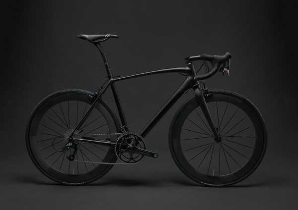
Usually, it's not the labels that are most important, but the data. And in the vast majority of cases, the data does not require a label because it is clear enough on its own.
Take advantage of this trait and give up labels wherever possible. At the same time, impose a clear hierarchy so that the user can easily identify the most important information.
| Product name | Mountain bike |
| Manufacturer | Cannondale Bikes |
| Year of production | 2010 |
| Price | $920 |
| Color | Black |
| Weight | 27 kg |
| Gender | Men |
| Seller | Sandra C Stuart |
| Contact | sandra.stuart@gmail.com |
Do
Usually, it's not the labels that are most important, but the data. And in the vast majority of cases, the data does not require a label because it is clear enough on its own.
Take advantage of this trait and give up labels wherever possible. At the same time, impose a clear hierarchy so that the user can easily identify the most important information.

Mountain bike - 12 years old
$920
Cannondale Bikes
Sandra C Stuart
sandra.stuart@gmail.com
Avoid unintended attraction with contrast
Don't
If you want to maintain adequate contrast, white text on a dark background is not the only solution. This way you will make the elements look really heavy.
Additionally, due to a very dark background, they can attract more user attention than you planned. In the example below, you can see badges, which by definition are a secondary elements, but because of their dark and heavy colors, they attract more attention than they should.
| Example | Contrast ratio |
|---|---|
| +20% | 2.12 (not enough) |
| -34% | 3.05 (not enough) |
| No change | 2.11 (not enough) |
Do
Invert the contrast. By using a similar hue but in different shades (lighter for background and darker for text) we can achieve an effect that is both light and visually attractive, while at the same time providing a strong enough contrast.
| Examples | Contrast ratio |
|---|---|
| +20% | 5.73 (AA) |
| -34% | 6.07 (AA) |
| No change | 5.41 (AA) |
The text color should match the background color
Don't
We often use gray text for secondary elements to reduce their visibility and thus maintain the hierarchy. However, gray text only works well on a white background.
Do not miss
any updates
We will write rarely and only high-quality content.
Do
In the case of a colored background, it will be best if we choose a shade similar to the background color for the text. The more the text color is similar to the background color, the less contrast there will be between them, and thus less visibility.
So leave the most important element in white, so that it contrasts the most and attracts the most attention. On the other hand, reduce the contrast of the secondary elements so that they are still visible, but do not compete for attention with the primary element.
Thanks to this, we not only maintain a clear herarchy, but also a coherent and aesthetic composition of colors.
Do not miss
any updates
We will write rarely and only high-quality content.
No matter what, always provide feedback
Don't
You know that feeling when you fill out a form on some website, click "submit" and a moment later you are taken to the home page out of nowhere, without any information whether there was an error or maybe everything went right?
Or you click a button and nothing seems to happen, but all of a sudden you find that an app in the background was processing data but didn't tell you to wait?
It's hard to imagine a more frustrating user experience.
Do
There are plenty of ways to provide user feedback - progress bars, notifications, animations and more. Use them generously and, no matter what, always make sure that the user knows what is happening at the moment.
We process your data. Please do not close this browser window
Take advantage of the law of proximity
Don't
Proximity helps to establish a relationship between objects in the interface. If the distance between UI elements is ambiguous, it will cause user confusion.
In the example below, it's hard to tell at first glance which name is assigned to which photo.
Veronica Smith
Emma Lovelace
Isabella Anderson
Olivia Bennett
Do
Closeness aids users in swiftly comprehending and structuring information with greater efficiency. Objects situated nearby are interpreted as having comparable functions or characteristics.
Veronica Smith
Emma Lovelace
Isabella Anderson
Olivia Bennett
Provide default option
Don't
Don't make your users' lives harder than it needs to be. Every extra action you require increases the user's mental effort and lowers the UI experience.
What location do you want to search?
Enter a destination to find the best deals
Do
Always provide a default option in your UI whenever possible. In many cases, this will coincide with the preferences of the user who will appreciate such help.
What location do you want to search?
Enter a destination to find the best deals
Watch out for destructive actions
Don't
Red color is associated with danger. In UI design, it is customary that destructive actions in the interface, such as "delete", "cancel", etc., are marked with red color.
Bootstrap contributed a lot to this, where the .btn-danger class creates a big red button.
However, this is not the best approach, because few things attract the user's attention as much as a big red button. And do we really want the unsubscribe or delete account buttons to stand out the most from the entire interface? Definitely not.
Do
Destructive action elements should still be easy to find in the UI, but with the big red button, not even the primary button can compete. Therefore, it is definitely better to lower their visibility so that they do not compete for attention with primary actions.
Use HSL instead of HEX or RGB colors
Don't
It's hard to customize your color palette using HEX or RGB formats because their codes are not easily interpreted by a human. So if you want to create a perfectly matched set of colors, using these formats you make your task harder.
Do
It's much easier with HSL colors.
              /* Syntax: hsl(hue, saturation, lightness) */
              background-color: hsl(120, 100%, 50%); /* Fully saturated green color */
HSL separates the color dimensions in a way that's more intuitive for human perception. Hue represents the color itself, Saturation controls the intensity or purity of the color, and Lightness adjusts the brightness. This makes it easier to mentally envision and control the color you want.
When you adjust the Hue value in HSL, you're changing the actual color while maintaining its brightness and saturation. This is especially useful when exploring color schemes or making small variations to find the right tone.
When you adjust the Lightness value in HSL, you can make a color lighter or darker without dramatically altering its hue or saturation. In RGB, changing brightness requires adjusting all three values, which can lead to unexpected color shifts.
HSL makes it easier to create harmonious color schemes.

About author
Michal Szymanski
Co Founder at MDBootstrap and Tailwind Elements / Listed in Forbes „30 under 30" / Open-source enthusiast / Dancer, nerd & book lover.
Author of hundreds of articles on programming, business, marketing and productivity. In the past, an educator working with troubled youth in orphanages and correctional facilities.
