Topic: Collapse links in navbar show when decreasing screen width

Expected behavior
The links in the collapsable menu should not show when resizing the view.
Actual behavior
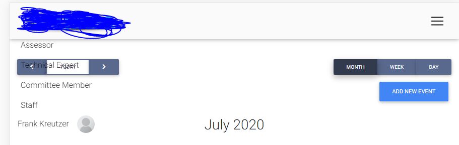
When decreasing the width of the page, after the MD breakpoint, the links that are supposed to be part of the hidden hamburger menu show. The page in the screenshot is the only one that this occurs on.
Resources (screenshots, code snippets etc.)
<!-- Navbar -->

<mdb-navbar SideClass="navbar navbar-expand-lg navbar-light grey lighten-5 fixed-top" [containerInside]="false">

  <mdb-navbar-brand>
    <!-- Breadcrumb-->
    <div class="breadcrumbs breadcrumb-dn mr-auto">
      <a [routerLink]="'/dashboard'">
        <img src="../../assets/audeee-logo.png" class="img-fluid flex-center" width="200" [routerLink]="'/dashboard'">
      </a>
    </div>
    <!--/. Breadcrumb-->
  </mdb-navbar-brand>


  <!-- Collapsible content -->
  <links>

    <!-- Links -->
    <ul class="navbar-nav mr-auto">


      <li class="nav-item  waves-light" mdbWavesEffect>
        <a [routerLink]="'/assessor-info'" class="nav-link">Assessor</a>
      </li>

      <li class="nav-item  waves-light" mdbWavesEffect>
        <a href="#" class="nav-link">Technical Expert</a>
      </li>

      <li class="nav-item  waves-light" mdbWavesEffect>
        <a href="#" class="nav-link">Committee Member</a>
      </li>

      <li class="nav-item ative waves-light" mdbWavesEffect>
        <a href="#" class="nav-link">Staff</a>
      </li>

    </ul>

    <ul class="navbar-nav ml-auto nav-flex-icons d-inline-block">
      <li class="nav-item avatar dropdown" dropdown>
        <a dropdownToggle mdbWavesEffect type="button" class="nav-link dropdown-toggle waves-light">
          <span class="mr-3">{{name}}</span><img src="https://i0.wp.com/acaweb.org/wp-content/uploads/2018/12/profile-placeholder.png?fit=300%2C300&ssl=1" alt="" class="img-fluid rounded-circle z-depth-0">
        </a>
        <div *dropdownMenu class="dropdown-menu dropdown-menu-right dropdown dropdown-primary" role="menu">
          <a [routerLink]="'/account-overview'" class="dropdown-item waves-light" mdbWavesEffect href="#">Profile</a>
          <a [routerLink]="'/affiliations'" class="dropdown-item waves-light" mdbWavesEffect>Affiliations</a>
          <a target="_blank" class="dropdown-item waves-light" (click)="updatePassword()" mdbWavesEffect>Change Password</a>
          <div class="dropdown-divider"></div>
          <a class="dropdown-item waves-light" (click)="logOut()" mdbWavesEffect>Log out</a>
        </div>
      </li>
    </ul>
  </links>
</mdb-navbar>
<!--/. Navbar -->
Our team was able to resolve this issue. It was not an MDB issue, but rather the way we structured our project and certain services that we are using. I would say this is a very specific issue that others probably will not run into.
Closing this thread 😊.
FREE CONSULTATION
Hire our experts to build a dedicated project. We'll analyze your business requirements, for free.
Resolved
- ForumUser: Free
- Premium support: No
- Technology: MDB Angular
- MDB Version: 8.10.1
- Device: PC
- Browser: Chrome
- OS: Windows 10
- Provided sample code: No
- Provided link: No
Arkadiusz Idzikowski staff commented 6 years ago
We tried to reproduce this problem on our end using this simple example but without success. Could you send a simple demo to a.idzikowski@mdbootstrap.com and a more detailed description of how to reproduce that step by step?
Frank Kreutzer free commented 6 years ago
@Arkadiusz Idzikowski We discovered ultimately what the issue is. It seems like on that one page, whenever the navbar goes in a collapsed state (when the hamburger menu is shown), the navbar-collapse div classes lose the "collapse" class. ie the class attribute should look like class="navbar-collapse collapse", but looks like class="navbar-collapse". When going dev tools, we manually add the collapse class to the div, but anytime you resize the window, the class is removed.
Then when expanding or collapsing the hamburger menu, the "collapsing" class always remains which causes the "show" class not to be added/removed from that div's classlist.
How do you go about to ensure that the collapse class is always present as expected and that the show class is added when the menu is expanded? What may be causing this? It seems to be a potential JS conflict as we are using a third-party library for a calendar on this page.
Here is what the div looks like when the hamburger menu is active:
Then after opening/closing the menu a few times here's what the div looks like closed:
When it's expanded it looks like open :
Here is a gif of a demo of the issue, look at the dev tools to see the classes: https://imgur.com/a/jIW59oP
Arkadiusz Idzikowski staff commented 6 years ago
Thank you for the details, we will try to reproduce that on our end and let you know what we found.
Frank Kreutzer free commented 6 years ago
Also, the third-party calendar component we're using is an NPM package found here in case there's potential this may be causing the issues (v 0.28.2): https://www.npmjs.com/package/angular-calendar