Topic: MDB Grid Layouts

Hi MDB Support,
I have a new question about an issue I have tried to workout using Flexbox and Cards.I would like to have a Responsive Card Grid across viewport, but on mobile, I am seeing the grid become a single column.Here's an example of my code:
<code>
<div class="card-deck">
<div class="card mb-4 hoverable black darken-1 wow fadeInUp">
<a href="#">
<img class="card-img-top img-fluid" src="img/thumbnails/th-01.jpg" alt="thumbnail" />
</a>
<div class="card-block">
<p class="small white-text card-para">Card Title</p>
</div>
</div>
<div class="card mb-4 hoverable black darken-1 wow fadeInUp">
<a href="#">
<img class="card-img-top img-fluid" src="img/thumbnails/th-02.jpg" alt="thumbnail" />
</a>
<div class="card-block">
<p class="small white-text card-para">Card Title</p>
</div>
</div>
<div class="card mb-4 hoverable black darken-1 wow fadeInUp">
<a href="#">
<img class="card-img-top img-fluid" src="img/thumbnails/th-03.jpg" alt="thumbnail" />
</a>
<div class="card-block">
<p class="small white-text card-para">Card Title</p>
</div>
</div>
.
.
.
</code>
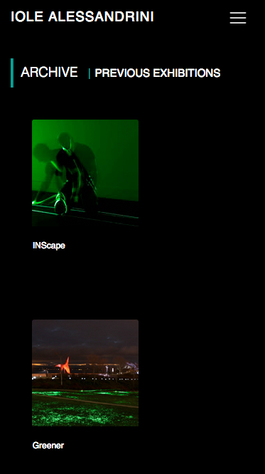
Here's a screenshot sample of what this looks like on mobile (single column):
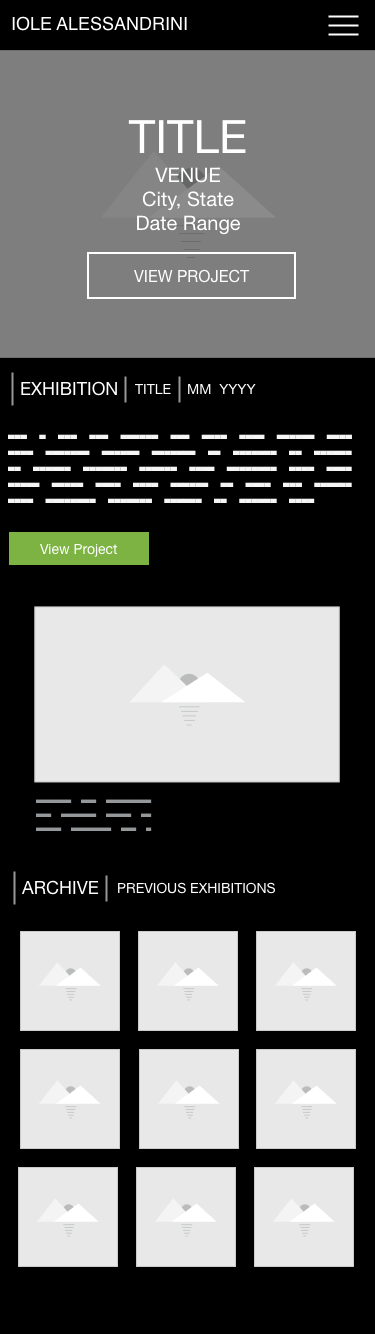
And here's a wireframe of what I would like to accomplish. Please scroll down to the text beginning with "Archive". I would either like to see the Responsive Card Grid show either a 2-column or 3-column grid on smaller smartphone viewports instead of a single column. Titles can be hidden at this viewport size.
Thanks!
Eric
Seattle, WA

Hi,
try this grid:
`<div class="row">
 <div class="col-lg-2 col-4">
 <div class="div"></div>
 </div>
 <div class="col-lg-2 col-4">
 <div class="div"></div>
 </div>
 <div class="col-lg-2 col-4">
 <div class="div"></div>
 </div>
 <div class="col-lg-2 col-4">
 <div class="div"></div>
 </div>
 <div class="col-lg-2 col-4">
 <div class="div"></div>
 </div>
 <div class="col-lg-2 col-4">
 <div class="div"></div>
 </div>
 </div>
 <div class="row">
 <div class="col-lg-2 col-4">
 <div class="div"></div>
 </div>
 <div class="col-lg-2 col-4">
 <div class="div"></div>
 </div>
 <div class="col-lg-2 col-4">
 <div class="div"></div>
 </div>
 <div class="col-lg-2 col-4">
 <div class="div"></div>
 </div>
 <div class="col-lg-2 col-4">
 <div class="div"></div>
 </div>
 <div class="col-lg-2 col-4">
 <div class="div"></div>
 </div>
 </div>`
Best,
Marta
surface2air free commented 8 years ago
Hi Marta, Thank you for all your assistance with this - the new grid classes work. The results look great! Thanks, again. Have a great weekend. Best, Eric Seattle, Washington
.row > .col-4.
Best,
Marta
Hi Marta,
Thanks! I have tried it out, but it still looks like I get a single column of the thumbnail images:
Visit: gridinteractive.com/iole/default.htm
That's my test page and view the mobile version at Screenfly:
http://quirktools.com/screenfly/
Here's an updated sample of the code I have:
<code>
<!-- Begin Grid Layout -->
<div class="”row”">
<div class="col-4 mx-0 px-0">
<div class="card-deck">
<div class="card mb-4 hoverable black darken-1 wow fadeInUp">
<a href="#">
<img src="img/thumbnails/the-01.jpg" class="card-img-top img-fluid" alt="" />
</a>
<div class="card-block">
<p class="small white-text card-para">Title 01</p>
</div>
</div>
</div>
</div>
<div class="col-4 mx-0 px-0">
<div class="card mb-4 hoverable black darken-1 wow fadeInUp">
<a href="#">
<img src="img/thumbnails/the-02.jpg" class="card-img-top img-fluid" alt="" />
</a>
<div class="card-block">
<p class="small white-text card-para">Title 02</p>
</div>
</div>
</div>
<div class="col-4 mx-0 px-0">
<div class="card mb-4 hoverable black darken-1 wow fadeInUp">
<a href="#">
<img src="img/thumbnails/the-03.jpg" class="card-img-top img-fluid" alt="" />
</a>
<div class="card-block">
<p class="small white-text card-para">Title 03</p>
</div>
</div>
</div>
.
.
.
</div> <!-- /End Row -->
</code>
Thanks for taking a look!
Best,
Eric
Seattle, Washington
Hi Eric,
when I looked at your code I saw that you don't use in the ARCHIVE section .row and .col-4 so that's why you can't create proper three columns layout on small devices. This is your code:
<!-- Begin Grid Layout -->
<div class="card-deck">
<div class="card mb-4 hoverable black darken-1 wow fadeInUp">
<a href="exhibitions/INScape.htm">
<img src="img/thumbnails/TH-INScape.jpg" class="card-img-top img-fluid" alt="INScape" />
</a>
<div class="card-block">
<p class="small white-text card-para">INScape</p>
</div>
</div>
<span></span>
<div class="card mb-4 hoverable black darken-1 wow fadeInUp">
<a href="exhibitions/greener-2016.htm">
<img src="img/thumbnails/TH-greener-2016.jpg" class="card-img-top img-fluid" alt="Greener" />
</a>
<div class="card-block">
<p class="small white-text card-para">Greener</p>
</div>
</div>
<span></span>
<div class="card mb-4 hoverable black darken-1 wow fadeInUp">
<a href="exhibitions/give-gallery.htm">
<img src="img/thumbnails/TH-give.jpg" class="card-img-top img-fluid" alt="Give Gallery" />
</a>
<div class="card-block">
<p class="small white-text card-para">Give Gallery</p>
</div>
</div>
and you shoud have sth like this:
<div class="row">
<div class="col-4 mx-0 px-0">
<div class="card mb-4 hoverable black darken-1 wow fadeInUp">
<a href="exhibitions/INScape.htm">
<img src="img/thumbnails/TH-INScape.jpg" class="card-img-top img-fluid" alt="INScape" />
</a>
<div class="card-block">
<p class="small white-text card-para">INScape</p>
</div>
</div>
</div>
<div class="col-4 mx-0 px-0"><div class="card mb-4 hoverable black darken-1 wow fadeInUp">
<a href="exhibitions/greener-2016.htm">
<img src="img/thumbnails/TH-INScape.jpg" class="card-img-top img-fluid" alt="Greener" />
</a>
<div class="card-block">
<p class="small white-text card-para">Greener</p>
</div>
</div></div>
<div class="col-4 mx-0 px-0"><div class="card mb-4 hoverable black darken-1 wow fadeInUp">
<a href="exhibitions/give-gallery.htm">
<img src="img/thumbnails/TH-INScape.jpg" class="card-img-top img-fluid" alt="Give Gallery" />
</a>
<div class="card-block">
<p class="small white-text card-para">Give Gallery</p>
</div>
</div></div>
</div>
Best,
Marta
FREE CONSULTATION
Hire our experts to build a dedicated project. We'll analyze your business requirements, for free.
Answered
- ForumUser: Free
- Premium support: No
- Technology: General Bootstrap questions
- MDB Version: -
- Device: -
- Browser: -
- OS: -
- Provided sample code: No
- Provided link: No