Topic: navbar dropdown color scheme and highlighted items

I have created a colour scheme to my navbar and extended this to the dropdown menu when a user is logged in. All good.
However when I hover over items in the dropdown they are unreadable.
The issue and requirement should be self evident from my attached screenshot where the mouse is hovering over the second item in the list.
How do i get them to highlight in a readable way. For example:
- maintain the custom background color but on hover the text changes from text-white to text-primary
- or the background of the item to change subtly on hover to some chosen colour instead of the harsh white/grey
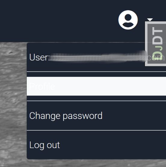
(Ignore DJDT tab in screenshot - this is a django dev debug tool)
                                       ...
<div class="collapse navbar-collapse" id="navbarCollapse">
        {% if user.is_authenticated %}
        <ul class="navbar-nav ml-auto">
            <li class="nav-item">
            <a class="nav-link dropdown-toggle d-flex align-items-center" href="#" id="userMenu" data-toggle="dropdown" aria-haspopup="true" aria-expanded="false">
                <i class="fas fa-user-circle fa-2x mr-2"></i>
            </a>
            <div class="dropdown-menu dropdown-menu-right unique-color-dark" aria-labelledby="userMenu">
                <a class="dropdown-item text-white p-1">{% trans 'User: ' %}{{ user.email }}</a>
                <div class="dropdown-divider"></div>
                <a class="dropdown-item text-white p-1">{% trans 'Profile' %}</a>
                <div class="dropdown-divider"></div>
                <a class="dropdown-item text-white p-1" href="{% url 'account_change_password' %}">{% trans 'Change password' %}</a>
                <div class="dropdown-divider"></div>
                <a class="dropdown-item text-white p-1" href="{% url 'account_logout' %}">{% trans 'Log out' %}</a>
            </div>
            </li>
        </ul>
        {% else %}
                                   ...etc...
Ok thanks, in the end the following works perfectly for me:
.dropdown-item:focus, .dropdown-item:hover {
background-color: #1C2331;
color: orange !important;}
It seems to work exactly as i want it to.
Krzysztof Wilk staff commented 5 years ago
Hi!
I'm glad it helped! If you have more questions - feel free to ask :)
Best regards

Hi!
I'm afraid it is not achievable using classes. You have to make a CSS file inside your static ones and change it in this way. Inside this file you have to add:
.dropdown .dropdown-menu.dropdown-primary .dropdown-item:hover,
.dropdown .dropdown-menu.dropdown-primary .dropdown-item:active,
.dropdown .dropdown-menu.dropdown-primary .dropdown-item.active,
.dropup .dropdown-menu.dropdown-primary .dropdown-item:hover,
.dropup .dropdown-menu.dropdown-primary .dropdown-item:active,
.dropup .dropdown-menu.dropdown-primary .dropdown-item.active,
.dropleft .dropdown-menu.dropdown-primary .dropdown-item:hover,
.dropleft .dropdown-menu.dropdown-primary .dropdown-item:active,
.dropleft .dropdown-menu.dropdown-primary .dropdown-item.active,
.dropright .dropdown-menu.dropdown-primary .dropdown-item:hover,
.dropright .dropdown-menu.dropdown-primary .dropdown-item:active,
.dropright .dropdown-menu.dropdown-primary .dropdown-item.active {
  background-color: #37474F !important;
}
And set CSS properties of dropdown items up to you :)
Best regards
FREE CONSULTATION
Hire our experts to build a dedicated project. We'll analyze your business requirements, for free.
Answered
- ForumUser: Free
- Premium support: No
- Technology: General Bootstrap questions
- MDB Version: -
- Device: Laptop
- Browser: Firefox
- OS: Win 10
- Provided sample code: No
- Provided link: No