Topic: How can we restrict the total site width to 990px (with fixed navbar)

We have to stop the site width from expanding past 970kb when browser size is expanded
This must be a language problem as it is a very simple question. I don't want the website to grow past 970px when we expand the desktop browser to full screen.
To be more specific. We have a large 27" desktop monitor. We want the the Advanced Double Navigation with fixed SideNav & fixed Navbar website to stop expanding to full screen at 970px when we open the web browser to full screen.
We have no link ready to send to you. Look at your snippet: https://mdbootstrap.com/snippets/jquery/mdbootstrap/410516?view=standard The site fills the whole screen when we expand it. We want the site not to grow past 970px when we go to fullscreen
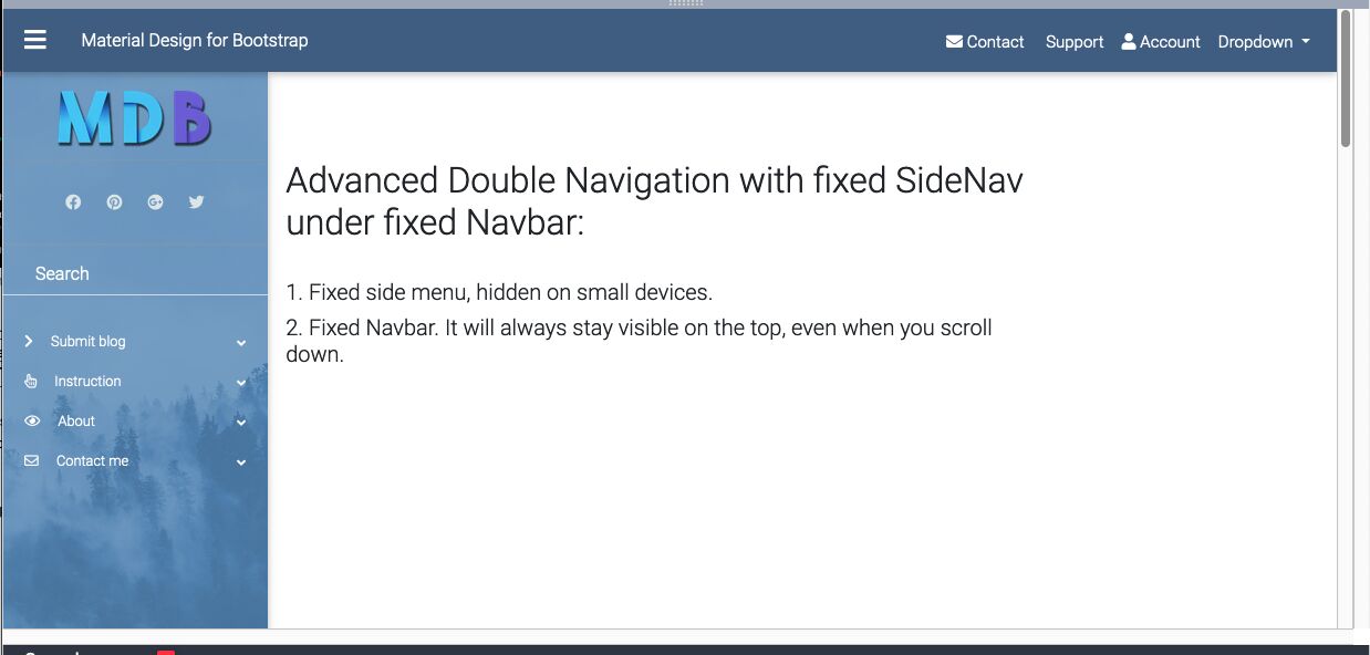
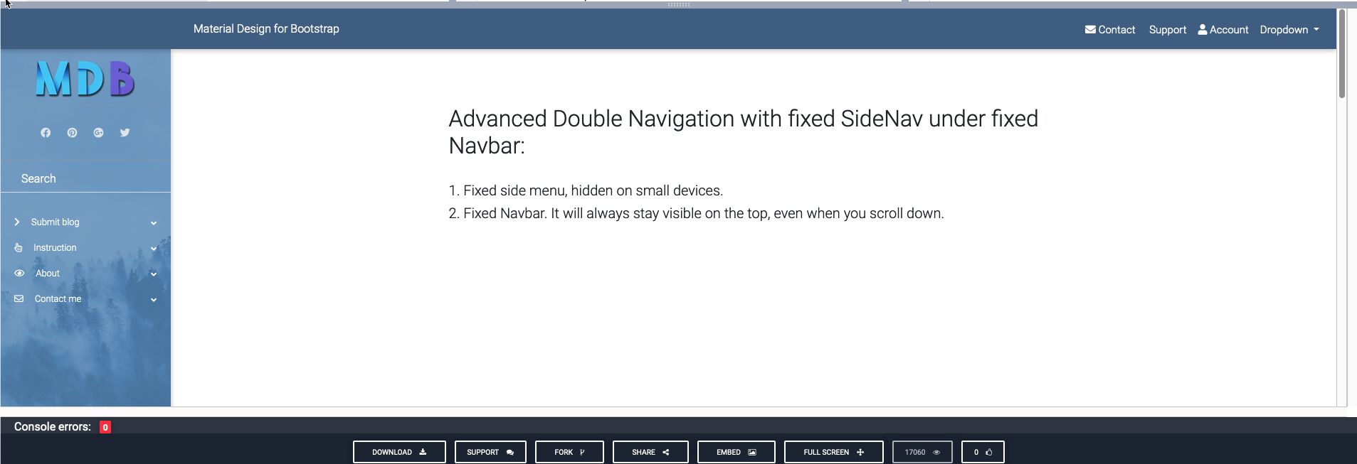
This is look at 970px and fullscreen
Marta Wierzbicka free commented 6 years ago
Hi,
Do you mean this effect: https://mdbootstrap.com/snippets/jquery/marta-szymanska/1611456?view=side#css-tab-view?
Best, Marta
lemons free commented 6 years ago
or maybe something like this:https://mdbootstrap.com/snippets/jquery/lhock/1612327
I'd recommend to have a look a the RFS topic to simply scale the font size according to the the screen size: https://mdbootstrap.com/docs/jquery/content/responsive-font-size/
Why would you want to use a fully responsive framework and limit it? Also you can use other ways to deal with all this whitespace. E.g. you could simply have some background animations, design elements breaking out of the container or a sidepanel with additional stuff on very-large-screens only.
Marta Wierzbicka free commented 6 years ago
Hi,
thank you @lemons for your help. Are our answers satisfying you, @stopsusa?
Best, Marta
stopsusa pro commented 6 years ago
These don't seem to answer the problem - we want the site to maintain the look and responsiveness up to 970px and stretch no further. It can be centered on a colored background that fills the rest of the monitor regardless of screen monitor size.
lemons free commented 6 years ago
isnt't that exactly what my snippet from my comment above shows? https://mdbootstrap.com/snippets/jquery/lhock/1612327
stopsusa pro commented 6 years ago
Looks ok after we cleared our browser cache. we will test it out and work into our next project. Thank you
Marta Wierzbicka free commented 6 years ago
You're welcome.
main { max-width: 970px; display: flex; align-self: center;} not working
By content we meant the entire web site. We want the entire website width to be 970px including navbar and sidebar centered within the browser
Marta Wierzbicka free commented 6 years ago
Hi,
would you provide en example of the problem, eg. paste here a link to your website or create a snippet here: https://mdbootstrap.com/snippets/?
Best, Marta
I'm sorry - we meant with of 970px - We want to limit the width of the site content to 970px and not to expand past 970px when browser is full screen.
lemons free commented 6 years ago
can't you simply add css?: main { max-width: 970px; display: flex; align-self: center;} // assuming your content is the html main tag
FREE CONSULTATION
Hire our experts to build a dedicated project. We'll analyze your business requirements, for free.
Answered
- ForumUser: Pro
- Premium support: No
- Technology: MDB jQuery
- MDB Version: 4.11.0
- Device: browser
- Browser: yes
- OS: max
- Provided sample code: No
- Provided link: No
Bartłomiej Malanowski staff commented 6 years ago
I'm afraid I don't understand your question. Could you please provide us more details?