Topic: React color customization

I am trying to customize the look of the MDBSwitch component. I cannot find any documentation on this, it seems the documentation is as bare bones as possible. How do I change the color of the active switch from the default blue to literally anything else? The same thing comes up with the input fields, while active they are outlined in blue.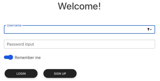
I would love to be able to customize it, but cannot find how anywhere.
<Container fluid>
        <Row className="p-5">
            <Col lg="4" ></Col>
            <Col lg="4" className="d-flex justify-content-center"><h1>Welcome!</h1></Col>
        </Row>
        <Row>
            <Col lg="4"></Col>
            <Col lg="4">
                <Col>
                    <MDBInput label='Username' id='username' type='text' />


                    <MDBInput label='Password input' id='password' type='password' />


                    <MDBSwitch id='rememberSwitch' label='Remember me' />


                </Col>
            </Col>
        </Row>
        <Row className="p-2">
            <Col lg="4" ></Col>
            <Col lg="1">
                <MDBBtn rounded className='mx-auto' color='dark' style={{width:"100%"}}>Login</MDBBtn>
            </Col>
            <Col lg="1" >
                <MDBBtn rounded className='mx-auto' color='dark' style={{width:"100%"}}>Sign up</MDBBtn>
            </Col>
        </Row>
    </Container>

Hi!
Due to a little bit complicated structure of these components, you have to use precise selectors in CSS. In the case of the MDBSwitch component it should look like this:
.form-switch .form-check-input {
    background-color: red;
}

.form-switch .form-check-input:after {
    background-color: purple;
}

.form-switch .form-check-input:checked[type=checkbox]:after {
    background-color: yellow;
}

.form-check-input[type=checkbox]:checked {
    background-color: green;
}
In the case of inputs - there are 3 notch divs appending to the input wrapper by the component, so you can select them like that:
.form-outline .form-control ~ .form-notch div {
  border-color: red;
}

.form-outline .form-control ~ .form-label {
  color: red;
}

.form-outline .form-control:focus ~ .form-notch .form-notch-leading,
.form-outline .form-control:focus ~ .form-notch .form-notch-middle,
.form-outline .form-control:focus ~ .form-notch .form-notch-trailing {
  border-color: green;
}

.form-outline .form-control:focus ~ .form-label {
    color: green;
}
Keep coding!
FREE CONSULTATION
Hire our experts to build a dedicated project. We'll analyze your business requirements, for free.
Answered
- ForumUser: Free
- Premium support: No
- Technology: MDB React
- MDB Version: MDB5 1.4.0
- Device: PC
- Browser: Chrome
- OS: Windows
- Provided sample code: No
- Provided link: No