Topic: React Section => Intro Component not resizing correctly on Mobile Device
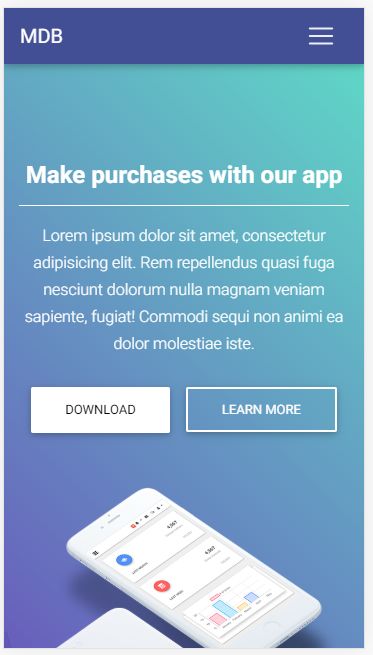
Expected behavior Jumbotron shows "centered" on screen on mobile device.
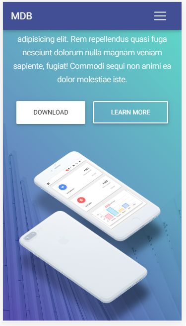
Actual behavior Jumbotron shows on top of the screen behind the navbar
Resources (screenshots, code snippets etc.)

Hi @abhi,
We probably will fix this in the next release. We must change styles for this element and update documentation. I think it is not a big issue to fix it, but we update MDBreact every two weeks. Next release will be on 16 September.
Best regards, Konrad.
abhi premium commented 6 years ago
Hi, the reason I paid for the pro version and premium support is that I don't have to fix things. I am a one man team and I hate dealing with CSS in production, thats where you guys come in! Please help. This issue was raised 3 months ago, and I have the same problem, https://mdbootstrap.com/support/react/section-not-responsive/
Konrad Stępień staff commented 6 years ago
Oh, sorry @abhi.
I thought that this problem is from the last days. I fixed it last month or earlier.
Please check this page: https://mdbootstrap.com/docs/react/sections/intros/#v-1 and copy code & styles to your project and tell me if the problem still exists.
Best regards, Konrad.
Konrad Stępień staff commented 6 years ago
Also, check this css
#apppage .gradient {
  background: -moz-linear-gradient(
    45deg,
    rgba(42, 27, 161, 0.7),
    rgba(29, 210, 177, 0.7) 100%
  );
  background: -webkit-linear-gradient(
    45deg,
    rgba(42, 27, 161, 0.7),
    rgba(29, 210, 177, 0.7) 100%
  );
  background: -webkit-gradient(
    linear,
    45deg,
    from(rgba(42, 27, 161, 0.7)),
    to(rgba(29, 210, 177, 0.7))
  );
  background: -o-linear-gradient(
    45deg,
    rgba(42, 27, 161, 0.7),
    rgba(29, 210, 177, 0.7) 100%
  );
  background: linear-gradient(
    45deg,
    rgba(42, 27, 161, 0.7),
    rgba(29, 210, 177, 0.7) 100%
  );
}

#apppage .view {
  background-image: url("https://mdbootstrap.com/img/Photos/Others/architecture.jpg");
  background-repeat: no-repeat;
  background-size: cover;
  background-position: center center;
  min-height: 100vh;
}

#apppage h6 {
  line-height: 1.7;
}

@media only screen and (max-width: 400px) {
  #apppage .animated img {
    max-height: 50vh;
    transform: translateX(-50%);
    left: 50%;
    position: absolute;
  }
}
@media only screen and (max-width: 767px) {
  #apppage .animated img {
    max-height: 35vh;
    transform: translateX(-50%);
    left: 50%;
  }
}

@media (max-width: 767px) and (orientation: landscape) {
  #apppage .animated img {
    max-height: 50vh;
    transform: translateX(-50%);
    left: 50%;
    position: relative;
  }
}
@media (max-width: 1000px) and (orientation: landscape) {
  #apppage .view {
    min-height: 150vh;
  }
}


FREE CONSULTATION
Hire our experts to build a dedicated project. We'll analyze your business requirements, for free.
Answered
- ForumUser: Free
- Premium support: No
- Technology: MDB React
- MDB Version: 4.16.0
- Device: PC
- Browser: chrome
- OS: windows 10
- Provided sample code: No
- Provided link: No