Topic: How do I get a fixed sidebar to fit underneath my navbar? - Extended.

Following the tutorial here : https://www.youtube.com/watch?v=Ro1x0zYUwwA&list=PLl1gkwYU90QlfX9oIJvC4JJKaucei7Hx8&index=16
and trying to adapt it to use the 2. Side navigation with a mode transition. Does not work.
Do you have working example where the sidebar is NOT over the top nav for a full screen side navigation with mode transition with the Pro advanced UI?
My code is organised so that I have a single script file in a partial view called like this, in _Layout.cshtml:
Dashboard
    <!-- Content Wrapper. Contains page content -->

        <div class="content-wrapper">
            <!-- /.content-header -->
            <!-- Main content -->
            <div class="content">
                <main>
                    <div class="container-fluid">

                        @RenderBody()
                        <!-- /.row -->
                    </div><!-- /.container-fluid -->
                </main>
            </div>
            <!-- /.content -->
        </div>
    </main>
    <!-- /.content-wrapper -->
    <!-- /.control-sidebar -->
    <!-- Main Footer -->
    <partial name="Themes/_Footer" />
</div>
<!-- ./wrapper -->
<!-- REQUIRED SCRIPTS -->
<partial name="Themes/_Scripts" />
@await RenderSectionAsync("Scripts", required: false)
The _Scripts.chstml:
const sidenav = document.getElementById('sidenav-main'); const sidenavInstance = mdb.Sidenav.getInstance(sidenav); let innerWidth = null; const setMode = (e) => { // Check necessary for Android devices if (window.innerWidth === innerWidth) { return; } innerWidth = window.innerWidth; if (window.innerWidthThe _Styles.cshtml
<!-- Font Awesome -->
Sidebar: TopNav: (the rest the same as the example)
Site css: (custom css file) @media (max-width: 1400px) { main, header, #top-navbar { padding-left: 240px; }
.page-intro {
    background-color: white;
    width: 100vw;
    min-height: 100vh;
}

img {
    max-width: 80%;
}

.mdb-page-content {
    padding-left: 240px;
    transition: padding 0.3s linear;
}

#toggler {
    display: none;
}

#toggler {
    display: unset;
}

.mask img {
    width: 100%;
}
}
Result is: 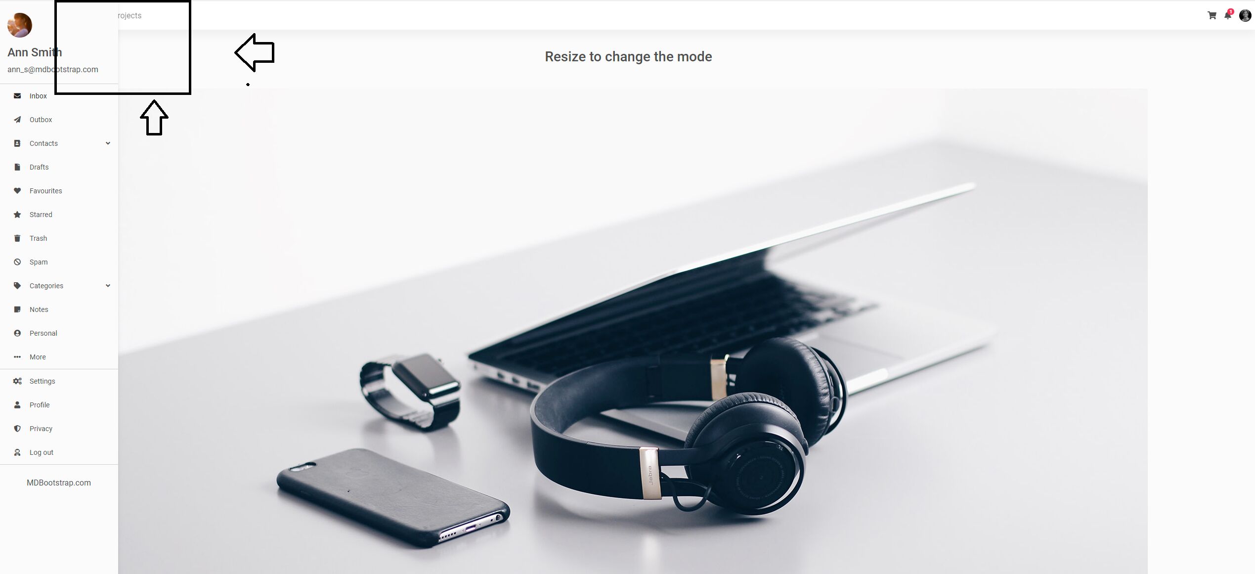

Add header and.navbar to styles which are related to resizing, as in the following snippet: https://mdbootstrap.com/snippets/standard/m-duszak/3057504#css-tab-view
FREE CONSULTATION
Hire our experts to build a dedicated project. We'll analyze your business requirements, for free.
Answered
- ForumUser: Free
- Premium support: No
- Technology: MDB Standard
- MDB Version: MDB5 3.5.1
- Device: PC
- Browser: Chrome
- OS: Windows 10
- Provided sample code: No
- Provided link: Yes