Topic: Input group with buttons addons responsive

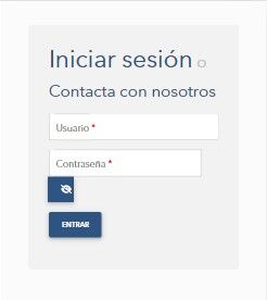
I have a responsive website with the following login page:

The input group for the password has the floating label using form-outline class
Expected behavior When I load this website in my mobile I expect to find the same appearance in the login page.
Actual behavior I get this:
Resources (screenshots, code snippets etc.) Here you can find this code so simple: https://mdbootstrap.com/snippets/standard/neocheck/4570218

Please try different approach to sizing password input with button because problem here is your custom CSS. I've prepared example snippet for you: https://mdbootstrap.com/snippets/standard/kpienkowska/4573383
FREE CONSULTATION
Hire our experts to build a dedicated project. We'll analyze your business requirements, for free.
Answered
- ForumUser: Premium
- Premium support: Yes
- Technology: MDB Standard
- MDB Version: MDB5 5.0.0
- Device: Mobile
- Browser: Chrome
- OS: Windows
- Provided sample code: No
- Provided link: Yes