Topic: Line Chart x-axis value

Hi,
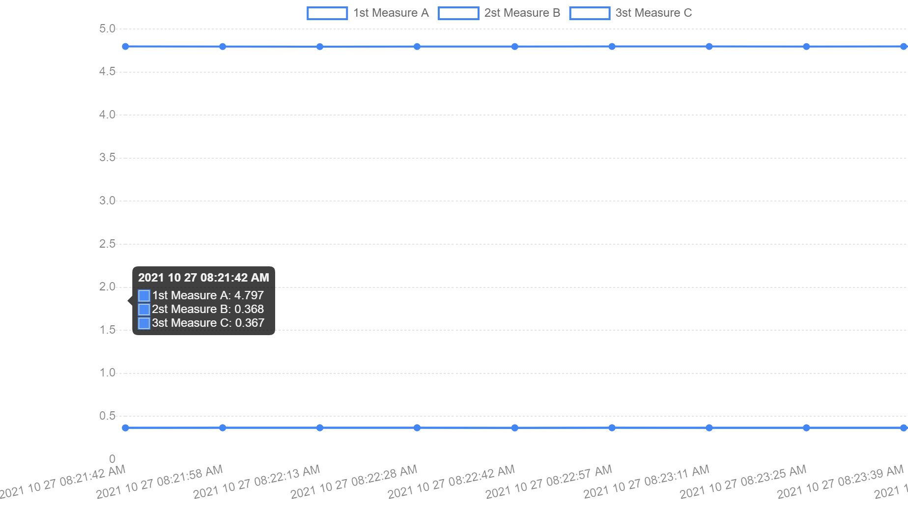
May I know how to display my line chart nicely ? Due to my data value too small and line chart unable display nicely as below :
following is my sample code :
const dataLine = {
type: 'line', data: { labels: ['2021 10 27 08:21:42 AM', '2021 10 27 08:21:58 AM' , '2021 10 27 08:22:13 AM' , '2021 10 27 08:22:28 AM' , '2021 10 27 08:22:42 AM' , '2021 10 27 08:22:57 AM' , '2021 10 27 08:23:11 AM', '2021 10 27 08:23:25 AM', '2021 10 27 08:23:39 AM', '2021 10 27 08:23:53 AM'], datasets: [ { label: '1st Measure A', data: [4.797,4.796,4.795,4.796,4.796,4.797,4.797,4.796,4.797,4.797], }, { label: '2st Measure B', data: [0.368,0.369,0.369,0.369,0.369,0.369,0.369,0.369,0.368,0.369], }, { label: '3st Measure C', data: [0.367,0.368,0.368,0.368,0.366,0.368,0.367,0.367,0.367,0.367], }, ], }, };
new mdb.Chart(document.getElementById('line-chart'), dataLine);

Hi,
You need to use 2 line charts. The difference between each number is to small to show it nicely on one chart. Here is the snippet https://mdbootstrap.com/snippets/standard/d-wajszczuk/3855102.
Keep coding,
Dawid
FREE CONSULTATION
Hire our experts to build a dedicated project. We'll analyze your business requirements, for free.
Resolved
- ForumUser: Priority
- Premium support: Yes
- Technology: MDB Standard
- MDB Version: MDB5 3.11.0
- Device: Desktop
- Browser: Chrome
- OS: Windows 10
- Provided sample code: No
- Provided link: No