Topic: Simultaneous maximum height column and maximum width row

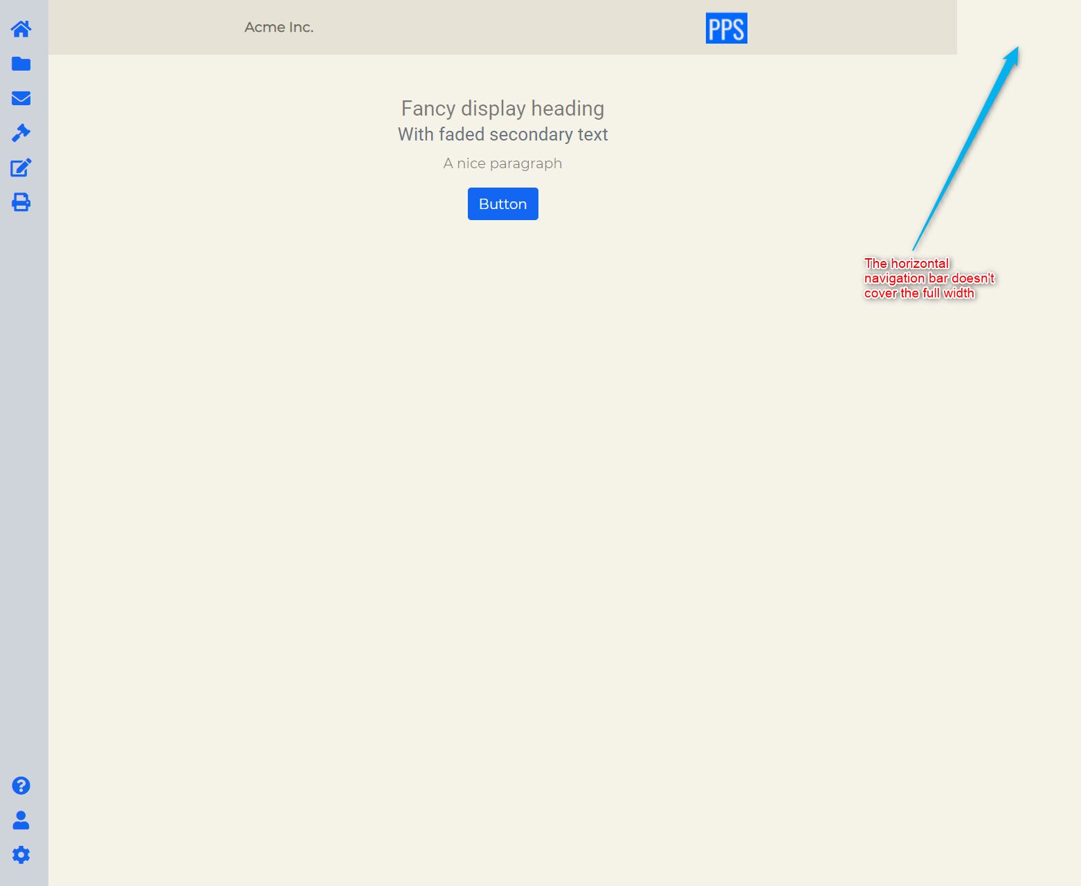
Expected behavior I would like to integrate a vertical navigation sidebar with a horizontal navigation bar on top. The vertical navigation covers the full height, the horizontal navigation bar covers the full width.
Actual behavior The horizontal navigation bar doesn't cover the full width of the column
Resources (screenshots, code snippets etc.)
code
                <div class="nav flex-column align-items-center mb-3">
                    <a class="nav-item nav-link" href="#">
                        <i class="fas fa-question-circle fa-lg"></i></a>
                    <a class="nav-item nav-link" href="#">
                        <i class="fas fa-user fa-lg"></i></a>
                    <a class="nav-item nav-link" href="#">
                        <i class="fas fa-cog fa-lg"></i></a>
                </div>
            </div>
        </div>
        <!-- End vertical navigation-->


        <!-- Start second column for content-->


        <div class="col-10 col-sm-10 p-0 text-black-50">
            <div class="row-fluid text-center fw-bolder justify-content-around bg-secondary">
                <div class="flex-column">


                    <nav class="navbar navbar-expand-lg navbar-light flex-row align-items-center justify-content-around bg-secondary" style="background-color: #f8f9fa;">

                        <span class="navbar-text fw-bolder align-self-center text-center">Acme Inc.</span>
                        <a class="navbar-brand text-end" href="#"><img src="assets/images/logo6.png" width="60" wappler-command="updateImage"></a>
                    </nav>


                </div>
            </div>

Hi,
Your problem occurs due to col-10 col-sm-10 classes in your div in which you have placed navbar. It means that it will use 10/12 of the available width. To fix this just replace them with col-12 col-sm-12.
Keep coding,
Dawid
FREE CONSULTATION
Hire our experts to build a dedicated project. We'll analyze your business requirements, for free.
Answered
- ForumUser: Free
- Premium support: No
- Technology: MDB Standard
- MDB Version: MDB5 3.9.0
- Device: PC
- Browser: Chrome
- OS: Windows 10
- Provided sample code: No
- Provided link: No