Topic: Bootstrap Navbar not working in combination with y-axis:scroll and Dropdowns


 Fiddles:
- Correct working Navbar: jsfiddle.net/udL6boke
- Incorrect working Navbar: jsfiddle.net/4z3x1aoc
Fiddles:
- Correct working Navbar: jsfiddle.net/udL6boke
- Incorrect working Navbar: jsfiddle.net/4z3x1aoc

Studyly priority commented 7 years ago
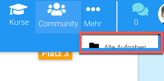
Thanks for your answer and your support! There are only two problems: In our case every element has a dropdown and when the screen is small the elements are overlapping (https://imgur.com/a/FbqIOOh)...
LG Leon
Piotr Glejzer staff commented 7 years ago
Hi,
there are few options what you can do with that. The reason why is not working correctly on mobile is a fact that is I put position absolute for the dropdown. If you want to have a nice view on every device you have to use @media or a little JavaScript code for that. But It's CSS code so probably only @media will be enough. I can help with that If you want.
Best,
Piotr
Studyly priority commented 7 years ago
If you could help us with that we would be so grateful! Thanks in advance! :)
Studyly priority commented 7 years ago
Thanks for your help!
Piotr Glejzer staff commented 7 years ago
I modified snippet above but implementation it will be hard to If you have a lot of dropdowns to each element because dropdowns are positioning absolute.
Studyly priority commented 7 years ago
Thanks for your help, we are very grateful ;)!!! But the 'More' button should be inline with the others, so some buttons have a dropdown and others don't. In our project we have a nabber with 6 buttons where 3 of them have submenus: The third has one, the fourth, the fifth hasn't and the sixth has one. Can they all line up next to each other?
Piotr Glejzer staff commented 7 years ago
I think that everything is possible. But without code, it's hard to make something. You can always experiment with @media .

Studyly priority commented 7 years ago
OK so here it comes: https://mdbootstrap.com/snippets/jquery/leonfri/61126
When adding
Studyly priority commented 7 years ago
Thanks for your help!
FREE CONSULTATION
Hire our experts to build a dedicated project. We'll analyze your business requirements, for free.
Answered
- ForumUser: Priority
- Premium support: Yes
- Technology: General Bootstrap questions
- MDB Version: -
- Device: All
- Browser: All
- OS: All
- Provided sample code: No
- Provided link: Yes
Studyly priority commented 7 years ago
Do you have any solution to the problem