Topic: Container Size Shifting Based on Screen Size

Expected behavior I expected the body/ parent container size to remain the full width regardless of when I change screen size. Actual behavior The container is taking up 100% of the width when at full screen and on iPad, but when looking at a mobile device screen, the container size switches to a no longer take up 100% of the width
Resources (screenshots, code snippets etc.)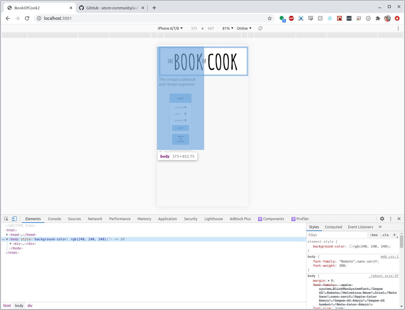
FREE CONSULTATION
Hire our experts to build a dedicated project. We'll analyze your business requirements, for free.
Status
Opened
Specification of the issue
- ForumUser: Free
- Premium support: No
- Technology: MDB React
- MDB Version: 5.0.1
- Device: PC
- Browser: Chrome
- OS: Ubuntu
- Provided sample code: No
- Provided link: No
Piotr Glejzer staff commented 5 years ago
is that book cook image has a responsive width or did you put constant value to width?
Mia Balsamo free commented 5 years ago
I don't have any css associated to the image besides text-center.
Piotr Glejzer staff commented 5 years ago
Without code about your problem I can't help