Topic: Full screen layout with navigation
Jalpertti
free
asked 6 years ago
Expected behavior
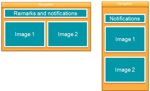
I would like to create a layout, which has ONLY three fields and fixed navigation so that the content is always 100% of height and width despite of the device and orientation. When the "device" is normal browser (a lot of space), it will have one field in the top and two field or areas below it side by side:

There should not be bleeding or escape outside of the screen, images should be responsive depending on the size of the screen.
Actual behavior
I cannot get those three boxes fo fill the whole screen without escaping the full screen view.
Thanks
Konrad Stępień
staff
answered 6 years ago
Hi @Jalpertti,
Did you see our page about the grid system in MDB?
If you didn't see, please check this page, and tell me if you have any problems.
I will try to make this layout.
Best regards, Konrad.
FREE CONSULTATION
Hire our experts to build a dedicated project. We'll analyze your business requirements, for free.
Answered
- ForumUser: Free
- Premium support: No
- Technology: MDB React
- MDB Version: 4.20.0
- Device: Android
- Browser: Chrome
- OS: Windows 10
- Provided sample code: No
- Provided link: No