Topic: Material Select className props does not work in custom markup mode

Expected behavior
Actual behavior
Resources (screenshots, code snippets etc.)
And better solution with selected props (aka placeholder for select) is solve it as placeholder not value, cos I cannot write condition with it. Something like if value is null do something. Can I get Context from your components some how? I need focused state class, or isEmpty class etc. Thanks for advice.
Konrad Stępień staff commented 6 years ago
Hi @tns, thank you for your feedback. I have on my ToDo list to refactor of Select component and i can add your suggestions for my tasks.
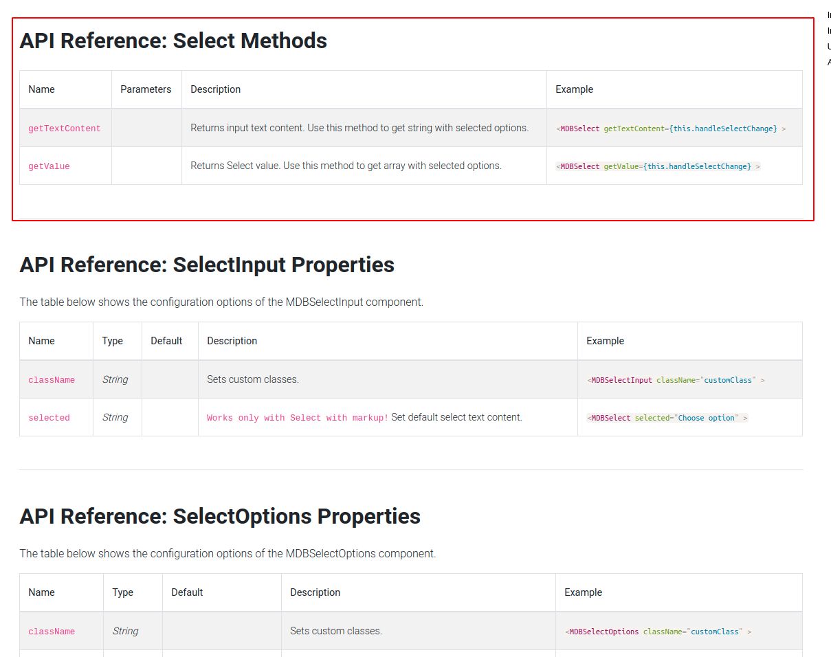
Is any of the methods below not right for you?
Same behavior with disabled props, now tested. Text input must get disabled, this can I writy by myself, but there are need some improvements. :-)
Konrad Stępień staff commented 6 years ago
Hi @tns, Can you tell me how it should look like? Do you need props something like disableSearch?
Konrad Stępień staff commented 6 years ago
There is also a class disabled which blocks components, inputs etc. Maybe it will help you in any way?
In component MDBSelect, className props is only default classes, not "test". In data array mode works properly.
import classNames from 'classnames';
import PropTypes from 'prop-types'; import { Component } from 'react'; import { MDBSelect, MDBSelectInput, MDBSelectOptions, MDBSelectOption } from 'mdbreact';
import Message from '../../Message'; import { Icon } from '../../../components/Generic';
class Select extends Component { static propTypes = { className: PropTypes.string, color: PropTypes.string, dark: PropTypes.bool, options: PropTypes.array.isRequired, disabled: PropTypes.bool, error: PropTypes.oneOfType([ PropTypes.bool, PropTypes.string, PropTypes.array, ]), id: PropTypes.string.isRequired, inputClass: PropTypes.string, label: PropTypes.string, labelClass: PropTypes.string, name: PropTypes.string.isRequired, onChange: PropTypes.func, required: PropTypes.bool, selectedOptionId: PropTypes.string, placeholder: PropTypes.string, success: PropTypes.oneOfType([ PropTypes.bool, PropTypes.string, PropTypes.array, ]), tag: PropTypes.string, tooltip: PropTypes.node, validate: PropTypes.oneOfType([ PropTypes.bool, PropTypes.func, ]), validating: PropTypes.bool, value: PropTypes.oneOfType([ PropTypes.number, PropTypes.string, ]), warning: PropTypes.oneOfType([ PropTypes.bool, PropTypes.string, PropTypes.array, ]), wrap: PropTypes.bool, };
static defaultProps = {
    wrap: true,
    dark: false,
    disabled: false,
    validate: true,
    validating: false,
    required: false,
    tag: 'div',
};

constructor(props) {
    super(props);
    const { options, selectedOptionId } = this.props;

    this.state = {
        options: options,
        selectedOptionId: selectedOptionId,
        focused: false,
        value: '',
    };
}

componentDidMount() {
    const { value } = this.props;

    this.setState({
        value: value,
    });
}

componentDidUpdate(prevProps) {
    const { value } = this.props;
    if (value !== prevProps.value) {
        this.setState({
            value: value
        });
    }
}

onBlur = () => {
    if (this.state.focused) {
        this.setState({
            focused: false,
        });
    }
}

onFocus = () => {
    if (!this.state.focused) {
        this.setState({
            focused: true,
        });
    }
}

handleOnChange = (event) => {
    const { onChange, id, name } = this.props;
    this.setState({
        value: event.target.value,
    });

    onChange(event.target.value, id, name);
}

render() {
    const { focused, value, options } = this.state;
    const { dark, className, inputClass, disabled, label, labelClass, tag, wrap, placeholder,
        tooltip, success, error, required, warning, validate, validating, color, name, id,
    } = this.props;
    const FormTag = tag;

    return (
        <FormTag
            className={classNames(
                { 'form-group from-group--select': wrap },
                { 'no-wrap': !wrap },
                { 'form-group--dark': dark && wrap },
                className,
            )}
        >
            <MDBSelect
                // BUG: this should get class name test, but only default classs appears
                className="test"
                disabled={disabled}
                focusShadow="none"
                getValue={this.onChange}
                id={id}
                name={name ? name : id}
                onBlur={this.onBlur}
                onFocus={this.onFocus}
                outline
                required={required}
                value={value}
            >
                <MDBSelectInput
                    className={classNames(
                        'form-control select',
                        {
                            'form-control--validate': validate,
                            'form-control--valid': success,
                            'form-control--invalid': error,
                            // 'form-control--filled': value,
                            'form-control--required': required,
                            'form-control--validating': validating,
                            'form-control--warning': warning,
                            'form-control--tooltip': tooltip,
                            [`form-control--${color}`]: color,
                        },
                        inputClass,
                    )}
                    selected={placeholder}
                />
                <MDBSelectOptions>
                    {/* TODO: Check if we need this */}
                    {/* <MDBSelectOption disabled>{placeholder}</MDBSelectOption> */}
                    {options.map((option, index) => (
                        <MDBSelectOption
                            disabled={option.disabled ? true : false}
                            key={index}
                            value={option.value}
                        >
                            {option.text}
                        </MDBSelectOption>
                    ))}
                </MDBSelectOptions>


                <label
                    className={classNames(
                        'form-control__label',
                        {
                            'active': focused || value,
                        },
                        labelClass,
                    )}
                    htmlFor={id}
                >
                    {typeof label === 'object' ?
                        label : <Message message={label} />
                    }
                </label>
                <Icon
                    className={classNames(
                        'form-control__icon',
                        {
                            'active': focused || value,
                        },
                    )}
                    name="chevron-down"
                    size="sm"
                />
            </MDBSelect>


        </FormTag>
    );
}
}
export default Select;
Konrad Stępień staff commented 6 years ago
Hi @tns,
This is our mistake. When you set outline property this did block custom class. We will fix it in the next release.
FREE CONSULTATION
Hire our experts to build a dedicated project. We'll analyze your business requirements, for free.
Answered
- ForumUser: Free
- Premium support: No
- Technology: MDB React
- MDB Version: 4.23.0
- Device: PC
- Browser: Chrome
- OS: Windows
- Provided sample code: No
- Provided link: No
Konrad Stępień staff commented 6 years ago
Hi @tns,
Can you send me part of your code?
I will try to help you.
Best, Konrad.