Topic: Megamenu dropdown behavior between screen sizes
Wesley Toet
priority
asked 2 years ago
Expected behavior Same behaver of the position of the megamenu dropdown on bigger screens. As seen in the screenshots it is showing other position between my macbook and my external (bigger) screen. The browser itself is exact the same size (i only change it from the macbook to the external) and then the dropdown is more to the right.
Actual behavior Always directly below the navigation (as on the macbook). I think it has something to do with the screen/viewsize; Could you advice what to change to get the same behavior between macbook and bigger screens?
Resources (screenshots, code snippets etc.)


Mateusz Lazaru
staff
answered 2 years ago
Remove data-display="static", but keep position-static in <li class="nav-item dropdown position-static">. It should fix the problem.
Wesley Toet
priority
answered 2 years ago
Problem solved for DESKTOP. Looking a lot on Google and found that it has something to do with the PopperJS. Adding " data-display="static" " to the link of the menu item solved the problem.
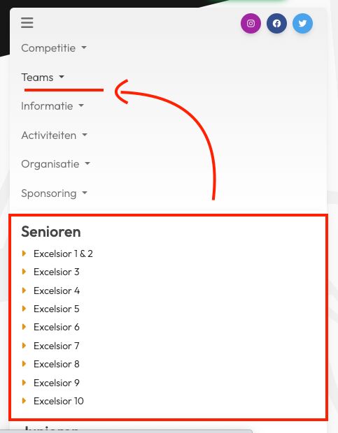
New issue for MOBILE By the data-display=static; the "dropdown" menu is coming BELOW all items, instead of between the items so it is showing on the bottom. What am I missing for code to put it "between" the items?

Mateusz Lazaru staff commented 2 years ago
Could you show the code or reproduce your problem in a sandbox tool?
Wesley Toet priority commented 2 years ago
Hi! You could see the version at https://wesdesign.nl/ckv/
FREE CONSULTATION
Hire our experts to build a dedicated project. We'll analyze your business requirements, for free.
Answered
- ForumUser: Priority
- Premium support: Yes
- Technology: MDB Standard
- MDB Version: MDB5 6.4.0
- Device: desktop
- Browser: all
- OS: all
- Provided sample code: No
- Provided link: No