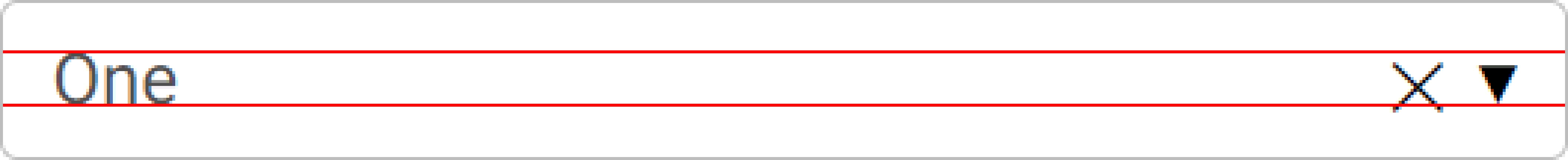
Topic: Select arrow and clear button are slightly off

Expected behavior
The Select arrow and clear button should be vertically centered
Actual behavior
The Select arrow and clear buttons are misaligned. Using top: 50%; transform: translateY(-50%); improves the layout, but it's still not perfect. Maybe use Font Awesome glyphs for both?
Resources (screenshots, code snippets etc.)
FREE CONSULTATION
Hire our experts to build a dedicated project. We'll analyze your business requirements, for free.
Status
Opened
Specification of the issue
- ForumUser: Priority
- Premium support: Yes
- Technology: MDB Standard
- MDB Version: MDB5 3.7.1
- Device: All devices
- Browser: All browsers
- OS: All operating systems
- Provided sample code: Yes
- Provided link: No
Michał Duszak staff commented 5 years ago
Hello, thank you for your feedback. Is this the screenshot of those elements before applying custom CSS?
UNNdev priority commented 5 years ago
Right, this is how it looks ouf-of-the-box. :)
Michał Duszak staff commented 5 years ago
Thank you, issue has been reported :D