Topic: Sidenav with shrinking nav column

Slightly different than your sidenav examples, I would like the sidenav to be sandwiched between the header and footer rather than being the full height of the page.
H E A D E R
NAV | CONTENT
F O O T E R
I can get everything to work except I can't get my left sidenav column to collapse when the sidenav menu is collapsed. The menu collapses nicely but the space it occupied remains. Any help you can provide would be appreciated! Thank you.
<div class="d-flex flex-column border border-1 min-vh-100">
<div class="flex-shrink-0" style="height:30px;line-height: 30px; padding: 0 8px;">
    <!-- Toggler -->
    <button data-mdb-toggle="sidenav"
            data-mdb-target="#sidenav-1"
            class="btn shadow-0 p-0"
            aria-controls="#sidenav-1"
            aria-haspopup="true">
        <i class="fas fa-bars fa-lg"></i>
    </button>
    Header
</div>
<div class="flex-grow-1 d-flex">
    <aside class="d-flex bg-warning" style="max-height: calc(100vh - 60px);">
        <!-- Sidenav -->
        <nav id="sidenav-1"
             class="sidenav position-relative h-100 overflow-auto"
             data-mdb-hidden="false"
             data-mdb-accordion="true"
             data-mdb-mode="side">
            <a class="ripple d-flex justify-content-center py-4"
               href="#!"
               data-mdb-ripple-color="primary">
                <img id="MDB-logo"
                     src="https://mdbcdn.b-cdn.net/wp-content/uploads/2018/06/logo-mdb-jquery-small.webp"
                     alt="MDB Logo"
                     draggable="false" />
            </a>

            <ul class="sidenav-menu">
                <li class="sidenav-item">
                    <a class="sidenav-link" href="">
                        <i class="fas fa-chart-area fa-fw me-3"></i><span>Webiste traffic</span>
                    </a>
                </li>
                <li class="sidenav-item">
                    <a class="sidenav-link"><i class="fas fa-cogs fa-fw me-3"></i><span>Settings</span></a>
                    <ul class="sidenav-collapse">
                        <li class="sidenav-item">
                            <a class="sidenav-link">Profile</a>
                        </li>
                        <li class="sidenav-item">
                            <a class="sidenav-link">Account</a>
                        </li>
                    </ul>
                </li>
                <li class="sidenav-item">
                    <a class="sidenav-link"><i class="fas fa-lock fa-fw me-3"></i><span>Password</span></a>
                    <ul class="sidenav-collapse">
                        <li class="sidenav-item">
                            <a class="sidenav-link">Request password</a>
                        </li>
                        <li class="sidenav-item">
                            <a class="sidenav-link">Reset password</a>
                        </li>
                    </ul>
                </li>
            </ul>
        </nav>
        <!-- Sidenav -->
    </aside>
    <main class="flex-grow-1 bg-danger overflow-auto" style="max-height: calc(100vh - 60px);">
        <div>
            <ul>
                <li>Content here</li>
            </ul>
        </div>
    </main>
</div>
<div class="flex-shrink-0" style="height:30px; line-height: 30px; padding: 0 8px;">Footer</div>
Kamila, thank you for your prompt reply. I am not using any special JS or CSS; just whatever is provided out of the box from mdbootstrap plus I added "overflow: hidden" to the Body tag.
I see that you added a collapsing menu to the nav bar at the top. It wasn't I was looking for, but maybe you were giving me a hint.
Below is what I want the page to look like when the menu is showing.
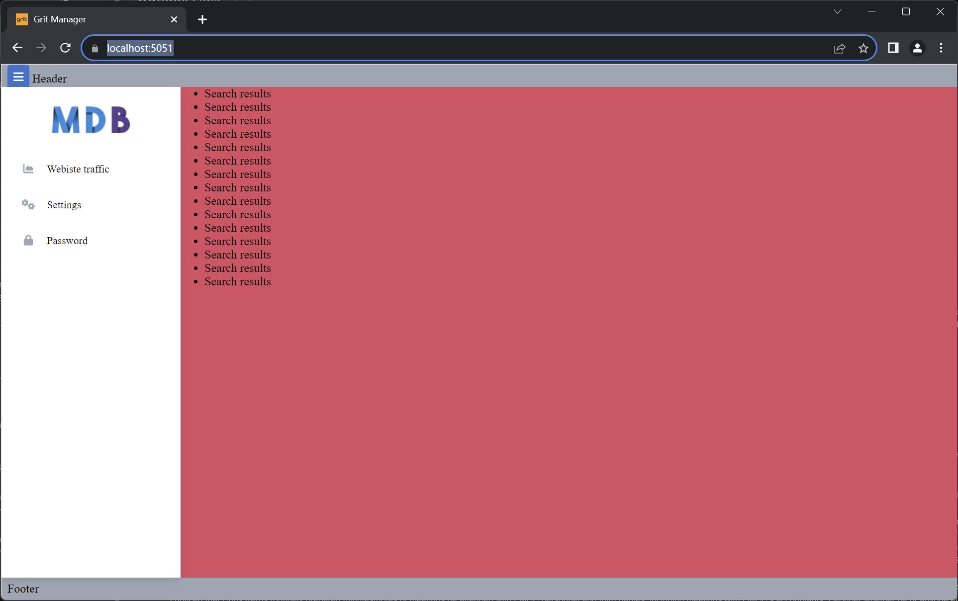
When I click the toggle button, I would like the sidenav menu to disappear and for the main content (red) section to take the full screen width. If I click the toggle button again, I would like the sidenav to appear and for the content (red) section to shrink to accommodate.
Your sidenav does all of this nicely in your examples on your website, but only seems to work if the sidenav is the full height of the screen. My design requirement is that the header and footer be full width and that the sidenav perform as yours does but inside the confines of the header and footer, ie, not extending over them.
I hope this message provides a better explanation than I did before. Thank you again for your help!!
Kamila Pieńkowska staff commented 2 years ago
Then you need to fiddle a little more with CSS.
Here is a more adjusted example: https://mdbootstrap.com/snippets/standard/kpienkowska/5645847
shrensky priority commented 2 years ago
Thank you again for your assistance. Your adjusted example gave me enough to go on, and I was able to get the result I wanted.

You did not provide CSS and JS so I've prepared a new example: https://mdbootstrap.com/snippets/standard/kpienkowska/5642293
FREE CONSULTATION
Hire our experts to build a dedicated project. We'll analyze your business requirements, for free.
Resolved
- ForumUser: Priority
- Premium support: Yes
- Technology: MDB Standard
- MDB Version: MDB5 6.4.1
- Device: PC
- Browser: Chrome
- OS: Windows
- Provided sample code: No
- Provided link: No