Topic: Fix styling of material select components

If a selection is disabled in the scripts section, it should also be greyed out when being selected (by default). The current styling behaviour shows labels like "Choose country" in black text color, although it should be grey, as any other input component is styled.

Hi there again,
We'll discuss it with our dev team and make the needed changes in one of the next releases. Thanks for Your suggestions.
Best regards
Hi Mikołaj,no, it's about using an entry as a placeholder / label.Labels and placeholder are always greyed out, also in all of your other components.To use a label or component with the select component, it is necessary to use the following parameters
{ text: 'Choose your option', value: null, disabled: true, selected: true },
"Choose your option" is a placeholder / label and is not selectable. Thus it should be greyed out.
Example from the material.io guidelines:
Hi there,
I'm still not sure about that issue.
We do follow the guidelines. Please add the disabled prop globally to the select component. Then the select will become inactive, so it's all greyed out as You want. Isn't it what You're talking about?
Best regards
Mikołaj Smoleński staff commented 7 years ago
Also, all disabled options are grayed out in the list. The option in the input can't be grayed out till the whole select component is not disabled.
In our opinion, the styling is correct.
Could you then please explain, why you do not follow the material.io guidelines, as for all the other components? https://material.io/design/components/menus.html#exposed-dropdown-menu (see "Behaviour")
Examples from material.io web components team: https://material-components.github.io/material-components-web-catalog/#/component/select
In addition we would like to know, why all the other placeholders in the input component are greyed out. They follow the same behaviour as the disabled dropdown option mentioned above.
Hi there again,
In our opinion, the styling is correct. Here are the basic assumptions for disabling select:
If You want to disable the input completely use the prop disabled, like this:
<mdb-select disabled :options="disabledOptions" />
To disable each option, use the key disabled with true value in the data array, as in the following example:
basicOptions: [
    { text: 'Choose your option', value: null, disabled: true, selected: true },
    { text: 'Option nr 1', value: 'Option 1' }
]
If You're disabling only the option (even the current option), the select is still active and can't be styled as inactive (grey).
Best regards

Hi there,
Could You provide more extensive information or examples? Which components are we talking about?
Best regards
Deepshore free commented 7 years ago
As mentioned in the topic, this is about the select component. You can find it here: https://mdbootstrap.com/docs/vue/forms/select/ Please compare the style of the label in input component (deactivated + default state) with the label state for inputs. https://mdbootstrap.com/docs/vue/forms/inputs/
Mikołaj Smoleński staff commented 7 years ago
As I can see here https://mdbootstrap.com/docs/vue/forms/select/#disabled the disabled state for select works correctly.
Best regards
Deepshore free commented 7 years ago
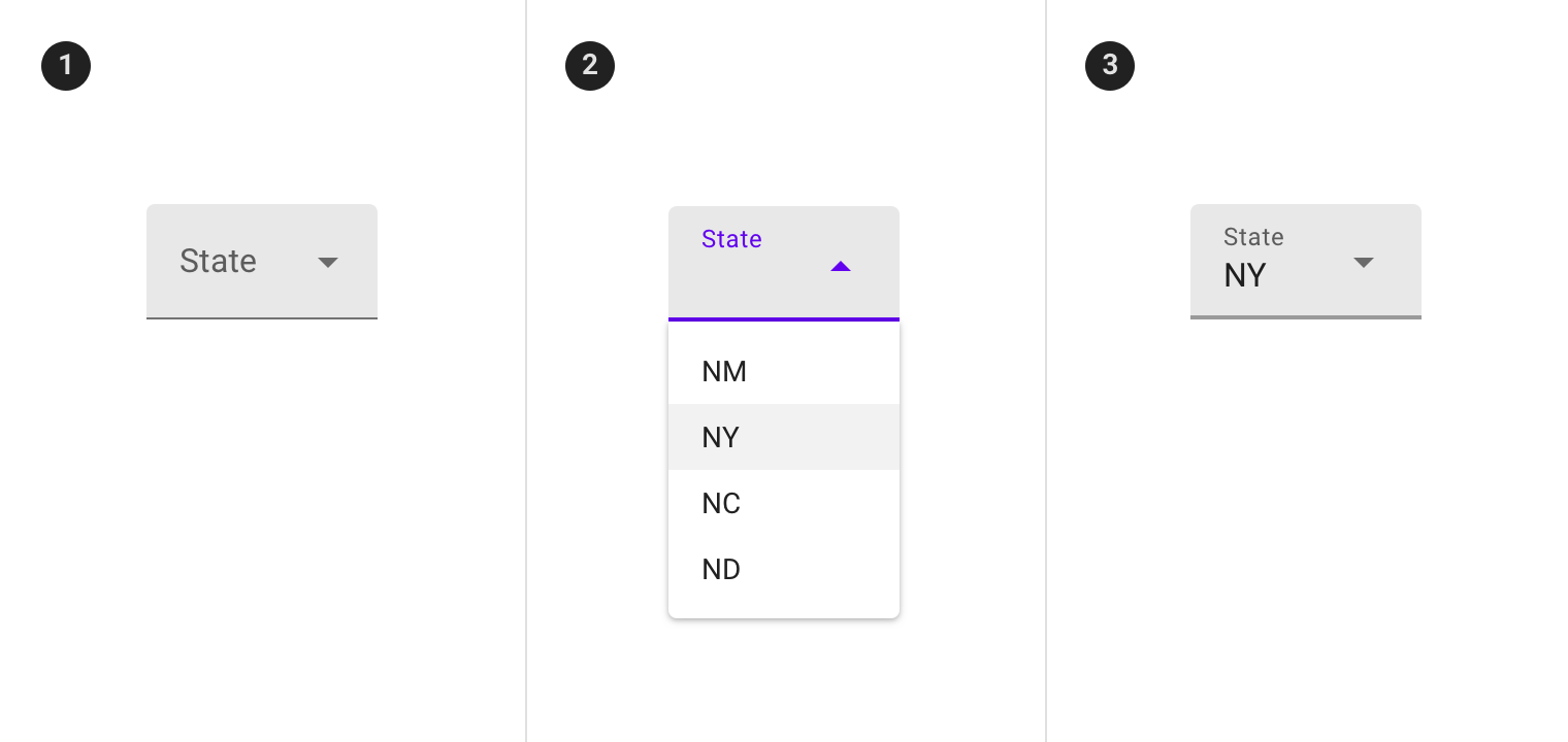
Again: This is about the styling of the field, when a default item is not selectable (this means item in script has "disabled: true, selected: true"). It is not about the behaviour, when the whole select button is being deactivated (mdb-select disabled). Example attached below.
FREE CONSULTATION
Hire our experts to build a dedicated project. We'll analyze your business requirements, for free.
Answered
- ForumUser: Free
- Premium support: No
- Technology: MDB Vue
- MDB Version: 5.1.0
- Device: Lenovo
- Browser: Chrome
- OS: Windows 10
- Provided sample code: No
- Provided link: No