Topic: MDB React Modal Header Issue

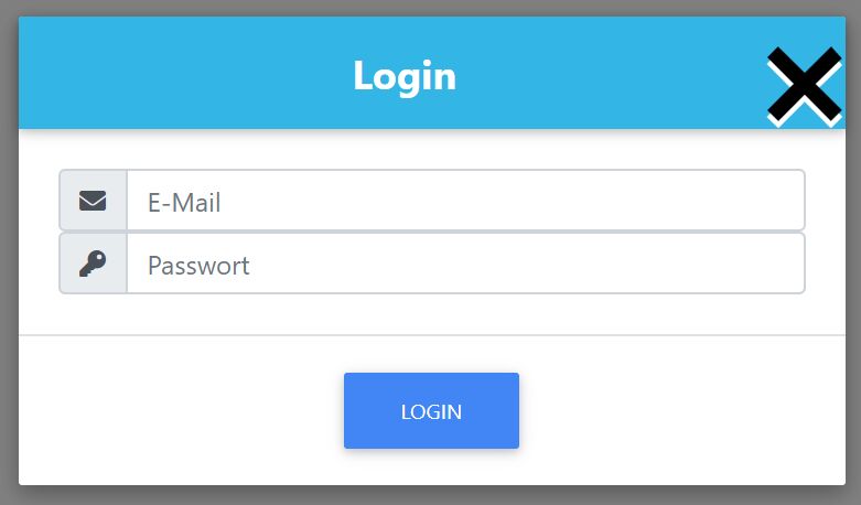
Hello, I'm currently developing a login modal and have an issue with the closing X. There are 2 X rendered, one in white and one in black.
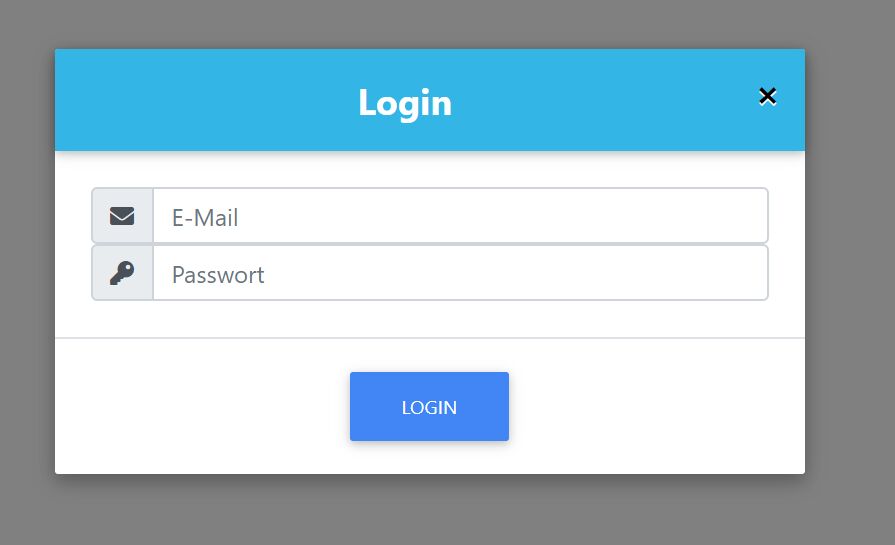
Expected behavior A white single clean closing X
Actual behavior Two closing X in black and white
Resources (screenshots, code snippets etc.)
With a CSS .close transform-scale by 4 it looks like that:
<MDBContainer>
        <MDBModal className="modal-notify modal-info text-white" isOpen={state.modalIsOpen} toggle={() => state.toggelModal()} centered>
            <MDBModalHeader className="text-center" titleClass="w-100 font-weight-bold white-text" toggle={() => state.toggelModal()}>
                Login
            </MDBModalHeader>
            <MDBModalBody className="text-center">
                <form onSubmit={(event) => state.onSubmit(event)} noValidate>
                    <div className="input-group">
                        <div className="input-group-prepend">
                            <span className="input-group-text" id="basic-addon">
                                <i className="fa fa-envelope prefix"></i>
                            </span>
                        </div>
                        <input
                            value={state.email.value}
                            onChange={(event) => state.onEmailChange(event)}
                            type="email"
                            id="defaultFormRegisterConfirmEx3"
                            className={"form-control " + ((!state.email.valid && state.email.changed) ? "is-invalid" : "")}
                            name="email"
                            placeholder="E-Mail"
                            required
                        />

                    </div>
                    <div className="input-group">
                        <div className="input-group-prepend">
                            <span className="input-group-text" id="basic-addon">
                                <i className="fa fa-key prefix"></i>
                            </span>
                        </div>
                        <input type="password" name="password" className="form-control" placeholder="Passwort" aria-label="Passwort" aria-describedby="basic-addon" onChange={(event) => state.onPasswordChange(event)} required/>
                    </div>
                </form>
            </MDBModalBody>
            <MDBModalFooter className="justify-content-center">
                <MDBBtn color="primary" onClick={() => null}>Login</MDBBtn>
            </MDBModalFooter>
        </MDBModal>
    </MDBContainer>
Best regards, DragonByte79

You can add a custom class to your component and overwrite this class.
button.close,
button.close:hover {
  color: white;
  text-shadow: none;
}
Hi,
this is a CSS style that makes a button X a border.
If you removing it there no more 'second' X.
Have a nice day.
Dragonbyte79 pro commented 6 years ago
Hi, you changed the style in the developer console and how can I achieve it via code? I don't use any css, only that MDB suggested or provided me. The x will be displayed as soon as I use the toggle attribute in And I want a white x in this case.
Thank you.
Hi, thanks for your reply. If you need more information, let me know.
Here is my complete component code
import React from 'react';
import { useObserver, useLocalStore } from 'mobx-react';
import { MDBBtn, MDBContainer, MDBModal, MDBModalHeader, MDBModalBody, MDBModalFooter } from 'mdbreact';
import { useStore } from '../../stores';

export const Login = () => {

const { appStore } = useStore();

const state = useLocalStore(() => ({
    modalIsOpen: true,
    toggelModal() {
        state.modalIsOpen = !this.modalIsOpen;
    },
    email: {
            value: '',
            valid: true,
            changed: false
        },
    password: '',
    onEmailChange(event: React.ChangeEvent<HTMLInputElement>) {
        state.email.value = event.target.value;
        state.email.changed = true;

        let valid: boolean = false;

        if (/^[a-zA-Z0-9.]+@[a-zA-Z0-9]+\.[A-Za-z]+$/.test(state.email.value)) {
            console.log('valid true');
            valid = true;
        }

        state.email.valid = valid
    },
    onPasswordChange(event: React.ChangeEvent<HTMLInputElement>) {
        state.password = event.target.value;
    },
    onSubmit(event: any){ // Wird auch bei einem Enter ausgeführt  React.FormEvent<HTMLFormElement>
        event.preventDefault();  // verhindert ein Submit bzw. Refresh einer Seite
        event.target.className = " was-validated";

        if (!state.email.valid) {
            console.error('E-Mail is invalid!');
            return;
        }

        appStore.firebaseAuth.signInWithEmailAndPassword( state.email.value, state.password);

        //formElement.submit();
    }
}));


return useObserver (() => (
    <>
    <MDBContainer>
        <MDBModal className="modal-notify modal-info text-white" isOpen={state.modalIsOpen} toggle={() => state.toggelModal()} centered>
            <MDBModalHeader className="text-center" titleClass="w-100 font-weight-bold white-text" toggle={() => state.toggelModal()}>
                Login
            </MDBModalHeader>
            <MDBModalBody className="text-center">
                <form onSubmit={(event) => state.onSubmit(event)} noValidate>
                    <div className="input-group">
                        <div className="input-group-prepend">
                            <span className="input-group-text" id="basic-addon">
                                <i className="fa fa-envelope prefix"></i>
                            </span>
                        </div>
                        <input
                            value={state.email.value}
                            onChange={(event) => state.onEmailChange(event)}
                            type="email"
                            id="defaultFormRegisterConfirmEx3"
                            className={"form-control " + ((!state.email.valid && state.email.changed) ? "is-invalid" : "")}
                            name="email"
                            placeholder="E-Mail"
                            required
                        />

                    </div>
                    <div className="input-group">
                        <div className="input-group-prepend">
                            <span className="input-group-text" id="basic-addon">
                                <i className="fa fa-key prefix"></i>
                            </span>
                        </div>
                        <input type="password" name="password" className="form-control" placeholder="Passwort" aria-label="Passwort" aria-describedby="basic-addon" onChange={(event) => state.onPasswordChange(event)} required/>
                    </div>
                </form>
            </MDBModalBody>
            <MDBModalFooter className="justify-content-center">
                <MDBBtn color="primary" onClick={() => null}>Login</MDBBtn>
            </MDBModalFooter>
        </MDBModal>
    </MDBContainer>
</>
    )
);
}
From my index.tsx I import only these css:
import '@fortawesome/fontawesome-free/css/all.min.css';
import 'bootstrap-css-only/css/bootstrap.min.css';
import 'mdbreact/dist/css/mdb.css';
My Package.json with modified MDB Token (for Forum only):
{
    "name": "gasstation-app",
    "version": "0.1.0",
    "private": true,
    "dependencies": {
    "@apollo/client": "^3.0.0-beta.35",
    "@testing-library/jest-dom": "^4.2.4",
    "@testing-library/react": "^9.3.2",
    "@testing-library/user-event": "^7.1.2",
    "@types/history": "^4.7.5",
    "@types/jest": "^24.0.24",
    "@types/node": "^12.12.21",
    "@types/react": "^16.9.16",
    "@types/react-dom": "^16.9.4",
    "firebase": "^7.8.2",
    "history": "^4.10.1",
    "mdbreact": "git+https://oauth2:xxx@git.mdbootstrap.com/mdb/react/re-pro.git",
    "mobx": "^5.15.1",
    "mobx-react": "^6.1.4",
    "mobx-react-router": "^4.1.0",
    "mobx-state-tree": "^3.15.0",
    "react": "^16.12.0",
    "react-dom": "^16.12.0",
    "react-router": "^5.1.2",
    "react-router-dom": "^5.1.2",
    "react-scripts": "3.3.0",
    "typescript": "~3.7.2"
  },
    "scripts": {
    "start": "react-scripts start",
    "build": "react-scripts build",
    "test": "react-scripts test",
    "eject": "react-scripts eject"
  },
    "eslintConfig": {
    "extends": "react-app"
  },
    "browserslist": {
    "production": [
      ">0.2%",
      "not dead",
      "not op_mini all"
    ],
     "development": [
     "last 1 chrome version",
     "last 1 firefox version",
     "last 1 safari version"
   ]
  },
 "devDependencies": {
    "@types/react-router": "^5.1.4",
    "@types/react-router-dom": "^5.1.3"
  }
}
FREE CONSULTATION
Hire our experts to build a dedicated project. We'll analyze your business requirements, for free.
Answered
- ForumUser: Pro
- Premium support: No
- Technology: MDB React
- MDB Version: 4.25.2
- Device: PC
- Browser: Chrome
- OS: Windows 10
- Provided sample code: No
- Provided link: No
Piotr Glejzer staff commented 6 years ago
I need more code to function, states, and other stuff. I change our modal-info and I don't see a problem with that.