Bootstrap grid
In this section, you can learn about options for structuring your pages with MDB, including global styles, required scaffolding, grid system, and more.
MDB includes several components and options for laying out your project, including wrapping containers, a powerful grid system, a flexible media object, and responsive utility classes.
Containers
Containers are the most basic layout element in Bootstrap and are required when using our default grid system. Choose from a responsive, fixed-width container (meaning its max-width changes at each breakpoint) or fluid-width (meaning it’s 100% wide all the time).
While containers can be nested, most layouts do not require a nested container.
Regular container
<div class="container">
  <!-- Content here -->
</div>
Fluid container
Use .container-fluid for a full-width container, spanning the entire width of the viewport.
<div class="container-fluid">
  <!-- Content here -->
</div>
Responsive breakpoints
Since Bootstrap is developed to be mobile first, we use a handful of media queries to create sensible breakpoints for our layouts and interfaces. These breakpoints are mostly based on minimum viewport widths and allow us to scale up elements as the viewport changes.
Bootstrap primarily uses the following media query ranges—or breakpoints—in our source Sass files for our layout, grid system, and components.
// Extra small devices (portrait phones, less than 576px)
// No media query since this is the default in Bootstrap

// Small devices (landscape phones, 576px and up)
@media (min-width: 576px) { ... }

// Medium devices (tablets, 768px and up)
@media (min-width: 768px) { ... }

// Large devices (desktops, 992px and up)
@media (min-width: 992px) { ... }

// Extra large devices (large desktops, 1200px and up)
@media (min-width: 1200px) { ... }
We occasionally use media queries that go in the other direction (the given screen size or smaller):
// Extra small devices (portrait phones, less than 576px)
@media (max-width: 575px) { ... }

// Small devices (landscape phones, less than 768px)
@media (max-width: 767px) { ... }

// Medium devices (tablets, less than 992px)
@media (max-width: 991px) { ... }

// Large devices (desktops, less than 1200px)
@media (max-width: 1199px) { ... }

// Extra large devices (large desktops)
// No media query since the extra-large breakpoint has no upper bound on its width
Grid system
Bootstrap includes a powerful mobile-first grid system for building layouts of all shapes and sizes. It’s based on a 12 column layout and has multiple tiers, one for each media query range. You can use it with Sass mixins or our predefined classes.
How it works
At a high level, here’s how the grid system works:
- Containers provide a means to center your site’s contents. Use
.containerfor fixed width or.container-fluidfor full width. - Rows are horizontal groups of columns that ensure your columns are lined up properly. We use the negative margin method on
.rowto ensure all your content is aligned properly down the left side. - Content should be placed within columns, and only columns may be immediate children of rows.
- Thanks to flexbox, grid columns without a set width will automatically layout with equal widths. For example, four instances of
.col-smwill each automatically be 25% wide for small breakpoints. - Column classes indicate the number of columns you’d like to use out of the possible 12 per row. So, if you want three equal-width columns, you can use
.col-sm-4. - Column
widths are set in percentages, so they’re always fluid and sized relative to their parent element. - Columns have horizontal
paddingto create the gutters between individual columns, however, you can remove themarginfrom rows andpaddingfrom columns with.no-gutterson the.row. - There are five grid tiers, one for each responsive breakpoint: all breakpoints (extra small), small, medium, large, and extra large.
- Grid tiers are based on minimum widths, meaning they apply to that one tier and all those above it (e.g.,
.col-sm-4applies to small, medium, large, and extra large devices). - You can use predefined grid classes or Sass mixins for more semantic markup.
Quick start example
<div class="container">
  <div class="row">

    <div class="col">
      One of three columns
    </div>

    <div class="col">
      One of three columns
    </div>

    <div class="col">
      One of three columns
    </div>

  </div>
</div>
The above example creates three equal-width columns on small, medium, large, and extra large devices using our predefined grid classes. Those columns are centered in the page with the parent .container.
Grid options
While Bootstrap uses ems or rems for defining most sizes, pxs are used for grid breakpoints and container widths. This is because the viewport width is in pixels and does not change with the font size.
|
Extra small
<576px |
Small
≥576px |
Medium
≥768px |
Large
≥992px |
Extra large
≥1200px |
|
|---|---|---|---|---|---|
| Grid behavior | Horizontal at all times | Collapsed to start, horizontal above breakpoints | |||
| Container width | None (auto) | 540px | 720px | 960px | 1140px |
| Class prefix | .col- |
.col-sm- |
.col-md- |
.col-lg- |
.col-xl- |
| # of columns | 12 | ||||
| Gutter width | 1.875rem / 30px (15px on each side of a column) | ||||
| Nestable | Yes | ||||
| Offsets | Yes | ||||
| Column ordering | Yes | ||||
Auto-layout columns
Utilize breakpoint-specific column classes for equal-width columns. Add any number of unit-less classes for each breakpoint you need and every column will be the same width.
Equal-width
For example, here are two grid layouts that apply to every device and viewport, from xs to xl.
<div class="container">
  <div class="row">
    <div class="col">
      1 of 2
    </div>
    <div class="col">
      1 of 2
    </div>
  </div>
  <div class="row">
    <div class="col">
      1 of 3
    </div>
    <div class="col">
      1 of 3
    </div>
    <div class="col">
      1 of 3
    </div>
  </div>
</div>
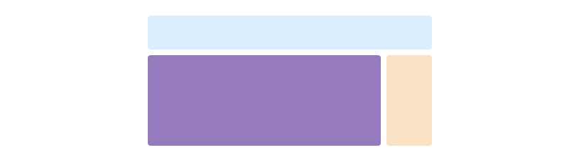
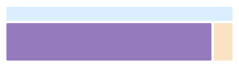
Setting one column width
Auto-layout for flexbox grid columns also means you can set the width of one column and the others will automatically resize around it. You may use predefined grid classes (as shown below), grid mixins, or inline widths. Note that the other columns will resize no matter the width of the center column.
<div class="container">
    <div class="row">
        <div class="col">
            1 of 3
        </div>
        <div class="col-6">
            2 of 3 (wider)
        </div>
        <div class="col">
            3 of 3
        </div>
    </div>
    <div class="row">
        <div class="col">
            1 of 3
        </div>
        <div class="col-5">
            2 of 3 (wider)
        </div>
        <div class="col">
            3 of 3
        </div>
    </div>
</div>
Variable width content
Using the col-{breakpoint}-auto classes, columns can size itself based on the natural width of its content. This is super handy with single line content like inputs, numbers, etc. This, in conjunction with horizontal alignment classes, is very useful for centering layouts with uneven column sizes as viewport width changes.
<div class="container">
    <div class="row justify-content-md-center">
        <div class="col col-lg-2">
            1 of 3
        </div>
        <div class="col-12 col-md-auto">
            Variable width content
        </div>
        <div class="col col-lg-2">
            3 of 3
        </div>
    </div>
    <div class="row">
        <div class="col">
            1 of 3
        </div>
        <div class="col-12 col-md-auto">
            Variable width content
        </div>
        <div class="col col-lg-2">
            3 of 3
        </div>
    </div>
</div>
Equal-width multi-row
Create equal-width columns that span multiple rows by inserting a .w-100 where you want the columns to break to a new line. Make the breaks responsive by mixing the .w-100 with some responsive display utilities.
<div class="row">
    <div class="col">
        col
    </div>
    <div class="col">
        col
    </div>
    <div class="w-100"></div>
    <div class="col">
        col
    </div>
    <div class="col">
        col
    </div>
</div>
Responsive classes
Bootstrap’s grid includes five tiers of predefined classes for building complex responsive layouts. Customize the size of your columns on extra small, small, medium, large, or extra large devices however you see fit.
All breakpoints
For grids that are the same from the smallest of devices to the largest, use the .col and .col-* classes. Specify a numbered class when you need a particularly sized column; otherwise, feel free to stick to .col.
<div class="row">
    <div class="col">
        col
    </div>
    <div class="col">
        col
    </div>
    <div class="col">
        col
    </div>
    <div class="col">
        col
    </div>
</div>
<div class="row">
    <div class="col-8">
        col-8
    </div>
    <div class="col-4">
        col-4
    </div>
</div>
Stacked to horizontal
Using a single set of .col-sm-* classes, you can create a basic grid system that starts out stacked on extra small devices before becoming horizontal on desktop (medium) devices.
<div class="row">
    <div class="col-sm-8">
        col-sm-8
    </div>
    <div class="col-sm-4">
        col-sm-4
    </div>
</div>
<div class="row">
    <div class="col-sm">
        col-sm
    </div>
    <div class="col-sm">
        col-sm
    </div>
    <div class="col-sm">
        col-sm
    </div>
</div>
Mix and match
Don’t want your columns to simply stack in some grid tiers? Use a combination of different classes for each tier as needed. See the example below for a better idea of how it all works.
<!-- Stack the columns on mobile by making one full-width and the other half-width -->
<div class="row">
    <div class="col col-md-8">
        .col .col-md-8
    </div>
    <div class="col-6 col-md-4">
        .col-6 .col-md-4
    </div>
</div>

<!-- Columns start at 50% wide on mobile and bump up to 33.3% wide on desktop -->
<div class="row">
    <div class="col-6 col-md-4">
        .col-6 .col-md-4
    </div>
    <div class="col-6 col-md-4">
        .col-6 .col-md-4
    </div>
    <div class="col-6 col-md-4">
        .col-6 .col-md-4
    </div>
</div>

<!-- Columns are always 50% wide, on mobile and desktop -->
<div class="row">
    <div class="col-6">
        .col-6
    </div>
    <div class="col-6">
        .col-6
    </div>
</div>
Alignment
Use flexbox alignment utilities to vertically and horizontally align columns.
Vertical alignment
For grids that are the same from the smallest of devices to the largest, use the .col and .col-* classes. Specify a numbered class when you need a particularly sized column; otherwise, feel free to stick to .col.
<div class="container">
    <div class="row align-items-start">
        <div class="col">
            One of three columns
        </div>
        <div class="col">
            One of three columns
        </div>
        <div class="col">
            One of three columns
        </div>
    </div>
    <div class="row align-items-center">
        <div class="col">
            One of three columns
        </div>
        <div class="col">
            One of three columns
        </div>
        <div class="col">
            One of three columns
        </div>
    </div>
    <div class="row align-items-end">
        <div class="col">
            One of three columns
        </div>
        <div class="col">
            One of three columns
        </div>
        <div class="col">
            One of three columns
        </div>
    </div>
</div>
<div class="container">
    <div class="row">
        <div class="col align-self-start">
            One of three columns
        </div>
        <div class="col align-self-center">
            One of three columns
        </div>
        <div class="col align-self-end">
            One of three columns
        </div>
    </div>
</div>
Horizontal alignment
<div class="container">
    <div class="row justify-content-start">
        <div class="col-4">
            One of two columns
        </div>
        <div class="col-4">
            One of two columns
        </div>
    </div>
    <div class="row justify-content-center">
        <div class="col-4">
            One of two columns
        </div>
        <div class="col-4">
            One of two columns
        </div>
    </div>
    <div class="row justify-content-end">
        <div class="col-4">
            One of two columns
        </div>
        <div class="col-4">
            One of two columns
        </div>
    </div>
    <div class="row justify-content-around">
        <div class="col-4">
            One of two columns
        </div>
        <div class="col-4">
            One of two columns
        </div>
    </div>
    <div class="row justify-content-between">
        <div class="col-4">
            One of two columns
        </div>
        <div class="col-4">
            One of two columns
        </div>
    </div>
</div>
No gutters
The gutters between columns in our predefined grid classes can be removed with .no-gutters. This removes the negative margins from .row and the horizontal padding from all immediate children columns.
Here’s the source code for creating these styles. Note that column overrides are scoped to only the first children columns and are targeted via attribute selector. While this generates a more specific selector, column padding can still be further customized with spacing utilities.
.no-gutters {
  margin-right: 0;
  margin-left: 0;

  > .col,
  > [class*="col-"] {
    padding-right: 0;
    padding-left: 0;
  }
}
In practice, here’s how it looks. Note you can continue to use this with all other predefined grid classes (including column widths, responsive tiers, reorders, and more).
<div class="row no-gutters">
    <div class="col-12 col-sm-6 col-md-8">
        .col-12 .col-sm-6 .col-md-8
    </div>
    <div class="col-6 col-md-4">
        .col-6 .col-md-4
    </div>
</div>
Column wrapping
If more than 12 columns are placed within a single row, each group of extra columns will, as one unit, wrap onto a new line.
Since 9 + 4 = 13 > 12, this 4-column-wide div gets wrapped onto a new line as one contiguous unit.
Subsequent columns continue along the new line.
<div class="row">
    <div class="col-9">
        .col-9
    </div>
    <div class="col-4">
        .col-4<br>
        Since 9 + 4 = 13 > 12, this 4-column-wide div gets wrapped onto a new line as one contiguous unit.
    </div>
    <div class="col-6">
        .col-6<br>
        Subsequent columns continue along the new line.
    </div>
</div>
Column resets
With the handful of grid tiers available, you’re bound to run into issues where, at certain breakpoints, your columns don’t clear quite right as one is taller than the other. To fix that, use a combination of a .clearfix and our responsive utility classes.
<div class="row">
    <div class="col-6 col-sm-3">
        .col-6 .col-sm-3
    </div>
    <div class="col-6 col-sm-3">
        .col-6 .col-sm-3
    </div>

    <!-- Add the extra clearfix for only the required viewport -->
    <div class="clearfix hidden-sm-up"></div>

    <div class="col-6 col-sm-3">
        .col-6 .col-sm-3
    </div>
    <div class="col-6 col-sm-3">
        .col-6 .col-sm-3
    </div>
</div>
In addition to column clearing at responsive breakpoints, you may need to reset offsets, pushes, or pulls. See this in action in the grid example.
<div class="row">
    <div class="col-sm-5 col-md-6">
        .col-sm-5 .col-md-6
    </div>
    <div class="col-sm-5 offset-sm-2 col-md-6 offset-md-0">
        .col-sm-5 .offset-sm-2 .col-md-6 .offset-md-0
    </div>
</div>

<div class="row">
    <div class="col-sm-6 col-md-5 col-lg-6">
        .col.col-sm-6.col-md-5.col-lg-6
    </div>
    <div class="col-sm-6 col-md-5 offset-md-2 col-lg-6 offset-lg-0">
        .col-sm-6 .col-md-5 .offset-md-2 .col-lg-6 .offset-lg-0
    </div>
</div>
Reordering
Flex order
Use flexbox utilities for controlling the visual order of your content.
<div class="container">
    <div class="row">
        <div class="col flex-unordered">
            First, but unordered
        </div>
        <div class="col flex-last">
            Second, but last
        </div>
        <div class="col flex-first">
            Third, but first
        </div>
    </div>
</div>
Offsetting columns
Move columns to the right using .offset-md-* classes. These classes increase the left margin of a column by * columns. For example, .offset-md-4 moves .col-md-4 over four columns.
<div class="row">
    <div class="col-md-4">
        .col-md-4
    </div>
    <div class="col-md-4 offset-md-4">
        .col-md-4 .offset-md-4
    </div>
</div>
<div class="row">
    <div class="col-md-3 offset-md-3">
        .col-md-3 .offset-md-3
    </div>
    <div class="col-md-3 offset-md-3">
        .col-md-3 .offset-md-3
    </div>
</div>
<div class="row">
    <div class="col-md-6 offset-md-3">
        .col-md-6 .offset-md-3
    </div>
</div>
Push and pull
Easily change the order of our built-in grid columns with .push-md-* and .pull-md-* modifier classes.
<div class="row">
    <div class="col-md-9 push-md-3">
        .col-md-9 .push-md-3
    </div>
    <div class="col-md-3 pull-md-9">
        .col-md-3 .pull-md-9
    </div>
</div>
Nesting
To nest your content with the default grid, add a new .row and set of .col-sm-* columns within an existing .col-sm-* column. Nested rows should include a set of columns that add up to 12 or fewer (it is not required that you use all 12 available columns).
<div class="row">
    <div class="col-sm-9">
        Level 1: .col-sm-9
        <div class="row">
            <div class="col-8 col-sm-6">
                Level 2: .col-8 .col-sm-6
            </div>
            <div class="col-4 col-sm-6">
                Level 2: .col-4 .col-sm-6
            </div>
        </div>
    </div>
</div>