
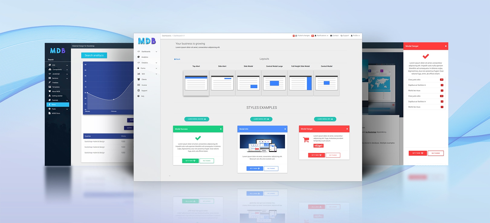
Enhanced Bootstrap Modals
Extended functionality and advanced usage. Free for personal and commercial use.
Available versions for Material Design for Bootstrap 4 or Pure Bootstrap 4 plugin without Material Design look.
Note: If you use MDB version higher than 4.3.1 (Free or Pro), Enhanced Bootstrap Modal are already part of your package.
Easily customizable, adjust size, position, and content. Automatically triggered based on rules and scoring system. Multiple examples and ready to use templates.
All fully responsive. All compatible with different browsers.
Live demo Getting started
What you can create with it?
Enhance UI of your project
Static UI elements aren't enough in modern web development. Enhanced Bootstrap Modals lets you create a dynamic and reactive environment similarly to the websites and apps of the biggest companies.
Automated Rule and Scoring System
Make your project behave like a living organism. Create your own artificial intelligence to react to user actions.
Related content system
Don't let you user look for the relevant content. Create a smart system which will always prompt the right content for the specific person.
Carts recovery system
If you didn't use abandoned cart recover system most probably you have lost a lot of money. Create a system that allows you easily start recovering abandoned transactions.
...and many more!
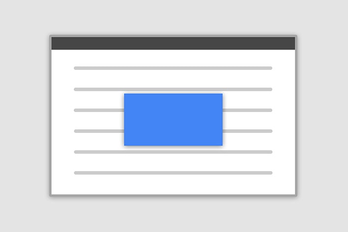
Position & Sizes
Click buttons below to launch modals demo
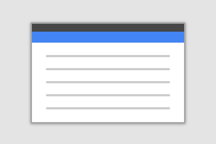
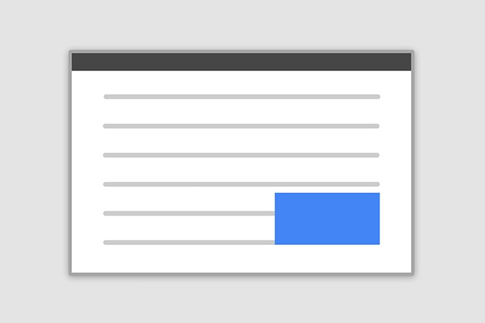
Central Modal
Size
Fluid Modal
Position
Styles examples
Modal Info
Lorem ipsum dolor sit amet, consectetur adipisicing elit. Nesciunt vero illo error eveniet cum.
Modal Warning
.jpg)
Jane
Consultant
Lorem ipsum dolor sit amet, consectetur adipisicing elit. Fuga, molestiae provident temporibus sunt earum.
Lorem ipsum dolor sit amet, consectetur adipisicing elit.
Forms Examples
Getting started
Choose your version
1. MDB - As a part of Material Design for Bootstrap Package
Note: If you use MDB version higher than 4.3.1 (Free or Pro), Enhanced Bootstrap Modal are already part of your package. You can miss "Getting Started" part and jump directly to the documentation.
If you need something more than just Modals you can use it together with our framework and take advantage of the full power of Material Design for Bootstrap .
Learn More about MDB2. Bootstrap Plugin - As a plugin for Bootstrap 4 with no MDB dependency and no Material Design look
You don't like or don't need Material Design? No problem. Instead of MDB use our plugin written for the newest Bootstrap 4.
| Features | MDB Package | Bootstrap Plugin |
|---|---|---|
| Requires Bootstrap | Yes | Yes |
| Requires jQuery | Yes | Yes |
| Requires MDB | Yes | No |
| Free for personal use | ||
| Free for commercial use | ||
Get it |
Direct download GitHub |
Direct download GitHub |
Basic usage
Contents
Basic example
Below is a most basic Modal example with a button triggering Modal via data attribute.
Click the button to trigger Modal.
<!-- Button trigger modal -->
<button type="button" class="btn btn-primary btn-lg" data-toggle="modal" data-target="#basicExample">
Launch demo modal
</button>
<!-- Modal -->
<div class="modal fade" id="basicExample" tabindex="-1" role="dialog" aria-labelledby="myModalLabel" aria-hidden="true">
<div class="modal-dialog" role="document">
<!--Content-->
<div class="modal-content">
<!--Header-->
<div class="modal-header">
<button type="button" class="close" data-dismiss="modal" aria-label="Close">
<span aria-hidden="true">×</span>
</button>
<h4 class="modal-title w-100" id="myModalLabel">Modal title</h4>
</div>
<!--Body-->
<div class="modal-body">
...
</div>
<!--Footer-->
<div class="modal-footer">
<button type="button" class="btn btn-secondary" data-dismiss="modal">Close</button>
<button type="button" class="btn btn-primary">Save changes</button>
</div>
</div>
<!--/.Content-->
</div>
</div>
<!-- Modal -->
Position and size
To change the position or size of the modal add one of the following classes to the .modal-dialog div.
Central modal
Note: Medium size is a default value, so there isn't a dedicated class for it.
.modal-sm Small Modal
.modal-lg Large Modal
.modal-fluid Full Width Modal
Code example:
<!-- Central Modal Small -->
<div class="modal fade" id="centralModalSm" tabindex="-1" role="dialog" aria-labelledby="myModalLabel" aria-hidden="true">
    <div class="modal-dialog modal-sm" role="document">
Side modal
Note: To make it works properly, apart from adding a class for position, you also need add special class .side-modal to .modal-dialog div.
Note 2: If you want to change a direction of modal animation add class .top, .right, bottom or .left to the .modal div.
.modal-side + .modal-top-right Top Right
.modal-side + .modal-top-left Top Left
.modal-side + .modal-bottom-right Bottom Right
.modal-side + .modal-bottom-right Bottom Left
Code example:
<div class="modal fade right" id="centralModalSm" tabindex="-1" role="dialog" aria-labelledby="myModalLabel" aria-hidden="true">
    <div class="modal-dialog modal-side modal-top-right" role="document">
Fluid modal
Note: As in the previous example - to make it works properly, apart from adding a class for position, you also need add special class .modal-full-height to .modal-dialog div.
Note 2: If you want to change a direction of modal animation add class .top, .right, bottom or .left to the .modal div.
.modal-full-height + .modal-right Right
.modal-full-height + .modal-left Left
.modal-full-height + .modal-bottom Bottom
.modal-full-height + .modal-top Top
Code example:
<!-- Full Height Modal Right -->
<div class="modal fade right" id="fullHeightModalRight" tabindex="-1" role="dialog" aria-labelledby="myModalLabel" aria-hidden="true">
    <div class="modal-dialog modal-full-height modal-right" role="document">
Frame modal
Note: As in the previous examples - to make it works properly, apart from adding a class for position, you also need add special class .modal-frame to .modal-dialog div.
Note 2: If you want to change a direction of modal animation add class .top, .right, bottom or .left to the .modal div.
.modal-frame + .modal-bottom Bottom
.modal-frame + .modal-top Top
Code example:
<!-- Frame Modal Bottom -->
<div class="modal fade bottom" id="frameModalBottom" tabindex="-1" role="dialog" aria-labelledby="myModalLabel" aria-hidden="true">
<div class="modal-dialog modal-frame modal-bottom" role="document">
Style
By using our predefined modal styles you can add some emotional weight to your information, ranging from a simple warning to critical system failure or from an operation success to a neutral information.
It requires 2 simple steps
Step 1: Add class .modal-notify to the .modal-dialog div.
Step 2: Add class .success, .info, .danger or .warning to the .modal-dialog div.
These classes will affect following elements:
-
.modal-header -
.badge -
.fa-4x- which stand for large icon -
.btn-primary-modal&btn-secondary-modal- 2 dedicated form modal button classes. If you want to use a classic Bootstrap buttons, just remove-modalpostfix (for example:.btn-primary,btn-danger).
Success modal
.modal-notify + .success
Code example:
<!-- Central Modal Medium Success -->
<div class="modal fade" id="centralModalSuccess" tabindex="-1" role="dialog" aria-labelledby="myModalLabel" aria-hidden="true">
<div class="modal-dialog modal-notify modal-success" role="document">
<!--Content-->
<div class="modal-content">
<!--Header-->
<div class="modal-header">
<p class="heading lead">Modal Success</p>
<button type="button" class="close" data-dismiss="modal" aria-label="Close">
<span aria-hidden="true" class="white-text">×</span>
</button>
</div>
<!--Body-->
<div class="modal-body">
<div class="text-center">
<i class="fa fa-check fa-4x mb-1 animated rotateIn"></i>
<p>Lorem ipsum dolor sit amet, consectetur adipisicing elit. Impedit iusto nulla aperiam blanditiis ad consequatur in dolores culpa, dignissimos, eius non possimus fugiat. Esse ratione fuga, enim,
ab officiis totam.</p>
</div>
</div>
<!--Footer-->
<div class="modal-footer justify-content-center">
<a type="button" class="btn btn-primary-modal">Get it now <i class="fa fa-diamond ml-1"></i></a>
<a type="button" class="btn btn-outline-secondary-modal waves-effect" data-dismiss="modal">No, thanks</a>
</div>
</div>
<!--/.Content-->
</div>
</div>
<!-- Central Modal Medium Success-->
Info modal
.modal-notify + .info
Code example:
<!-- Central Modal Medium Info -->
<div class="modal fade" id="centralModalInfo" tabindex="-1" role="dialog" aria-labelledby="myModalLabel" aria-hidden="true">
<div class="modal-dialog modal-notify modal-info" role="document">
<!--Content-->
<div class="modal-content">
<!--Header-->
<div class="modal-header">
<p class="heading lead">Modal Info</p>
<button type="button" class="close" data-dismiss="modal" aria-label="Close">
<span aria-hidden="true" class="white-text">×</span>
</button>
</div>
<!--Body-->
<div class="modal-body">
<div class="text-center">
<i class="fa fa-check fa-4x mb-1 animated rotateIn"></i>
<p>Lorem ipsum dolor sit amet, consectetur adipisicing elit. Impedit iusto nulla aperiam blanditiis ad consequatur in dolores culpa, dignissimos, eius non possimus fugiat. Esse ratione fuga, enim,
ab officiis totam.</p>
</div>
</div>
<!--Footer-->
<div class="modal-footer justify-content-center">
<a type="button" class="btn btn-primary-modal">Get it now <i class="fa fa-diamond ml-1"></i></a>
<a type="button" class="btn btn-outline-secondary-modal waves-effect" data-dismiss="modal">No, thanks</a>
</div>
</div>
<!--/.Content-->
</div>
</div>
<!-- Central Modal Medium Info-->
Danger modal
.modal-notify + .danger
Code example:
<!-- Central Modal Medium Danger -->
<div class="modal fade" id="centralModalDanger" tabindex="-1" role="dialog" aria-labelledby="myModalLabel" aria-hidden="true">
<div class="modal-dialog modal-notify modal-danger" role="document">
<!--Content-->
<div class="modal-content">
<!--Header-->
<div class="modal-header">
<p class="heading lead">Modal Danger</p>
<button type="button" class="close" data-dismiss="modal" aria-label="Close">
<span aria-hidden="true" class="white-text">×</span>
</button>
</div>
<!--Body-->
<div class="modal-body">
<div class="text-center">
<i class="fa fa-check fa-4x mb-1 animated rotateIn"></i>
<p>Lorem ipsum dolor sit amet, consectetur adipisicing elit. Impedit iusto nulla aperiam blanditiis ad consequatur in dolores culpa, dignissimos, eius non possimus fugiat. Esse ratione fuga, enim,
ab officiis totam.</p>
</div>
</div>
<!--Footer-->
<div class="modal-footer justify-content-center">
<a type="button" class="btn btn-primary-modal">Get it now <i class="fa fa-diamond ml-1"></i></a>
<a type="button" class="btn btn-outline-secondary-modal waves-effect" data-dismiss="modal">No, thanks</a>
</div>
</div>
<!--/.Content-->
</div>
</div>
<!-- Central Modal Medium Danger-->
Warning modal
.modal-notify + .warning
Code example:
<!-- Central Modal Medium Warning -->
<div class="modal fade" id="centralModalWarning" tabindex="-1" role="dialog" aria-labelledby="myModalLabel" aria-hidden="true">
<div class="modal-dialog modal-notify modal-warning" role="document">
<!--Content-->
<div class="modal-content">
<!--Header-->
<div class="modal-header">
<p class="heading lead">Modal Warning</p>
<button type="button" class="close" data-dismiss="modal" aria-label="Close">
<span aria-hidden="true" class="white-text">×</span>
</button>
</div>
<!--Body-->
<div class="modal-body">
<div class="text-center">
<i class="fa fa-check fa-4x mb-1 animated rotateIn"></i>
<p>Lorem ipsum dolor sit amet, consectetur adipisicing elit. Impedit iusto nulla aperiam blanditiis ad consequatur in dolores culpa, dignissimos, eius non possimus fugiat. Esse ratione fuga, enim,
ab officiis totam.</p>
</div>
</div>
<!--Footer-->
<div class="modal-footer justify-content-center">
<a type="button" class="btn btn-primary-modal">Get it now <i class="fa fa-diamond ml-1"></i></a>
<a type="button" class="btn btn-outline-secondary-modal waves-effect" data-dismiss="modal">No, thanks</a>
</div>
</div>
<!--/.Content-->
</div>
</div>
<!-- Central Modal Medium Warning-->
Forms
You can use one of our predefined templates or create your custom form by using our Inputs elements.
Examples
Contact Form
<!--Modal: Contact form-->
<div class="modal fade" id="modalContactForm" tabindex="-1" role="dialog" aria-labelledby="myModalLabel" aria-hidden="true">
<div class="modal-dialog cascading-modal" role="document">
<!--Content-->
<div class="modal-content">
<!--Header-->
<div class="modal-header light-blue darken-3 white-text">
<button type="button" class="close waves-effect waves-light" data-dismiss="modal" aria-label="Close">
<span aria-hidden="true">×</span>
</button>
<h4 class="title"><i class="fa fa-pencil"></i> Contact form</h4>
</div>
<!--Body-->
<div class="modal-body mb-0">
<div class="md-form form-sm">
<i class="fa fa-envelope prefix"></i>
<input type="text" id="form19" class="form-control">
<label for="form19">Your name</label>
</div>
<div class="md-form form-sm">
<i class="fa fa-lock prefix"></i>
<input type="password" id="form20" class="form-control">
<label for="form20">Your email</label>
</div>
<div class="md-form form-sm">
<i class="fa fa-tag prefix"></i>
<input type="text" id="form21" class="form-control">
<label for="form21">Subject</label>
</div>
<div class="md-form form-sm">
<i class="fa fa-pencil prefix"></i>
<textarea type="text" id="form8" class="md-textarea mb-0"></textarea>
<label for="form8">Your message</label>
</div>
<div class="text-center mt-1-half">
<button class="btn btn-info mb-2">Send <i class="fa fa-send ml-1"></i></button>
</div>
</div>
</div>
<!--/.Content-->
</div>
</div>
<!--Modal: Contact form-->
Login / Register Form
<!--Modal: Login / Register Form-->
<div class="modal fade" id="modalLRForm" tabindex="-1" role="dialog" aria-labelledby="myModalLabel" aria-hidden="true">
    <div class="modal-dialog cascading-modal" role="document">
        <!--Content-->
        <div class="modal-content">

            <!--Modal cascading tabs-->
            <div class="modal-c-tabs">

                <!-- Nav tabs -->
                <ul class="nav nav-tabs tabs-2 light-blue darken-3" role="tablist">
                    <li class="nav-item">
                        <a class="nav-link active" data-toggle="tab" href="#panel7" role="tab"><i class="fa fa-user mr-1"></i> Login</a>
                    </li>
                    <li class="nav-item">
                        <a class="nav-link" data-toggle="tab" href="#panel8" role="tab"><i class="fa fa-user-plus mr-1"></i> Register</a>
                    </li>
                </ul>

                <!-- Tab panels -->
                <div class="tab-content">
                    <!--Panel 7-->
                    <div class="tab-pane fade in show active" id="panel7" role="tabpanel">

                        <!--Body-->
                        <div class="modal-body mb-1">
                            <div class="md-form form-sm">
                                <i class="fa fa-envelope prefix"></i>
                                <input type="text" id="form22" class="form-control">
                                <label for="form22">Your email</label>
                            </div>

                            <div class="md-form form-sm">
                                <i class="fa fa-lock prefix"></i>
                                <input type="password" id="form23" class="form-control">
                                <label for="form23">Your password</label>
                            </div>
                            <div class="text-center mt-2">
                                <button class="btn btn-info">Log in <i class="fa fa-sign-in ml-1"></i></button>
                            </div>
                        </div>
                        <!--Footer-->
                        <div class="modal-footer display-footer">
                            <div class="options text-center text-md-right mt-1">
                                <p>Not a member? <a href="#" class="blue-text">Sign Up</a></p>
                                <p>Forgot <a href="#" class="blue-text">Password?</a></p>
                            </div>
                            <button type="button" class="btn btn-outline-info waves-effect ml-auto" data-dismiss="modal">Close <i class="fa fa-times-circle ml-1"></i></button>
                        </div>

                    </div>
                    <!--/.Panel 7-->

                    <!--Panel 8-->
                    <div class="tab-pane fade" id="panel8" role="tabpanel">

                        <!--Body-->
                        <div class="modal-body">
                            <div class="md-form form-sm">
                                <i class="fa fa-envelope prefix"></i>
                                <input type="text" id="form24" class="form-control">
                                <label for="form24">Your email</label>
                            </div>

                            <div class="md-form form-sm">
                                <i class="fa fa-lock prefix"></i>
                                <input type="password" id="form25" class="form-control">
                                <label for="form25">Your password</label>
                            </div>

                            <div class="md-form form-sm">
                                <i class="fa fa-lock prefix"></i>
                                <input type="password" id="form26" class="form-control">
                                <label for="form26">Repeat password</label>
                            </div>

                            <div class="text-center form-sm mt-2">
                                <button class="btn btn-info">Sign up <i class="fa fa-sign-in ml-1"></i></button>
                            </div>

                            <fieldset class="additional-option">
                                <input type="checkbox" id="checkbox21">
                                <label for="checkbox21">Subscribe me to the newsletter</label>
                            </fieldset>

                        </div>
                        <!--Footer-->
                        <div class="modal-footer">
                            <div class="options text-right">
                                <p class="pt-1">Already have an account? <a href="#" class="blue-text">Log In</a></p>
                            </div>
                            <button type="button" class="btn btn-outline-info waves-effect ml-auto" data-dismiss="modal">Close <i class="fa fa-times-circle ml-1"></i></button>
                        </div>
                    </div>
                    <!--/.Panel 8-->
                </div>

            </div>
        </div>
        <!--/.Content-->
    </div>
</div>
<!--Modal: Login / Register Form-->
Subscription Form
<!--Modal: Subscription From-->
<div class="modal fade" id="modalSubscription" tabindex="-1" role="dialog" aria-labelledby="myModalLabel" aria-hidden="true">
<div class="modal-dialog cascading-modal" role="document">
<!--Content-->
<div class="modal-content">
<!--Header-->
<div class="modal-header light-blue darken-3 white-text">
<button type="button" class="close waves-effect waves-light" data-dismiss="modal" aria-label="Close">
<span aria-hidden="true">×</span>
</button>
<h4 class="title"><i class="fa fa-newspaper-o"></i> Subscription form</h4>
</div>
<!--Body-->
<div class="modal-body mb-0">
<div class="md-form form-sm">
<i class="fa fa-lock prefix"></i>
<input type="password" id="form27" class="form-control">
<label for="form27">Your name</label>
</div>
<div class="md-form form-sm">
<i class="fa fa-envelope prefix"></i>
<input type="text" id="form28" class="form-control">
<label for="form28">Your email</label>
</div>
<div class="text-center mt-1-half">
<button class="btn btn-info mb-1">Submit <i class="fa fa-check ml-1"></i></button>
</div>
</div>
</div>
<!--/.Content-->
</div>
</div>
<!--Modal: Subscription From-->
Login with Avatar Form
<!--Modal: Login with Avatar Form-->
<div class="modal fade" id="modalLoginAvatar" tabindex="-1" role="dialog" aria-labelledby="myModalLabel" aria-hidden="true">
    <div class="modal-dialog cascading-modal modal-avatar modal-sm" role="document">
        <!--Content-->
        <div class="modal-content">

            <!--Header-->
            <div class="modal-header">
                <img src="https://mdbootstrap.com/img/Photos/Avatars/img%20%281%29.jpg" class="rounded-circle img-responsive">
            </div>
            <!--Body-->
            <div class="modal-body text-center mb-1">

                <h5 class="mt-1 mb-2">Maria Doe</h5>

                <div class="md-form ml-0 mr-0">
                    <input type="password" type="text" id="form29" class="form-control ml-0">
                    <label for="form29" class="ml-0">Enter password</label>
                </div>

                <div class="text-center">
                    <button class="btn btn-cyan mt-1">Login <i class="fa fa-sign-in ml-1"></i></button>
                </div>
            </div>

        </div>
        <!--/.Content-->
    </div>
</div>
<!--Modal: Login with Avatar Form-->
Login Form
<!--Modal: Login Form-->
<div class="modal fade" id="modalLogin" tabindex="-1" role="dialog" aria-labelledby="myModalLabel" aria-hidden="true">
<div class="modal-dialog cascading-modal" role="document">
<!--Content-->
<div class="modal-content">
<!--Header-->
<div class="modal-header light-blue darken-3 white-text">
<button type="button" class="close waves-effect waves-light" data-dismiss="modal" aria-label="Close">
<span aria-hidden="true">×</span>
</button>
<h4 class="title"><i class="fa fa-user"></i> Log in</h4>
</div>
<!--Body-->
<div class="modal-body">
<div class="md-form form-sm">
<i class="fa fa-envelope prefix"></i>
<input type="text" id="form30" class="form-control">
<label for="form30">Your email</label>
</div>
<div class="md-form form-sm">
<i class="fa fa-lock prefix"></i>
<input type="password" id="form31" class="form-control">
<label for="form31">Your password</label>
</div>
<div class="text-center mt-2">
<button class="btn btn-info">Log in <i class="fa fa-sign-in ml-1"></i></button>
</div>
</div>
<!--Footer-->
<div class="modal-footer">
<div class="options text-center text-md-right mt-1">
<p>Not a member? <a href="#">Sign Up</a></p>
<p>Forgot <a href="#">Password?</a></p>
</div>
<button type="button" class="btn btn-outline-info waves-effect ml-auto" data-dismiss="modal">Close <i class="fa fa-times-circle ml-1"></i></button>
</div>
</div>
<!--/.Content-->
</div>
</div>
<!--Modal: Login Form-->
Register Form
<!--Modal: Register Form-->
<div class="modal fade" id="modalRegister" tabindex="-1" role="dialog" aria-labelledby="myModalLabel" aria-hidden="true">
<div class="modal-dialog cascading-modal" role="document">
<!--Content-->
<div class="modal-content">
<!--Header-->
<div class="modal-header light-blue darken-3 white-text">
<button type="button" class="close waves-effect waves-light" data-dismiss="modal" aria-label="Close">
<span aria-hidden="true">×</span>
</button>
<h4 class="title"><i class="fa fa-user-plus"></i> Register</h4>
</div>
<!--Body-->
<div class="modal-body">
<div class="md-form form-sm">
<i class="fa fa-envelope prefix"></i>
<input type="text" id="form32" class="form-control">
<label for="form32">Your email</label>
</div>
<div class="md-form form-sm">
<i class="fa fa-lock prefix"></i>
<input type="password" id="form33" class="form-control">
<label for="form33">Your password</label>
</div>
<div class="md-form form-sm">
<i class="fa fa-lock prefix"></i>
<input type="password" id="form34" class="form-control">
<label for="form34">Repeat password</label>
</div>
<div class="text-center mt-2">
<button class="btn btn-info">Sign up <i class="fa fa-sign-in ml-1"></i></button>
</div>
</div>
<!--Footer-->
<div class="modal-footer">
<div class="options text-center text-md-right mt-1">
<p>Already have an account? <a href="#">Log In</a></p>
</div>
<button type="button" class="btn btn-outline-info waves-effect ml-auto" data-dismiss="modal">Close <i class="fa fa-times-circle ml-1"></i></button>
</div>
</div>
<!--/.Content-->
</div>
</div>
<!--Modal: Register Form-->
Scrolling long content
When modals become too long for the user’s viewport or device, they scroll independent of the page itself. Try the demo below to see what we mean.
Using the grid
Utilize the Bootstrap grid system within a modal by nesting .container-fluid within the .modal-body. Then, use the normal grid system classes as you would anywhere else.
Varying modal content
Have a bunch of buttons that all trigger the same modal, just with slightly different contents? Use event.relatedTarget and HTML data-* attributes (possibly via jQuery) to vary the contents of the modal depending on which button was clicked. See the Modal Events docs for details on relatedTarget.
$('#exampleModal').on('show.bs.modal', function(event) {
    var button = $(event.relatedTarget) // Button that triggered the modal
    var recipient = button.data('whatever') // Extract info from data-* attributes
        // If necessary, you could initiate an AJAX request here (and then do the updating in a callback).
        // Update the modal's content. We'll use jQuery here, but you could use a data binding library or other methods instead.
    var modal = $(this)
    modal.find('.modal-title').text('New message to ' + recipient)
    modal.find('.modal-body input').val(recipient)
})
<div class="bd-example">
<button type="button" class="btn btn-primary" data-toggle="modal" data-target="#exampleModal" data-whatever="@mdo">Open modal for @mdo</button>
<button type="button" class="btn btn-primary" data-toggle="modal" data-target="#exampleModal" data-whatever="@fat">Open modal for @fat</button>
<button type="button" class="btn btn-primary" data-toggle="modal" data-target="#exampleModal" data-whatever="@getbootstrap">Open modal for @getbootstrap</button>
<div class="modal fade" id="exampleModal" tabindex="-1" role="dialog" aria-labelledby="exampleModalLabel" aria-hidden="true">
<div class="modal-dialog" role="document">
<div class="modal-content">
<div class="modal-header">
<button type="button" class="close" data-dismiss="modal" aria-label="Close">
<span aria-hidden="true">×</span>
</button>
<h4 class="modal-title" id="exampleModalLabel">New message</h4>
</div>
<div class="modal-body">
<form>
<div class="md-form">
<input type="text" class="form-control" id="recipient-name">
</div>
<div class="md-form">
<textarea type="text" id="message-text" class="md-textarea"></textarea>
</div>
</form>
</div>
<div class="modal-footer">
<button type="button" class="btn btn-secondary" data-dismiss="modal">Close</button>
<button type="button" class="btn btn-primary">Send message</button>
</div>
</div>
</div>
</div>
</div>
Remove animation
For modals that simply appear rather than fade into view, remove the .fade class from your modal markup.
<div class="modal" tabindex="-1" role="dialog" aria-labelledby="..." aria-hidden="true">
...
</div>
Dynamic heights
If the height of a modal changes while it is open, you should call $('#myModal').data('bs.modal').handleUpdate() to readjust the modal’s position in case a scrollbar appears.
Accessibility
Be sure to add role="dialog" and aria-labelledby="...", referencing the modal title, to .modal, and role="document" to the .modal-dialog itself. Additionally, you may give a
description of your modal dialog with aria-describedby on .modal.
Embedding YouTube videos
Embedding YouTube videos in modals requires additional JavaScript not in Bootstrap to automatically stop playback and more. See this helpful Stack Overflow post for more information.
Advanced usage
The modal plugin toggles your hidden content on demand, via data attributes or JavaScript. It also adds .modal-open to the <body> to override default scrolling behavior and generates a .modal-backdrop to provide a click area for dismissing shown modals when clicking outside the modal.
Via data attributes
Activate a modal without writing JavaScript. Set data-toggle="modal" on a controller element, like a button, along with a data-target="#foo" or href="#foo" to target a specific modal to toggle.
<button type="button" data-toggle="modal" data-target="#myModal">Launch modal</button>
Via JavaScript
Call a modal with id myModal with a single line of JavaScript:
$('#myModal').modal(options)
Options
Options can be passed via data attributes or JavaScript. For data attributes, append the option name to data-, as in data-backdrop="".
| Name | Type | Default | Description |
|---|---|---|---|
| backdrop | boolean or the string 'static' |
true | Includes a modal-backdrop element. Alternatively, specify static for a backdrop which doesn't close the modal on click. |
| keyboard | boolean | true | Closes the modal when escape key is pressed |
| focus | boolean | true | Puts the focus on the modal when initialized. |
| show | boolean | true | Shows the modal when initialized. |
Methods
.modal(options)
Activates your content as a modal. Accepts an optional options object.
$('#myModal').modal({
keyboard: false
})
.modal('toggle')
Manually toggles a modal. Returns to the caller before the modal has actually been shown or hidden (i.e. before the shown.bs.modal or hidden.bs.modal event occurs).
$('#myModal').modal('toggle')
.modal('show')
Manually opens a modal. Returns to the caller before the modal has actually been shown (i.e. before the shown.bs.modal event occurs).
$('#myModal').modal('show')
.modal('hide')
Manually hides a modal. Returns to the caller before the modal has actually been hidden (i.e. before the hidden.bs.modal event occurs).
$('#myModal').modal('hide')
Events
Bootstrap’s modal class exposes a few events for hooking into modal functionality. All modal events are fired at the modal itself (i.e. at the <div class="modal">).
| Event Type | Description |
|---|---|
| show.bs.modal | This event fires immediately when the show instance method is called. If caused by a click, the clicked element is available as the relatedTarget property of the event. |
| shown.bs.modal | This event is fired when the modal has been made visible to the user (will wait for CSS transitions to complete). If caused by a click, the clicked element is available as the relatedTarget property of the event. |
| hide.bs.modal | This event is fired immediately when the hide instance method has been called. |
| hidden.bs.modal | This event is fired when the modal has finished being hidden from the user (will wait for CSS transitions to complete). |
$('#myModal').on('hidden.bs.modal', function (e) {
// do something...
})
Automation and Scoring System
Apart from button click you can launch your modal on many automated ways.
By using triggers like Conditions, Scoring or Labels you can greatly improve User Experience.
You can implement all of these functionalities by using free tool "BrandFlow" created by our developers.
BrandFlow lets you manage your modals, handle conditions, create your own scoring and label system.
Learn More About BrandFlow Start TutorialConditions
Conditions are the most fundamental triggers which let you handle your modals in more sophisticated way than just a button click (which is a standard Bootstrap functionality).
To apply Condition as a trigger you need to use one of the following Variables together with Operator and assign a Value.
-
Click ID -
Click Class -
Page Path -
Form Submission -
Scroll Page % -
Scroll ID % -
Scroll Class % -
Delay Time -
Innactive Time -
Referrer -
UTM Tag
VARIABLES
-
equals -
does not equal -
contains -
does not contain -
starts with -
ends with -
greater than -
greater than or equal to -
less than -
less than or equal to
OPERATORS
EXAMPLES OF USE
If you want to launch your "Welcome Modal" only on specific page and only if user scroll at least 60% of page you set a following condition:
If page path equals https://yourwebsite.com/
& scroll page % greater than 60%
then launch Welcome Modal
If you want to launch your "Discount Modal" only if visitor came to your website from other specific website (for example from Blog, where you have bought sponsored post for your product) you set a following condition:
If refferer equals https://otherwebsite.com/
then launch Modal with 10% discount coupon
Scoring
Scoring system is a basic mechanism allowing to adjust content on the webpage according to visitors needs.
In a nutshell - for each meaning activity, a user is collecting scores, which allows measuring his engagement. Once a certain threshold is reached - system triggers actions adjusted to user engagement level.
You can create your own Scoring Type our use our predefined templates: Scoring Standard and Scoring Pro.
SCORING STANDARD
Start counting when:
- User first time visits your website
Set 1 point to the User every time he visits a new page on your website.
OR Set 10 point to the User if he spent at least 15 minutes on your website
OR Set 5 point to the User if he share on Facebook your website
SCORING PRO
Start counting when:
- User visited your Pricing Page
Set 5 point to the User if he scrolled your Pricing Page at least to the 70% of its length
OR Set 15 point to the User if he spent at least 3 minutes on your Pricing Page
EXAMPLES OF USE
If user gained 20 points of Scoring Standard display him a Modal with Subscription Form to encourage him to subscripe to your newsletter.
If user gained 25 points of Scoring Pro and didn't proceed to checkout, display him a Modal with a 10% discount to convince him to buy your product.
Labels
Labels are the most advanced triggers and they can be constructed of conditions and scoring.
To use Label firstly you need to create it and define its name and conditions. Take a look at examples below:
ENGAGED USER
Set a label Engaged User to the visitor if he:
Gained 50 points of Scoring Standard
AND Come back to your website at least 10 times
AND Share your content on social media at least 3 times
POTENTIAL CUSTOMER
Set a label Potential Customer to the visitor if he:
Gained 30 points of Scoring Pro
AND Subscribe to your "special offers" newsletter
AND Downloaded free version of your product
EXAMPLES OF USE
If user gained a label Engaged User display him a Modal with Registration Form to encourage him to register on your website. That can help
to engage him even more and in the future he can become "evangelist" of your project or customer.
If user gained a label Potential Customer send him an email asking how you can help him and what would convince him to buy your product.
Analytics
You won't create a great project with perfectly suited UI and you won't provide excellent User Experience if you don't measure results of your decisions and improvements.
You really need to learn how your users behave and how they interact with your UI. There is no excuse for belittling analytics.
You can measure users interactions with your UI on 2 levels: Basic and Advanced.
Both of them can be implemented by using software created by our developers - BrandFlow.
Learn More About BrandFlow Start TutorialBasic Analytics
You can measure the effectiveness of your automation by counting clicks on the elements included in Modal.
For example, you can measure how many times users clicked Start tutorial button comparing to clicks of No, thanks button.
Welcome to MDBootstrap!

Michal
MDB Founder
Hey there!
We're happy to see that you're getting involved.
How about we help you in getting more out of all this awesomeness?
You can measure any users' interactions with your UI.
Such a single interaction we call Event.
To create an Event you have to:
-
Define its Action, for Example: "Start Tutorial Button Click"
-
Define its trigger (condition), for example: Report an Event "Start Tutorial Button Click" if the
userclicks the button with id = "abc".
To create Event you can use predefined Variables in BrandFlow Events' Creator. Then you can measure results in BrandFlow Analytics Dashboard.
-
Click ID -
Click Class -
Page Path -
Form Submission -
Scroll Page % -
Scroll ID % -
Scroll Class % -
Delay Time -
Innactive Time -
Referrer -
UTM Tag
VARIABLES
-
equals -
does not equal -
contains -
does not contain -
starts with -
ends with -
greater than -
greater than or equal to -
less than -
less than or equal to
OPERATORS
EXAMPLES OF USE
Report event Deep Scroll if Scroll Page % is greater than or equal to 80%
Report event Learn More Button Click if Click ID is equal to "learnMoreButton"
Report event Newsletter Subscription if Form Submission ID is equal to "subscriptionForm"
Advanced Analytics
More advanced analytics requires a special taxonomy.
If you want to receive a truly relevant and meaningful data you also need to define a context of the event.
The construction of well-defined event contains Category, Label and Action.
Event Category
It's a name assigned to the group of similar events. For example:
-
Scoring Basic events
-
Home Page clickability
-
Tutorial engagement
Event Label
It's a name assigned to the UI element whose users' interaction you want to track. Examples:
-
Welcome Modal
-
Side Navigation
-
Tutorial Introduction
Event Action
It's an actual users interaction. For Example:
-
Learn More Click
-
Call to Action Button
-
Deep Page Scroll
To implement advanced event tracking use BrandFlow.
Subscription
This is an example of subscription form. It looks nice, but the problem is, right now it doesn't collect any data. It's static.
If you want to make it work you need to create the entire infrastructure with database and custom scripts.
Or you can use our free tool "BrandFlow" and with few click make it start collecting any data you whish.
Learn more in BrandFlow Tutorial.