Bootstrap tables
Tables are old, though still the best way of presenting a huge amount of data to users. MDB provides you with numerous tables containing various functionalities.
Responsive tables with buttons, checkboxes, graphics and variety of data segregation methods are all at your disposal.
Due to the widespread use of tables across third-party widgets like calendars and date pickers, we’ve designed our tables to be opt-in. Just add the base class .table to any <table>.
Table with checkbox Premium component
| # | First Name | Last Name | Username | Actions | |
|---|---|---|---|---|---|
| 1 | Ashley | Lynwood | @ashow | ||
| 2 | Billy | Cullen | @cullby | ||
| 3 | Ariel | Macy | @arielsea |
<table class="table">
    <thead>
        <tr>
            <th>#</th>
            <th></th>
            <th>First Name</th>
            <th>Last Name</th>
            <th>Username</th>
            <th>Actions</th>
        </tr>
    </thead>
    <tbody>
        <tr>
            <th scope="row">1</th>
            <td>
                <fieldset class="form-group">
                    <input type="checkbox" id="checkbox1">
                    <label for="checkbox1"></label>
                </fieldset>
            </td>
            <td>Ashley</td>
            <td>Lynwood</td>
            <td>@ashow</td>
            <td>
                <a class="blue-text"><i class="fa fa-user"></i></a>
                <a class="teal-text"><i class="fa fa-pencil"></i></a>
                <a class="red-text"><i class="fa fa-times"></i></a>
            </td>
        </tr>
        <tr>
            <th scope="row">2</th>
            <td>
                <fieldset class="form-group">
                    <input type="checkbox" id="checkbox2">
                    <label for="checkbox2"></label>
                </fieldset>
            </td>
            <td>Billy</td>
            <td>Cullen</td>
            <td>@cullby</td>
            <td>
                <a class="blue-text"><i class="fa fa-user"></i></a>
                <a class="teal-text"><i class="fa fa-pencil"></i></a>
                <a class="red-text"><i class="fa fa-times"></i></a>
            </td>
        </tr>
        <tr>
            <th scope="row">3</th>
            <td>
                <fieldset class="form-group">
                    <input type="checkbox" id="checkbox3">
                    <label for="checkbox3"></label>
                </fieldset>
            </td>
            <td>Ariel</td>
            <td>Macy</td>
            <td>@arielsea</td>
            <td>
                <a class="blue-text"><i class="fa fa-user"></i></a>
                <a class="teal-text"><i class="fa fa-pencil"></i></a>
                <a class="red-text"><i class="fa fa-times"></i></a>
            </td>
        </tr>

    </tbody>
</table>
Shopping Cart table Premium component
| Product | Color | Size | Price | QTY | Amount | ||
|---|---|---|---|---|---|---|---|
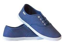
|
Sportswearby FifeSteps |
Blue | 38 | 200 $ |
1
|
200 $ | |
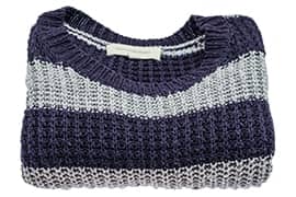
|
Striped sweaterby FifeSteps |
Blue | L | 200 $ |
3
|
600 $ | |
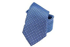
|
Elegant tieby FifeSteps |
Blue | M | 200 $ |
2
|
400 $ | |
Total |
1200$ |
||||||
<!--Shopping Cart table-->
<div class="table-responsive">
<table class="table product-table">
<!--Table head-->
<thead>
<tr>
<th></th>
<th>Product</th>
<th>Color</th>
<th>Size</th>
<th>Price</th>
<th>QTY</th>
<th>Amount</th>
<th></th>
</tr>
</thead>
<!--/Table head-->
<!--Table body-->
<tbody>
<!--First row-->
<tr>
<th scope="row">
<img src="https://mdbootstrap.com/img/Photos/Horizontal/E-commerce/Products/shoes.jpg" alt="" class="img-fluid">
</th>
<td>
<h5><strong>Sportswear</strong></h5>
<p class="text-muted">by FifeSteps</p>
</td>
<td>Blue</td>
<td>38</td>
<td>200 $</td>
<td>
<span class="qty">1 </span>
<div class="btn-group" data-toggle="buttons">
<label class="btn btn-sm btn-primary btn-rounded">
<input type="radio" name="options" id="option1">—
</label>
<label class="btn btn-sm btn-primary btn-rounded">
<input type="radio" name="options" id="option2">+
</label>
</div>
</td>
<td>200 $</td>
<td>
<button type="button" class="btn btn-sm btn-primary" data-toggle="tooltip" data-placement="top" title="Remove item">X
</button>
</td>
</tr>
<!--/First row-->
<!--Second row-->
<tr>
<th scope="row">
<img src="https://mdbootstrap.com/img/Photos/Horizontal/E-commerce/Products/sweater.jpg" alt="" class="img-fluid">
</th>
<td>
<h5><strong>Striped sweater</strong></h5>
<p class="text-muted">by FifeSteps</p>
</td>
<td>Blue</td>
<td>L</td>
<td>200 $</td>
<td>
<span class="qty">3 </span>
<div class="btn-group" data-toggle="buttons">
<label class="btn btn-sm btn-primary btn-rounded">
<input type="radio" name="options" id="option1">—
</label>
<label class="btn btn-sm btn-primary btn-rounded">
<input type="radio" name="options" id="option2">+
</label>
</div>
</td>
<td>600 $</td>
<td>
<button type="button" class="btn btn-sm btn-primary" data-toggle="tooltip" data-placement="top" title="Remove item">X
</button>
</td>
</tr>
<!--/Second row-->
<!--Third row-->
<tr>
<th scope="row">
<img src="https://mdbootstrap.com/img/Photos/Horizontal/E-commerce/Products/tie.jpg" alt="" class="img-fluid">
</th>
<td>
<h5><strong>Elegant tie</strong></h5>
<p class="text-muted">by FifeSteps</p>
</td>
<td>Blue</td>
<td>M</td>
<td>200 $</td>
<td>
<span class="qty">2 </span>
<div class="btn-group" data-toggle="buttons">
<label class="btn btn-sm btn-primary btn-rounded">
<input type="radio" name="options" id="option1">—
</label>
<label class="btn btn-sm btn-primary btn-rounded">
<input type="radio" name="options" id="option2">+
</label>
</div>
</td>
<td>400 $</td>
<td>
<button type="button" class="btn btn-sm btn-primary" data-toggle="tooltip" data-placement="top" title="Remove item">X
</button>
</td>
</tr>
<!--/Third row-->
<!--Fourth row-->
<tr>
<td colspan="3"></td>
<td>
<h4><strong>Total</strong></h4></td>
<td>
<h4><strong>1200 $</strong></h4></td>
<td colspan="3"><button type="button" class="btn btn-primary">Complete purchase <i class="fa fa-angle-right right"></i></button></td>
</tr>
<!--/Fourth row-->
</tbody>
<!--/Table body-->
</table>
</div>
<!--/Shopping Cart table-->
Simple table
| # | First Name | Last Name | Username |
|---|---|---|---|
| 1 | Mark | Otto | @mdo |
| 2 | Jacob | Thornton | @fat |
| 3 | Larry | the Bird |
<table class="table">
  <thead>
    <tr>
      <th>#</th>
      <th>First Name</th>
      <th>Last Name</th>
      <th>Username</th>
    </tr>
  </thead>
  <tbody>
    <tr>
      <th scope="row">1</th>
      <td>Mark</td>
      <td>Otto</td>
      <td>@mdo</td>
    </tr>
    <tr>
      <th scope="row">2</th>
      <td>Jacob</td>
      <td>Thornton</td>
      <td>@fat</td>
    </tr>
    <tr>
      <th scope="row">3</th>
      <td>Larry</td>
      <td>the Bird</td>
      <td>@twitter</td>
    </tr>
  </tbody>
</table>
Inverse table
| # | First Name | Last Name | Username |
|---|---|---|---|
| 1 | Mark | Otto | @mdo |
| 2 | Jacob | Thornton | @fat |
| 3 | Larry | the Bird |
<table class="table table-inverse">
  <thead>
    <tr>
      <th>#</th>
      <th>First Name</th>
      <th>Last Name</th>
      <th>Username</th>
    </tr>
  </thead>
  <tbody>
    <tr>
      <th scope="row">1</th>
      <td>Mark</td>
      <td>Otto</td>
      <td>@mdo</td>
    </tr>
    <tr>
      <th scope="row">2</th>
      <td>Jacob</td>
      <td>Thornton</td>
      <td>@fat</td>
    </tr>
    <tr>
      <th scope="row">3</th>
      <td>Larry</td>
      <td>the Bird</td>
      <td>@twitter</td>
    </tr>
  </tbody>
</table>
Table head options
Use one of two modifier classes to make <thead>s appear light or dark gray.
| # | First Name | Last Name | Username |
|---|---|---|---|
| 1 | Mark | Otto | @mdo |
| 2 | Jacob | Thornton | @fat |
| 3 | Larry | the Bird |
| # | First Name | Last Name | Username |
|---|---|---|---|
| 1 | Mark | Otto | @mdo |
| 2 | Jacob | Thornton | @fat |
| 3 | Larry | the Bird |
<table class="table">
  <thead class="thead-inverse">
    <tr>
      <th>#</th>
      <th>First Name</th>
      <th>Last Name</th>
      <th>Username</th>
    </tr>
  </thead>
  <tbody>
    <tr>
      <th scope="row">1</th>
      <td>Mark</td>
      <td>Otto</td>
      <td>@mdo</td>
    </tr>
    <tr>
      <th scope="row">2</th>
      <td>Jacob</td>
      <td>Thornton</td>
      <td>@fat</td>
    </tr>
    <tr>
      <th scope="row">3</th>
      <td>Larry</td>
      <td>the Bird</td>
      <td>@twitter</td>
    </tr>
  </tbody>
</table>

<table class="table">
  <thead class="thead-default">
    <tr>
      <th>#</th>
      <th>First Name</th>
      <th>Last Name</th>
      <th>Username</th>
    </tr>
  </thead>
  <tbody>
    <tr>
      <th scope="row">1</th>
      <td>Mark</td>
      <td>Otto</td>
      <td>@mdo</td>
    </tr>
    <tr>
      <th scope="row">2</th>
      <td>Jacob</td>
      <td>Thornton</td>
      <td>@fat</td>
    </tr>
    <tr>
      <th scope="row">3</th>
      <td>Larry</td>
      <td>the Bird</td>
      <td>@twitter</td>
    </tr>
  </tbody>
</table>
Striped rows
Use .table-striped to add zebra-striping to any table row within the <tbody>.
| # | First Name | Last Name | Username |
|---|---|---|---|
| 1 | Mark | Otto | @mdo |
| 2 | Jacob | Thornton | @fat |
| 3 | Larry | the Bird |
<table class="table table-striped">
  <thead>
    <tr>
      <th>#</th>
      <th>First Name</th>
      <th>Last Name</th>
      <th>Username</th>
    </tr>
  </thead>
  <tbody>
    <tr>
      <th scope="row">1</th>
      <td>Mark</td>
      <td>Otto</td>
      <td>@mdo</td>
    </tr>
    <tr>
      <th scope="row">2</th>
      <td>Jacob</td>
      <td>Thornton</td>
      <td>@fat</td>
    </tr>
    <tr>
      <th scope="row">3</th>
      <td>Larry</td>
      <td>the Bird</td>
      <td>@twitter</td>
    </tr>
  </tbody>
</table>
Bordered table
Add .table-bordered for borders on all sides of the table and cells.
| # | First Name | Last Name | Username |
|---|---|---|---|
| 1 | Mark | Otto | @mdo |
| 2 | Mark | Otto | @TwBootstrap |
| 3 | Jacob | Thornton | @fat |
| 4 | Larry the Bird | ||
<table class="table table-bordered">
  <thead>
    <tr>
      <th>#</th>
      <th>First Name</th>
      <th>Last Name</th>
      <th>Username</th>
    </tr>
  </thead>
  <tbody>
    <tr>
      <th scope="row">1</th>
      <td>Mark</td>
      <td>Otto</td>
      <td>@mdo</td>
    </tr>
    <tr>
      <th scope="row">2</th>
      <td>Mark</td>
      <td>Otto</td>
      <td>@TwBootstrap</td>
    </tr>
    <tr>
      <th scope="row">3</th>
      <td>Jacob</td>
      <td>Thornton</td>
      <td>@fat</td>
    </tr>
    <tr>
      <th scope="row">4</th>
      <td colspan="2">Larry the Bird</td>
      <td>@twitter</td>
    </tr>
  </tbody>
</table>
Hoverable rows
Add .table-hover to enable a hover state on table rows within a <tbody>.
| # | First Name | Last Name | Username |
|---|---|---|---|
| 1 | Mark | Otto | @mdo |
| 2 | Jacob | Thornton | @fat |
| 3 | Larry the Bird | ||
<table class="table table-hover">
  <thead>
    <tr>
      <th>#</th>
      <th>First Name</th>
      <th>Last Name</th>
      <th>Username</th>
    </tr>
  </thead>
  <tbody>
    <tr>
      <th scope="row">1</th>
      <td>Mark</td>
      <td>Otto</td>
      <td>@mdo</td>
    </tr>
    <tr>
      <th scope="row">2</th>
      <td>Jacob</td>
      <td>Thornton</td>
      <td>@fat</td>
    </tr>
    <tr>
      <th scope="row">3</th>
      <td colspan="2">Larry the Bird</td>
      <td>@twitter</td>
    </tr>
  </tbody>
</table>
Small table
Add .table-sm to make tables more compact by cutting cell padding in half.
| # | First Name | Last Name | Username |
|---|---|---|---|
| 1 | Mark | Otto | @mdo |
| 2 | Jacob | Thornton | @fat |
| 3 | Larry the Bird | ||
<table class="table table-sm">
  <thead>
    <tr>
      <th>#</th>
      <th>First Name</th>
      <th>Last Name</th>
      <th>Username</th>
    </tr>
  </thead>
  <tbody>
    <tr>
      <th scope="row">1</th>
      <td>Mark</td>
      <td>Otto</td>
      <td>@mdo</td>
    </tr>
    <tr>
      <th scope="row">2</th>
      <td>Jacob</td>
      <td>Thornton</td>
      <td>@fat</td>
    </tr>
    <tr>
      <th scope="row">3</th>
      <td colspan="2">Larry the Bird</td>
      <td>@twitter</td>
    </tr>
  </tbody>
</table>
Contextual classes
Use contextual classes to color table rows or individual cells.
| # | Column heading | Column heading | Column heading |
|---|---|---|---|
| 1 | Column content | Column content | Column content |
| 2 | Column content | Column content | Column content |
| 3 | Column content | Column content | Column content |
| 4 | Column content | Column content | Column content |
| 5 | Column content | Column content | Column content |
| 6 | Column content | Column content | Column content |
| 7 | Column content | Column content | Column content |
| 8 | Column content | Column content | Column content |
| 9 | Column content | Column content | Column content |
| Class | Description |
|---|---|
.table-active
|
Applies the hover color to a particular row or cell |
.table-success
|
Indicates a successful or positive action |
.table-info
|
Indicates a neutral informative change or action |
.table-warning
|
Indicates a warning that might need attention |
.table-danger
|
Indicates a dangerous or potentially negative action |
<table class="table">
    <thead>
        <tr>
            <th>#</th>
            <th>Column heading</th>
            <th>Column heading</th>
            <th>Column heading</th>
        </tr>
    </thead>
    <tbody>
        <tr class="table-active">
            <th scope="row">1</th>
            <td>Column content</td>
            <td>Column content</td>
            <td>Column content</td>
        </tr>
        <tr>
            <th scope="row">2</th>
            <td>Column content</td>
            <td>Column content</td>
            <td>Column content</td>
        </tr>
        <tr class="table-success">
            <th scope="row">3</th>
            <td>Column content</td>
            <td>Column content</td>
            <td>Column content</td>
        </tr>
        <tr>
            <th scope="row">4</th>
            <td>Column content</td>
            <td>Column content</td>
            <td>Column content</td>
        </tr>
        <tr class="table-info">
            <th scope="row">5</th>
            <td>Column content</td>
            <td>Column content</td>
            <td>Column content</td>
        </tr>
        <tr>
            <th scope="row">6</th>
            <td>Column content</td>
            <td>Column content</td>
            <td>Column content</td>
        </tr>
        <tr class="table-warning">
            <th scope="row">7</th>
            <td>Column content</td>
            <td>Column content</td>
            <td>Column content</td>
        </tr>
        <tr>
            <th scope="row">8</th>
            <td>Column content</td>
            <td>Column content</td>
            <td>Column content</td>
        </tr>
        <tr class="table-danger">
            <th scope="row">9</th>
            <td>Column content</td>
            <td>Column content</td>
            <td>Column content</td>
        </tr>
    </tbody>
</table>
Responsive tables
Create responsive tables by wrapping any .table in .table-responsive to make them scroll horizontally on small devices (under 768px). When viewing on anything larger than 768px wide, you will not see any difference in
these tables.
Vertical clipping/truncation
Responsive tables make use of
overflow-y: hidden, which clips off any content that goes beyond the bottom or top edges of the table. In particular, this can clip off dropdown menus and other third-party widgets.
Firefox and fieldsets
Firefox has some awkward fieldset styling involving width that interferes with the responsive table. This cannot be overridden without a Firefox-specific hack that Bootstrap doesn't provide.
@-moz-document url-prefix() {
  fieldset { display: table-cell; }
}
For more information, read this Stack Overflow answer.
| # | Table heading | Table heading | Table heading | Table heading | Table heading | Table heading |
|---|---|---|---|---|---|---|
| 1 | Table cell | Table cell | Table cell | Table cell | Table cell | Table cell |
| 2 | Table cell | Table cell | Table cell | Table cell | Table cell | Table cell |
| 3 | Table cell | Table cell | Table cell | Table cell | Table cell | Table cell |
<div class="table-responsive">
    <table class="table">
      <thead>
        <tr>
          <th>#</th>
          <th>Table heading</th>
          <th>Table heading</th>
          <th>Table heading</th>
          <th>Table heading</th>
          <th>Table heading</th>
          <th>Table heading</th>
        </tr>
      </thead>
      <tbody>
        <tr>
          <th scope="row">1</th>
          <td>Table cell</td>
          <td>Table cell</td>
          <td>Table cell</td>
          <td>Table cell</td>
          <td>Table cell</td>
          <td>Table cell</td>
        </tr>
        <tr>
          <th scope="row">2</th>
          <td>Table cell</td>
          <td>Table cell</td>
          <td>Table cell</td>
          <td>Table cell</td>
          <td>Table cell</td>
          <td>Table cell</td>
        </tr>
        <tr>
          <th scope="row">3</th>
          <td>Table cell</td>
          <td>Table cell</td>
          <td>Table cell</td>
          <td>Table cell</td>
          <td>Table cell</td>
          <td>Table cell</td>
        </tr>
      </tbody>
    </table>
  </div>

  <div class="table-responsive">
    <table class="table table-bordered">
      <thead>
        <tr>
          <th>#</th>
          <th>Table heading</th>
          <th>Table heading</th>
          <th>Table heading</th>
          <th>Table heading</th>
          <th>Table heading</th>
          <th>Table heading</th>
        </tr>
      </thead>
      <tbody>
        <tr>
          <th scope="row">1</th>
          <td>Table cell</td>
          <td>Table cell</td>
          <td>Table cell</td>
          <td>Table cell</td>
          <td>Table cell</td>
          <td>Table cell</td>
        </tr>
        <tr>
          <th scope="row">2</th>
          <td>Table cell</td>
          <td>Table cell</td>
          <td>Table cell</td>
          <td>Table cell</td>
          <td>Table cell</td>
          <td>Table cell</td>
        </tr>
        <tr>
          <th scope="row">3</th>
          <td>Table cell</td>
          <td>Table cell</td>
          <td>Table cell</td>
          <td>Table cell</td>
          <td>Table cell</td>
          <td>Table cell</td>
        </tr>
      </tbody>
    </table>
  </div>