.jpg)

Angular Bootstrap Modal
The Modal is a dialog box/popup window which can be used for lightboxes, user notifications, UI enhancements, e-commerce components and many other cases.
It's easily customized. You can manipulate size, position, and content.
See also: Modal Forms, Modal Styles and Modal Templates.Basic example
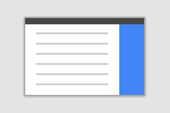
Below is a most basic Modal example with a button triggering Modal via data attribute.
Click the button to trigger Modal.
                                <button type="button" mdbBtn color="primary" class="relative waves-light" (click)="basicModal.show()" mdbWavesEffect>Launch demo modal</button>

<div mdbModal #basicModal="mdbModal" class="modal fade" tabindex="-1" role="dialog" aria-labelledby="myBasicModalLabel"
  aria-hidden="true">
  <div class="modal-dialog" role="document">
    <div class="modal-content">
      <div class="modal-header">
        <button type="button" class="close pull-right" aria-label="Close" (click)="basicModal.hide()">
          <span aria-hidden="true">×</span>
        </button>
        <h4 class="modal-title w-100" id="myModalLabel">Modal title</h4>
      </div>
      <div class="modal-body">
        ...
      </div>
      <div class="modal-footer">
        <button type="button" mdbBtn color="secondary" class="waves-light" aria-label="Close" (click)="basicModal.hide()" mdbWavesEffect>Close</button>
        <button type="button" mdbBtn color="primary" class="relative waves-light" mdbWavesEffect>Save changes</button>
      </div>
    </div>
  </div>
</div>
Position & Sizes
Click buttons below to launch modals demo
Central Modal
Size
Fluid Modal
Position
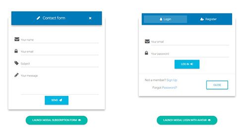
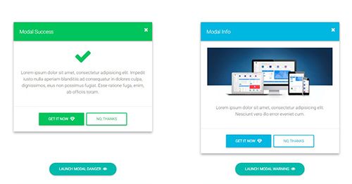
Forms, styles & Predefined templates
Click buttons below to see live previews

Advanced usage
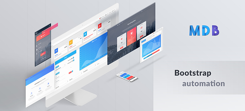
If you want to learn about advanced usage of Modals, read our free tutorial "Creating Automated web application" .
Position and size
To change the position or size of the modal add one of the following classes to the
.modal-dialog div.
Central modal
Note: Medium size is a default value, so there isn't a dedicated class for it.
.modal-sm Small Modal
.modal-lg Large Modal
.modal-fluid Full Width Modal
Small Modal code example:
                <!-- Small Modal -->
<div mdbModal #basicModal="mdbModal" class="modal fade" tabindex="-1" role="dialog" aria-labelledby="myBasicModalLabel"
  aria-hidden="true">
  <div class="modal-dialog modal-sm" role="document">
Medium Modal code example:
                <!-- Medium Modal -->
<div mdbModal #basicModal="mdbModal" class="modal fade" tabindex="-1" role="dialog" aria-labelledby="myBasicModalLabel"
  aria-hidden="true">
  <div class="modal-dialog" role="document">
Large Modal code example:
                <!-- Large Modal -->
<div mdbModal #basicModal="mdbModal" class="modal fade" tabindex="-1" role="dialog" aria-labelledby="myBasicModalLabel"
  aria-hidden="true">
  <div class="modal-dialog modal-lg" role="document">
Fluid Modal code example:
                <!-- Fluid Modal -->
<div mdbModal #basicModal="mdbModal" class="modal fade" tabindex="-1" role="dialog" aria-labelledby="myBasicModalLabel"
  aria-hidden="true">
  <div class="modal-dialog modal-fluid" role="document">
Side modal
Note: To make it works properly, apart from adding a class for a position, you also need to add
special class
.side-modal to
.modal-dialog div.
Note 2: If you want to change a direction of modal animation, add class
.top,
.right,
bottom or
.left to the
.modal div.
.modal-side +
.modal-top-right Top Right
.modal-side +
.modal-top-left Top Left
.modal-side +
.modal-bottom-right Bottom Right
.modal-side +
.modal-bottom-right Bottom Left
Top left side Modal Code example:
<!-- Top left side Modal -->
<div mdbModal #basicModal="mdbModal" class="modal fade left" tabindex="-1" role="dialog" aria-labelledby="myBasicModalLabel"
  aria-hidden="true">
  <div class="modal-dialog modal-side modal-top-left" role="document">
Top right side Modal Code example:
<!-- Top right side Modal -->
<div mdbModal #basicModal="mdbModal" class="modal fade right" tabindex="-1" role="dialog" aria-labelledby="myBasicModalLabel"
  aria-hidden="true">
  <div class="modal-dialog modal-side modal-top-right" role="document">
Bottom left side Modal Code example:
<!-- Bottom left side Modal -->
<div mdbModal #basicModal="mdbModal" class="modal fade left" tabindex="-1" role="dialog" aria-labelledby="myBasicModalLabel"
  aria-hidden="true">
  <div class="modal-dialog modal-side modal-bottom-left" role="document">
Bottom right side Modal Code example:
<!-- Bottom right side Modal -->
<div mdbModal #basicModal="mdbModal" class="modal fade right" tabindex="-1" role="dialog" aria-labelledby="myBasicModalLabel"
  aria-hidden="true">
  <div class="modal-dialog modal-side modal-bottom-right" role="document">
Fluid modal
Note: As in the previous example - to make it works properly, apart from adding a class for a position,
you also need to add special class
.modal-full-height to
.modal-dialog div.
Note 2: If you want to change a direction of modal animation, add class
.top,
.right,
bottom or
.left to the
.modal div.
.modal-full-height +
.modal-right Right
.modal-full-height +
.modal-left Left
.modal-full-height +
.modal-bottom Bottom
.modal-full-height +
.modal-top Top
Full-height left Modal Code example:
                    <!-- Full-height left Modal -->
<div mdbModal #basicModal="mdbModal" class="modal fade left" tabindex="-1" role="dialog" aria-labelledby="myBasicModalLabel"
  aria-hidden="true">
  <div class="modal-dialog modal-full-height modal-left" role="document">
Full-height right Modal Code example:
                        <!-- Full-height right Modal -->
    <div mdbModal #basicModal="mdbModal" class="modal fade right" tabindex="-1" role="dialog" aria-labelledby="myBasicModalLabel"
      aria-hidden="true">
      <div class="modal-dialog modal-full-height modal-right" role="document">
Full-height top Modal Code example:
                    <!-- Full-height top Modal -->
<div mdbModal #basicModal="mdbModal" class="modal fade top" tabindex="-1" role="dialog" aria-labelledby="myBasicModalLabel"
  aria-hidden="true">
  <div class="modal-dialog modal-full-height modal-top" role="document">
Full-height bottom Modal Code example:
                    <!-- Full-height bottom Modal -->
<div mdbModal #basicModal="mdbModal" class="modal fade bottom" tabindex="-1" role="dialog" aria-labelledby="myBasicModalLabel"
  aria-hidden="true">
  <div class="modal-dialog modal-full-height modal-bottom" role="document">
Frame modal
Note: As in the previous examples - to make it works properly, apart from adding a class for a position,
you also need to add special class
.modal-frame to
.modal-dialog div.
Note 2: If you want to change a direction of modal animation, add class
.top,
.right,
bottom or
.left to the
.modal div.
.modal-frame +
.modal-bottom Bottom
.modal-frame +
.modal-top Top
Frame bottom Modal Code example:
                <!-- Frame bottom Modal -->
<div mdbModal #basicModal="mdbModal" class="modal fade bottom" tabindex="-1" role="dialog" aria-labelledby="myBasicModalLabel"
  aria-hidden="true">
  <div class="modal-dialog modal-frame modal-bottom" role="document">
Frame top Modal Code example:
                <!-- Frame top Modal -->
<div mdbModal #basicModal="mdbModal" class="modal fade top" tabindex="-1" role="dialog" aria-labelledby="myBasicModalLabel"
  aria-hidden="true">
  <div class="modal-dialog modal-frame modal-top" role="document">
Remove backdrop
To remove
backdrop add
[config]="{backdrop: false, ignoreBackdropClick: true}" property to the modal markup
<div class="modal fade" id="exampleModal" tabindex="-1" role="dialog" aria-labelledby="exampleModalLabel" aria-hidden="true" [config]="{backdrop: false, ignoreBackdropClick: true}">
<div class="modal-dialog modal-side modal-top-right" role="document">
Scrolling long content
When modal become too long for the user’s viewport or device, it scrolls independently of the page itself.
You only need to set overflow: auto; to <div mdbModal>. Try the demo below to see what we mean.
Vertically centered
Add
.modal-dialog-centered to
.modal-dialog to vertically center the modal.
Tooltips and popovers
Tooltips and popovers can be placed within modals as needed. When modals are closed, any tooltips and popovers within are also automatically dismissed.
Note: Remember to initialize tooltips/popovers. You can find more information in the Tooltips and popovers documentation.
Using the grid
Utilize the Bootstrap grid system within a modal by nesting
.container-fluid within the
.modal-body. Then, use the normal grid system classes as you would anywhere else.
Varying modal content
Have a bunch of buttons that all trigger the same modal with slightly different contents?
Below is a live demo followed by example HTML and JavaScript. For more information,
read the modal events docs for details on
relatedTarget.
import { Component, ViewChild } from '@angular/core';

@Component({
  selector: 'modal-content-example',
  templateUrl: 'modal-content.html',
})

export class ModalContentComponent {
    @ViewChild('content') public contentModal;
    public name: string;

    show(value:string){
        this.name = value;
        this.contentModal.show();
    }
}
Remove animation
For modals that simply appear rather than fade into view, remove the
.fade class from your modal markup.
              <div mdbModal #basicModal="mdbModal" class="modal" tabindex="-1" role="dialog" aria-labelledby="myBasicModalLabel" aria-hidden="true">
...
</div>
Accessibility
Be sure to add
role="dialog" and
aria-labelledby="...", referencing the modal title, to
.modal, and
role="document" to the
.modal-dialog itself. Additionally, you may give a description of your modal dialog with aria-describedby on
.modal.
Embedding YouTube videos
import { Component, ViewChild } from '@angular/core';

@Component({
  selector: 'modal-video-example',
  templateUrl: 'modal-video.html',
})

export class ModalVideoComponent {
    @ViewChild('videoPlayer') public player;

    stopVideoPlayer(){
        this.player.nativeElement.src = this.player.nativeElement.src;
    }
}
Using show and hide functions in typescript file
Use Angular ViewChild decorator to get access to modal functions in your typescript file. In following example you can click on button to open modal and it will hide automatically after 3 seconds.
import { Component, ViewChild } from '@angular/core';
import { ModalDirective } from 'your path to modal directive';

@Component({
  selector: 'show-and-hide-modal-example',

  templateUrl: './show-and-hide-modal.component.html',

})
export class ShowAndHideModalComponent {
@ViewChild('demoBasic') demoBasic: ModalDirective;

  showAndHideModal() {
    this.demoBasic.show();

    setTimeout(() => {
      this.demoBasic.hide();
    }, 3000);
  }

}
Auto focus input in Modal
import { Component, ElementRef, HostListener, ViewChild, Output, EventEmitter } from '@angular/core';


@Component({
selector: 'inputfocus',

  })
  export class InputFocusComponent {
    @Output() onFocusOut: EventEmitter = new EventEmitter();

    @ViewChild('focusInput') focusInput: ElementRef;

    @HostListener('focusout', ['$event']) public onListenerTriggered(event: any): void {
      this.setFocusToInput();
    }

    setFocusToInput() {
      this.focusInput.nativeElement.focus();
    }
  }
Advanced Usage
ModalDirective
| Selector |
[mdbModal]
|
| Exported as |
mdbModal
|
Inputs
[config]
|
Type:
ModalOptions
allows to set modal configuration via element property |
Outputs (events)
(onHidden)="onHidden()"
|
Event is fired when the modal has finished being hidden from the user. |
(onHide)="onHide()"
|
Event is fired instantly when the hide instance method has been called. |
(onShow)="onShow()"
|
Event fires instantly when the show instance method is called. |
(onShown)="onShown()"
|
Event is fired when the modal has been made visible to the user. |
Example:
<button type="button" mdbBtn color="primary" class="relative waves-light" (click)="basicModal.show()" mdbWavesEffect>Basic Example</button>

<div mdbModal #basicModal="mdbModal" [config]="{keyboard: false}" class="modal fade" tabindex="-1" role="dialog" aria-labelledby="myBasicModalLabel" aria-hidden="true">
    <div class="modal-dialog" role="document">
        <div class="modal-content">
            <div class="modal-header">
                <button type="button" class="close pull-right" aria-label="Close" (click)="basicModal.hide()">
                    <span aria-hidden="true">×</span>
                </button>
                <h4 class="modal-title w-100" id="myModalLabel">Modal title</h4>
            </div>
            <div class="modal-body">
                ...
            </div>
            <div class="modal-footer">
                <button type="button" mdbBtn color="secondary" class="waves-light" aria-label="Close" (click)="basicModal.hide()" mdbWavesEffect>Close</button>
                <button type="button" mdbBtn color="primary" class="waves-light" mdbWavesEffect>Save changes</button>
            </div>
        </div>
    </div>
</div>
Methods
(event)="name.show()"
|
Return type:
void
Allows to manually open modal. |
(event)="name.hide()"
|
Return type:
void
Allows to manually close modal. |
(event)="name.toggle(value: boolean)()"
|
Return type:
void
Allows to manually toggle modal visibility. |
(event)="name.focusOtherModal()"
|
Return type:
void
Events tricks. |
Example:
<button type="button" mdbBtn color="primary" class="waves-light" (click)="staticModal.show()" mdbWavesEffect>Static modal</button>

<div class="modal fade" mdbModal #staticModal="mdbModal" [config]="{backdrop: 'static'}" tabindex="-1" role="dialog" aria-labelledby="mySmallModalLabel" aria-hidden="true">
    <div class="modal-dialog modal-sm">
        <div class="modal-content">
            <div class="modal-header">
                <h4 class="modal-title pull-left">Static modal</h4>
                <button type="button" class="close pull-right" aria-label="Close" (click)="staticModal.hide()">
                    <span aria-hidden="true">×</span>
                </button>
            </div>
            <div class="modal-body">
                <p>This is static modal.</p>
                <p>Click <b>×</b> to close modal.</p>
            </div>
        </div>
    </div>
</div>
ModalOptions
Properties
backdrop
|
Type:
boolean | "static"
Includes a modal-backdrop element. Alternatively, specify static for a backdrop which doesn't close the modal on click. |
ignoreBackdropClick
|
Type:
boolean
Ignore the backdrop click. |
keyboard
|
Type:
boolean
Closes the modal when the escape key is pressed. |
show
|
Type:
boolean
Shows the modal when initialized. |
class
|
Type:
string
Css class for opened modal. |
animated
|
Type:
boolean
Toggle animation. |
Example:
import { Component, ViewChild } from '@angular/core';
import { ModalDirective } from 'your-path-to/typescripts/free';

@Component({
  selector: 'modal-auto-example',
  templateUrl: 'modal-auto.html',
})

export class ModalAutoComponent {
    @ViewChild('autoShownModal') public autoShownModal:ModalDirective;
    public isModalShown:boolean = true;

    public showModal():void {
        this.isModalShown = true;
    }

    public hideModal():void {
        this.autoShownModal.hide();
    }

    public onHidden():void {
        this.isModalShown = false;
    }
}
API Reference:
In order to speed up your application, you can choose to import only the modules you actually need, instead of importing the entire MDB Angular library. Remember that importing the entire library, and immediately afterwards a specific module, is bad practice, and can cause application errors.
API Reference for MDB Angular Modals:
// For MDB Angular Pro
import { ModalModule, WavesModule, InputsModule } from 'ng-uikit-pro-standard'
// For MDB Angular Free
import { ModalModule, WavesModule, InputsModule } from 'angular-bootstrap-md'