Topic: Modal height is not calculated upon opening, using accordions

Hi MDB
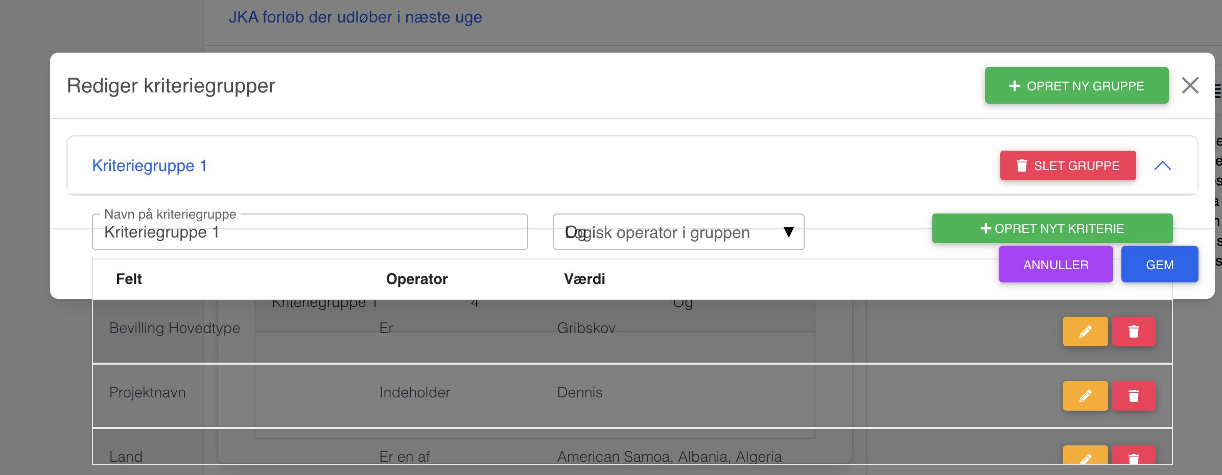
I am experiencing rendering issues with modals containing collapse elements, that are rendered incorrectly if the window size changes while the modal is closed. If i resize the window while the modal is opened, the problem resolves itself immediately.
Expected behavior The modal should recalculate the height of the content upon opening everytime.
Actual behavior The content of the modal is overflowing, until window is resized while the modal is opened
Resources (screenshots, code snippets etc.)
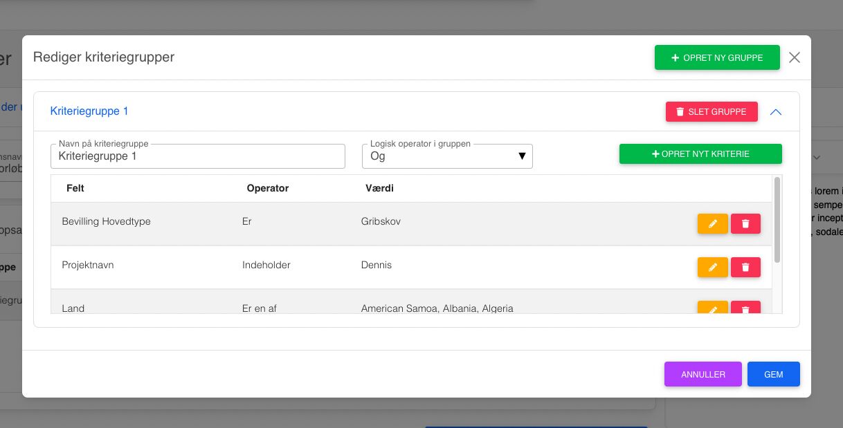
And here is the modal as it should have rendered (which it does after resizing the browser window a teeny tiny bit, or by closing and opening the collapsible again)
I can reproduce this issue with all modals containing collapsibles (Accordions).
Here's an example taken straight from your docs and put into an empty page:
And here is the code i've used to make this modal:
<ModalWrapper>
    <MDBModal show={basicModal} setShow={setBasicModal} tabIndex="-1">
      <MDBModalDialog>
        <MDBModalContent>
          <MDBModalHeader>
            <MDBModalTitle>Modal title</MDBModalTitle>
            <MDBBtn
              className="btn-close"
              color="none"
              onClick={toggleShow}
            ></MDBBtn>
          </MDBModalHeader>
          <MDBModalBody>
            <MDBAccordion initialActive={1}>
              <MDBAccordionItem
                collapseId={1}
                headerTitle="Accordion Item #1"
              >
                <strong>This is the first item's accordion body.</strong> It
                is shown by default, until the collapse plugin adds the
                appropriate classes that we use to style each element. These
                classes control the overall appearance, as well as the
                showing and hiding via CSS transitions. You can modify any
                of this with custom CSS or overriding our default variables.
                It's also worth noting that just about any HTML can go
                within the <code>.accordion-body</code>, though the
                transition does limit overflow.
              </MDBAccordionItem>
              <MDBAccordionItem
                collapseId={2}
                headerTitle="Accordion Item #2"
              >
                <strong>This is the second item's accordion body.</strong>{" "}
                It is hidden by default, until the collapse plugin adds the
                appropriate classes that we use to style each element. These
                classes control the overall appearance, as well as the
                showing and hiding via CSS transitions. You can modify any
                of this with custom CSS or overriding our default variables.
                It's also worth noting that just about any HTML can go
                within the <code>.accordion-body</code>, though the
                transition does limit overflow.
              </MDBAccordionItem>
              <MDBAccordionItem
                collapseId={3}
                headerTitle="Accordion Item #3"
              >
                <strong>This is the third item's accordion body.</strong> It
                is hidden by default, until the collapse plugin adds the
                appropriate classes that we use to style each element. These
                classes control the overall appearance, as well as the
                showing and hiding via CSS transitions. You can modify any
                of this with custom CSS or overriding our default variables.
                It's also worth noting that just about any HTML can go
                within the <code>.accordion-body</code>, though the
                transition does limit overflow.
              </MDBAccordionItem>
            </MDBAccordion>
          </MDBModalBody>

          <MDBModalFooter>
            <MDBBtn color="secondary" onClick={toggleShow}>
              Close
            </MDBBtn>
            <MDBBtn>Save changes</MDBBtn>
          </MDBModalFooter>
        </MDBModalContent>
      </MDBModalDialog>
    </MDBModal>
  </ModalWrapper>
The modal wrapper is just a portal to the bottom of the body:
import React from "react";
import ReactDOM from "react-dom";
const modalRoot = document.getElementById("modal-root") as HTMLElement;
// assuming in your html file has a div with id 'modal-root';
type Props = {
  children: JSX.Element;
};
export class ModalWrapper extends React.Component<Props> {
  el: HTMLElement = document.createElement("div");

  componentDidMount() {
    modalRoot.appendChild(this.el);
  }

  componentWillUnmount() {
    modalRoot.removeChild(this.el);
  }

  render() {
    return ReactDOM.createPortal(this.props.children, this.el);
  }
}
thanks for your help :)

Unfortunately, it is a bug. Thanks for reporting this! We will fix it in the next release.
FREE CONSULTATION
Hire our experts to build a dedicated project. We'll analyze your business requirements, for free.
Answered
- ForumUser: Priority
- Premium support: Yes
- Technology: MDB React
- MDB Version: MDB5 4.1.0
- Device: Macbook Pro M1 Max
- Browser: Chrome 103.0.5060.134
- OS: Mac OS 12.5
- Provided sample code: No
- Provided link: No