Free UI/UX design course
Learn how to create exceptional designs by reading my new tutorial.
Start learningGoogle maps
In this lesson, we will create a contact section and add an interactive map to it using Google Maps iframe.
Step 1 - add an empty Contact section
Add an empty Contact section with a grid of 2 columns in the middle:
        <!-- Section: Contact -->
        <section class="mb-10 text-center">

          <div class="container">

            <div class="row gx-0 align-items-center">

              <!-- First column -->
              <div class="col-lg-6 mb-5 mb-lg-0">


              </div>
              <!-- First column -->

              <!-- Second column -->
              <div class="col-lg-6 mb-5 mb-lg-0">


              </div>
              <!-- Second column -->

            </div>

          </div>

        </section>
        <!-- Section: Contact -->
Step 2 - add a card with a contact form
In this section, we will use the same cascading layout as in the About me section. So you can copy the contents of the first column from the About me section and insert it into the first column of the Contact section.
The difference will be that instead of text in the card, we will add a contact form to it. Copy it from the forms documentation page:
              <!-- First column -->
              <div class="col-lg-6 mb-5 mb-lg-0">

                <div style="background: hsla(0, 0%, 100%, 0.55);
                backdrop-filter: blur(30px);
                z-index: 1;" class="card rounded-7 me-lg-n5">
                  <div class="card-body p-lg-5 shadow-5">
                    <form>
                      <!-- Name input -->
                      <div class="form-outline mb-4" data-mdb-input-init>
                        <input type="text" id="form4Example1" class="form-control" />
                        <label class="form-label" for="form4Example1">Name</label>
                      </div>

                      <!-- Email input -->
                      <div class="form-outline mb-4" data-mdb-input-init>
                        <input type="email" id="form4Example2" class="form-control" />
                        <label class="form-label" for="form4Example2">Email address</label>
                      </div>

                      <!-- Message input -->
                      <div class="form-outline mb-4" data-mdb-input-init>
                        <textarea class="form-control" id="form4Example3" rows="4"></textarea>
                        <label class="form-label" for="form4Example3">Message</label>
                      </div>

                      <!-- Checkbox -->
                      <div class="form-check d-flex justify-content-center mb-4">
                        <input class="form-check-input me-2" type="checkbox" value="" id="form4Example4" checked />
                        <label class="form-check-label" for="form4Example4">
                          Send me a copy of this message
                        </label>
                      </div>

                      <!-- Submit button -->
                      <button type="submit" class="btn btn-primary btn-block mb-4" data-mdb-ripple-init>Send</button>
                    </form>
                  </div>
                </div>

              </div>
              <!-- First column -->
Step 3 - add Google Maps iframe
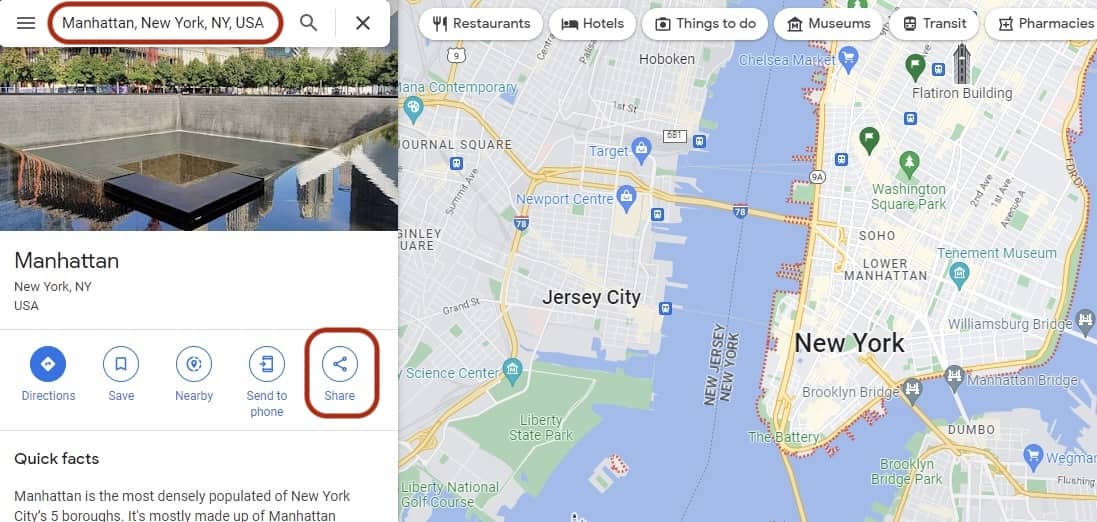
In your browser, go to Google Maps and enter the address you want to be visible on the map in the Contact section. I, for example, searched for the location of Manhattan.
Then click the "Share" button
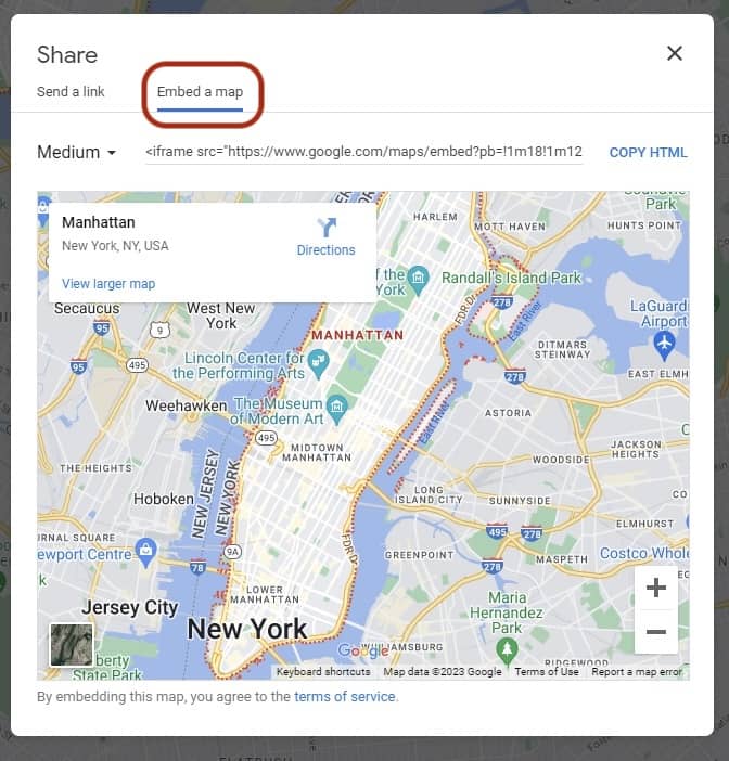
A new window will pop up. Click on the "Embed a map" tab and copy the provided HTML:
Then paste the copied HTML into the second column of our Contact section:
              <!-- Second column -->
              <div class="col-lg-6 mb-5 mb-lg-0">

                <iframe src="https://www.google.com/maps/embed?pb=!1m18!1m12!1m3!1d96813.17497894862!2d-73.97484803586903!3d40.68692922859912!2m3!1f0!2f0!3f0!3m2!1i1024!2i768!4f13.1!3m3!1m2!1s0x89c2588f046ee661%3A0xa0b3281fcecc08c!2sManhattan%2C%20New%20York%2C%20NY%2C%20USA!5e0!3m2!1sen!2spl!4v1671718528728!5m2!1sen!2spl" width="600" height="450" style="border:0;" allowfullscreen="" loading="lazy" referrerpolicy="no-referrer-when-downgrade"></iframe>

              </div>
              <!-- Second column -->
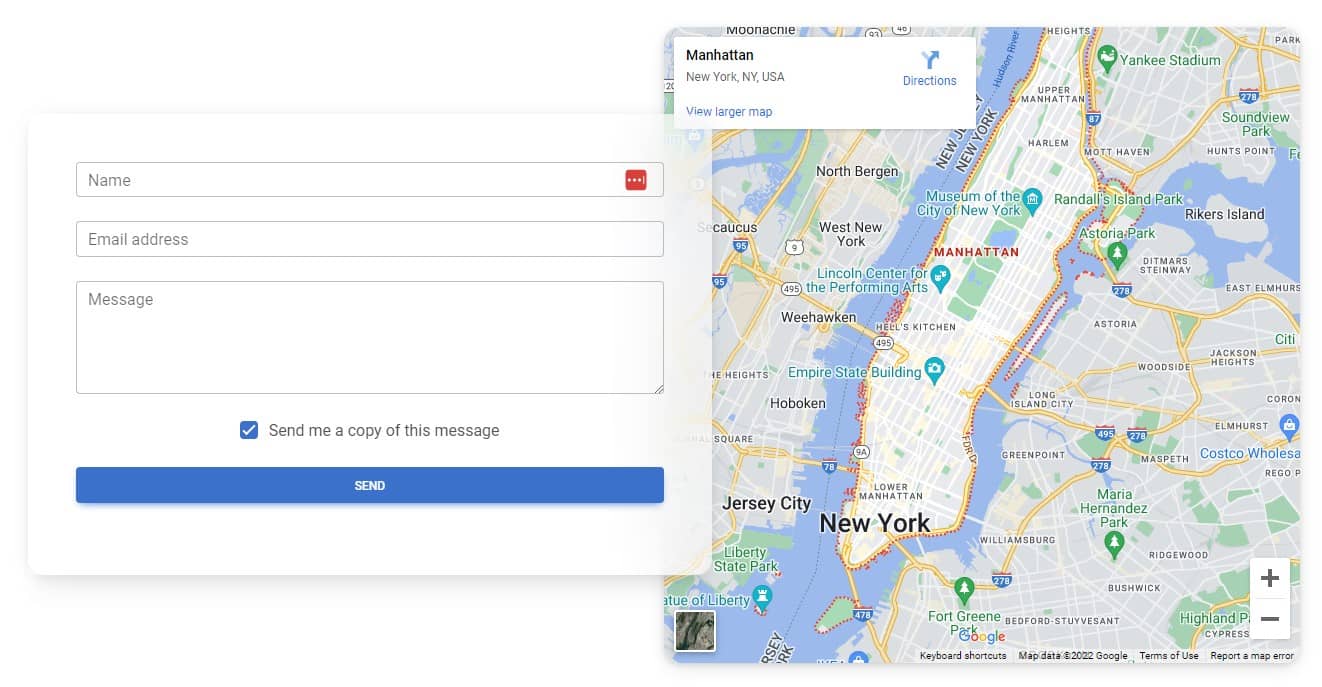
After saving the file, you should see a Google Maps iframe with the location you chose:
Step 4 - adjust the iframe
Bootstrap provides us with classes with which we can adjust the aspect ratio of the iframe. To use them, we need to put our iframe into a wrapper with a ratio class and a second class that defines our ratio.
For example, if we want our iframe to have an aspect ratio like youtube video thumbnails, we can use the ratio-16x9 class:
      <div class="ratio ratio-16x9">
        <iframe src="https://www.google.com/maps/embed?pb=!1m18!1m12!1m3!1d96813.17497894862!2d-73.97484803586903!3d40.68692922859912!2m3!1f0!2f0!3f0!3m2!1i1024!2i768!4f13.1!3m3!1m2!1s0x89c2588f046ee661%3A0xa0b3281fcecc08c!2sManhattan%2C%20New%20York%2C%20NY%2C%20USA!5e0!3m2!1sen!2spl!4v1671718528728!5m2!1sen!2spl" allowfullscreen="" loading="lazy" referrerpolicy="no-referrer-when-downgrade"></iframe>
      </div>
Note that in order to make this work, we had to remove the iframe's hardcoded height, width, and inline CSS.
As mentioned above, aspect ratios can be customized with modifier classes. By default the following ratio classes are provided:
      <div class="ratio ratio-1x1">
        <div>1x1</div>
      </div>
      <div class="ratio ratio-4x3">
        <div>4x3</div>
      </div>
      <div class="ratio ratio-16x9">
        <div>16x9</div>
      </div>
      <div class="ratio ratio-21x9">
        <div>21x9</div>
      </div>
Let's change the ratio of our iframe to 1x1:
    <div class="ratio ratio-1x1">
      <iframe src="https://www.google.com/maps/embed?pb=!1m18!1m12!1m3!1d96813.17497894862!2d-73.97484803586903!3d40.68692922859912!2m3!1f0!2f0!3f0!3m2!1i1024!2i768!4f13.1!3m3!1m2!1s0x89c2588f046ee661%3A0xa0b3281fcecc08c!2sManhattan%2C%20New%20York%2C%20NY%2C%20USA!5e0!3m2!1sen!2spl!4v1671718528728!5m2!1sen!2spl" width="600" height="450" style="border:0;" allowfullscreen="" loading="lazy" referrerpolicy="no-referrer-when-downgrade"></iframe>
    </div>
Step 5 - add roundings and shadow to the iframe
Time for some final touches. Let's add a shadow and rounded corners to the iframe to match the rest of our design:
    <div class="ratio ratio-1x1">
      <iframe class="shadow-3-strong rounded-7" src="https://www.google.com/maps/embed?pb=!1m18!1m12!1m3!1d96813.17497894862!2d-73.97484803586903!3d40.68692922859912!2m3!1f0!2f0!3f0!3m2!1i1024!2i768!4f13.1!3m3!1m2!1s0x89c2588f046ee661%3A0xa0b3281fcecc08c!2sManhattan%2C%20New%20York%2C%20NY%2C%20USA!5e0!3m2!1sen!2spl!4v1671718528728!5m2!1sen!2spl" allowfullscreen="" loading="lazy" referrerpolicy="no-referrer-when-downgrade"></iframe>
    </div>
And that's it! We have a responsive, interactive map in our portfolio. Nicely done ;)
You can learn more about iframes and ratio by reading embeds documentation page.

About author
Michal Szymanski
Co Founder at MDBootstrap / Listed in Forbes „30 under 30" / Open-source enthusiast / Dancer, nerd & book lover.
Author of hundreds of articles on programming, business, marketing and productivity. In the past, an educator working with troubled youth in orphanages and correctional facilities.