Overview
In this section you can learn about options for structuring your pages with MDB, including global styles, required scaffolding, grid system, and more.
MDB includes several components and options for laying out your project, including wrapping containers, a powerful grid system, a flexible media object, and responsive utility classes.
Containers
Containers are the most basic layout element in MDB and are required when using our grid system. Choose from a responsive, fixed-width container (meaning its max-width changes at each breakpoint) or fluid-width (meaning it’s 100% wide all the
time).
While containers can be nested, most layouts do not require a nested container.
Regular container
<div class="container">
  <!-- Content here -->
</div>
Fluid container
Use .container-fluid for a full width container, spanning the entire width of the viewport.
<div class="container-fluid">
  <!-- Content here -->
</div>
Responsive breakpoints
Since Bootstrap is developed to be mobile first, we use a handful of media queries to create sensible breakpoints for our layouts and interfaces. These breakpoints are mostly based on minimum viewport widths and allow us to scale up elements as the viewport changes. Bootstrap primarily uses the following media query ranges—or breakpoints—in our source Sass files for our layout, grid system, and components.
// Extra small devices (portrait phones, less than 544px)
// No media query since this is the default in Bootstrap

// Small devices (landscape phones, 544px and up)
@media (min-width: 544px) { ... }

// Medium devices (tablets, 768px and up)
@media (min-width: 768px) { ... }

// Large devices (desktops, 992px and up)
@media (min-width: 992px) { ... }

// Extra large devices (large desktops, 1200px and up)
@media (min-width: 1200px) { ... }
We occasionally use media queries that go in the other direction (the given screen size or smaller):
// Extra small devices (portrait phones, less than 544px)
@media (max-width: 543px) { ... }

// Small devices (landscape phones, less than 768px)
@media (max-width: 768px) { ... }

// Medium devices (tablets, less than 992px)
@media (max-width: 992px) { ... }

// Large devices (desktops, less than 1200px)
@media (max-width: 1199px) { ... }

// Extra large devices (large desktops)
// No media query since the extra-large breakpoint has no upper bound on its width
Grid system
Bootstrap includes a powerful mobile-first grid system for building layouts of all shapes and sizes. It’s based on a 12 column layout and has multiple tiers, one for each media query range. You can use it with Sass mixins or our predefined classes.
How it works
At a high level, here’s how the grid system works:
- There are three major components—containers, rows, and columns.
- Containers—
.containerfor fixed width or.container-fluidfor full width—center your site’s contents and help align your grid content. - Rows are horizontal groups of columns that ensure your columns are lined up properly.
- Content should be placed within columns, and only columns may be immediate children of rows.
- Column classes indicate the number of columns you’d like to use out of the possible 12 per row. So if you want three equal-width columns, you’d use
.col-sm-4. - Column
widths are set in percentages, so they’re always fluid and sized relative to their parent element. - Columns have horizontal
paddingto create the gutters between individual columns. - There are five grid tiers, one for each responsive breakpoint: extra small, small, medium, large, and extra large.
- Grid tiers are based on minimum widths, meaning they apply to that one tier and all those above it (e.g.,
.col-sm-4applies to small, medium, large, and extra large devices). - You can use predefined grid classes or Sass mixins for more semantic markup.
Quick start example
<div class="container">
  <div class="row">

    <div class="col-sm-4">
      One of three columns
    </div>

    <div class="col-sm-4">
      One of three columns
    </div>

    <div class="col-sm-4">
      One of three columns
    </div>

  </div>
</div>
The above example creates three equal-width columns on small, medium, large, and extra large devices using our predefined grid classes. Those columns are centered in the page with the parent .container.
Grid options
While Bootstrap uses ems or rems for defining most sizes, px are used for grid breakpoints and container widths. This is because the viewport width is in pixels and does not change with the font size. See
how aspects of the Bootstrap grid system work across multiple devices with a handy table.
|
Extra small
<544px |
Small
≥544px |
Medium
≥768px |
Large
≥992px |
Extra large
≥1200px |
|
|---|---|---|---|---|---|
| Grid behavior | Horizontal at all times | Collapsed to start, horizontal above breakpoints | |||
| Container width | None (auto) | 576px | 720px | 940px | 1140px |
| Class prefix | .col-xs- |
.col-sm- |
.col-md- |
.col-lg- |
.col-xl- |
| # of columns | 12 | ||||
| Gutter width | 1.875rem / 30px (15px on each side of a column) | ||||
| Nestable | Yes | ||||
| Offsets | Yes | ||||
| Column ordering | Yes | ||||
Predefined grid classes
Bootstrap includes an extensive set of prebuilt classes for quickly creating grid columns. It includes options for device-based column sizing, reordering columns, and more.
Using a single set of .col-md-* grid classes, you can create a basic grid system that starts out stacked on mobile devices and tablet devices (the extra small to small range) before becoming horizontal on desktop (medium) devices.
Place grid columns in any .row.
<div class="row">
  <div class="col-md-1">.col-md-1</div>
  <div class="col-md-1">.col-md-1</div>
  <div class="col-md-1">.col-md-1</div>
  <div class="col-md-1">.col-md-1</div>
  <div class="col-md-1">.col-md-1</div>
  <div class="col-md-1">.col-md-1</div>
  <div class="col-md-1">.col-md-1</div>
  <div class="col-md-1">.col-md-1</div>
  <div class="col-md-1">.col-md-1</div>
  <div class="col-md-1">.col-md-1</div>
  <div class="col-md-1">.col-md-1</div>
  <div class="col-md-1">.col-md-1</div>
</div>

<div class="row">
  <div class="col-md-8">.col-md-8</div>
  <div class="col-md-4">.col-md-4</div>
</div>

<div class="row">
  <div class="col-md-4">.col-md-4</div>
  <div class="col-md-4">.col-md-4</div>
  <div class="col-md-4">.col-md-4</div>
</div>

<div class="row">
  <div class="col-md-6">.col-md-6</div>
  <div class="col-md-6">.col-md-6</div>
</div>
Example: Mobile and desktop
Don’t want your columns to simply stack in smaller devices? Use the extra small and medium device grid classes by adding .col-xs-* and .col-md-* to your columns. See the example below for a better idea of how it all works.
<!-- Stack the columns on mobile by making one full-width and the other half-width -->
<div class="row">
  <div class="col-xs-12 col-md-8">.col-xs-12 .col-md-8</div>
  <div class="col-xs-6 col-md-4">.col-xs-6 .col-md-4</div>
</div>

<!-- Columns start at 50% wide on mobile and bump up to 33.3% wide on desktop -->
<div class="row">
  <div class="col-xs-6 col-md-4">.col-xs-6 .col-md-4</div>
  <div class="col-xs-6 col-md-4">.col-xs-6 .col-md-4</div>
  <div class="col-xs-6 col-md-4">.col-xs-6 .col-md-4</div>
</div>

<!-- Columns are always 50% wide, on mobile and desktop -->
<div class="row">
  <div class="col-xs-6">.col-xs-6</div>
  <div class="col-xs-6">.col-xs-6</div>
</div>
Example: Mobile, tablet, desktop
Build on the previous example by creating even more dynamic and powerful layouts with tablet .col-sm-* classes.
<div class="row">
  <div class="col-xs-12 col-sm-6 col-md-8">.col-xs-12 .col-sm-6 .col-md-8</div>
  <div class="col-xs-6 col-md-4">.col-xs-6 .col-md-4</div>
</div>
<div class="row">
  <div class="col-xs-6 col-sm-4">.col-xs-6 .col-sm-4</div>
  <div class="col-xs-6 col-sm-4">.col-xs-6 .col-sm-4</div>
  <!-- Optional: clear the XS cols if their content doesn't match in height -->
  <div class="clearfix hidden-sm-up"></div>
  <div class="col-xs-6 col-sm-4">.col-xs-6 .col-sm-4</div>
</div>
Example: Column wrapping
If more than 12 columns are placed within a single row, each group of extra columns will, as one unit, wrap onto a new line.
Since 9 + 4 = 13 > 12, this 4-column-wide div gets wrapped onto a new line as one contiguous unit.
Subsequent columns continue along the new line.
<div class="row">
<div class="col-xs-9">.col-xs-9</div>
<div class="col-xs-4">.col-xs-4<br>Since 9 + 4 = 13 > 12, this 4-column-wide div gets wrapped onto a new line as one contiguous unit.</div>
<div class="col-xs-6">.col-xs-6<br>Subsequent columns continue along the new line.</div>
</div>
Example: Responsive column resets
With the four tiers of grids available you’re bound to run into issues where, at certain breakpoints, your columns don’t clear quite right as one is taller than the other. To fix that, use a combination of a .clearfix and our responsive utility classes.
<div class="row">
  <div class="col-xs-6 col-sm-3">.col-xs-6 .col-sm-3</div>
  <div class="col-xs-6 col-sm-3">.col-xs-6 .col-sm-3</div>

  <!-- Add the extra clearfix for only the required viewport -->
  <div class="clearfix hidden-sm-up"></div>

  <div class="col-xs-6 col-sm-3">.col-xs-6 .col-sm-3</div>
  <div class="col-xs-6 col-sm-3">.col-xs-6 .col-sm-3</div>
</div>
In addition to column clearing at responsive breakpoints, you may need to reset offsets, pushes, or pulls. See this in action in the grid example
<div class="row">
  <div class="col-sm-5 col-md-6">.col-sm-5 .col-md-6</div>
  <div class="col-sm-5 offset-sm-2 col-md-6 offset-md-0">.col-sm-5 .offset-sm-2 .col-md-6 .offset-md-0</div>
</div>

<div class="row">
  <div class="col-sm-6 col-md-5 col-lg-6">.col-sm-6 .col-md-5 .col-lg-6</div>
  <div class="col-sm-6 col-md-5 offset-md-2 col-lg-6 offset-lg-0">.col-sm-6 .col-md-5 .offset-md-2 .col-lg-6 .offset-lg-0</div>
</div>
Example: Offsetting columns
Move columns to the right using .offset-md-* classes. These classes increase the left margin of a column by * columns. For example, .offset-md-4 moves .col-md-4 over four columns.
<div class="row">
  <div class="col-md-4">.col-md-4</div>
  <div class="col-md-4 offset-md-4">.col-md-4 .offset-md-4</div>
</div>
<div class="row">
  <div class="col-md-3 offset-md-3">.col-md-3 .offset-md-3</div>
  <div class="col-md-3 offset-md-3">.col-md-3 .offset-md-3</div>
</div>
<div class="row">
  <div class="col-md-6 offset-md-3">.col-md-6 .offset-md-3</div>
</div>
Example: Nesting columns
To nest your content with the default grid, add a new .row and set of .col-sm-* columns within an existing .col-sm-* column. Nested rows should include a set of columns that add up to 12 or fewer (it is not
required that you use all 12 available columns).
<div class="row">
  <div class="col-sm-9">
    Level 1: .col-sm-9
    <div class="row">
      <div class="col-xs-8 col-sm-6">
        Level 2: .col-xs-8 .col-sm-6
      </div>
      <div class="col-xs-4 col-sm-6">
        Level 2: .col-xs-4 .col-sm-6
      </div>
    </div>
  </div>
</div>
Example: Column ordering
Easily change the order of our built-in grid columns with .push-md-* and .pull-md-* modifier classes.
<div class="row">
  <div class="col-md-9 push-md-3">.col-md-9 .push-md-3</div>
  <div class="col-md-3 pull-md-9">.col-md-3 .pull-md-9</div>
</div>
Grid examples
Basic grid layouts to get you familiar with building within the Bootstrap grid system.
Five grid tiers
There are five tiers to the Bootstrap grid system, one for each range of devices we support. Each tier starts at a minimum viewport size and automatically applies to the larger devices unless overridden.
<div class="row">
  <div class="col-xs-4">.col-xs-4</div>
  <div class="col-xs-4">.col-xs-4</div>
  <div class="col-xs-4">.col-xs-4</div>
</div>

<div class="row">
  <div class="col-sm-4">.col-sm-4</div>
  <div class="col-sm-4">.col-sm-4</div>
  <div class="col-sm-4">.col-sm-4</div>
</div>

<div class="row">
  <div class="col-md-4">.col-md-4</div>
  <div class="col-md-4">.col-md-4</div>
  <div class="col-md-4">.col-md-4</div>
</div>

<div class="row">
  <div class="col-lg-4">.col-lg-4</div>
  <div class="col-lg-4">.col-lg-4</div>
  <div class="col-lg-4">.col-lg-4</div>
</div>

<div class="row">
  <div class="col-xl-4">.col-xl-4</div>
  <div class="col-xl-4">.col-xl-4</div>
  <div class="col-xl-4">.col-xl-4</div>
</div>
Three equal columns
Get three equal-width columns starting at desktops and scaling to large desktops. On mobile devices, tablets and below, the columns will automatically stack.
<div class="row">
    <div class="col-md-4">.col-md-4</div>
    <div class="col-md-4">.col-md-4</div>
    <div class="col-md-4">.col-md-4</div>
</div>
Three unequal columns
Get three columns starting at desktops and scaling to large desktops of various widths. Remember, grid columns should add up to twelve for a single horizontal block. More than that, and columns start stacking no matter the viewport.
<div class="row">
    <div class="col-md-3">.col-md-3</div>
    <div class="col-md-6">.col-md-6</div>
    <div class="col-md-3">.col-md-3</div>
</div>
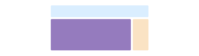
Two columns
Get two columns starting at desktops and scaling to large desktops.
<div class="row">
    <div class="col-md-8">.col-md-8</div>
    <div class="col-md-4">.col-md-4</div>
</div>
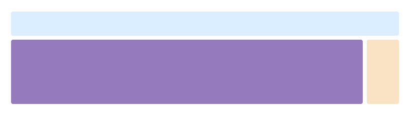
Full width, single column
No grid classes are necessary for full-width elements.
Two columns with two nested columns
Per the documentation, nesting is easy—just put a row of columns within an existing column. This gives you two columns starting at desktops and scaling to large desktops, with another two (equal widths) within the larger column.
At mobile device sizes, tablets and down, these columns and their nested columns will stack.
<div class="row">
    <div class="col-md-8">
        .col-md-8
        <div class="row">
            <div class="col-md-6">.col-md-6</div>
            <div class="col-md-6">.col-md-6</div>
        </div>
    </div>
    <div class="col-md-4">.col-md-4</div>
</div>
Mixed: mobile and desktop
The Bootstrap 3 grid system has four tiers of classes: xs (phones), sm (tablets), md (desktops), and lg (larger desktops). You can use nearly any combination of these classes to create more dynamic and flexible layouts.
Each tier of classes scales up, meaning if you plan on setting the same widths for xs and sm, you only need to specify xs.
  <div class="row">
    <div class="col-xs-12 col-md-8">.col-xs-12 .col-md-8</div>
    <div class="col-xs-6 col-md-4">.col-xs-6 .col-md-4</div>
  </div>
  <div class="row">
    <div class="col-xs-6 col-md-4">.col-xs-6 .col-md-4</div>
    <div class="col-xs-6 col-md-4">.col-xs-6 .col-md-4</div>
    <div class="col-xs-6 col-md-4">.col-xs-6 .col-md-4</div>
  </div>
  <div class="row">
    <div class="col-xs-6">.col-xs-6</div>
    <div class="col-xs-6">.col-xs-6</div>
  </div>
Mixed: mobile, tablet, and desktop
  <div class="row">
    <div class="col-xs-12 col-sm-6 col-lg-8">.col-xs-12 .col-sm-6 .col-lg-8</div>
    <div class="col-xs-6 col-lg-4">.col-xs-6 .col-lg-4</div>
  </div>
  <div class="row">
    <div class="col-xs-6 col-sm-4">.col-xs-6 .col-sm-4</div>
    <div class="col-xs-6 col-sm-4">.col-xs-6 .col-sm-4</div>
    <div class="col-xs-6 col-sm-4">.col-xs-6 .col-sm-4</div>
  </div>
Column clearing
Clear floats at specific breakpoints to prevent awkward wrapping with uneven content.
Resize your viewport or check it out on your phone for an example.
  <div class="row">
    <div class="col-xs-6 col-sm-3">
      .col-xs-6 .col-sm-3
      <br>
      Resize your viewport or check it out on your phone for an example.
    </div>
    <div class="col-xs-6 col-sm-3">.col-xs-6 .col-sm-3</div>

    <!-- Add the extra clearfix for only the required viewport -->
    <div class="clearfix hidden-sm-up"></div>

    <div class="col-xs-6 col-sm-3">.col-xs-6 .col-sm-3</div>
    <div class="col-xs-6 col-sm-3">.col-xs-6 .col-sm-3</div>
  </div>
Offset, push, and pull resets
Reset offsets, pushes, and pulls at specific breakpoints.
Reset offsets, pushes, and pulls at specific breakpoints.
  <p>Reset offsets, pushes, and pulls at specific breakpoints.</p>
  <div class="row">
    <div class="col-sm-5 col-md-6">.col-sm-5 .col-md-6</div>
    <div class="col-sm-5 offset-sm-2 col-md-6 offset-md-0">.col-sm-5 .offset-sm-2 .col-md-6 .offset-md-0</div>
  </div>
  <div class="row">
    <div class="col-sm-6 col-md-5 col-lg-6">.col-sm-6 .col-md-5 .col-lg-6</div>
    <div class="col-sm-6 col-md-5 offset-md-2 col-lg-6 offset-lg-0">.col-sm-6 .col-md-5 .offset-md-2 .col-lg-6 .offset-lg-0</div>
  </div>