Introduction Premium component
SideNav, also called Sidebar or simply - Side Menu, is not Bootstraps native component. It’s a common for Material Design form of navigation, which quickly became a standard in modern web design.
By virtue of its clarity and simplicity it remarkably increases User Experience. It allows you to swiftly navigate through small applications as well as vast portals. Multiple link embedding functionality enables you to implement more advanced content categorisation, which is almost essential within bigger projects.
Thanks to MDB you can easily implement SideNav in your own projects, by using one of various, alluring Side Menus.
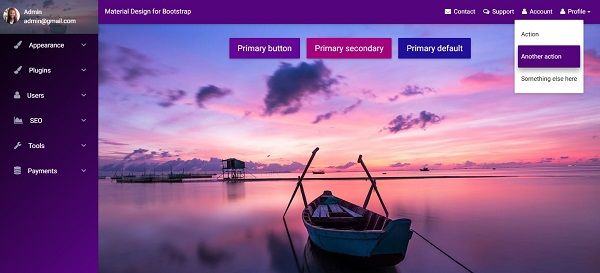
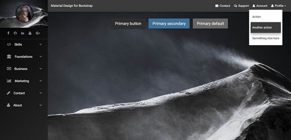
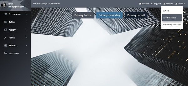
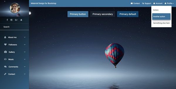
Navigation on the left is a live demo of SideNav.
How it looks on mobile device:

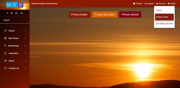
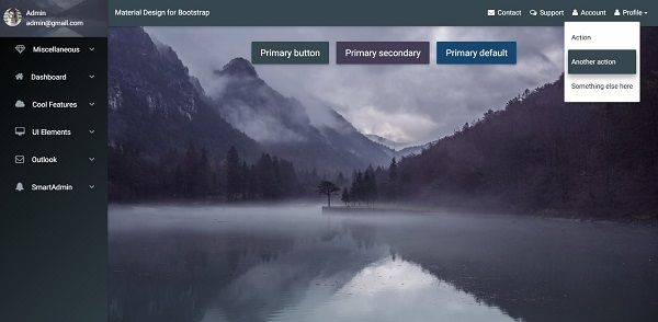
SideNav examples
Click on the images below to see live preview
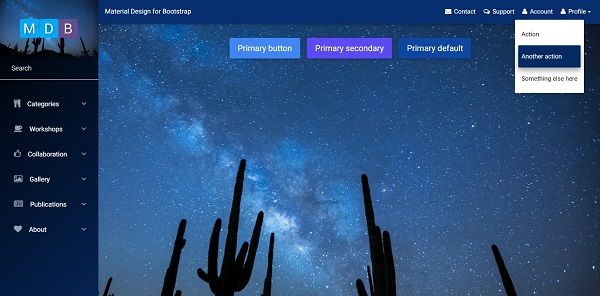
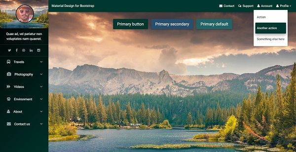
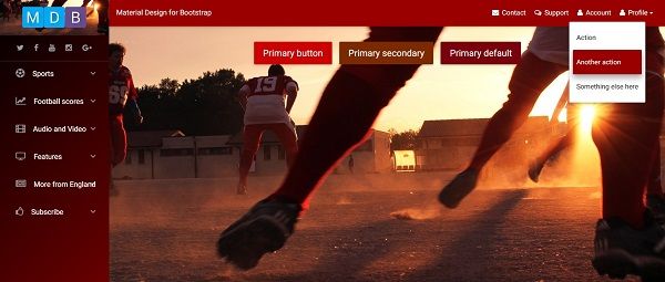
Basic usage
Initialization required
You have to initialize SideNav with code below before you can use it.
Initialization code:
// SideNav Initialization
$(".button-collapse").sideNav();
Basic example:
<!-- SideNav slide-out button -->
<a href="#" data-activates="slide-out" class="button-collapse"><i class="fa fa-bars"></i></a>
<!--/. SideNav slide-out button -->

<!-- Sidebar navigation -->
<ul id="slide-out" class="side-nav fixed default-side-nav light-side-nav">

    <!-- Logo -->
    <div class="logo-wrapper waves-light">
        <a href="#"><img src="http://mdbootstrap.com/wp-content/uploads/2015/12/mdb-white2.png" class="img-fluid flex-center"></a>
    </div>
    <!--/. Logo -->

    <!--Search Form-->
    <form class="search-form" role="search">
        <div class="form-group waves-effect">
            <input type="text" class="form-control" placeholder="Search">
        </div>
    </form>
    <!--/.Search Form-->

    <!-- Side navigation links -->
    <ul class="collapsible collapsible-accordion">
        <li><a class="collapsible-header waves-effect">Click me</a>
            <div class="collapsible-body">
                <ul>
                    <li><a href="#" class="waves-effect">Link</a>
                    </li>
                    <li><a href="#" class="waves-effect">Link</a>
                    </li>
                </ul>
            </div>
        </li>
    </ul>
    <!--/. Side navigation links -->
</ul>
<!--/. Sidebar navigation -->
Options:
// SideNav Options
$('.button-collapse').sideNav({
  edge: 'right', // Choose the horizontal origin
  closeOnClick: true // Closes side-nav on <a> clicks, useful for Angular/Meteor
});
jQuery Methods:
// Show sideNav
$('.button-collapse').sideNav('show');
// Hide sideNav
$('.button-collapse').sideNav('hide');
Fixed SideNav
Add the class .fixed to have the sideNav be fixed and open on large screens and hides to the regular functionality on smaller screens. Our sideNav on the left is an example of this.
<ul id="slide-out" class="side-nav fixed">
Required
padding-leftwhen using.fixedclassIf you are planning on using this you will have to offset your content by the width of the side menu. Place the padding on where the offset content will be, which in our case is in header, main and footer.
header, main, footer {
  padding-left: 240px;
}

@media only screen and (max-width : 992px) {
  header, main, footer {
    padding-left: 0;
  }
}
Advanced usage
MDB provides you multiple useful, ready-to-use page layouts with various predefined navigation types.
Click buttons below to learn more:
Predefined layouts Predefined skins