Cards
Bootstrap cards
Bootstrap cards are components which display content build of different elements with characteristic shadows, depth and hover effects.
It is hard to think of a better way of displaying your content to users other than by cards. Some of the biggest players like Facebook or Google are well aware of that, as you might have noticed in almost all their products.
Cards provide you with clarity, clean content categorisation and attractive form of presenting it to the users.
MDB enhances Bootstrap cards with characteristic Material Design features, such as slight shadows, depth, cascading or waves effects. Apart from that, it enriches it with additional optional animations, social icons, avatars and various other effects not available in a native Bootstrap.
Basic example

Card title
Some quick example text to build on the card title and make up the bulk of the card's content.
Button
        <!-- Card -->
        <div class="card">

          <!-- Card image -->
          <img class="card-img-top" src="https://mdbootstrap.com/img/Photos/Others/images/43.jpg" alt="Card image cap">

          <!-- Card content -->
          <div class="card-body">

            <!-- Title -->
            <h4 class="card-title"><a>Card title</a></h4>
            <!-- Text -->
            <p class="card-text">Some quick example text to build on the card title and make up the bulk of the card's content.</p>
            <!-- Button -->
            <a href="#" class="btn btn-primary">Button</a>

          </div>

        </div>
        <!-- Card -->
Waves effect
.jpg)
Card title
Some quick example text to build on the card title and make up the bulk of the card's content.
Button
        <!-- Card -->
        <div class="card">

          <!-- Card image -->
          <div class="view overlay">
            <img class="card-img-top" src="https://mdbootstrap.com/img/Mockups/Lightbox/Thumbnail/img%20(67).jpg" alt="Card image cap">
            <a href="#!">
              <div class="mask rgba-white-slight"></div>
            </a>
          </div>

          <!-- Card content -->
          <div class="card-body">

            <!-- Title -->
            <h4 class="card-title">Card title</h4>
            <!-- Text -->
            <p class="card-text">Some quick example text to build on the card title and make up the bulk of the card's content.</p>
            <!-- Button -->
            <a href="#" class="btn btn-primary">Button</a>

          </div>

        </div>
        <!-- Card -->
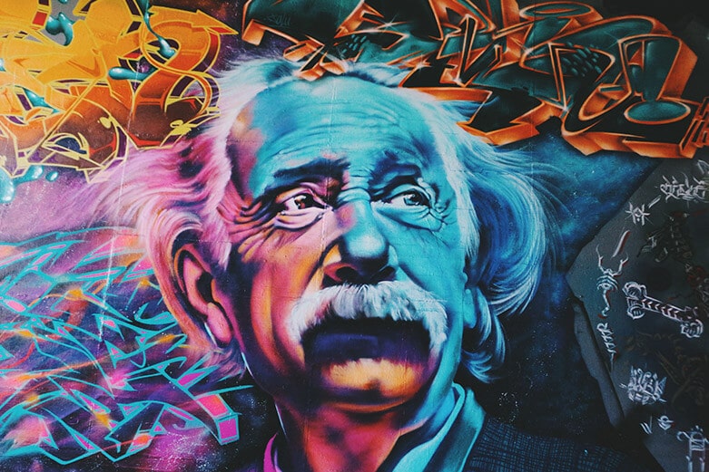
Cascading cards MDB Pro component
Add .card-cascade to the .card to achieve cascading effect. You can manipulate the width of the image by adding .wider or .narrower class to the .card.
Wider
Narrower
.jpg)
Culinary
Cheat day inspirations
Ut enim ad minima veniam, quis nostrum exercitationem ullam corporis suscipit laboriosam, nisi ut aliquid ex ea commodi.
Button
        <!-- Card Wider -->
        <div class="card card-cascade wider">

          <!-- Card image -->
          <div class="view view-cascade overlay">
            <img  class="card-img-top" src="https://mdbootstrap.com/img/Photos/Others/photo6.jpg" alt="Card image cap">
            <a href="#!">
              <div class="mask rgba-white-slight"></div>
            </a>
          </div>

          <!-- Card content -->
          <div class="card-body card-body-cascade text-center">

            <!-- Title -->
            <h4 class="card-title"><strong>Alison Belmont</strong></h4>
            <!-- Subtitle -->
            <h5 class="blue-text pb-2"><strong>Graffiti Artist</strong></h5>
            <!-- Text -->
            <p class="card-text">Sed ut perspiciatis unde omnis iste natus sit voluptatem accusantium doloremque laudantium, totam rem aperiam. </p>

            <!-- Linkedin -->
            <a class="px-2 fa-lg li-ic"><i class="fa fa-linkedin"></i></a>
            <!-- Twitter -->
            <a class="px-2 fa-lg tw-ic"><i class="fa fa-twitter"></i></a>
            <!-- Dribbble -->
            <a class="px-2 fa-lg fb-ic"><i class="fa fa-facebook"></i></a>

          </div>

        </div>
        <!-- Card Wider -->

        <!-- Card Narrower -->
        <div class="card card-cascade narrower">

          <!-- Card image -->
          <div class="view view-cascade overlay">
            <img  class="card-img-top" src="https://mdbootstrap.com/img/Photos/Lightbox/Thumbnail/img%20(147).jpg" alt="Card image cap">
            <a>
              <div class="mask rgba-white-slight"></div>
            </a>
          </div>

          <!-- Card content -->
          <div class="card-body card-body-cascade">

            <!-- Label -->
            <h5 class="pink-text pb-2 pt-1"><i class="fa fa-cutlery"></i> Culinary</h5>
            <!-- Title -->
            <h4 class="font-weight-bold card-title">Cheat day inspirations</h4>
            <!-- Text -->
            <p class="card-text">Ut enim ad minima veniam, quis nostrum exercitationem ullam corporis suscipit laboriosam, nisi ut aliquid ex ea commodi.</p>
            <!-- Button -->
            <a class="btn btn-unique">Button</a>

          </div>

        </div>
        <!-- Card Narrower -->

        <!-- Card Regular -->
        <div class="card card-cascade">

          <!-- Card image -->
          <div class="view view-cascade overlay">
            <img class="card-img-top" src="https://mdbootstrap.com/img/Photos/Others/men.jpg" alt="Card image cap">
            <a>
              <div class="mask rgba-white-slight"></div>
            </a>
          </div>

          <!-- Card content -->
          <div class="card-body card-body-cascade text-center">

            <!-- Title -->
            <h4 class="card-title"><strong>Billy Coleman</strong></h4>
            <!-- Subtitle -->
            <h6 class="font-weight-bold indigo-text py-2">Web developer</h6>
            <!-- Text -->
            <p class="card-text">Lorem ipsum dolor sit amet, consectetur adipisicing elit. Voluptatibus, ex, recusandae. Facere modi sunt, quod quibusdam.
            </p>

            <!-- Facebook -->
            <a type="button" class="btn-floating btn-small btn-fb"><i class="fa fa-facebook"></i></a>
            <!-- Twitter -->
            <a type="button" class="btn-floating btn-small btn-tw"><i class="fa fa-twitter"></i></a>
            <!-- Google + -->
            <a type="button" class="btn-floating btn-small btn-dribbble"><i class="fa fa-dribbble"></i></a>

          </div>

        </div>
        <!-- Card Regular -->
Cascading panels MDB Pro component
Lorem ipsum dolor sit amet, consectetur adipisicing elit. Voluptatibus, ex, recusandae. Facere modi sunt, quod quibusdam dignissimos neque rem nihil ratione est placeat vel, natus non quos laudantium veritatis sequi.Ut enim ad minima veniam, quis nostrum exercitationem ullam corporis suscipit laboriosam, nisi ut aliquid ex ea commodi.
Title of the news
26.07.2017
Lorem ipsum dolor sit amet, consectetur adipisicing elit. Voluptatibus, ex minis recusandae. Facere modi sunt, quod quibusdam dignissimos neque rem nihil ratione est placeat vel, natus non quos laudantium veritatis sequi.Ut enim ad minima veniam, quis nostrum.
Read more
Marta
Deserve for her own card
Lorem ipsum dolor sit amet, consectetur adipisicing elit. Voluptatibus, ex, recusandae. Facere modi sunt, quod quibusdam dignissimos neque rem nihil ratione est placeat vel, natus non quos laudantium veritatis sequi.Ut enim ad minima veniam, quis nostrum exercitationem ullam corporis suscipit laboriosam.
        <!-- Card -->
        <div class="card card-cascade narrower">

          <!-- Card image -->
          <div class="view view-cascade gradient-card-header purple-gradient">

            <!-- Title -->
            <h2 class="card-header-title">Ally Cook</h2>
            <!-- Subtitle -->
            <h5 class="mb-0 pb-3 pt-2">Follow me</h5>

            <!-- Facebook -->
            <a type="button" class="btn-floating"><i class="fa fa-facebook"></i></a>
            <!-- Twitter -->
            <a type="button" class="btn-floating"><i class="fa fa-twitter"></i></a>
            <!-- Google + -->
            <a type="button" class="btn-floating"><i class="fa fa-google-plus"></i></a>

          </div>

          <!-- Card content -->
          <div class="card-body card-body-cascade text-center">

            <!-- Text -->
            <p class="card-text">Lorem ipsum dolor sit amet, consectetur adipisicing elit. Voluptatibus, ex, recusandae. Facere modi sunt, quod quibusdam dignissimos neque rem nihil ratione est placeat vel, natus non quos laudantium veritatis sequi.Ut enim ad minima veniam, quis nostrum exercitationem ullam corporis suscipit laboriosam, nisi ut aliquid ex ea commodi.</p>

          </div>

        </div>
        <!-- Card -->

        <!-- Card -->
        <div class="card card-cascade wider">

          <!-- Card image -->
          <div class="view view-cascade gradient-card-header peach-gradient">

            <!-- Title -->
            <h2 class="card-header-title mb-3">Title of the news</h2>
            <!-- Text -->
            <p class="mb-0"><i class="fa fa-calendar mr-2"></i>26.07.2017</p>

          </div>

          <!-- Card content -->
          <div class="card-body card-body-cascade text-center">

            <!-- Text -->
            <p class="card-text">Lorem ipsum dolor sit amet, consectetur adipisicing elit. Voluptatibus, ex minis recusandae. Facere modi sunt, quod quibusdam dignissimos neque rem nihil ratione est placeat vel, natus non quos laudantium veritatis sequi.Ut enim ad minima veniam, quis nostrum.</p>
            <!-- Link -->
            <a href="#!" class="orange-text d-flex flex-row-reverse p-2">
              <h5 class="waves-effect waves-light">Read more<i class="fa fa-angle-double-right ml-2"></i></h5>
            </a>

          </div>
          <!-- Card content -->

        </div>
        <!-- Card -->

        <!-- Card -->
        <div class="card card-cascade">

          <!-- Card image -->
          <div class="view view-cascade gradient-card-header blue-gradient">

            <!-- Title -->
            <h2 class="card-header-title mb-3">Marta</h2>
            <!-- Subtitle -->
            <p class="card-header-subtitle mb-0">Deserve for her own card</p>

          </div>

          <!-- Card content -->
          <div class="card-body card-body-cascade text-center">

            <!-- Text -->
            <p class="card-text">Lorem ipsum dolor sit amet, consectetur adipisicing elit. Voluptatibus, ex, recusandae. Facere modi sunt, quod quibusdam dignissimos neque rem nihil ratione est placeat vel, natus non quos laudantium veritatis sequi.Ut enim ad minima veniam, quis nostrum exercitationem ullam corporis suscipit laboriosam.</p>

            <hr>

            <!-- Twitter -->
            <a class="px-2 fa-lg tw-ic"><i class="fa fa-twitter"> </i></a>
            <!-- Linkedin -->
            <a class="px-2 fa-lg li-ic"><i class="fa fa-linkedin"> </i></a>
            <!-- Facebook -->
            <a class="px-2 fa-lg fb-ic"><i class="fa fa-facebook"> </i></a>
            <!-- Email -->
            <a class="px-2 fa-lg email-ic"><i class="fa fa-envelope"> </i></a>

          </div>

        </div>
        <!-- Card -->
Reversed cascade MDB Pro component
.jpg)
        <!-- Card -->
        <div class="card card-cascade wider reverse">

          <!-- Card image -->
          <div class="view view-cascade overlay">
            <img class="card-img-top" src="https://mdbootstrap.com/img/Photos/Slides/img%20(70).jpg" alt="Card image cap">
            <a href="#!">
              <div class="mask rgba-white-slight"></div>
            </a>
          </div>

          <!-- Card content -->
          <div class="card-body card-body-cascade text-center">

            <!-- Title -->
            <h4 class="card-title"><strong>My adventure</strong></h4>
            <!-- Subtitle -->
            <h6 class="font-weight-bold indigo-text py-2">Photography</h6>
            <!-- Text -->
            <p class="card-text">Lorem ipsum dolor sit amet, consectetur adipisicing elit. Exercitationem perspiciatis voluptatum a, quo nobis, non commodi quia repellendus sequi nulla voluptatem dicta reprehenderit, placeat laborum ut beatae ullam suscipit veniam.
            </p>

            <!-- Linkedin -->
            <a class="px-2 fa-lg li-ic"><i class="fa fa-linkedin"></i></a>
            <!-- Twitter -->
            <a class="px-2 fa-lg tw-ic"><i class="fa fa-twitter"></i></a>
            <!-- Dribbble -->
            <a class="px-2 fa-lg fb-ic"><i class="fa fa-facebook"></i></a>

          </div>

        </div>
        <!-- Card -->
Action button & footer MDB Pro component
        <!-- Card -->
        <div class="card">

          <!-- Card image -->
          <div class="view overlay">
            <img class="card-img-top" src="https://mdbootstrap.com/img/Photos/Others/food.jpg" alt="Card image cap">
            <a>
              <div class="mask rgba-white-slight"></div>
            </a>
          </div>

          <!-- Button -->
          <a class="btn-floating btn-action ml-auto mr-4 mdb-color lighten-3"><i class="fa fa-chevron-right pl-1"></i></a>

          <!-- Card content -->
          <div class="card-body">

            <!-- Title -->
            <h4 class="card-title">Card title</h4>
            <hr>
            <!-- Text -->
            <p class="card-text">Some quick example text to build on the card title and make up the bulk of the card's content.</p>

          </div>

          <!-- Card footer -->
          <div class="rounded-bottom mdb-color lighten-3 text-center pt-3">
            <ul class="list-unstyled list-inline font-small">
              <li class="list-inline-item pr-2 white-text"><i class="fa fa-clock-o pr-1"></i>05/10/2015</li>
              <li class="list-inline-item pr-2"><a href="#" class="white-text"><i class="fa fa-comments-o pr-1"></i>12</a></li>
              <li class="list-inline-item pr-2"><a href="#" class="white-text"><i class="fa fa-facebook pr-1"> </i>21</a></li>
              <li class="list-inline-item"><a href="#" class="white-text"><i class="fa fa-twitter pr-1"> </i>5</a></li>
            </ul>
          </div>

        </div>
        <!-- Card -->
Flat buttons MDB Pro component
The light version

Card title
Some quick example text to build on the card title and make up the bulk of the card's content.
Read more
        <!-- Card Light -->
        <div class="card">

          <!-- Card image -->
          <div class="view overlay">
            <img class="card-img-top" src="https://mdbootstrap.com/img/Photos/Horizontal/Nature/4-col/img%20%28131%29.jpg" alt="Card image cap">
            <a>
              <div class="mask rgba-white-slight"></div>
            </a>
          </div>

          <!-- Card content -->
          <div class="card-body">

            <!-- Social shares button -->
            <a class="activator waves-effect waves-light mr-4"><i class="fa fa-share-alt"></i></a>
            <!-- Title -->
            <h4 class="card-title">Card title</h4>
            <hr>
            <!-- Text -->
            <p class="card-text">Some quick example text to build on the card title and make up the bulk of the card's content.</p>
            <!-- Link -->
            <a href="#!" class="black-text d-flex justify-content-end"><h5>Read more <i class="fa fa-angle-double-right"></i></h5></a>

          </div>

        </div>
        <!-- Card Light -->
The dark version

Card title
Some quick example text to build on the card title and make up the bulk of the card's content.
Read more
        <!-- Card Dark -->
        <div class="card">

          <!-- Card image -->
          <div class="view overlay">
            <img class="card-img-top" src="https://mdbootstrap.com/img/Photos/Horizontal/Work/4-col/img%20%2821%29.jpg" alt="Card image cap">
            <a>
              <div class="mask rgba-white-slight"></div>
            </a>
          </div>

          <!-- Card content -->
          <div class="card-body elegant-color white-text rounded-bottom">

            <!-- Social shares button -->
            <a class="activator waves-effect mr-4"><i class="fa fa-share-alt white-text"></i></a>
            <!-- Title -->
            <h4 class="card-title">Card title</h4>
            <hr class="hr-light">
            <!-- Text -->
            <p class="card-text white-text mb-4">Some quick example text to build on the card title and make up the bulk of the card's content.</p>
            <!-- Link -->
            <a href="#!" class="white-text d-flex justify-content-end"><h5>Read more <i class="fa fa-angle-double-right"></i></h5></a>

          </div>

        </div>
        <!-- Card Dark -->
Testimonial card MDB Pro component
To change a background color use one of over 300 color classes from our colors or gradients palette.

Anna Doe
Lorem ipsum dolor sit amet, consectetur adipisicing elit. Eos, adipisci

Martha Smith
Lorem ipsum dolor sit amet, consectetur adipisicing elit. Eos, adipisci
        <!-- Card -->
        <div class="card testimonial-card">

          <!-- Background color -->
          <div class="card-up indigo lighten-1"></div>

          <!-- Avatar -->
          <div class="avatar mx-auto white">
            <img src="https://mdbootstrap.com/img/Photos/Avatars/img%20%2810%29.jpg" class="rounded-circle" alt="woman avatar">
          </div>

          <!-- Content -->
          <div class="card-body">
            <!-- Name -->
            <h4 class="card-title">Anna Doe</h4>
            <hr>
            <!-- Quotation -->
            <p><i class="fa fa-quote-left"></i> Lorem ipsum dolor sit amet, consectetur adipisicing elit. Eos, adipisci</p>
          </div>

        </div>
        <!-- Card -->
Image overlay
Marketing
This is card title
Lorem ipsum dolor sit amet, consectetur adipisicing elit. Repellat fugiat, laboriosam, voluptatem, optio vero odio nam sit officia accusamus minus error nisi architecto nulla ipsum dignissimos. Odit sed qui, dolorum!.
View projectSoftware
This is card title
Lorem ipsum dolor sit amet, consectetur adipisicing elit. Repellat fugiat, laboriosam, voluptatem, optio vero odio nam sit officia accusamus minus error nisi architecto nulla ipsum dignissimos. Odit sed qui, dolorum!.
View project
        <!-- Card -->
        <div class="card card-image" style="background-image: url(https://mdbootstrap.com/img/Photos/Horizontal/Work/4-col/img%20%2814%29.jpg);">

          <!-- Content -->
          <div class="text-white text-center d-flex align-items-center rgba-black-strong py-5 px-4">
            <div>
              <h5 class="pink-text"><i class="fa fa-pie-chart"></i> Marketing</h5>
              <h3 class="card-title pt-2"><strong>This is card title</strong></h3>
              <p>Lorem ipsum dolor sit amet, consectetur adipisicing elit. Repellat fugiat, laboriosam, voluptatem,
                optio vero odio nam sit officia accusamus minus error nisi architecto nulla ipsum dignissimos.
                Odit sed qui, dolorum!.</p>
              <a class="btn btn-pink"><i class="fa fa-clone left"></i> View project</a>
            </div>
          </div>

        </div>
        <!-- Card -->
Card groups
Use card groups to render cards as a single, attached element with equal width and height columns. Card groups use display: flex; to achieve their uniform sizing.

Card title
Some quick example text to build on the card title and make up the bulk of the card's content.

Card title
Some quick example text to build on the card title and make up the bulk of the card's content.

        <!-- Card group -->
        <div class="card-group">

          <!-- Card -->
          <div class="card mb-4">

            <!-- Card image -->
            <div class="view overlay">
              <img class="card-img-top" src="https://mdbootstrap.com/img/Photos/Others/images/49.jpg" alt="Card image cap">
              <a href="#!">
                <div class="mask rgba-white-slight"></div>
              </a>
            </div>

            <!-- Card content -->
            <div class="card-body">

              <!-- Title -->
              <h4 class="card-title">Card title</h4>
              <!-- Text -->
              <p class="card-text">Some quick example text to build on the card title and make up the bulk of the card's content.</p>
              <!-- Provides extra visual weight and identifies the primary action in a set of buttons -->
              <button type="button" class="btn btn-primary btn-md">Read more</button>

            </div>
            <!-- Card content -->

          </div>
          <!-- Card -->

          <!-- Card -->
          <div class="card mb-4">

            <!-- Card image -->
            <div class="view overlay">
              <img class="card-img-top" src="https://mdbootstrap.com/img/Photos/Others/images/48.jpg" alt="Card image cap">
              <a href="#!">
                <div class="mask rgba-white-slight"></div>
              </a>
            </div>

            <!-- Card content -->
            <div class="card-body">
              <!-- Title -->
              <h4 class="card-title">Card title</h4>
              <!-- Text -->
              <p class="card-text">Some quick example text to build on the card title and make up the bulk of the card's content.</p>
              <!-- Provides extra visual weight and identifies the primary action in a set of buttons -->
              <button type="button" class="btn btn-primary btn-md">Read more</button>

            </div>
            <!-- Card content -->

          </div>
          <!-- Card -->

          <!-- Card -->
          <div class="card mb-4">

            <!-- Card image -->
            <div class="view overlay">
              <img class="card-img-top" src="https://mdbootstrap.com/img/Photos/Others/images/77.jpg" alt="Card image cap">
              <a href="#!">
                <div class="mask rgba-white-slight"></div>
              </a>
            </div>

            <!-- Card content -->
            <div class="card-body">

              <!-- Title -->
              <h4 class="card-title">Card title</h4>
              <!-- Text -->
              <p class="card-text">Some quick example text to build on the card title and make up the bulk of the card's content.</p>
              <!-- Provides extra visual weight and identifies the primary action in a set of buttons -->
              <button type="button" class="btn btn-primary btn-md">Read more</button>

            </div>
            <!-- Card content -->

          </div>
          <!-- Card -->

        </div>
        <!-- Card group -->
Card decks
Need a set of equal width and height cards that aren’t attached to one another? Use card decks.
Card title
Some quick example text to build on the card title and make up the bulk of the card's content.
Card title
Some quick example text to build on the card title and make up the bulk of the card's content.
        <!-- Card deck -->
        <div class="card-deck">

          <!-- Card -->
          <div class="card mb-4">

            <!--Card image-->
            <div class="view overlay">
              <img class="card-img-top" src="https://mdbootstrap.com/img/Photos/Others/images/16.jpg" alt="Card image cap">
              <a href="#!">
                <div class="mask rgba-white-slight"></div>
              </a>
            </div>

            <!--Card content-->
            <div class="card-body">

              <!--Title-->
              <h4 class="card-title">Card title</h4>
              <!--Text-->
              <p class="card-text">Some quick example text to build on the card title and make up the bulk of the card's content.</p>
              <!-- Provides extra visual weight and identifies the primary action in a set of buttons -->
              <button type="button" class="btn btn-light-blue btn-md">Read more</button>

            </div>

          </div>
          <!-- Card -->

          <!-- Card -->
          <div class="card mb-4">

            <!--Card image-->
            <div class="view overlay">
              <img class="card-img-top" src="https://mdbootstrap.com/img/Photos/Others/images/14.jpg" alt="Card image cap">
              <a href="#!">
                <div class="mask rgba-white-slight"></div>
              </a>
            </div>

            <!--Card content-->
            <div class="card-body">

              <!--Title-->
              <h4 class="card-title">Card title</h4>
              <!--Text-->
              <p class="card-text">Some quick example text to build on the card title and make up the bulk of the card's content.</p>
              <!-- Provides extra visual weight and identifies the primary action in a set of buttons -->
              <button type="button" class="btn btn-light-blue btn-md">Read more</button>

            </div>

          </div>
          <!-- Card -->

          <!-- Card -->
          <div class="card mb-4">

            <!--Card image-->
            <div class="view overlay">
              <img class="card-img-top" src="https://mdbootstrap.com/img/Photos/Others/images/15.jpg" alt="Card image cap">
              <a href="#!">
                <div class="mask rgba-white-slight"></div>
              </a>
            </div>

            <!--Card content-->
            <div class="card-body">

              <!--Title-->
              <h4 class="card-title">Card title</h4>
              <!--Text-->
              <p class="card-text">Some quick example text to build on the card title and make up the bulk of the card's content.</p>
              <!-- Provides extra visual weight and identifies the primary action in a set of buttons -->
              <button type="button" class="btn btn-light-blue btn-md">Read more</button>

            </div>

          </div>
          <!-- Card -->

        </div>
        <!-- Card deck -->
Getting started : download & setup
Download
All the components and features are part of MDBootstrap package.
MDBootstrap (Material Design for Bootstrap) is a free (MIT Licensed) framework combining Material Design and the newest Bootstrap 4.
Click the button below to go to Download Page, where you can download MDBootstrap package.
MDBootstrap Download MDBootstrap AboutMDB Pro
Using components and features labeled as MDB Pro component requires MDB Pro package.
Click the button below to learn more about MDBbootstrap Pro package
MDBootstrap ProTutorials
If you need additional help to start, use our "5 min Quick Start" or "Full tutorial" resources.
5 min Quick Start Full TutorialCompilation
To reduce a weight of MDBootstrap package, you can compile your own, custom package containing only components and features you need.
Map of dependencies of SCSS files in MDBootstrap:
    Legend:

    '-->' means 'required'

    All free and pro files require files from 'core' catalog

    'none' means 'this component doesn't require anything except core files'

    A file wrapped by `< >` means that this file make the base component prettier but it isn't necessary for the proper working

    All PRO components require 'pro/_variables.scss' file

    scss/
    |
    |-- core/
    |   |
    |   |-- bootstrap/
    |   |	|-- _functions.scss
    |   |	|-- _variables.scss
    |   |
    |   |-- _colors.scss
    |   |-- _global.scss
    |   |-- _helpers.scss
    |   |-- _masks.scss
    |   |-- _mixins.scss
    |   |-- _typography.scss
    |   |-- _variables.scss
    |   |-- _waves.scss
    |
    |-- free/
    |   |-- _animations-basic.scss --> none
    |   |-- _animations-extended.scss --> _animations-basic.scss
    |   |-- _buttons.scss --> none
    |   |-- _cards.scss --> none <_buttons.scss>
    |   |-- _dropdowns.scss --> none <_buttons.scss>
    |   |-- _input-group.scss --> _forms.scss, _buttons.scss, _dropdowns.scss
    |   |-- _navbars.scss --> none <_buttons.scss, _forms.scss, _input-group.scss>
    |   |-- _pagination.scss --> none
    |   |-- _badges.scss --> none
    |   |-- _modals.scss --> _buttons.scss, _forms.scss (PRO --> _tabs.scss)
    |   |-- _carousels.scss --> <_buttons.scss>
    |   |-- _forms.scss --> none
    |   |-- _msc.scss --> none <_buttons.scss, _forms.scss, _cards.scss>
    |   |-- _footers.scss none <_buttons.scss> (PRO: )
    |   |-- _list-group.scss --> none
    |   |-- _tables.scss --> none (PRO: _material-select.scss, pro/_forms.scss, _checkbox.scss, pro/_buttons.scss, pro/_cards.scss, _pagination.scss, pro/_msc.scss)
    |   |-- _depreciated.scss
    |
    |-- pro/
    |   |
    |   |-- picker/
    |   |   |-- _default.scss --> none
    |   |   |-- _default-time.scss --> _default.scss, free/_forms.scss, free/_buttons.scss, pro/_buttons.scss, free/_cards.scss
    |   |   |-- _default-date.scss --> _default.scss, free/_forms.scss
    |   |
    |   |-- sections/
    |   |   |-- _templates.scss --> _sidenav.scss
    |   |   |-- _social.scss --> free/_cards.scss, free/ _forms.scss, free/_buttons.scss, pro/_buttons.scss,
    |   |   |-- _team.scss --> free/_buttons.scss, pro/_buttons.scss, free/_cards.scss, pro/_cards.scss
    |   |   |-- _testimonials.scss --> free/_carousels.scss, pro/_carousels.scss, free/_buttons.scss, pro/_buttons.scss
    |   |   |-- _magazine.scss --> _badges.scss
    |   |   |-- _pricing.scss --> free/_buttons.scss, pro/_buttons.scss
    |   |   |-- _contacts.scss --> free/_forms.scss, pro/_forms.scss, free/_buttons.scss, pro/_buttons.scss
    |   |
    |   |-- _variables.scss
    |   |-- _buttons.scss --> free/_buttons.scss, pro/_msc.scss, _checkbox.scss, _radio.scss
    |   |-- _social-buttons.scss --> free/_buttons.scss, pro/_buttons.scss
    |   |-- _tabs.scss --> _cards.scss
    |   |-- _cards.scss --> free/_cards.scss <_buttons.scss, _social-buttons.scss>
    |   |-- _dropdowns.scss --> free/_dropdowns.scss, free/_buttons.scss
    |   |-- _navbars.scss --> free/_navbars.scss  (PRO: )
    |   |-- _scrollspy.scss --> none
    |   |-- _lightbox.scss --> none
    |   |-- _chips.scss --> none
    |   |-- _msc.scss --> none
    |   |-- _forms.scss --> none
    |   |-- _radio.scss --> none
    |   |-- _checkbox.scss --> none
    |   |-- _material-select.scss --> none
    |   |-- _switch.scss --> none
    |   |-- _file-input.scss --> free/_forms.scss, free/_buttons.scss
    |   |-- _range.scss --> none
    |   |-- _input-group.scss --> free/_input-group.scss and the same what free input group, _checkbox.scss, _radio.scss
    |   |-- _autocomplete.scss --> free/_forms.scss
    |   |-- _accordion.scss --> pro/_animations.scss, free/_cards.scss
    |   |-- _parallax.scss --> none
    |   |-- _sidenav.scss --> free/_forms.scss, pro/_animations.scss, sections/_templates.scss
    |   |-- _ecommerce.scss --> free/_cards.scss, pro/_cards.scss, free/_buttons.scss, pro/_buttons.scss, pro/_msc.scss
    |   |-- _carousels.scss --> free/_carousels.scss, free/_cards.scss, free/_buttons.scss
    |   |-- _steppers.scss --> free/_buttons.scss
    |   |-- _blog.scss --> none
    |   |-- _toasts.scss --> free/_buttons.scss
    |   |-- _animations.scss --> none
    |   |-- _charts.scss --> none
    |   |-- _progress.scss --> none
    |   |-- _scrollbar.scss --> none
    |   |-- _skins.scss --> none
    |   |-- _depreciated.scss
    |
    `-- _custom-skin.scss
    `-- _custom-styles.scss
    `-- _custom-variables.scss
    `-- mdb.scss
Map of dependencies of JavaScript modules in MDBootstrap:
    Legend:

    '-->' means 'required'

    All files require jQuery and bootstrap.js

    js/
    ├── dist/
    │   ├── buttons.js
    │   ├── cards.js
    │   ├── character-counter.js
    │   ├── chips.js
    │   ├── collapsible.js --> vendor/velocity.js
    │   ├── dropdown.js --> Popper.js, jquery.easing.js
    │   ├── file-input.js
    │   ├── forms-free.js
    │   ├── material-select.js --> dropdown.js
    │   ├── mdb-autocomplete.js
    │   ├── preloading.js
    │   ├── range-input.js --> vendor/velocity.js
    │   ├── scrolling-navbar.js
    │   ├── sidenav.js --> vendor/velocity.js, vendor/hammer.js, vendor/jquery.hammer.js
    │   └── smooth-scroll.js
    ├── _intro-mdb-pro.js
    ├── modules.js
    ├── src/
    │   ├── buttons.js
    │   ├── cards.js
    │   ├── character-counter.js
    │   ├── chips.js
    │   ├── collapsible.js --> vendor/velocity.js
    │   ├── dropdown.js --> Popper.js, jquery.easing.js
    │   ├── file-input.js
    │   ├── forms-free.js
    │   ├── material-select.js --> dropdown.js
    │   ├── mdb-autocomplete.js
    │   ├── preloading.js
    │   ├── range-input.js --> vendor/velocity.js
    │   ├── scrolling-navbar.js
    │   ├── sidenav.js --> vendor/velocity.js, vendor/hammer.js, vendor/jquery.hammer.js
    │   └── smooth-scroll.js
    └── vendor/
        ├── addons/
        │   ├── datatables.js
        │   └── datatables.min.js
        ├── chart.js
        ├── enhanced-modals.js
        ├── hammer.js
        ├── jarallax.js
        ├── jarallax-video.js --> vendor/jarallax.js
        ├── jquery.easing.js
        ├── jquery.easypiechart.js
        ├── jquery.hammer.js --> vendor/hammer.js
        ├── jquery.sticky.js
        ├── lightbox.js
        ├── picker-date.js --> vendor/picker.js
        ├── picker.js
        ├── picker-time.js --> vendor/picker.js
        ├── scrollbar.js
        ├── scrolling-navbar.js
        ├── toastr.js
        ├── velocity.js
        ├── waves.js
        └── wow.js
Compilation & Customization tutorial
If you need additional help to compile your custom package, use our Compilation & Customization tutorial
Compilation & Customization tutorialIntegrations with Angular, React or Vue
Apart from standard Bootstrap integration with jQuery, MDBootstrap provides integrations with Angular, React and Vue.
About MDB Angular About MDB React About MDB Vue