Icons
Bootstrap icons
Bootstrap icons usage is a quick tutorial which describes the proper way of using Font Awesome icons in Bootstrap framework.
MDB uses a powerful set of icons called Font Awesome.
One Font, 628 Icons
In a single collection, Font Awesome is a pictographic language of web-related actions.No JavaScript Required
Fewer compatibility concerns because Font Awesome doesn't require JavaScript.Infinite Scalability
Scalable vector graphics means every icon looks awesome at any size.Free, as in Speech
Font Awesome is completely free for commercial use.CSS Control
Easily style icon color, size, shadow, and anything that's possible with CSS.Perfect on Retina Displays
Font Awesome icons are vectors, which mean they're gorgeous on high-resolution displays.Accessibility-minded
Font Awesome loves screen readers and helps make your icons accessible on the web.Basic usage
Example: basic icon fa-camera-retro
You can place Font Awesome icons just about anywhere using the CSS Prefix fa and the icon's
name. Font Awesome is designed to be used with inline elements (we like the <i> tag for
brevity, but using
a <span> is more semantically correct).
<i class="fa fa-camera-retro"></i> fa-camera-retro
- Example: basic icon If you change the font-size of the icon's container, the icon gets bigger. Same thing goes for color, drop shadow, and anything else that gets inherited using CSS.
Larger icons
fa-lg
fa-2x
fa-3x
fa-4x
fa-5x
To increase icon sizes relative to their container, use the fa-lg (33% increase), fa-2x,
fa-3x, fa-4x, or fa-5x classes.
              <i class="fa fa-camera-retro fa-lg"></i> fa-lg
              <i class="fa fa-camera-retro fa-2x"></i> fa-2x
              <i class="fa fa-camera-retro fa-3x"></i> fa-3x
              <i class="fa fa-camera-retro fa-4x"></i> fa-4x
              <i class="fa fa-camera-retro fa-5x"></i> fa-5x
- If your icons are getting chopped off on top and bottom, make sure you have sufficient line-height.
Colors
amber-text
red-text
indigo-text
cyan-text
green-text
To see all colors options, go to colors list.
              <p><i class="fa fa-bolt fa-3x amber-text pr-3" aria-hidden="true"></i> amber-text</p>
              <p><i class="fa fa-bug fa-3x red-text pr-3" aria-hidden="true"></i> red-text</p>
              <p><i class="fa fa-heart fa-3x indigo-text pr-3" aria-hidden="true"></i> indigo-text</p>
              <p><i class="fa fa-bell fa-3x cyan-text pr-3" aria-hidden="true"></i> cyan-text</p>
              <p><i class="fa fa-birthday-cake fa-3x green-text pr-3" aria-hidden="true"></i> green-text</p>
Margins
ml-3
mr-3
mx-4
my-4
m-5
You can add spacing to your icons from the top, bottom, right, left or all sides. Look at here to see all possibilities.
              <p><i class="fa fa-gift fa-2x pink-text ml-3" aria-hidden="true"></i> ml-3</p>
              <p><i class="fa fa-gift fa-2x pink-text mr-3" aria-hidden="true"></i> mr-3</p>
              <p><i class="fa fa-gift fa-2x pink-text mx-4" aria-hidden="true"></i> mx-4</p>
              <p><i class="fa fa-gift fa-2x pink-text my-4" aria-hidden="true"></i> my-4</p>
              <p><i class="fa fa-gift fa-2x pink-text m-5" aria-hidden="true"></i> m-5</p>
Features
Icons are very useful when you want to show the features of something. Look at here to see more our features sections.
Why is it so great?
Lorem ipsum dolor sit amet, consectetur adipiscing elit, sed do eiusmod tempor incididunt ut labore et dolore magna aliqua. Ut enim ad minim veniam.
International
Lorem ipsum dolor sit amet, consectetur adipisicing elit. Reprehenderit maiores nam, aperiam minima assumenda deleniti hic.
Experimental
Lorem ipsum dolor sit amet, consectetur adipisicing elit. Reprehenderit maiores nam, aperiam minima assumenda deleniti hic.
Relaxing
Lorem ipsum dolor sit amet, consectetur adipisicing elit. Reprehenderit maiores nam, aperiam minima assumenda deleniti hic.
Beloved
Lorem ipsum dolor sit amet, consectetur adipisicing elit. Reprehenderit maiores nam, aperiam minima assumenda deleniti hic.
Rapid
Lorem ipsum dolor sit amet, consectetur adipisicing elit. Reprehenderit maiores nam, aperiam minima assumenda deleniti hic.
Magical
Lorem ipsum dolor sit amet, consectetur adipisicing elit. Reprehenderit maiores nam, aperiam minima assumenda deleniti hic.
<!--Section: Features v.4-->
<section>
<!--Section heading-->
<h2 class="h1 py-5 font-weight-bold text-center">Why is it so great?</h2>
<!--Section description-->
<p class="px-5 mb-5 pb-3 lead grey-text text-center">Lorem ipsum dolor sit amet, consectetur adipiscing elit,
sed do eiusmod tempor incididunt ut labore et dolore magna
aliqua. Ut enim ad minim veniam.</p>
<!--Grid row-->
<div class="row">
<!--Grid column-->
<div class="col-md-4">
<!--Grid row-->
<div class="row mb-2">
<div class="col-2">
<i class="fa fa-2x fa-flag-checkered deep-purple-text"></i>
</div>
<div class="col-10 text-left">
<h5 class="font-weight-bold">International</h5>
<p class="grey-text">Lorem ipsum dolor sit amet, consectetur adipisicing elit. Reprehenderit maiores
nam, aperiam minima assumenda
deleniti hic.</p>
</div>
</div>
<!--Grid row-->
<!--Grid row-->
<div class="row mb-2">
<div class="col-2">
<i class="fa fa-2x fa-flask deep-purple-text"></i>
</div>
<div class="col-10 text-left">
<h5 class="font-weight-bold">Experimental</h5>
<p class="grey-text">Lorem ipsum dolor sit amet, consectetur adipisicing elit. Reprehenderit maiores
nam, aperiam minima assumenda
deleniti hic.</p>
</div>
</div>
<!--Grid row-->
<!--Grid row-->
<div class="row mb-2">
<div class="col-2">
<i class="fa fa-2x fa-glass deep-purple-text"></i>
</div>
<div class="col-10 text-left">
<h5 class="font-weight-bold">Relaxing</h5>
<p class="grey-text">Lorem ipsum dolor sit amet, consectetur adipisicing elit. Reprehenderit maiores
nam, aperiam minima assumenda
deleniti hic.</p>
</div>
</div>
<!--Grid row-->
</div>
<!--Grid column-->
<!--Grid column-->
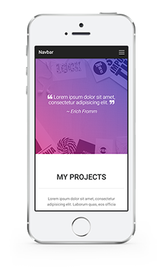
<div class="col-md-4 mb-2 center-on-small-only flex-center">
<img src="https://mdbootstrap.com/img/Mockups/Transparent/Small/iphone-portfolio1.png" alt="" class="z-depth-0">
</div>
<!--Grid column-->
<!--Grid column-->
<div class="col-md-4">
<!--Grid row-->
<div class="row mb-2">
<div class="col-2">
<i class="fa fa-2x fa-heart deep-purple-text"></i>
</div>
<div class="col-10 text-left">
<h5 class="font-weight-bold">Beloved</h5>
<p class="grey-text">Lorem ipsum dolor sit amet, consectetur adipisicing elit. Reprehenderit maiores
nam, aperiam minima assumenda
deleniti hic.</p>
</div>
</div>
<!--Grid row-->
<!--Grid row-->
<div class="row mb-2">
<div class="col-2">
<i class="fa fa-2x fa-flash deep-purple-text"></i>
</div>
<div class="col-10 text-left">
<h5 class="font-weight-bold">Rapid</h5>
<p class="grey-text">Lorem ipsum dolor sit amet, consectetur adipisicing elit. Reprehenderit maiores
nam, aperiam minima assumenda
deleniti hic.</p>
</div>
</div>
<!--Grid row-->
<!--Grid row-->
<div class="row mb-2">
<div class="col-2">
<i class="fa fa-2x fa-magic deep-purple-text"></i>
</div>
<div class="col-10 text-left">
<h5 class="font-weight-bold">Magical</h5>
<p class="grey-text">Lorem ipsum dolor sit amet, consectetur adipisicing elit. Reprehenderit maiores
nam, aperiam minima assumenda
deleniti hic.</p>
</div>
</div>
<!--Grid row-->
</div>
<!--Grid column-->
</div>
<!--Grid row-->
</section>
<!--/Section: Features v.4-->
Full list
To see the full list of available icons click the button below
Icons listGetting started : download & setup
Download
All the components and features are part of MDBootstrap package.
MDBootstrap (Material Design for Bootstrap) is a free (MIT Licensed) framework combining Material Design and the newest Bootstrap 4.
Click the button below to go to Download Page, where you can download MDBootstrap package.
MDBootstrap Download MDBootstrap AboutMDB Pro
Using components and features labeled as MDB Pro component requires MDB Pro package.
Click the button below to learn more about MDBbootstrap Pro package
MDBootstrap ProTutorials
If you need additional help to start, use our "5 min Quick Start" or "Full tutorial" resources.
5 min Quick Start Full TutorialCompilation
To reduce a weight of MDBootstrap package, you can compile your own, custom package containing only components and features you need.
Map of dependencies of SCSS files in MDBootstrap:
    Legend:

    '-->' means 'required'

    All free and pro files require files from 'core' catalog

    'none' means 'this component doesn't require anything except core files'

    A file wrapped by `< >` means that this file make the base component prettier but it isn't necessary for the proper working

    All PRO components require 'pro/_variables.scss' file

    scss/
    |
    |-- core/
    |   |
    |   |-- bootstrap/
    |   |	|-- _functions.scss
    |   |	|-- _variables.scss
    |   |
    |   |-- _colors.scss
    |   |-- _global.scss
    |   |-- _helpers.scss
    |   |-- _masks.scss
    |   |-- _mixins.scss
    |   |-- _typography.scss
    |   |-- _variables.scss
    |   |-- _waves.scss
    |
    |-- free/
    |   |-- _animations-basic.scss --> none
    |   |-- _animations-extended.scss --> _animations-basic.scss
    |   |-- _buttons.scss --> none
    |   |-- _cards.scss --> none <_buttons.scss>
    |   |-- _dropdowns.scss --> none <_buttons.scss>
    |   |-- _input-group.scss --> _forms.scss, _buttons.scss, _dropdowns.scss
    |   |-- _navbars.scss --> none <_buttons.scss, _forms.scss, _input-group.scss>
    |   |-- _pagination.scss --> none
    |   |-- _badges.scss --> none
    |   |-- _modals.scss --> _buttons.scss, _forms.scss (PRO --> _tabs.scss)
    |   |-- _carousels.scss --> <_buttons.scss>
    |   |-- _forms.scss --> none
    |   |-- _msc.scss --> none <_buttons.scss, _forms.scss, _cards.scss>
    |   |-- _footers.scss none <_buttons.scss> (PRO: )
    |   |-- _list-group.scss --> none
    |   |-- _tables.scss --> none (PRO: _material-select.scss, pro/_forms.scss, _checkbox.scss, pro/_buttons.scss, pro/_cards.scss, _pagination.scss, pro/_msc.scss)
    |   |-- _depreciated.scss
    |
    |-- pro/
    |   |
    |   |-- picker/
    |   |   |-- _default.scss --> none
    |   |   |-- _default-time.scss --> _default.scss, free/_forms.scss, free/_buttons.scss, pro/_buttons.scss, free/_cards.scss
    |   |   |-- _default-date.scss --> _default.scss, free/_forms.scss
    |   |
    |   |-- sections/
    |   |   |-- _templates.scss --> _sidenav.scss
    |   |   |-- _social.scss --> free/_cards.scss, free/ _forms.scss, free/_buttons.scss, pro/_buttons.scss,
    |   |   |-- _team.scss --> free/_buttons.scss, pro/_buttons.scss, free/_cards.scss, pro/_cards.scss
    |   |   |-- _testimonials.scss --> free/_carousels.scss, pro/_carousels.scss, free/_buttons.scss, pro/_buttons.scss
    |   |   |-- _magazine.scss --> _badges.scss
    |   |   |-- _pricing.scss --> free/_buttons.scss, pro/_buttons.scss
    |   |   |-- _contacts.scss --> free/_forms.scss, pro/_forms.scss, free/_buttons.scss, pro/_buttons.scss
    |   |
    |   |-- _variables.scss
    |   |-- _buttons.scss --> free/_buttons.scss, pro/_msc.scss, _checkbox.scss, _radio.scss
    |   |-- _social-buttons.scss --> free/_buttons.scss, pro/_buttons.scss
    |   |-- _tabs.scss --> _cards.scss
    |   |-- _cards.scss --> free/_cards.scss <_buttons.scss, _social-buttons.scss>
    |   |-- _dropdowns.scss --> free/_dropdowns.scss, free/_buttons.scss
    |   |-- _navbars.scss --> free/_navbars.scss  (PRO: )
    |   |-- _scrollspy.scss --> none
    |   |-- _lightbox.scss --> none
    |   |-- _chips.scss --> none
    |   |-- _msc.scss --> none
    |   |-- _forms.scss --> none
    |   |-- _radio.scss --> none
    |   |-- _checkbox.scss --> none
    |   |-- _material-select.scss --> none
    |   |-- _switch.scss --> none
    |   |-- _file-input.scss --> free/_forms.scss, free/_buttons.scss
    |   |-- _range.scss --> none
    |   |-- _input-group.scss --> free/_input-group.scss and the same what free input group, _checkbox.scss, _radio.scss
    |   |-- _autocomplete.scss --> free/_forms.scss
    |   |-- _accordion.scss --> pro/_animations.scss, free/_cards.scss
    |   |-- _parallax.scss --> none
    |   |-- _sidenav.scss --> free/_forms.scss, pro/_animations.scss, sections/_templates.scss
    |   |-- _ecommerce.scss --> free/_cards.scss, pro/_cards.scss, free/_buttons.scss, pro/_buttons.scss, pro/_msc.scss
    |   |-- _carousels.scss --> free/_carousels.scss, free/_cards.scss, free/_buttons.scss
    |   |-- _steppers.scss --> free/_buttons.scss
    |   |-- _blog.scss --> none
    |   |-- _toasts.scss --> free/_buttons.scss
    |   |-- _animations.scss --> none
    |   |-- _charts.scss --> none
    |   |-- _progress.scss --> none
    |   |-- _scrollbar.scss --> none
    |   |-- _skins.scss --> none
    |   |-- _depreciated.scss
    |
    `-- _custom-skin.scss
    `-- _custom-styles.scss
    `-- _custom-variables.scss
    `-- mdb.scss
Map of dependencies of JavaScript modules in MDBootstrap:
    Legend:

    '-->' means 'required'

    All files require jQuery and bootstrap.js

    js/
    ├── dist/
    │   ├── buttons.js
    │   ├── cards.js
    │   ├── character-counter.js
    │   ├── chips.js
    │   ├── collapsible.js --> vendor/velocity.js
    │   ├── dropdown.js --> Popper.js, jquery.easing.js
    │   ├── file-input.js
    │   ├── forms-free.js
    │   ├── material-select.js --> dropdown.js
    │   ├── mdb-autocomplete.js
    │   ├── preloading.js
    │   ├── range-input.js --> vendor/velocity.js
    │   ├── scrolling-navbar.js
    │   ├── sidenav.js --> vendor/velocity.js, vendor/hammer.js, vendor/jquery.hammer.js
    │   └── smooth-scroll.js
    ├── _intro-mdb-pro.js
    ├── modules.js
    ├── src/
    │   ├── buttons.js
    │   ├── cards.js
    │   ├── character-counter.js
    │   ├── chips.js
    │   ├── collapsible.js --> vendor/velocity.js
    │   ├── dropdown.js --> Popper.js, jquery.easing.js
    │   ├── file-input.js
    │   ├── forms-free.js
    │   ├── material-select.js --> dropdown.js
    │   ├── mdb-autocomplete.js
    │   ├── preloading.js
    │   ├── range-input.js --> vendor/velocity.js
    │   ├── scrolling-navbar.js
    │   ├── sidenav.js --> vendor/velocity.js, vendor/hammer.js, vendor/jquery.hammer.js
    │   └── smooth-scroll.js
    └── vendor/
        ├── addons/
        │   ├── datatables.js
        │   └── datatables.min.js
        ├── chart.js
        ├── enhanced-modals.js
        ├── hammer.js
        ├── jarallax.js
        ├── jarallax-video.js --> vendor/jarallax.js
        ├── jquery.easing.js
        ├── jquery.easypiechart.js
        ├── jquery.hammer.js --> vendor/hammer.js
        ├── jquery.sticky.js
        ├── lightbox.js
        ├── picker-date.js --> vendor/picker.js
        ├── picker.js
        ├── picker-time.js --> vendor/picker.js
        ├── scrollbar.js
        ├── scrolling-navbar.js
        ├── toastr.js
        ├── velocity.js
        ├── waves.js
        └── wow.js
Compilation & Customization tutorial
If you need additional help to compile your custom package, use our Compilation & Customization tutorial
Compilation & Customization tutorialIntegrations with Angular, React or Vue
Apart from standard Bootstrap integration with jQuery, MDBootstrap provides integrations with Angular, React and Vue.
About MDB Angular About MDB React About MDB Vue