Navbar
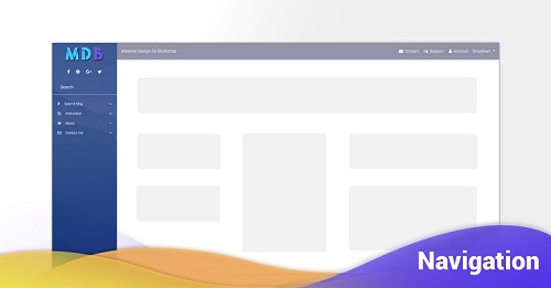
Bootstrap Navbar
Documentation and examples for Bootstrap’s powerful, responsive navigation header, the navbar. Includes support for branding, navigation, and more, including support for our collapse plugin.
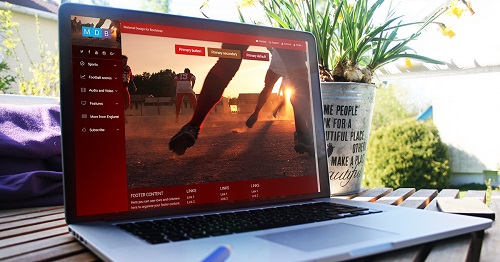
MDB provides you with stylish Navbars, with distinctive for Material Design details (such as shadows, living colors or charming wave effects triggered by clicking on the link). Apart from traditional, text links, Bootstraps Navbar might embed regular & social icons, dropdowns, avatars or search forms.
How it works
Here’s what you need to know before getting started with the navbar:
- Navbars require a wrapping
.navbarwith.navbar-expand{-sm|-md|-lg|-xl}for responsive collapsing and color scheme classes. - Navbars and their contents are fluid by default. Use optional containers to limit their horizontal width.
- Use our spacing and flex utility classes for controlling spacing and alignment within navbars.
- Navbars are responsive by default, but you can easily modify them to change that. Responsive behavior depends on our Collapse JavaScript plugin.
- Navbars are hidden by default when printing. Force them to be printed by adding
.d-printto the.navbar. See the display utility class. - Ensure accessibility by using a
<nav>element or, if using a more generic element such as a<div>, add arole="navigation"to every navbar to explicitly identify it as a landmark region for users of assistive technologies.
Read on for an example and list of supported sub-components.
Basic example
Here’s an example of all the sub-components included in a responsive light-themed navbar that
automatically collapses
at the
lg (large) breakpoint.
        <!--Navbar-->
        <nav class="navbar navbar-expand-lg navbar-dark primary-color">

          <!-- Navbar brand -->
          <a class="navbar-brand" href="#">Navbar</a>

          <!-- Collapse button -->
          <button class="navbar-toggler" type="button" data-toggle="collapse" data-target="#basicExampleNav"
            aria-controls="basicExampleNav" aria-expanded="false" aria-label="Toggle navigation">
            <span class="navbar-toggler-icon"></span>
          </button>

          <!-- Collapsible content -->
          <div class="collapse navbar-collapse" id="basicExampleNav">

            <!-- Links -->
            <ul class="navbar-nav mr-auto">
              <li class="nav-item active">
                <a class="nav-link" href="#">Home
                  <span class="sr-only">(current)</span>
                </a>
              </li>
              <li class="nav-item">
                <a class="nav-link" href="#">Features</a>
              </li>
              <li class="nav-item">
                <a class="nav-link" href="#">Pricing</a>
              </li>

              <!-- Dropdown -->
              <li class="nav-item dropdown">
                <a class="nav-link dropdown-toggle" id="navbarDropdownMenuLink" data-toggle="dropdown" aria-haspopup="true"
                  aria-expanded="false">Dropdown</a>
                <div class="dropdown-menu dropdown-primary" aria-labelledby="navbarDropdownMenuLink">
                  <a class="dropdown-item" href="#">Action</a>
                  <a class="dropdown-item" href="#">Another action</a>
                  <a class="dropdown-item" href="#">Something else here</a>
                </div>
              </li>

            </ul>
            <!-- Links -->

            <form class="form-inline">
              <div class="md-form my-0">
                <input class="form-control mr-sm-2" type="text" placeholder="Search" aria-label="Search">
              </div>
            </form>
          </div>
          <!-- Collapsible content -->

        </nav>
        <!--/.Navbar-->
Supported content
Navbars come with built-in support for a handful of sub-components. Choose from the following as needed:
-
.navbar-brandfor your company, product, or project name. -
.navbar-navfor a full-height and lightweight navigation (including support for dropdowns). -
.navbar-togglerfor use with our collapse plugin and other navigation toggling behaviors. -
.form-inlinefor any form controls and actions. -
.navbar-textfor adding vertically centered strings of text. -
.collapse.navbar-collapsefor grouping and hiding navbar contents by a parent breakpoint.
Brand
The
.navbar-brand can be applied to most elements, but an anchor works best as some elements might require
utility classes or
custom styles.
        <!-- As a link -->
        <nav class="navbar navbar-dark primary-color">
          <a class="navbar-brand" href="#">Link</a>
        </nav>

        <br>

        <!-- As a heading -->
        <nav class="navbar navbar-light blue lighten-4">
          <span class="navbar-brand">Heading</span>
        </nav>
Naving
Navbar navigation links build on our
.nav options with their own modifier class and require the use of
toggler classes for proper responsive styling.
Navigation in navbars will also grow to occupy as much horizontal space as possible to keep your
navbar
contents securely aligned.
Active states—with
.active—to indicate the current page can be applied directly to
.nav-links or their immediate parent
.nav-items.
        <nav class="navbar navbar-expand-lg navbar-dark primary-color">
          <a class="navbar-brand" href="#">Navbar</a>
          <button class="navbar-toggler" type="button" data-toggle="collapse" data-target="#navbarNav" aria-controls="navbarNav"
            aria-expanded="false" aria-label="Toggle navigation">
            <span class="navbar-toggler-icon"></span>
          </button>
          <div class="collapse navbar-collapse" id="navbarNav">
            <ul class="navbar-nav">
              <li class="nav-item active">
                <a class="nav-link" href="#">Home <span class="sr-only">(current)</span></a>
              </li>
              <li class="nav-item">
                <a class="nav-link" href="#">Features</a>
              </li>
              <li class="nav-item">
                <a class="nav-link" href="#">Pricing</a>
              </li>
              <li class="nav-item">
                <a class="nav-link disabled" href="#">Disabled</a>
              </li>
            </ul>
          </div>
        </nav>
Forms
Place various form controls and components within a navbar with
.form-inline. You can use form control in material kind of style or default bootstrap one.
        <nav class="navbar navbar-dark default-color">
          <form class="form-inline">
            <div class="md-form my-0">
              <input class="form-control mr-sm-2" type="text" placeholder="Search" aria-label="Search">
            </div>
            <button class="btn btn-outline-white btn-md my-2 my-sm-0 ml-3" type="submit">Search</button>
          </form>
        </nav>

        <br>

        <!--Navbar-->
        <nav class="navbar navbar-dark default-color">
          <form class="form-inline my-2 my-lg-0 ml-auto">
            <input class="form-control" type="search" placeholder="Search" aria-label="Search">
            <button class="btn btn-outline-white btn-md my-2 my-sm-0 ml-3" type="submit">Search</button>
          </form>
        </nav>
        <!--/.Navbar-->
Text
Navbars may contain bits of text with the help of
.navbar-text. This class adjusts vertical alignment and horizontal spacing for strings of text.
        <nav class="navbar navbar-dark indigo">
          <span class="navbar-text white-text">
            Navbar text with an inline element
          </span>
        </nav>
Mix and match with other components and utilities as needed.
        <nav class="navbar navbar-expand-lg navbar-dark indigo">
          <a class="navbar-brand" href="#">Navbar w/ text</a>
          <button class="navbar-toggler" type="button" data-toggle="collapse" data-target="#navbarText" aria-controls="navbarText"
            aria-expanded="false" aria-label="Toggle navigation">
            <span class="navbar-toggler-icon"></span>
          </button>
          <div class="collapse navbar-collapse" id="navbarText">
            <ul class="navbar-nav mr-auto">
              <li class="nav-item active">
                <a class="nav-link" href="#">Home
                  <span class="sr-only">(current)</span>
                </a>
              </li>
              <li class="nav-item">
                <a class="nav-link" href="#">Features</a>
              </li>
              <li class="nav-item">
                <a class="nav-link" href="#">Pricing</a>
              </li>
            </ul>
            <span class="navbar-text white-text">
              Navbar text with an inline element
            </span>
          </div>
        </nav>
Images
Adding images to the .navbar-brand will likely always require custom styles or
utilities to properly size. Here are
some examples to demonstrate.
        <!-- Just an image -->
        <nav class="navbar navbar-dark primary-color">
          <a class="navbar-brand" href="#">
            <img src="https://mdbootstrap.com/img/logo/mdb-transparent.png" height="30" alt="mdb logo">
          </a>
        </nav>
        <!-- Just an image -->
        <nav class="navbar navbar-dark primary-color">
          <a class="navbar-brand" href="#">
            <img src="https://mdbootstrap.com/img/logo/mdb-transparent.png" height="30" alt="mdb logo">
          </a>
        </nav>
        <!-- Image and text -->
        <nav class="navbar navbar-dark primary-color">
          <a class="navbar-brand" href="#">
            <img src="https://mdbootstrap.com/img/logo/mdb-transparent.png" height="30" class="d-inline-block align-top"
              alt="mdb logo"> Bootstrap
          </a>
        </nav>
Heading
Align the contents of your inline forms with utilities as needed.
        <nav class="navbar navbar-dark default-color justify-content-between">
          <a class="navbar-brand" href="#">Navbar</a>
          <form class="form-inline my-1">
            <div class="md-form form-sm my-0">
              <input class="form-control form-control-sm mr-sm-2 mb-0" type="text" placeholder="Search" aria-label="Search">
            </div>
            <button class="btn btn-outline-white btn-sm my-0" type="submit">Search</button>
          </form>
        </nav>
Input groups work, too:
        <nav class="navbar navbar-dark default-color">
          <form class="form-inline">
            <div class="md-form input-group my-0">
              <div class="input-group-prepend">
                <span class="input-group-text" id="basic-addon11">@</span>
              </div>
              <input type="text" class="form-control" placeholder="Username" aria-label="Username" aria-describedby="basic-addon11">
            </div>
          </form>
        </nav>
Various buttons are supported as part of these navbar forms, too. This is also a great reminder that vertical alignment utilities can be used to align different sized elements.
        <nav class="navbar navbar-dark indigo">
          <form class="form-inline">
            <button class="btn btn-outline-success" type="button">Main button</button>
            <button class="btn btn-sm align-middle btn-outline-secondary" type="button">Smaller button</button>
          </form>
        </nav>
Color schemes
Theming the navbar has never been easier thanks to the combination of a simple link color
modifier class and
background-color utilities. Put another way, you specify light or dark and apply a background color.
You can choose one of over 300 colors form our material palette .
        <!--/.Navbar danger color-->
        <nav class="navbar navbar-dark danger-color">
          ...
        </nav>
        <!--/.Navbar danger color-->

        <!--/.Navbar secondary color-->
        <nav class="navbar navbar-dark secondary-color">
          ...
        </nav>
        <!--/.Navbar secondary color-->

        <!--/.Navbar default color-->
        <nav class="navbar-light default-color lighten-4">
          ...
        </nav>
        <!--/.Navbar default color-->
If you want to use light background you should apply
.navbar-light class to the Navbar, to provide a proper contrast for the links.
        <!--Navbar-->
        <nav class="navbar navbar-expand-lg navbar-light warning-color lighten-5">
          [..]
        </nav>
        <!--/.Navbar-->
Containers
Although it’s not required, you can wrap a navbar in a
.container to center it on a page or add one within to only center the contents of a
fixed or static top navbar
        <div class="container">
          <nav class="navbar navbar-expand-lg navbar-dark indigo">
            <a class="navbar-brand" href="#">Navbar</a>
          </nav>
        </div>
When the container is within your navbar, its horizontal padding is removed at breakpoints lower than your
specified
.navbar-expand{-sm|-md|-lg|-xl} class. This ensures we’re not doubling up on padding unnecessarily on
lower viewports when your navbar is collapsed.
        <nav class="navbar navbar-expand-lg navbar-dark indigo">
          <div class="container">
            <a class="navbar-brand" href="#">Navbar</a>
          </div>
        </nav>
Placement
Use our
position utilities to place navbars in
non-static positions. Choose from fixed to the top, fixed to the
bottom, or stickied to the top (scrolls with the page until it reaches the top, then stays there). Fixed
navbars use
position: fixed, meaning they’re pulled from the normal flow of the DOM and may require custom CSS
(e.g.,
padding-top on the
<body>) to prevent overlap with other elements.
Also note that
.sticky-top uses
position: sticky, which
isn’t fully supported in every browser
.
Default
        <nav class="navbar navbar-light bg-light">
          <a class="navbar-brand" href="#">Default</a>
        </nav>
Fixed top
        <nav class="navbar fixed-top navbar-light bg-light">
          <a class="navbar-brand" href="#">Fixed top</a>
        </nav>
Fixed bottom
        <nav class="navbar fixed-bottom navbar-dark indigo">
          <a class="navbar-brand" href="#">Fixed bottom</a>
        </nav>
Sticky top
        <nav class="navbar sticky-top navbar-dark indigo">
          <a class="navbar-brand" href="#">Sticky top</a>
        </nav>
Responsive behaviors
Navbars can utilize
.navbar-toggler,
.navbar-collapse, and
.navbar-expand{-sm|-md|-lg|-xl} classes to change when their content collapses behind a button. In
combination with other utilities, you can
easily choose when to show or hide particular elements.
For navbars that never collapse, add the
.navbar-expand class on the navbar. For navbars that always collapse, don’t add any
.navbar-expand class.
Toggler
Navbar togglers are left-aligned by default, but should they follow a sibling element like a
.navbar-brand, they’ll automatically be aligned to the far right. Reversing your markup will reverse
the placement of the
toggler. Below are examples of different toggle styles.
With no
.navbar-brand shown in lowest breakpoint:
        <nav class="navbar navbar-expand-lg navbar-dark indigo">
          <button class="navbar-toggler" type="button" data-toggle="collapse" data-target="#navbarTogglerDemo01"
            aria-controls="navbarTogglerDemo01" aria-expanded="false" aria-label="Toggle navigation">
            <span class="navbar-toggler-icon"></span>
          </button>
          <div class="collapse navbar-collapse" id="navbarTogglerDemo01">
            <a class="navbar-brand" href="#">Hidden brand</a>
            <ul class="navbar-nav mr-auto mt-lg-0">
              <li class="nav-item active">
                <a class="nav-link" href="#">Home <span class="sr-only">(current)</span></a>
              </li>
              <li class="nav-item">
                <a class="nav-link" href="#">Link</a>
              </li>
              <li class="nav-item">
                <a class="nav-link disabled" href="#">Disabled</a>
              </li>
            </ul>
          </div>
        </nav>
With a brand name shown on the left and toggler on the right:
        <nav class="navbar navbar-expand-lg navbar-dark indigo">
          <a class="navbar-brand" href="#">Navbar</a>
          <button class="navbar-toggler" type="button" data-toggle="collapse" data-target="#navbarTogglerDemo02"
            aria-controls="navbarTogglerDemo02" aria-expanded="false" aria-label="Toggle navigation">
            <span class="navbar-toggler-icon"></span>
          </button>

          <div class="collapse navbar-collapse" id="navbarTogglerDemo02">
            <ul class="navbar-nav mr-auto mt-lg-0">
              <li class="nav-item active">
                <a class="nav-link" href="#">Home <span class="sr-only">(current)</span></a>
              </li>
              <li class="nav-item">
                <a class="nav-link" href="#">Link</a>
              </li>
              <li class="nav-item">
                <a class="nav-link disabled" href="#">Disabled</a>
              </li>
            </ul>
          </div>
        </nav>
External content
Sometimes you want to use the collapse plugin to trigger hidden content elsewhere on the page. Because our plugin works on the id and data-target matching, that’s easily done!
        <div class="pos-f-t">
          <div class="collapse" id="navbarToggleExternalContent">
            <div class="bg-dark p-4">
              <h4 class="text-white">Collapsed content</h4>
              <span class="text-muted">Toggleable via the navbar brand.</span>
            </div>
          </div>
          <nav class="navbar navbar-dark bg-dark">
            <button class="navbar-toggler" type="button" data-toggle="collapse" data-target="#navbarToggleExternalContent"
              aria-controls="navbarToggleExternalContent" aria-expanded="false" aria-label="Toggle navigation">
              <span class="navbar-toggler-icon"></span>
            </button>
          </nav>
        </div>
Advanced navigation MDB Pro component
MDB provides you multiple useful, ready-to-use page layouts with various predefined navigation types.
Getting started : download & setup
Download
All the components and features are part of MDBootstrap package.
MDBootstrap (Material Design for Bootstrap) is a free (MIT Licensed) framework combining Material Design and the newest Bootstrap 4.
Click the button below to go to Download Page, where you can download MDBootstrap package.
MDBootstrap Download MDBootstrap AboutMDB Pro
Using components and features labeled as MDB Pro component requires MDB Pro package.
Click the button below to learn more about MDBbootstrap Pro package
MDBootstrap ProTutorials
If you need additional help to start, use our "5 min Quick Start" or "Full tutorial" resources.
5 min Quick Start Full TutorialCompilation
To reduce a weight of MDBootstrap package, you can compile your own, custom package containing only components and features you need.
Map of dependencies of SCSS files in MDBootstrap:
    Legend:

    '-->' means 'required'

    All free and pro files require files from 'core' catalog

    'none' means 'this component doesn't require anything except core files'

    A file wrapped by `< >` means that this file make the base component prettier but it isn't necessary for the proper working

    All PRO components require 'pro/_variables.scss' file

    scss/
    |
    |-- core/
    |   |
    |   |-- bootstrap/
    |   |	|-- _functions.scss
    |   |	|-- _variables.scss
    |   |
    |   |-- _colors.scss
    |   |-- _global.scss
    |   |-- _helpers.scss
    |   |-- _masks.scss
    |   |-- _mixins.scss
    |   |-- _typography.scss
    |   |-- _variables.scss
    |   |-- _waves.scss
    |
    |-- free/
    |   |-- _animations-basic.scss --> none
    |   |-- _animations-extended.scss --> _animations-basic.scss
    |   |-- _buttons.scss --> none
    |   |-- _cards.scss --> none <_buttons.scss>
    |   |-- _dropdowns.scss --> none <_buttons.scss>
    |   |-- _input-group.scss --> _forms.scss, _buttons.scss, _dropdowns.scss
    |   |-- _navbars.scss --> none <_buttons.scss, _forms.scss, _input-group.scss>
    |   |-- _pagination.scss --> none
    |   |-- _badges.scss --> none
    |   |-- _modals.scss --> _buttons.scss, _forms.scss (PRO --> _tabs.scss)
    |   |-- _carousels.scss --> <_buttons.scss>
    |   |-- _forms.scss --> none
    |   |-- _msc.scss --> none <_buttons.scss, _forms.scss, _cards.scss>
    |   |-- _footers.scss none <_buttons.scss> (PRO: )
    |   |-- _list-group.scss --> none
    |   |-- _tables.scss --> none (PRO: _material-select.scss, pro/_forms.scss, _checkbox.scss, pro/_buttons.scss, pro/_cards.scss, _pagination.scss, pro/_msc.scss)
    |   |-- _depreciated.scss
    |
    |-- pro/
    |   |
    |   |-- picker/
    |   |   |-- _default.scss --> none
    |   |   |-- _default-time.scss --> _default.scss, free/_forms.scss, free/_buttons.scss, pro/_buttons.scss, free/_cards.scss
    |   |   |-- _default-date.scss --> _default.scss, free/_forms.scss
    |   |
    |   |-- sections/
    |   |   |-- _templates.scss --> _sidenav.scss
    |   |   |-- _social.scss --> free/_cards.scss, free/ _forms.scss, free/_buttons.scss, pro/_buttons.scss,
    |   |   |-- _team.scss --> free/_buttons.scss, pro/_buttons.scss, free/_cards.scss, pro/_cards.scss
    |   |   |-- _testimonials.scss --> free/_carousels.scss, pro/_carousels.scss, free/_buttons.scss, pro/_buttons.scss
    |   |   |-- _magazine.scss --> _badges.scss
    |   |   |-- _pricing.scss --> free/_buttons.scss, pro/_buttons.scss
    |   |   |-- _contacts.scss --> free/_forms.scss, pro/_forms.scss, free/_buttons.scss, pro/_buttons.scss
    |   |
    |   |-- _variables.scss
    |   |-- _buttons.scss --> free/_buttons.scss, pro/_msc.scss, _checkbox.scss, _radio.scss
    |   |-- _social-buttons.scss --> free/_buttons.scss, pro/_buttons.scss
    |   |-- _tabs.scss --> _cards.scss
    |   |-- _cards.scss --> free/_cards.scss <_buttons.scss, _social-buttons.scss>
    |   |-- _dropdowns.scss --> free/_dropdowns.scss, free/_buttons.scss
    |   |-- _navbars.scss --> free/_navbars.scss  (PRO: )
    |   |-- _scrollspy.scss --> none
    |   |-- _lightbox.scss --> none
    |   |-- _chips.scss --> none
    |   |-- _msc.scss --> none
    |   |-- _forms.scss --> none
    |   |-- _radio.scss --> none
    |   |-- _checkbox.scss --> none
    |   |-- _material-select.scss --> none
    |   |-- _switch.scss --> none
    |   |-- _file-input.scss --> free/_forms.scss, free/_buttons.scss
    |   |-- _range.scss --> none
    |   |-- _input-group.scss --> free/_input-group.scss and the same what free input group, _checkbox.scss, _radio.scss
    |   |-- _autocomplete.scss --> free/_forms.scss
    |   |-- _accordion.scss --> pro/_animations.scss, free/_cards.scss
    |   |-- _parallax.scss --> none
    |   |-- _sidenav.scss --> free/_forms.scss, pro/_animations.scss, sections/_templates.scss
    |   |-- _ecommerce.scss --> free/_cards.scss, pro/_cards.scss, free/_buttons.scss, pro/_buttons.scss, pro/_msc.scss
    |   |-- _carousels.scss --> free/_carousels.scss, free/_cards.scss, free/_buttons.scss
    |   |-- _steppers.scss --> free/_buttons.scss
    |   |-- _blog.scss --> none
    |   |-- _toasts.scss --> free/_buttons.scss
    |   |-- _animations.scss --> none
    |   |-- _charts.scss --> none
    |   |-- _progress.scss --> none
    |   |-- _scrollbar.scss --> none
    |   |-- _skins.scss --> none
    |   |-- _depreciated.scss
    |
    `-- _custom-skin.scss
    `-- _custom-styles.scss
    `-- _custom-variables.scss
    `-- mdb.scss
Map of dependencies of JavaScript modules in MDBootstrap:
    Legend:

    '-->' means 'required'

    All files require jQuery and bootstrap.js

    js/
    ├── dist/
    │   ├── buttons.js
    │   ├── cards.js
    │   ├── character-counter.js
    │   ├── chips.js
    │   ├── collapsible.js --> vendor/velocity.js
    │   ├── dropdown.js --> Popper.js, jquery.easing.js
    │   ├── file-input.js
    │   ├── forms-free.js
    │   ├── material-select.js --> dropdown.js
    │   ├── mdb-autocomplete.js
    │   ├── preloading.js
    │   ├── range-input.js --> vendor/velocity.js
    │   ├── scrolling-navbar.js
    │   ├── sidenav.js --> vendor/velocity.js, vendor/hammer.js, vendor/jquery.hammer.js
    │   └── smooth-scroll.js
    ├── _intro-mdb-pro.js
    ├── modules.js
    ├── src/
    │   ├── buttons.js
    │   ├── cards.js
    │   ├── character-counter.js
    │   ├── chips.js
    │   ├── collapsible.js --> vendor/velocity.js
    │   ├── dropdown.js --> Popper.js, jquery.easing.js
    │   ├── file-input.js
    │   ├── forms-free.js
    │   ├── material-select.js --> dropdown.js
    │   ├── mdb-autocomplete.js
    │   ├── preloading.js
    │   ├── range-input.js --> vendor/velocity.js
    │   ├── scrolling-navbar.js
    │   ├── sidenav.js --> vendor/velocity.js, vendor/hammer.js, vendor/jquery.hammer.js
    │   └── smooth-scroll.js
    └── vendor/
        ├── addons/
        │   ├── datatables.js
        │   └── datatables.min.js
        ├── chart.js
        ├── enhanced-modals.js
        ├── hammer.js
        ├── jarallax.js
        ├── jarallax-video.js --> vendor/jarallax.js
        ├── jquery.easing.js
        ├── jquery.easypiechart.js
        ├── jquery.hammer.js --> vendor/hammer.js
        ├── jquery.sticky.js
        ├── lightbox.js
        ├── picker-date.js --> vendor/picker.js
        ├── picker.js
        ├── picker-time.js --> vendor/picker.js
        ├── scrollbar.js
        ├── scrolling-navbar.js
        ├── toastr.js
        ├── velocity.js
        ├── waves.js
        └── wow.js
Compilation & Customization tutorial
If you need additional help to compile your custom package, use our Compilation & Customization tutorial
Compilation & Customization tutorialIntegrations with Angular, React or Vue
Apart from standard Bootstrap integration with jQuery, MDBootstrap provides integrations with Angular, React and Vue.
About MDB Angular About MDB React About MDB Vue