Skins
Bootstrap skins
Bootstrap skins are basic color schemes which can be applied for the website providing ready to use full-page web design.
MDB provides you with few basic color skins schemes you might consider applying on your website for a different effect.
To apply a skin you just need to add one of our skin classes to the <body> element.
Skin affects the following elements: navbar, sideNav, footer, button, dropdown, pagination, input, controls of carousel-multi-item, form-header, card-header, spinners, pagination, gradients, primary, secondary, default colors.
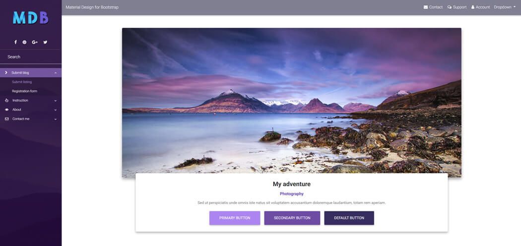
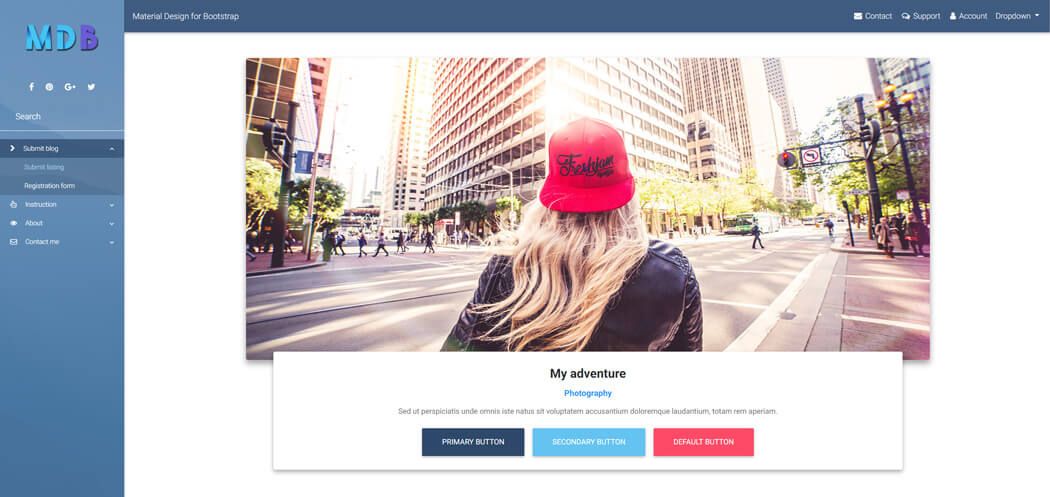
White skin MDB Pro component
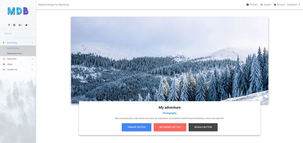
<body class="white-skin">
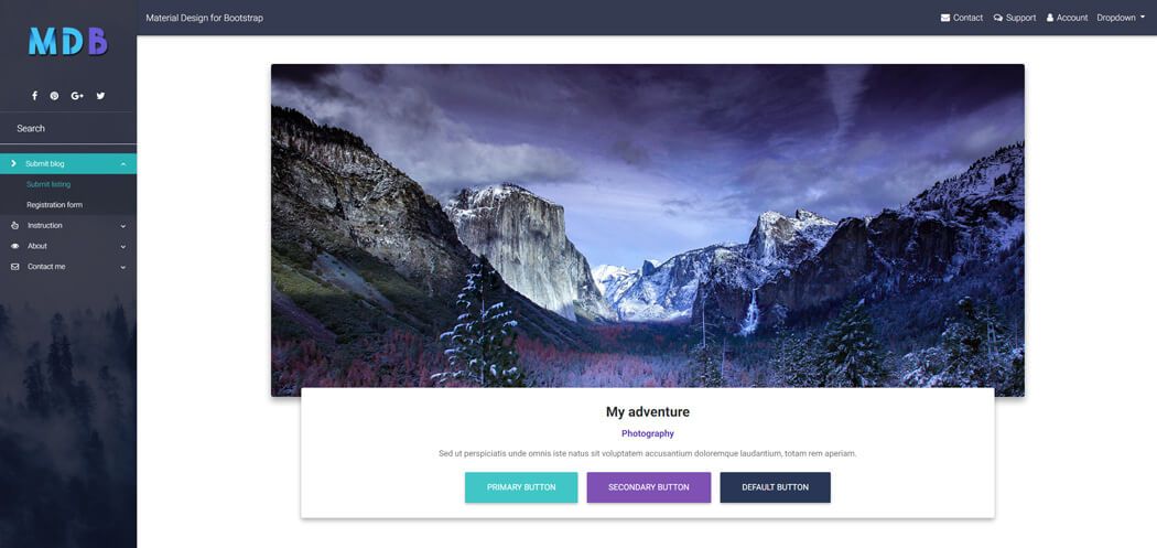
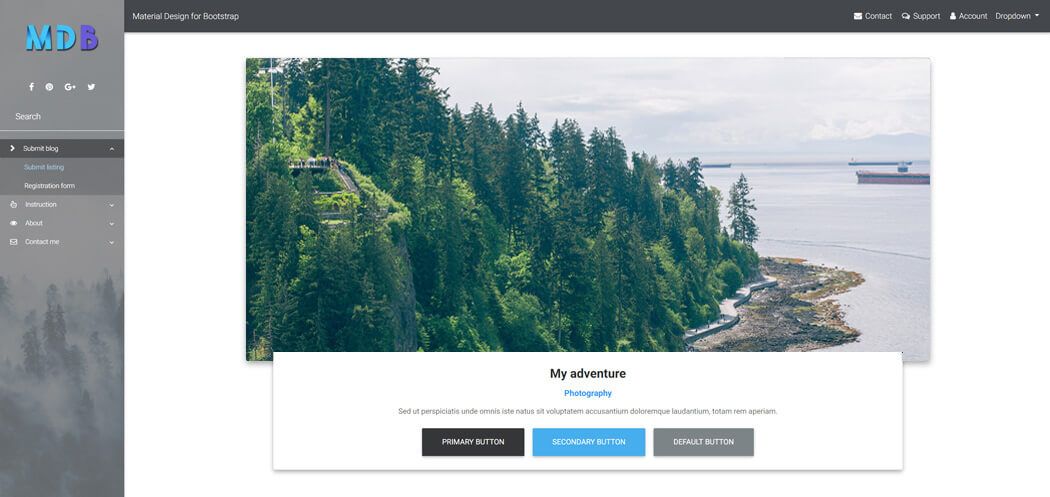
Black skin MDB Pro component
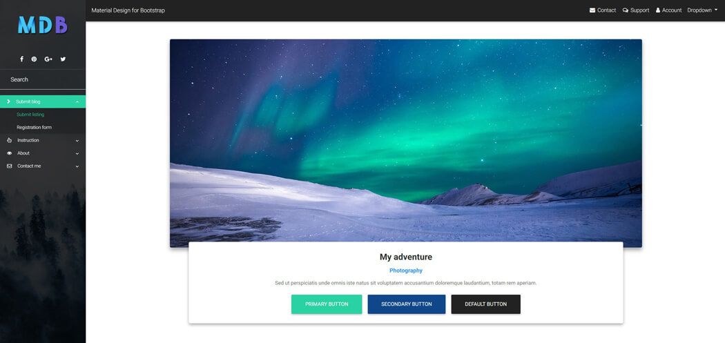
<body class="black-skin">
Cyan skin MDB Pro component
<body class="cyan-skin">
MDB skin MDB Pro component
<body class="mdb-skin">
Deep purple skin MDB Pro component
<body class="deep-purple-skin">
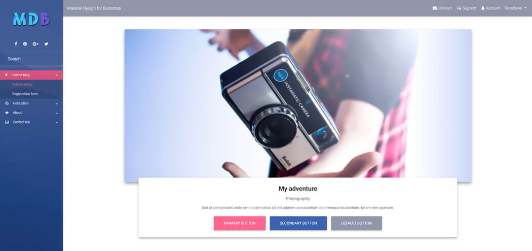
Navy blue skin MDB Pro component
<body class="navy-blue-skin">
Pink skin MDB Pro component
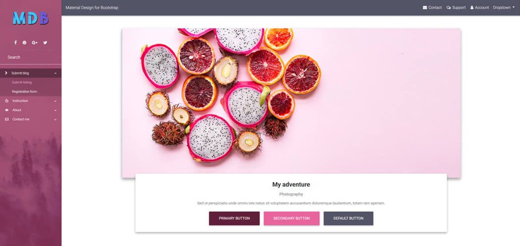
<body class="pink-skin">
Indigo skin MDB Pro component
<body class="indigo-skin">
Light blue skin MDB Pro component
<body class="light-blue-skin">
Grey skin MDB Pro component
<body class="grey-skin">
The possibility to add custom skin
From the newest version of MDB - 4.5.2 you have a possibility of adding custom skin. Below we explain in a few steps how to do this. Note: to create the custom skin, it's best to use MDB Pro Gulp package.
Instruction of adding custom skin:
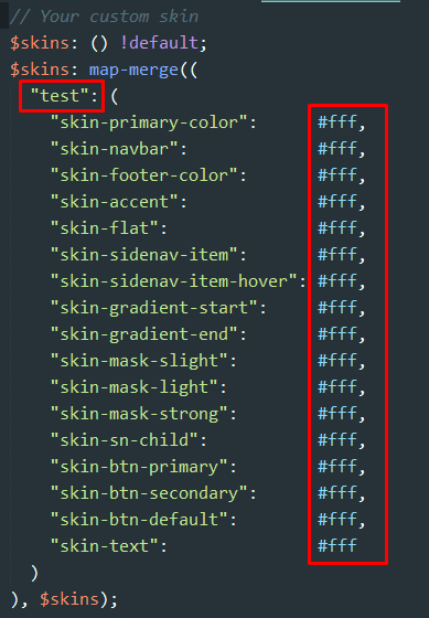
In your package in the SCSS catalog, you can see _custom-skin.scss file.
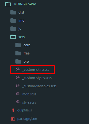
Go to this file and change name of skin and the values of $skins object to your custom colors and safe the file. After that you will have recompiled mdb.css file with your new skin.
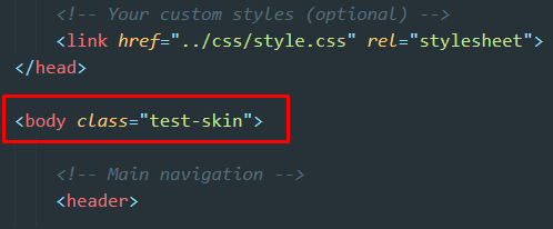
In your HTML file, add to the body tag the class for your custom skin, eg. .test-skin class.
Getting started : download & setup
Download
All the components and features are part of MDBootstrap package.
MDBootstrap (Material Design for Bootstrap) is a free (MIT Licensed) framework combining Material Design and the newest Bootstrap 4.
Click the button below to go to Download Page, where you can download MDBootstrap package.
MDBootstrap Download MDBootstrap AboutMDB Pro
Using components and features labeled as MDB Pro component requires MDB Pro package.
Click the button below to learn more about MDBbootstrap Pro package
MDBootstrap ProTutorials
If you need additional help to start, use our "5 min Quick Start" or "Full tutorial" resources.
5 min Quick Start Full TutorialCompilation
To reduce a weight of MDBootstrap package, you can compile your own, custom package containing only components and features you need.
Map of dependencies of SCSS files in MDBootstrap:
    Legend:

    '-->' means 'required'

    All free and pro files require files from 'core' catalog

    'none' means 'this component doesn't require anything except core files'

    A file wrapped by `< >` means that this file make the base component prettier but it isn't necessary for the proper working

    All PRO components require 'pro/_variables.scss' file

    scss/
    |
    |-- core/
    |   |
    |   |-- bootstrap/
    |   |	|-- _functions.scss
    |   |	|-- _variables.scss
    |   |
    |   |-- _colors.scss
    |   |-- _global.scss
    |   |-- _helpers.scss
    |   |-- _masks.scss
    |   |-- _mixins.scss
    |   |-- _typography.scss
    |   |-- _variables.scss
    |   |-- _waves.scss
    |
    |-- free/
    |   |-- _animations-basic.scss --> none
    |   |-- _animations-extended.scss --> _animations-basic.scss
    |   |-- _buttons.scss --> none
    |   |-- _cards.scss --> none <_buttons.scss>
    |   |-- _dropdowns.scss --> none <_buttons.scss>
    |   |-- _input-group.scss --> _forms.scss, _buttons.scss, _dropdowns.scss
    |   |-- _navbars.scss --> none <_buttons.scss, _forms.scss, _input-group.scss>
    |   |-- _pagination.scss --> none
    |   |-- _badges.scss --> none
    |   |-- _modals.scss --> _buttons.scss, _forms.scss (PRO --> _tabs.scss)
    |   |-- _carousels.scss --> <_buttons.scss>
    |   |-- _forms.scss --> none
    |   |-- _msc.scss --> none <_buttons.scss, _forms.scss, _cards.scss>
    |   |-- _footers.scss none <_buttons.scss> (PRO: )
    |   |-- _list-group.scss --> none
    |   |-- _tables.scss --> none (PRO: _material-select.scss, pro/_forms.scss, _checkbox.scss, pro/_buttons.scss, pro/_cards.scss, _pagination.scss, pro/_msc.scss)
    |   |-- _depreciated.scss
    |
    |-- pro/
    |   |
    |   |-- picker/
    |   |   |-- _default.scss --> none
    |   |   |-- _default-time.scss --> _default.scss, free/_forms.scss, free/_buttons.scss, pro/_buttons.scss, free/_cards.scss
    |   |   |-- _default-date.scss --> _default.scss, free/_forms.scss
    |   |
    |   |-- sections/
    |   |   |-- _templates.scss --> _sidenav.scss
    |   |   |-- _social.scss --> free/_cards.scss, free/ _forms.scss, free/_buttons.scss, pro/_buttons.scss,
    |   |   |-- _team.scss --> free/_buttons.scss, pro/_buttons.scss, free/_cards.scss, pro/_cards.scss
    |   |   |-- _testimonials.scss --> free/_carousels.scss, pro/_carousels.scss, free/_buttons.scss, pro/_buttons.scss
    |   |   |-- _magazine.scss --> _badges.scss
    |   |   |-- _pricing.scss --> free/_buttons.scss, pro/_buttons.scss
    |   |   |-- _contacts.scss --> free/_forms.scss, pro/_forms.scss, free/_buttons.scss, pro/_buttons.scss
    |   |
    |   |-- _variables.scss
    |   |-- _buttons.scss --> free/_buttons.scss, pro/_msc.scss, _checkbox.scss, _radio.scss
    |   |-- _social-buttons.scss --> free/_buttons.scss, pro/_buttons.scss
    |   |-- _tabs.scss --> _cards.scss
    |   |-- _cards.scss --> free/_cards.scss <_buttons.scss, _social-buttons.scss>
    |   |-- _dropdowns.scss --> free/_dropdowns.scss, free/_buttons.scss
    |   |-- _navbars.scss --> free/_navbars.scss  (PRO: )
    |   |-- _scrollspy.scss --> none
    |   |-- _lightbox.scss --> none
    |   |-- _chips.scss --> none
    |   |-- _msc.scss --> none
    |   |-- _forms.scss --> none
    |   |-- _radio.scss --> none
    |   |-- _checkbox.scss --> none
    |   |-- _material-select.scss --> none
    |   |-- _switch.scss --> none
    |   |-- _file-input.scss --> free/_forms.scss, free/_buttons.scss
    |   |-- _range.scss --> none
    |   |-- _input-group.scss --> free/_input-group.scss and the same what free input group, _checkbox.scss, _radio.scss
    |   |-- _autocomplete.scss --> free/_forms.scss
    |   |-- _accordion.scss --> pro/_animations.scss, free/_cards.scss
    |   |-- _parallax.scss --> none
    |   |-- _sidenav.scss --> free/_forms.scss, pro/_animations.scss, sections/_templates.scss
    |   |-- _ecommerce.scss --> free/_cards.scss, pro/_cards.scss, free/_buttons.scss, pro/_buttons.scss, pro/_msc.scss
    |   |-- _carousels.scss --> free/_carousels.scss, free/_cards.scss, free/_buttons.scss
    |   |-- _steppers.scss --> free/_buttons.scss
    |   |-- _blog.scss --> none
    |   |-- _toasts.scss --> free/_buttons.scss
    |   |-- _animations.scss --> none
    |   |-- _charts.scss --> none
    |   |-- _progress.scss --> none
    |   |-- _scrollbar.scss --> none
    |   |-- _skins.scss --> none
    |   |-- _depreciated.scss
    |
    `-- _custom-skin.scss
    `-- _custom-styles.scss
    `-- _custom-variables.scss
    `-- mdb.scss
Map of dependencies of JavaScript modules in MDBootstrap:
    Legend:

    '-->' means 'required'

    All files require jQuery and bootstrap.js

    js/
    ├── dist/
    │   ├── buttons.js
    │   ├── cards.js
    │   ├── character-counter.js
    │   ├── chips.js
    │   ├── collapsible.js --> vendor/velocity.js
    │   ├── dropdown.js --> Popper.js, jquery.easing.js
    │   ├── file-input.js
    │   ├── forms-free.js
    │   ├── material-select.js --> dropdown.js
    │   ├── mdb-autocomplete.js
    │   ├── preloading.js
    │   ├── range-input.js --> vendor/velocity.js
    │   ├── scrolling-navbar.js
    │   ├── sidenav.js --> vendor/velocity.js, vendor/hammer.js, vendor/jquery.hammer.js
    │   └── smooth-scroll.js
    ├── _intro-mdb-pro.js
    ├── modules.js
    ├── src/
    │   ├── buttons.js
    │   ├── cards.js
    │   ├── character-counter.js
    │   ├── chips.js
    │   ├── collapsible.js --> vendor/velocity.js
    │   ├── dropdown.js --> Popper.js, jquery.easing.js
    │   ├── file-input.js
    │   ├── forms-free.js
    │   ├── material-select.js --> dropdown.js
    │   ├── mdb-autocomplete.js
    │   ├── preloading.js
    │   ├── range-input.js --> vendor/velocity.js
    │   ├── scrolling-navbar.js
    │   ├── sidenav.js --> vendor/velocity.js, vendor/hammer.js, vendor/jquery.hammer.js
    │   └── smooth-scroll.js
    └── vendor/
        ├── addons/
        │   ├── datatables.js
        │   └── datatables.min.js
        ├── chart.js
        ├── enhanced-modals.js
        ├── hammer.js
        ├── jarallax.js
        ├── jarallax-video.js --> vendor/jarallax.js
        ├── jquery.easing.js
        ├── jquery.easypiechart.js
        ├── jquery.hammer.js --> vendor/hammer.js
        ├── jquery.sticky.js
        ├── lightbox.js
        ├── picker-date.js --> vendor/picker.js
        ├── picker.js
        ├── picker-time.js --> vendor/picker.js
        ├── scrollbar.js
        ├── scrolling-navbar.js
        ├── toastr.js
        ├── velocity.js
        ├── waves.js
        └── wow.js
Compilation & Customization tutorial
If you need additional help to compile your custom package, use our Compilation & Customization tutorial
Compilation & Customization tutorialIntegrations with Angular, React or Vue
Apart from standard Bootstrap integration with jQuery, MDBootstrap provides integrations with Angular, React and Vue.
About MDB Angular About MDB React About MDB Vue