.jpg)

Modal / Popup
Bootstrap Modal
The Modal is a dialog box/popup window which can be used for lightboxes, user notifications, UI enhancements, e-commerce components and many other cases.
It's easily customized. You can manipulate size, position, and content.
If you want to learn about advanced usage of Modals, read our free tutorial Creating Automated web application .
This documentation presents the basic options and examples of modals. If you need more advanced help have a look at additional pages of the documentation listed below:
Basic example
Below is a most basic Modal example with a button triggering Modal via data attribute.
Click the button to trigger Modal.
<!-- Button trigger modal -->
<button type="button" class="btn btn-primary" data-toggle="modal" data-target="#basicExampleModal">
Launch demo modal
</button>
<!-- Modal -->
<div class="modal fade" id="basicExampleModal" tabindex="-1" role="dialog" aria-labelledby="exampleModalLabel" aria-hidden="true">
<div class="modal-dialog" role="document">
<div class="modal-content">
<div class="modal-header">
<h5 class="modal-title" id="exampleModalLabel">Modal title</h5>
<button type="button" class="close" data-dismiss="modal" aria-label="Close">
<span aria-hidden="true">×</span>
</button>
</div>
<div class="modal-body">
...
</div>
<div class="modal-footer">
<button type="button" class="btn btn-secondary" data-dismiss="modal">Close</button>
<button type="button" class="btn btn-primary">Save changes</button>
</div>
</div>
</div>
</div>
Position & Sizes
Click buttons below to launch modals demo
Central Modal
Size
Fluid Modal
Position
Forms, styles & Predefined templates
Click buttons below to see live previews

Advanced usage
If you want to learn about advanced usage of Modals, read our free tutorial "Creating Automated web application" .
Position and size
To change the position or size of the modal add one of the following classes to the
.modal-dialog div.
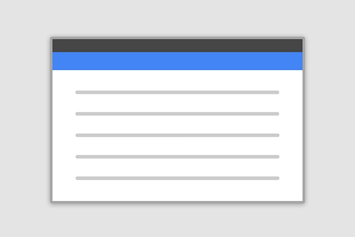
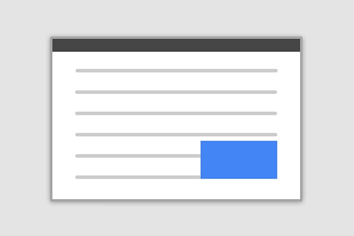
Central modal
Note: Medium size is a default value, so there isn't a dedicated class for it.
.modal-sm Small Modal
.modal-lg Large Modal
.modal-fluid Full Width Modal
<!-- Central Modal Small -->
<div class="modal fade" id="centralModalSm" tabindex="-1" role="dialog" aria-labelledby="myModalLabel" aria-hidden="true">
<!-- Change class .modal-sm to change the size of the modal -->
<div class="modal-dialog modal-sm" role="document">
<div class="modal-content">
<div class="modal-header">
<h4 class="modal-title w-100" id="myModalLabel">Modal title</h4>
<button type="button" class="close" data-dismiss="modal" aria-label="Close">
<span aria-hidden="true">×</span>
</button>
</div>
<div class="modal-body">
...
</div>
<div class="modal-footer">
<button type="button" class="btn btn-secondary btn-sm" data-dismiss="modal">Close</button>
<button type="button" class="btn btn-primary btn-sm">Save changes</button>
</div>
</div>
</div>
</div>
<!-- Central Modal Small -->
Side modal
Note: To make it works properly, apart from adding a class for a position, you also need to add special class
.side-modal to
.modal-dialog div.
Note 2: If you want to change a direction of modal animation, add class
.top,
.right,
bottom or
.left to the
.modal div.
.modal-side +
.modal-top-right Top Right
.modal-side +
.modal-top-left Top Left
.modal-side +
.modal-bottom-right Bottom Right
.modal-side +
.modal-bottom-right Bottom Left
<!-- Side Modal Top Right -->
<!-- To change the direction of the modal animation change .right class -->
<div class="modal fade right" id="sideModalTR" tabindex="-1" role="dialog" aria-labelledby="myModalLabel" aria-hidden="true">
<!-- Add class .modal-side and then add class .modal-top-right (or other classes from list above) to set a position to the modal -->
<div class="modal-dialog modal-side modal-top-right" role="document">
<div class="modal-content">
<div class="modal-header">
<h4 class="modal-title w-100" id="myModalLabel">Modal title</h4>
<button type="button" class="close" data-dismiss="modal" aria-label="Close">
<span aria-hidden="true">×</span>
</button>
</div>
<div class="modal-body">
...
</div>
<div class="modal-footer">
<button type="button" class="btn btn-secondary" data-dismiss="modal">Close</button>
<button type="button" class="btn btn-primary">Save changes</button>
</div>
</div>
</div>
</div>
<!-- Side Modal Top Right -->
Fluid modal
Note: As in the previous example - to make it works properly, apart from adding a class for a position, you
also need to add special class
.modal-full-height to
.modal-dialog div.
Note 2: If you want to change a direction of modal animation, add class
.top,
.right,
bottom or
.left to the
.modal div.
.modal-full-height +
.modal-right Right
.modal-full-height +
.modal-left Left
.modal-full-height +
.modal-bottom Bottom
.modal-full-height +
.modal-top Top
<!-- Full Height Modal Right -->
<div class="modal fade right" id="fullHeightModalRight" tabindex="-1" role="dialog" aria-labelledby="myModalLabel" aria-hidden="true">
<!-- Add class .modal-full-height and then add class .modal-right (or other classes from list above) to set a position to the modal -->
<div class="modal-dialog modal-full-height modal-right" role="document">
<div class="modal-content">
<div class="modal-header">
<h4 class="modal-title w-100" id="myModalLabel">Modal title</h4>
<button type="button" class="close" data-dismiss="modal" aria-label="Close">
<span aria-hidden="true">×</span>
</button>
</div>
<div class="modal-body">
...
</div>
<div class="modal-footer justify-content-center">
<button type="button" class="btn btn-secondary" data-dismiss="modal">Close</button>
<button type="button" class="btn btn-primary">Save changes</button>
</div>
</div>
</div>
</div>
<!-- Full Height Modal Right -->
Frame modal
Note: As in the previous examples - to make it works properly, apart from adding a class for a position, you
also need to add special class
.modal-frame to
.modal-dialog div.
Note 2: If you want to change a direction of modal animation, add class
.top,
.right,
bottom or
.left to the
.modal div.
.modal-frame +
.modal-bottom Bottom
.modal-frame +
.modal-top Top
        <!-- Frame Modal Bottom -->
        <div class="modal fade bottom" id="frameModalBottom" tabindex="-1" role="dialog" aria-labelledby="myModalLabel" aria-hidden="true">

            <!-- Add class .modal-frame and then add class .modal-bottom (or other classes from list above) to set a position to the modal -->
            <div class="modal-dialog modal-frame modal-bottom" role="document">


              <div class="modal-content">
                <div class="modal-body">
                  <div class="row d-flex justify-content-center align-items-center">

                    <p class="pt-3 pr-2">Lorem ipsum dolor sit amet, consectetur adipisicing elit. Impedit nisi quo provident fugiat reprehenderit nostrum
                      quos..
                    </p>

                    <button type="button" class="btn btn-secondary" data-dismiss="modal">Close</button>
                    <button type="button" class="btn btn-primary">Save changes</button>
                  </div>
                </div>
              </div>
            </div>
          </div>
          <!-- Frame Modal Bottom -->
Scrolling long content
When modal become too long for the user’s viewport or device, it scrolls independently of the page itself. Try the demo below.
Vertically centered
Add
.modal-dialog-centered to
.modal-dialog to vertically center the modal.
<!-- Modal -->
<div class="modal fade" id="exampleModalCenter" tabindex="-1" role="dialog" aria-labelledby="exampleModalCenterTitle" aria-hidden="true">
<!-- Add .modal-dialog-centered to .modal-dialog to vertically center the modal -->
<div class="modal-dialog modal-dialog-centered" role="document">
<div class="modal-content">
<div class="modal-header">
<h5 class="modal-title" id="exampleModalLongTitle">Modal title</h5>
<button type="button" class="close" data-dismiss="modal" aria-label="Close">
<span aria-hidden="true">×</span>
</button>
</div>
<div class="modal-body">
...
</div>
<div class="modal-footer">
<button type="button" class="btn btn-secondary" data-dismiss="modal">Close</button>
<button type="button" class="btn btn-primary">Save changes</button>
</div>
</div>
</div>
</div>
Tooltips and popovers
Tooltips and popovers can be placed within modals as needed. When modals are closed, any tooltips and popovers within are also automatically dismissed.
Note: Remember to initialize tooltips/popovers. You can find more information in the Tooltips and popovers documentation.
        <div id="exampleModalPopovers" class="modal fade" tabindex="-1" role="dialog" aria-labelledby="exampleModalPopoversLabel">
            <div class="modal-dialog" role="document">
              <div class="modal-content">
                <div class="modal-header">
                  <h5 class="modal-title" id="exampleModalPopoversLabel">Modal title</h5>
                  <button type="button" class="close" data-dismiss="modal" aria-label="Close">
                    <span aria-hidden="true">×</span>
                  </button>
                </div>
                <div class="modal-body">
                  <h5>Popover in a modal</h5>
                  <p>This
                    <a role="button" class="btn btn-secondary popover-test" title="" data-content="Popover body content is set in this attribute."
                      data-original-title="Popover title" data-toggle="popover">button</a> triggers a popover on click.</p>
                  <hr>
                  <h5>Tooltips in a modal</h5>
                  <p>
                    <a class="tooltip-test" title="" data-original-title="Tooltip" data-toggle="tooltip">This link</a> and
                    <a class="tooltip-test" title="" data-original-title="Tooltip" data-toggle="tooltip">that link</a> have tooltips on hover.</p>
                </div>
                <div class="modal-footer">
                  <button type="button" class="btn btn-secondary" data-dismiss="modal">Close</button>
                  <button type="button" class="btn btn-primary">Save changes</button>
                </div>
              </div>
            </div>
          </div>
Using the grid
Utilize the Bootstrap grid system within a modal by nesting
.container-fluid within the
.modal-body. Then, use the normal grid system classes as you would anywhere else.
        <div id="gridSystemModal" class="modal fade" tabindex="-1" role="dialog" aria-labelledby="gridModalLabel">
          <div class="modal-dialog" role="document">
            <div class="modal-content">
              <div class="modal-header">
                <h4 class="modal-title" id="gridModalLabel">Modal title</h4>
                <button type="button" class="close" data-dismiss="modal" aria-label="Close">
                  <span aria-hidden="true">×</span>
                </button>
              </div>
              <div class="modal-body">
                <div class="container-fluid">
                  <div class="row">
                    <div class="col-md-4 col-example">.col-md-4</div>
                    <div class="col-md-4 ml-auto col-example">.col-md-4 .ml-auto</div>
                  </div>
                  <br>
                  <div class="row">
                    <div class="col-md-3 ml-auto col-example">.col-md-3 .ml-auto</div>
                    <div class="col-md-2 ml-auto col-example">.col-md-2 .ml-auto</div>
                  </div>
                  <div class="row">
                    <div class="col-md-6 ml-5 col-example">.col-md-6 .ml-5</div>
                  </div>
                  <br>
                  <div class="row">
                    <div class="col-sm-9 col-example">
                      Level 1: .col-sm-9
                      <div class="row">
                        <div class="col-8 col-sm-6 col-example">
                          Level 2: .col-8 .col-sm-6
                        </div>
                        <div class="col-4 col-sm-6 col-example">
                          Level 2: .col-4 .col-sm-6
                        </div>
                      </div>
                    </div>
                  </div>
                </div>
              </div>
              <div class="modal-footer">
                <button type="button" class="btn btn-default waves-effect waves-light" data-dismiss="modal">Close</button>
                <button type="button" class="btn btn-primary waves-effect waves-light">Save changes</button>
              </div>
            </div>
          </div>
        </div>
Varying modal content
Have a bunch of buttons that all trigger the same modal with slightly different contents? Use
event.relatedTarget and
HTML
data-* attributes (possibly
via jQuery) to vary the contents of the modal depending on which button was clicked.
Below is a live demo followed by example HTML and JavaScript. For more information,
read the modal events docs for details on
relatedTarget.
<button type="button" class="btn btn-primary" data-toggle="modal" data-target="#exampleModal" data-whatever="@mdo">Open modal for @mdo</button>
<button type="button" class="btn btn-primary" data-toggle="modal" data-target="#exampleModal" data-whatever="@fat">Open modal for @fat</button>
<button type="button" class="btn btn-primary" data-toggle="modal" data-target="#exampleModal" data-whatever="@getbootstrap">Open modal for @getbootstrap</button>
<div class="modal fade" id="exampleModal" tabindex="-1" role="dialog" aria-labelledby="exampleModalLabel" aria-hidden="true">
<div class="modal-dialog" role="document">
<div class="modal-content">
<div class="modal-header">
<h4 class="modal-title" id="exampleModalLabel">New message</h4>
<button type="button" class="close" data-dismiss="modal" aria-label="Close">
<span aria-hidden="true">×</span>
</button>
</div>
<div class="modal-body">
<form>
<div class="md-form">
<input type="text" class="form-control" id="recipient-name">
</div>
<div class="md-form">
<textarea type="text" id="message-text" class="form-control md-textarea" rows="3"></textarea>
</div>
</form>
</div>
<div class="modal-footer">
<button type="button" class="btn btn-secondary" data-dismiss="modal">Close</button>
<button type="button" class="btn btn-primary">Send message</button>
</div>
</div>
</div>
</div>
        $('#exampleModal').on('show.bs.modal', function (event) {
          var button = $(event.relatedTarget) // Button that triggered the modal
          var recipient = button.data('whatever') // Extract info from data-* attributes
          // If necessary, you could initiate an AJAX request here (and then do the updating in a callback).
          // Update the modal's content. We'll use jQuery here, but you could use a data binding library or other methods instead.
          var modal = $(this)
          modal.find('.modal-title').text('New message to ' + recipient)
          modal.find('.modal-body input').val(recipient)
        })
Remove animation
For modals that simply appear rather than fade into view, remove the
.fade class from your modal markup.
        <div class="modal" tabindex="-1" role="dialog" aria-labelledby="..." aria-hidden="true">
            ...
        </div>
Dynamic heights
If the height of a modal changes while it is open, you should call
$('#myModal').data('bs.modal').handleUpdate() to readjust the modal’s position in case a scrollbar appears.
Accessibility
Be sure to add
role="dialog" and
aria-labelledby="...", referencing the modal title, to
.modal, and
role="document" to the
.modal-dialog itself. Additionally, you may give a description of your modal dialog with aria-describedby on
.modal.
Embedding YouTube & Vimeo videos
Have a look at this examples to see how it works:
Remove backdrop
To remove
backdrop add
data-backdrop="false" attribute to the modal markup
          <div class="modal fade" id="exampleModal" tabindex="-1" role="dialog" aria-labelledby="exampleModalLabel" aria-hidden="true" data-backdrop="false">
            ...
          </div>
Usage
The modal plugin toggles your hidden content on demand, via data attributes or JavaScript. It also adds
.modal-open to the
<body> to override default scrolling behavior and generates a
.modal-backdrop to provide a click area for dismissing shown modals when clicking outside the modal.
Via data attributes
Activate a modal without writing JavaScript. Set
data-toggle="modal" on a controller element, like a button, along with a
data-target="#foo" or
href="#foo" to target a specific modal to toggle.
<button type="button" data-toggle="modal" data-target="#myModal">Launch modal</button>
Via JavaScript
Call a modal with id
myModal with a single line of JavaScript:
$('#myModal').modal(options)
Options
Options can be passed via data attributes or JavaScript. For data attributes, append the option name to
data-, as in
data-backdrop="".
| Name | Type | Default | Description |
|---|---|---|---|
| backdrop | boolean or the string
'static'
|
true | Includes a modal-backdrop element. Alternatively, specify
static for a backdrop which doesn't close the modal on click. |
| keyboard | boolean | true | Closes the modal when escape key is pressed |
| focus | boolean | true | Puts the focus on the modal when initialized. |
| show | boolean | true | Shows the modal when initialized. |
Methods
Asynchronous methods and transitions
All API methods are asynchronous and start a transition. They return to the caller as soon as the transition is started but before it ends. In addition, a method call on a transitioning component will be ignored.
.modal(options)
Activates your content as a modal. Accepts an optional options
object.
      $('#myModal').modal({
        keyboard: false
      })
.modal('toggle')
Manually toggles a modal.
Returns to the caller before the modal has actually been shown or hidden (i.e. before the
shown.bs.modal or
hidden.bs.modal event occurs).
$('#myModal').modal('toggle')
.modal('show')
Manually opens a modal.
Returns to the caller before the modal has actually been shown (i.e. before the
shown.bs.modal event occurs).
$('#myModal').modal('show')
.modal('hide')
Manually hides a modal.
Returns to the caller before the modal has actually been hidden (i.e. before the
hidden.bs.modal event occurs).
$('#myModal').modal('hide')
.modal('handleUpdate')
Manually readjust the modal’s position if the height of a modal changes while it is open (i.e. in case a scrollbar appears).
$('#myModal').modal('handleUpdate')
.modal('dispose')
Destroys an element’s modal.
Events
Bootstrap’s modal class exposes a few events for hooking into modal functionality. All modal events are fired at the modal
itself (i.e. at the
<div class="modal">).
To see more examples of modal events read Modal event documentation
| Event Type | Description |
|---|---|
| show.bs.modal | This event fires immediately when the
show instance method is called. If caused by a click, the clicked element is available as the
relatedTarget property of the event. |
| shown.bs.modal | This event is fired when the modal has been made visible to the user (will wait for CSS transitions to complete).
If caused by a click, the clicked element is available as the
relatedTarget property of the event. |
| hide.bs.modal | This event is fired immediately when the
hide instance method has been called. |
| hidden.bs.modal | This event is fired when the modal has finished being hidden from the user (will wait for CSS transitions to complete). |
      $('#myModal').on('hidden.bs.modal', function (e) {
        // do something...
      })
Getting started : download & setup
Download
All the components and features are part of MDBootstrap package.
MDBootstrap (Material Design for Bootstrap) is a free (MIT Licensed) framework combining Material Design and the newest Bootstrap 4.
Click the button below to go to Download Page, where you can download MDBootstrap package.
MDBootstrap Download MDBootstrap AboutMDB Pro
Using components and features labeled as MDB Pro component requires MDB Pro package.
Click the button below to learn more about MDBbootstrap Pro package
MDBootstrap ProTutorials
If you need additional help to start, use our "5 min Quick Start" or "Full tutorial" resources.
5 min Quick Start Full TutorialCompilation
To reduce a weight of MDBootstrap package, you can compile your own, custom package containing only components and features you need.
Map of dependencies of SCSS files in MDBootstrap:
    Legend:

    '-->' means 'required'

    All free and pro files require files from 'core' catalog

    'none' means 'this component doesn't require anything except core files'

    A file wrapped by `< >` means that this file make the base component prettier but it isn't necessary for the proper working

    All PRO components require 'pro/_variables.scss' file

    scss/
    |
    |-- core/
    |   |
    |   |-- bootstrap/
    |   |	|-- _functions.scss
    |   |	|-- _variables.scss
    |   |
    |   |-- _colors.scss
    |   |-- _global.scss
    |   |-- _helpers.scss
    |   |-- _masks.scss
    |   |-- _mixins.scss
    |   |-- _typography.scss
    |   |-- _variables.scss
    |   |-- _waves.scss
    |
    |-- free/
    |   |-- _animations-basic.scss --> none
    |   |-- _animations-extended.scss --> _animations-basic.scss
    |   |-- _buttons.scss --> none
    |   |-- _cards.scss --> none <_buttons.scss>
    |   |-- _dropdowns.scss --> none <_buttons.scss>
    |   |-- _input-group.scss --> _forms.scss, _buttons.scss, _dropdowns.scss
    |   |-- _navbars.scss --> none <_buttons.scss, _forms.scss, _input-group.scss>
    |   |-- _pagination.scss --> none
    |   |-- _badges.scss --> none
    |   |-- _modals.scss --> _buttons.scss, _forms.scss (PRO --> _tabs.scss)
    |   |-- _carousels.scss --> <_buttons.scss>
    |   |-- _forms.scss --> none
    |   |-- _msc.scss --> none <_buttons.scss, _forms.scss, _cards.scss>
    |   |-- _footers.scss none <_buttons.scss> (PRO: )
    |   |-- _list-group.scss --> none
    |   |-- _tables.scss --> none (PRO: _material-select.scss, pro/_forms.scss, _checkbox.scss, pro/_buttons.scss, pro/_cards.scss, _pagination.scss, pro/_msc.scss)
    |   |-- _depreciated.scss
    |
    |-- pro/
    |   |
    |   |-- picker/
    |   |   |-- _default.scss --> none
    |   |   |-- _default-time.scss --> _default.scss, free/_forms.scss, free/_buttons.scss, pro/_buttons.scss, free/_cards.scss
    |   |   |-- _default-date.scss --> _default.scss, free/_forms.scss
    |   |
    |   |-- sections/
    |   |   |-- _templates.scss --> _sidenav.scss
    |   |   |-- _social.scss --> free/_cards.scss, free/ _forms.scss, free/_buttons.scss, pro/_buttons.scss,
    |   |   |-- _team.scss --> free/_buttons.scss, pro/_buttons.scss, free/_cards.scss, pro/_cards.scss
    |   |   |-- _testimonials.scss --> free/_carousels.scss, pro/_carousels.scss, free/_buttons.scss, pro/_buttons.scss
    |   |   |-- _magazine.scss --> _badges.scss
    |   |   |-- _pricing.scss --> free/_buttons.scss, pro/_buttons.scss
    |   |   |-- _contacts.scss --> free/_forms.scss, pro/_forms.scss, free/_buttons.scss, pro/_buttons.scss
    |   |
    |   |-- _variables.scss
    |   |-- _buttons.scss --> free/_buttons.scss, pro/_msc.scss, _checkbox.scss, _radio.scss
    |   |-- _social-buttons.scss --> free/_buttons.scss, pro/_buttons.scss
    |   |-- _tabs.scss --> _cards.scss
    |   |-- _cards.scss --> free/_cards.scss <_buttons.scss, _social-buttons.scss>
    |   |-- _dropdowns.scss --> free/_dropdowns.scss, free/_buttons.scss
    |   |-- _navbars.scss --> free/_navbars.scss  (PRO: )
    |   |-- _scrollspy.scss --> none
    |   |-- _lightbox.scss --> none
    |   |-- _chips.scss --> none
    |   |-- _msc.scss --> none
    |   |-- _forms.scss --> none
    |   |-- _radio.scss --> none
    |   |-- _checkbox.scss --> none
    |   |-- _material-select.scss --> none
    |   |-- _switch.scss --> none
    |   |-- _file-input.scss --> free/_forms.scss, free/_buttons.scss
    |   |-- _range.scss --> none
    |   |-- _input-group.scss --> free/_input-group.scss and the same what free input group, _checkbox.scss, _radio.scss
    |   |-- _autocomplete.scss --> free/_forms.scss
    |   |-- _accordion.scss --> pro/_animations.scss, free/_cards.scss
    |   |-- _parallax.scss --> none
    |   |-- _sidenav.scss --> free/_forms.scss, pro/_animations.scss, sections/_templates.scss
    |   |-- _ecommerce.scss --> free/_cards.scss, pro/_cards.scss, free/_buttons.scss, pro/_buttons.scss, pro/_msc.scss
    |   |-- _carousels.scss --> free/_carousels.scss, free/_cards.scss, free/_buttons.scss
    |   |-- _steppers.scss --> free/_buttons.scss
    |   |-- _blog.scss --> none
    |   |-- _toasts.scss --> free/_buttons.scss
    |   |-- _animations.scss --> none
    |   |-- _charts.scss --> none
    |   |-- _progress.scss --> none
    |   |-- _scrollbar.scss --> none
    |   |-- _skins.scss --> none
    |   |-- _depreciated.scss
    |
    `-- _custom-skin.scss
    `-- _custom-styles.scss
    `-- _custom-variables.scss
    `-- mdb.scss
Map of dependencies of JavaScript modules in MDBootstrap:
    Legend:

    '-->' means 'required'

    All files require jQuery and bootstrap.js

    js/
    ├── dist/
    │   ├── buttons.js
    │   ├── cards.js
    │   ├── character-counter.js
    │   ├── chips.js
    │   ├── collapsible.js --> vendor/velocity.js
    │   ├── dropdown.js --> Popper.js, jquery.easing.js
    │   ├── file-input.js
    │   ├── forms-free.js
    │   ├── material-select.js --> dropdown.js
    │   ├── mdb-autocomplete.js
    │   ├── preloading.js
    │   ├── range-input.js --> vendor/velocity.js
    │   ├── scrolling-navbar.js
    │   ├── sidenav.js --> vendor/velocity.js, vendor/hammer.js, vendor/jquery.hammer.js
    │   └── smooth-scroll.js
    ├── _intro-mdb-pro.js
    ├── modules.js
    ├── src/
    │   ├── buttons.js
    │   ├── cards.js
    │   ├── character-counter.js
    │   ├── chips.js
    │   ├── collapsible.js --> vendor/velocity.js
    │   ├── dropdown.js --> Popper.js, jquery.easing.js
    │   ├── file-input.js
    │   ├── forms-free.js
    │   ├── material-select.js --> dropdown.js
    │   ├── mdb-autocomplete.js
    │   ├── preloading.js
    │   ├── range-input.js --> vendor/velocity.js
    │   ├── scrolling-navbar.js
    │   ├── sidenav.js --> vendor/velocity.js, vendor/hammer.js, vendor/jquery.hammer.js
    │   └── smooth-scroll.js
    └── vendor/
        ├── addons/
        │   ├── datatables.js
        │   └── datatables.min.js
        ├── chart.js
        ├── enhanced-modals.js
        ├── hammer.js
        ├── jarallax.js
        ├── jarallax-video.js --> vendor/jarallax.js
        ├── jquery.easing.js
        ├── jquery.easypiechart.js
        ├── jquery.hammer.js --> vendor/hammer.js
        ├── jquery.sticky.js
        ├── lightbox.js
        ├── picker-date.js --> vendor/picker.js
        ├── picker.js
        ├── picker-time.js --> vendor/picker.js
        ├── scrollbar.js
        ├── scrolling-navbar.js
        ├── toastr.js
        ├── velocity.js
        ├── waves.js
        └── wow.js
Compilation & Customization tutorial
If you need additional help to compile your custom package, use our Compilation & Customization tutorial
Compilation & Customization tutorialIntegrations with Angular, React or Vue
Apart from standard Bootstrap integration with jQuery, MDBootstrap provides integrations with Angular, React and Vue.
About MDB Angular About MDB React About MDB Vue