Images
Bootstrap Images
Documentation and examples for opting images into responsive behavior (so they never become larger than their parent elements) and add lightweight styles to them—all via classes..
Responsive images


<img src="..." class="img-fluid" alt="Responsive image">
SVG images and IE 10
In Internet Explorer 10, SVG images with
.img-fluidare disproportionately sized. To fix this, addwidth: 100% \9;where necessary. This fix improperly sizes other image formats, so Bootstrap doesn’t apply it automatically.
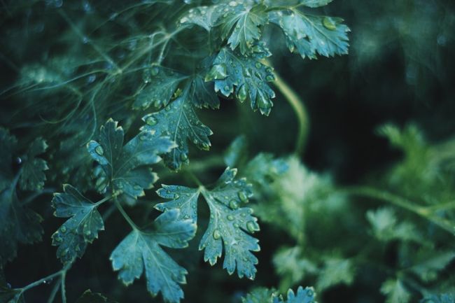
Image thumbnails
In addition to our border-radius
utilities, you can use .img-thumbnail to give an image a rounded 1px border appearance.
-mini.jpg)
        <img src="https://mdbootstrap.com/img/Others/documentation/img%20(75)-mini.jpg" alt="thumbnail" class="img-thumbnail"
          style="width: 200px">
Aligning Images
Align images with the helper
float classes or text alignment classes
. block-level images can be centered using the
.mx-auto margin utility class.
        <img src="..." class="rounded float-left" alt="...">
        <img src="..." class="rounded float-right" alt="...">
<img src="..." class="rounded mx-auto d-block" alt="...">
        <div class="text-center">
          <img src="..." class="rounded" alt="...">
        </div>
Picture
If you are using the <picture> element to specify multiple <source> elements
for a specific , make sure to add the .img-* classes to the
<img> and not to the <picture>
tag.
<picture>
<source srcset="..." type="image/svg+xml">
<img src="..." class="img-fluid img-thumbnail" alt="...">
</picture>
Images with shadows
-mini.jpg)
<img src="https://mdbootstrap.com/img/Photos/Slides/img%20(54).jpg" class="img-fluid z-depth-1" alt="1">
Images with overlays

super light overlay
light overlay
strong overlay
Info notification
Take a look at our masks section to know all the colors possibilities.
        <div class="view">
          <img src="https://mdbootstrap.com/img/Photos/Others/forest-sm.jpg" class="img-fluid" alt="placeholder">
          <div class="mask flex-center waves-effect waves-light rgba-teal-strong">
            <p class="white-text">strong overlay</p>
          </div>
        </div>
Images with patterns

.pattern-1
.pattern-2
.pattern-3
.pattern-4
.pattern-5
.pattern-6
.pattern-7
.pattern-8
.pattern-9
Add one of the following classes:
.pattern-1.pattern-2.pattern-3.pattern-4.pattern-5.pattern-6.pattern-7.pattern-8.pattern-9
        <div class="view">
          <img src="https://mdbootstrap.com/img/Photos/Others/nature-sm.jpg" class="img-fluid" alt="Image of ballons flying over canyons with mask pattern one.">
          <div class="mask pattern-1 flex-center waves-effect waves-light">
            <p class="white-text">.pattern-1</p>
          </div>
        </div>
Images with hover effects
Strong overlay
Light overlay
Super light overlay
-mini.jpg)
Zoom effect
Shadow effect
Add one of the following classes:
.rgba-red-light.rgba-red-slight.rgba-red-strong.zoom.hoverable
        <!--Zoom effect-->
        <div class="view overlay zoom">
          <img src="https://mdbootstrap.com/img/Photos/Horizontal/Nature/6-col/img%20(131).jpg" class="img-fluid " alt="zoom">
          <div class="mask flex-center waves-effect waves-light">
            <p class="white-text">Zoom effect</p>
          </div>
        </div>

        <!-- Hoverable -->
        <img src="https://mdbootstrap.com/img/Photos/Horizontal/Nature/6-col/img%20(132).jpg" class="img-fluid rounded-circle hoverable"
          alt="hoverable">
Images with waves effects
Click on the images to see the effect
2-mini.jpg)
-mini.jpg)
        <!--Mask with wave-->
        <div class="view overlay">
          <img src="https://mdbootstrap.com/img/Photos/Horizontal/Nature/6-col/img%20(1).jpg" class="img-fluid" alt="Sample image with waves effect.">
          <a>
            <div class="mask waves-effect waves-light rgba-white-slight"></div>
          </a>
        </div>
        <!--Mask with wave-->
        <div class="view overlay">
          <img src="https://mdbootstrap.com/img/Photos/Horizontal/Nature/6-col/img%20(7).jpg" class="img-fluid" alt="Sample image with waves effect.">
          <a>
            <div class="mask waves-effect rgba-white-slight"></div>
          </a>
        </div>
Images within lightbox MDB Pro component
-mini.jpg)
-mini.jpg)
-mini.jpg)
-mini.jpg)
-mini.jpg)
-mini.jpg)
-mini.jpg)
-mini.jpg)
-mini.jpg)
        // MDB Lightbox Init
        $(function () {
         $("#mdb-lightbox-ui").load("mdb-addons/mdb-lightbox-ui.html");
        });
        <div class="row">
          <div class="col-md-12">

            <div id="mdb-lightbox-ui"></div>

            <div class="mdb-lightbox">

              <figure class="col-md-4">
                <a href="https://mdbootstrap.com/img/Photos/Lightbox/Original/img%20(145).jpg" data-size="1600x1067">
                  <img src="https://mdbootstrap.com/img/Photos/Lightbox/Thumbnail/img%20(145).jpg" alt="placeholder"
                    class="img-fluid">
                </a>
              </figure>

              <figure class="col-md-4">
                <a href="https://mdbootstrap.com/img/Photos/Lightbox/Original/img%20(150).jpg" data-size="1600x1067">
                  <img src="https://mdbootstrap.com/img/Photos/Lightbox/Thumbnail/img%20(150).jpg" alt="placeholder"
                    class="img-fluid" />
                </a>
              </figure>

              <figure class="col-md-4">
                <a href="https://mdbootstrap.com/img/Photos/Lightbox/Original/img%20(152).jpg" data-size="1600x1067">
                  <img src="https://mdbootstrap.com/img/Photos/Lightbox/Thumbnail/img%20(152).jpg" alt="placeholder"
                    class="img-fluid" />
                </a>
              </figure>

              <figure class="col-md-4">
                <a href="https://mdbootstrap.com/img/Photos/Lightbox/Original/img%20(42).jpg" data-size="1600x1067">
                  <img src="https://mdbootstrap.com/img/Photos/Lightbox/Thumbnail/img%20(42).jpg" alt="placeholder"
                    class="img-fluid" />
                </a>
              </figure>

              <figure class="col-md-4">
                <a href="https://mdbootstrap.com/img/Photos/Lightbox/Original/img%20(151).jpg" data-size="1600x1067">
                  <img src="https://mdbootstrap.com/img/Photos/Lightbox/Thumbnail/img%20(151).jpg" alt="placeholder"
                    class="img-fluid" />
                </a>
              </figure>

              <figure class="col-md-4">
                <a href="https://mdbootstrap.com/img/Photos/Lightbox/Original/img%20(40).jpg" data-size="1600x1067">
                  <img src="https://mdbootstrap.com/img/Photos/Lightbox/Thumbnail/img%20(40).jpg" alt="placeholder"
                    class="img-fluid" />
                </a>
              </figure>

              <figure class="col-md-4">
                <a href="https://mdbootstrap.com/img/Photos/Lightbox/Original/img%20(148).jpg" data-size="1600x1067">
                  <img src="https://mdbootstrap.com/img/Photos/Lightbox/Thumbnail/img%20(148).jpg" alt="placeholder"
                    class="img-fluid" />
                </a>
              </figure>

              <figure class="col-md-4">
                <a href="https://mdbootstrap.com/img/Photos/Lightbox/Original/img%20(147).jpg" data-size="1600x1067">
                  <img src="https://mdbootstrap.com/img/Photos/Lightbox/Thumbnail/img%20(147).jpg" alt="placeholder"
                    class="img-fluid" />
                </a>
              </figure>

              <figure class="col-md-4">
                <a href="https://mdbootstrap.com/img/Photos/Lightbox/Original/img%20(149).jpg" data-size="1600x1067">
                  <img src="https://mdbootstrap.com/img/Photos/Lightbox/Thumbnail/img%20(149).jpg" alt="placeholder"
                    class="img-fluid" />
                </a>
              </figure>

            </div>

          </div>
        </div>
Images within cards MDB Pro component
-mini.jpg)
Culinary
Cheat day inspirations
Ut enim ad minima veniam, quis nostrum exercitationem ullam corporis suscipit laboriosam, nisi ut aliquid ex ea commodi.
Button
        <!-- Grid row -->
        <div class="row">

          <!-- Grid column -->
          <div class="col-lg-4 col-md-12">

            <!--Card Wider-->
            <div class="card card-cascade wider">

              <!--Card image-->
              <div class="view view-cascade overlay">
                <img src="https://mdbootstrap.com/img/Photos/Horizontal/People/6-col/img%20%283%29.jpg" class="card-img-top"
                  alt="wider">
                <a href="#!">
                  <div class="mask rgba-white-slight"></div>
                </a>
              </div>
              <!--/Card image-->

              <!--Card content-->
              <div class="card-body card-body-cascade text-center">
                <!--Title-->
                <h4 class="card-title"><strong>Alice Mayer</strong></h4>
                <h5 class="indigo-text"><strong>Photographer</strong></h5>

                <p class="card-text">Sed ut perspiciatis unde omnis iste natus sit voluptatem accusantium doloremque
                  laudantium, totam rem aperiam. </p>


                <!--Linkedin-->
                <a class="icons-sm li-ic"><i class="fa fa-linkedin"> </i></a>
                <!--Twitter-->
                <a class="icons-sm tw-ic"><i class="fa fa-twitter"> </i></a>
                <!--Dribbble-->
                <a class="icons-sm fb-ic"><i class="fa fa-facebook"> </i></a>

              </div>
              <!--/.Card content-->

            </div>
            <!--/.Card Wider-->

          </div>
          <!-- Grid column -->

          <!-- Grid column -->
          <div class="col-lg-4 col-md-6">

            <!--Card Narrower-->
            <div class="card card-cascade narrower">

              <!--Card image-->
              <div class="view view-cascade overlay">
                <img src="https://mdbootstrap.com/img/Photos/Lightbox/Thumbnail/img%20(147).jpg" class="card-img-top"
                  alt="narrower">
                <a>
                  <div class="mask rgba-white-slight"></div>
                </a>
              </div>
              <!--/.Card image-->

              <!--Card content-->
              <div class="card-body card-body-cascade">
                <h5 class="pink-text"><i class="fa fa-cutlery"></i> Culinary</h5>
                <!--Title-->
                <h4 class="card-title">Cheat day inspirations</h4>
                <!--Text-->
                <p class="card-text">Ut enim ad minima veniam, quis nostrum exercitationem ullam corporis suscipit
                  laboriosam, nisi ut aliquid ex ea commodi.</p>
                <a class="btn btn-unique">Button</a>
              </div>
              <!--/.Card content-->

            </div>
            <!--/.Card Narrower-->

          </div>
          <!-- Grid column -->

          <!-- Grid column -->
          <div class="col-lg-4 col-md-6">

            <!--Card Regular-->
            <div class="card card-cascade">

              <!--Card image-->
              <div class="view view-cascade overlay">
                <img src="https://mdbootstrap.com/img/Photos/Others/men.jpg" class="card-img-top" alt="normal">
                <a>
                  <div class="mask rgba-white-slight"></div>
                </a>
              </div>
              <!--/.Card image-->

              <!--Card content-->
              <div class="card-body card-body-cascade text-center">
                <!--Title-->
                <h4 class="card-title"><strong>Billy Cullen</strong></h4>
                <h5>Web developer</h5>

                <p class="card-text">Lorem ipsum dolor sit amet, consectetur adipisicing elit. Voluptatibus, ex,
                  recusandae. Facere modi sunt, quod quibusdam.
                </p>

                <!--Facebook-->
                <a type="button" class="btn-floating btn-small btn-fb"><i class="fa fa-facebook"></i></a>
                <!--Twitter-->
                <a type="button" class="btn-floating btn-small btn-tw"><i class="fa fa-twitter"></i></a>
                <!--Google +-->
                <a type="button" class="btn-floating btn-small btn-dribbble"><i class="fa fa-dribbble"></i></a>

              </div>
              <!--/.Card content-->

            </div>
            <!--/.Card Regular-->

          </div>
          <!-- Grid column -->

        </div>
        <!-- Grid row -->
Images within magazine section MDB Pro component
Section title
Duis aute irure dolor in reprehenderit in voluptate velit esse cillum dolore eu fugiat nulla pariatur. Excepteur sint occaecat cupidatat non proident, sunt in culpa qui officia deserunt mollit id laborum.

        <!-- Section: Magazine v.3 -->
        <section class="magazine-section my-5">

          <!-- Section heading -->
          <h2 class="h1-responsive font-weight-bold text-center my-5">Section title</h2>
          <!-- Section description -->
          <p class="text-center w-responsive mx-auto mb-5">Duis aute irure dolor in reprehenderit in voluptate velit
            esse cillum dolore eu fugiat nulla pariatur. Excepteur sint occaecat cupidatat non proident, sunt in culpa
            qui officia deserunt mollit id laborum.</p>

          <!-- Grid row -->
          <div class="row">

            <!-- Grid column -->
            <div class="col-lg-4 col-md-12 mb-lg-0 mb-5">

              <!-- Featured news -->
              <div class="single-news mb-3">

                <!-- Image -->
                <div class="view overlay rounded z-depth-2 mb-4">
                  <img class="img-fluid" src="https://mdbootstrap.com/img/Photos/Others/images/86.jpg" alt="Sample image">
                  <a>
                    <div class="mask rgba-white-slight"></div>
                  </a>
                </div>

                <!-- Grid row -->
                <div class="row mb-3">

                  <!-- Grid column -->
                  <div class="col-12">

                    <!-- Badge -->
                    <a href="#!"><span class="badge pink"><i class="fa fa-camera pr-2" aria-hidden="true"></i>Adventure</span></a>

                  </div>
                  <!-- Grid column -->

                </div>
                <!-- Grid row -->

                <!-- Title -->
                <div class="d-flex justify-content-between">
                  <div class="col-11 text-truncate pl-0 mb-3">
                    <a class="font-weight-bold">This is title of the news</a>
                  </div>
                  <a><i class="fa fa-angle-double-right"></i></a>
                </div>

              </div>
              <!-- Featured news -->

              <!-- Small news -->
              <div class="single-news mb-3">

                <!-- Title -->
                <div class="d-flex justify-content-between">
                  <div class="col-11 text-truncate pl-0 mb-3">
                    <a>24 Food Swaps That Slash Calories.</a>
                  </div>
                  <a><i class="fa fa-angle-double-right"></i></a>
                </div>

              </div>
              <!-- Small news -->

              <!-- Small news -->
              <div class="single-news mb-3">

                <!-- Title -->
                <div class="d-flex justify-content-between">
                  <div class="col-11 text-truncate pl-0 mb-3">
                    <a>How to Make a Beet Cocktail?</a>
                  </div>
                  <a><i class="fa fa-angle-double-right"></i></a>
                </div>

              </div>
              <!-- Small news -->

              <!-- Small news -->
              <div class="single-news mb-3">

                <!-- Title -->
                <div class="d-flex justify-content-between">
                  <div class="col-11 text-truncate pl-0 mb-3">
                    <a>8 Sneaky Reasons You're Always Hungry.</a>
                  </div>
                  <a><i class="fa fa-angle-double-right"></i></a>
                </div>

              </div>
              <!-- Small news -->

              <!-- Small news -->
              <div class="single-news">

                <!-- Title -->
                <div class="d-flex justify-content-between">
                  <div class="col-11 text-truncate pl-0">
                    <a>5 Pressure Cooker Recipes You Need to Try.</a>
                  </div>
                  <a><i class="fa fa-angle-double-right"></i></a>
                </div>

              </div>
              <!-- Small news -->

            </div>
            <!-- Grid column -->

            <!-- Grid column -->
            <div class="col-lg-4 col-md-6 mb-md-0 mb-5">

              <!-- Featured news -->
              <div class="single-news mb-3">

                <!-- Image -->
                <div class="view overlay rounded z-depth-2 mb-4">
                  <img class="img-fluid" src="https://mdbootstrap.com/img/Photos/Others/images/31.jpg" alt="Sample image">
                  <a>
                    <div class="mask rgba-white-slight"></div>
                  </a>
                </div>

                <!-- Grid row -->
                <div class="row mb-3">

                  <!-- Grid column -->
                  <div class="col-12">

                    <!-- Badge -->
                    <a href="#!"><span class="badge deep-orange"><i class="fa fa-plane pr-2" aria-hidden="true"></i>Travel</span></a>

                  </div>
                  <!-- Grid column -->

                </div>
                <!-- Grid row -->

                <!-- Title -->
                <div class="d-flex justify-content-between">
                  <div class="col-11 text-truncate pl-0 mb-3">
                    <a class="font-weight-bold">This is title of the news</a>
                  </div>
                  <a><i class="fa fa-angle-double-right"></i></a>
                </div>

              </div>
              <!-- Featured news -->

              <!-- Small news -->
              <div class="single-news mb-3">

                <!-- Title -->
                <div class="d-flex justify-content-between">
                  <div class="col-11 text-truncate pl-0 mb-3">
                    <a>Trends in the blogosphere for 2016.</a>
                  </div>
                  <a><i class="fa fa-angle-double-right"></i></a>
                </div>

              </div>
              <!-- Small news -->

              <!-- Small news -->
              <div class="single-news mb-3">

                <!-- Title -->
                <div class="d-flex justify-content-between">
                  <div class="col-11 text-truncate pl-0 mb-3">
                    <a>Where you eat the best lunch in Warsaw?</a>
                  </div>
                  <a><i class="fa fa-angle-double-right"></i></a>
                </div>

              </div>
              <!-- Small news -->

              <!-- Small news -->
              <div class="single-news mb-3">

                <!-- Title -->
                <div class="d-flex justify-content-between">
                  <div class="col-11 text-truncate pl-0 mb-3">
                    <a>What camera take for holidays?</a>
                  </div>
                  <a><i class="fa fa-angle-double-right"></i></a>
                </div>

              </div>
              <!-- Small news -->

              <!-- Small news -->
              <div class="single-news">

                <!-- Title -->
                <div class="d-flex justify-content-between">
                  <div class="col-11 text-truncate pl-0">
                    <a>Why you should visit Lisbon?</a>
                  </div>
                  <a><i class="fa fa-angle-double-right"></i></a>
                </div>

              </div>
              <!-- Small news -->

            </div>
            <!-- Grid column -->

            <!-- Grid column -->
            <div class="col-lg-4 col-md-6 mb-0">

              <!-- Featured news -->
              <div class="single-news mb-3">

                <!-- Image -->
                <div class="view overlay rounded z-depth-2 mb-4">
                  <img class="img-fluid" src="https://mdbootstrap.com/img/Photos/Others/images/52.jpg" alt="Sample image">
                  <a>
                    <div class="mask rgba-white-slight"></div>
                  </a>
                </div>

                <!-- Grid row -->
                <div class="row mb-3">

                  <!-- Grid column -->
                  <div class="col-12">

                    <!-- Badge -->
                    <a href="#!"><span class="badge success-color"><i class="fa fa-plane pr-2" aria-hidden="true"></i>Nature</span></a>

                  </div>
                  <!-- Grid column -->

                </div>
                <!-- Grid row -->

                <!-- Title -->
                <div class="d-flex justify-content-between">
                  <div class="col-11 text-truncate pl-0 mb-3">
                    <a class="font-weight-bold">This is title of the news</a>
                  </div>
                  <a><i class="fa fa-angle-double-right"></i></a>
                </div>

              </div>
              <!-- Featured news -->

              <!-- Small news -->
              <div class="single-news mb-3">

                <!-- Title -->
                <div class="d-flex justify-content-between">
                  <div class="col-11 text-truncate pl-0 mb-3">
                    <a>How to recognize the footsteps of wild animals?</a>
                  </div>
                  <a><i class="fa fa-angle-double-right"></i></a>
                </div>

              </div>
              <!-- Small news -->

              <!-- Small news -->
              <div class="single-news mb-3">

                <!-- Title -->
                <div class="d-flex justify-content-between">
                  <div class="col-11 text-truncate pl-0 mb-3">
                    <a>National Parks in Poland.</a>
                  </div>
                  <a><i class="fa fa-angle-double-right"></i></a>
                </div>

              </div>
              <!-- Small news -->

              <!-- Small news -->
              <div class="single-news mb-3">

                <!-- Title -->
                <div class="d-flex justify-content-between">
                  <div class="col-11 text-truncate pl-0 mb-3">
                    <a>Traveling without littering the planet.</a>
                  </div>
                  <a><i class="fa fa-angle-double-right"></i></a>
                </div>

              </div>
              <!-- Small news -->

              <!-- Small news -->
              <div class="single-news">

                <!-- Title -->
                <div class="d-flex justify-content-between">
                  <div class="col-11 text-truncate pl-0">
                    <a>How to protect rainforests?</a>
                  </div>
                  <a><i class="fa fa-angle-double-right"></i></a>
                </div>

              </div>
              <!-- Small news -->

            </div>
            <!-- Grid column -->

          </div>
          <!-- Grid row -->

        </section>
        <!-- Section: Magazine v.3 -->
Images as the avatars within testimonials MDB Pro component
Testimonials
Lorem ipsum dolor sit amet, consectetur adipisicing elit. Fugit, error amet numquam iure provident voluptate esse quasi, veritatis totam voluptas nostrum quisquam eum porro a pariatur accusamus veniam.
-mini.jpg)
John Doe
Lorem ipsum dolor sit amet, consectetur adipisicing elit. Eos, adipisci.
-mini.jpg)
Anna Aston
Neque cupiditate assumenda in maiores repudiandae mollitia architecto.
-mini.jpg)
Maria Kate
Delectus impedit saepe officiis ab aliquam repellat, rem totam unde ducimus.
        <!--Section: Testimonials v.1-->
        <section class="section pb-3 text-center">

          <!--Section heading-->
          <h1 class="section-heading h1 pt-4">Testimonials</h1>
          <!--Section description-->
          <p class="section-description">Lorem ipsum dolor sit amet, consectetur adipisicing elit. Fugit, error amet
            numquam iure provident voluptate esse quasi, veritatis totam voluptas nostrum quisquam eum porro a pariatur
            accusamus veniam.</p>

          <div class="row">

            <!--Grid column-->
            <div class="col-lg-4 col-md-12 mb-4">

              <!--Card-->
              <div class="card testimonial-card">

                <!--Background color-->
                <div class="card-up teal lighten-2">
                </div>

                <!--Avatar-->
                <div class="avatar mx-auto white"><img src="https://mdbootstrap.com/img/Photos/Avatars/img%20(27).jpg"
                    alt="avatar mx-auto white" class="rounded-circle img-fluid">
                </div>

                <div class="card-body">
                  <!--Name-->
                  <h4 class="card-title mt-1">John Doe</h4>
                  <hr>
                  <!--Quotation-->
                  <p><i class="fa fa-quote-left"></i> Lorem ipsum dolor sit amet, consectetur adipisicing elit. Eos,
                    adipisci.</p>
                </div>

              </div>
              <!--Card-->

            </div>
            <!--Grid column-->

            <!--Grid column-->
            <div class="col-lg-4 col-md-12 mb-4">

              <!--Card-->
              <div class="card testimonial-card">

                <!--Background color-->
                <div class="card-up blue lighten-2">
                </div>

                <!--Avatar-->
                <div class="avatar mx-auto white"><img src="https://mdbootstrap.com/img/Photos/Avatars/img%20(20).jpg"
                    alt="avatar mx-auto white" class="rounded-circle img-fluid">
                </div>

                <div class="card-body">
                  <!--Name-->
                  <h4 class="card-title mt-1">Anna Aston</h4>
                  <hr>
                  <!--Quotation-->
                  <p><i class="fa fa-quote-left"></i> Neque cupiditate assumenda in maiores repudiandae mollitia
                    architecto.</p>
                </div>

              </div>
              <!--Card-->

            </div>
            <!--Grid column-->

            <!--Grid column-->
            <div class="col-lg-4 col-md-12 mb-4">

              <!--Card-->
              <div class="card testimonial-card">

                <!--Background color-->
                <div class="card-up deep-purple lighten-2"></div>

                <!--Avatar-->
                <div class="avatar mx-auto white"><img src="https://mdbootstrap.com/img/Photos/Avatars/img%20(10).jpg"
                    alt="avatar mx-auto white" class="rounded-circle img-fluid">
                </div>

                <div class="card-body">
                  <!--Name-->
                  <h4 class="card-title mt-1">Maria Kate</h4>
                  <hr>
                  <!--Quotation-->
                  <p><i class="fa fa-quote-left"></i> Delectus impedit saepe officiis ab aliquam repellat, rem totam
                    unde ducimus.</p>
                </div>

              </div>
              <!--Card-->

            </div>
            <!--Grid column-->

          </div>

        </section>
        <!--Section: Testimonials v.1-->
Images within grid
.jpg)
-mini.jpg)
-mini.jpg)
-mini.jpg)
-mini.jpg)
-mini.jpg)
        <!-- Grid row -->
        <div class="row">

          <!-- Grid column -->
          <div class="col-md-12 mb-3">

            <img src="https://mdbootstrap.com/img/Photos/Slides/img%20(137).jpg" class="img-fluid z-depth-1" alt="Responsive image">

          </div>
          <!-- Grid column -->

        </div>
        <!-- Grid row -->

        <!-- Grid row -->
        <div class="row">

          <!-- Grid column -->
          <div class="col-lg-4 col-md-12 mb-3">

            <img src="https://mdbootstrap.com/img/Photos/Horizontal/Nature/6-col/img(115).jpg" class="img-fluid z-depth-1"
              alt="Responsive image">

          </div>
          <!-- Grid column -->

          <!-- Grid column -->
          <div class="col-lg-4 col-md-6 mb-3">

            <img src="https://mdbootstrap.com/img/Photos/Horizontal/Nature/6-col/img(116).jpg" class="img-fluid z-depth-1"
              alt="Responsive image">

          </div>
          <!-- Grid column -->

          <!-- Grid column -->
          <div class="col-lg-4 col-md-6 mb-3">

            <img src="https://mdbootstrap.com/img/Photos/Horizontal/Nature/6-col/img(117).jpg" class="img-fluid z-depth-1"
              alt="Responsive image">

          </div>
          <!-- Grid column -->

        </div>
        <!-- Grid row -->

        <!-- Grid row -->
        <div class="row">

          <!-- Grid column -->
          <div class="col-md-6 mb-3">

            <img src="https://mdbootstrap.com/img/Photos/Horizontal/People/6-col/img(117).jpg" class="img-fluid z-depth-1"
              alt="Responsive image">

          </div>
          <!-- Grid column -->

          <!-- Grid column -->
          <div class="col-md-6 mb-3">

            <img src="https://mdbootstrap.com/img/Photos/Horizontal/People/6-col/img(129).jpg" class="img-fluid z-depth-1"
              alt="Responsive image">

          </div>
          <!-- Grid column -->

        </div>
        <!-- Grid row -->
Shapes of images
-mini.jpg)
.jpg)
.jpg)
        <!-- Grid row -->
        <div class="row">

          <!-- Grid column -->
          <div class="col-xl-4 col-md-4 mb-3">

            <img src="https://mdbootstrap.com/img/Photos/Horizontal/People/6-col/img(119).jpg" class="img-fluid z-depth-1"
              alt="Responsive image">

          </div>
          <!-- Grid column -->

          <!-- Grid column -->
          <div class="col-xl-5 col-md-4 mb-3 text-center">

            <img src="https://mdbootstrap.com/img/Photos/Avatars/img(31).jpg" class="img-fluid z-depth-1 rounded-circle"
              alt="Responsive image">

          </div>
          <!-- Grid column -->

          <!-- Grid column -->
          <div class="col-xl-3 col-md-4 mb-3 text-right">

            <img src="https://mdbootstrap.com/img/Photos/Avatars/img(30).jpg" class="img-fluid z-depth-1" alt="Responsive image">

          </div>
          <!-- Grid column -->

        </div>
        <!-- Grid row -->
Images within carousel
-mini.jpg)
-mini.jpg)
-mini.jpg)
        <!--Carousel Wrapper-->
        <div id="carousel-example-1z" class="carousel slide carousel-fade" data-ride="carousel">
          <!--Indicators-->
          <ol class="carousel-indicators">
            <li data-target="#carousel-example-1z" data-slide-to="0" class="active"></li>
            <li data-target="#carousel-example-1z" data-slide-to="1"></li>
            <li data-target="#carousel-example-1z" data-slide-to="2"></li>
          </ol>
          <!--/.Indicators-->
          <!--Slides-->
          <div class="carousel-inner" role="listbox">
            <!--First slide-->
            <div class="carousel-item active">
              <img class="d-block w-100" src="https://mdbootstrap.com/img/Photos/Slides/img%20(141).jpg" alt="First slide">
            </div>
            <!--/First slide-->
            <!--Second slide-->
            <div class="carousel-item">
              <img class="d-block w-100" src="https://mdbootstrap.com/img/Photos/Slides/img%20(136).jpg" alt="Second slide">
            </div>
            <!--/Second slide-->
            <!--Third slide-->
            <div class="carousel-item">
              <img class="d-block w-100" src="https://mdbootstrap.com/img/Photos/Slides/img%20(137).jpg" alt="Third slide">
            </div>
            <!--/Third slide-->
          </div>
          <!--/.Slides-->
          <!--Controls-->
          <a class="carousel-control-prev" href="#carousel-example-1z" role="button" data-slide="prev">
            <span class="carousel-control-prev-icon" aria-hidden="true"></span>
            <span class="sr-only">Previous</span>
          </a>
          <a class="carousel-control-next" href="#carousel-example-1z" role="button" data-slide="next">
            <span class="carousel-control-next-icon" aria-hidden="true"></span>
            <span class="sr-only">Next</span>
          </a>
          <!--/.Controls-->
        </div>
        <!--/.Carousel Wrapper-->
Getting started : download & setup
Download
All the components and features are part of MDBootstrap package.
MDBootstrap (Material Design for Bootstrap) is a free (MIT Licensed) framework combining Material Design and the newest Bootstrap 4.
Click the button below to go to Download Page, where you can download MDBootstrap package.
MDBootstrap Download MDBootstrap AboutMDB Pro
Using components and features labeled as MDB Pro component requires MDB Pro package.
Click the button below to learn more about MDBbootstrap Pro package
MDBootstrap ProTutorials
If you need additional help to start, use our "5 min Quick Start" or "Full tutorial" resources.
5 min Quick Start Full TutorialCompilation
To reduce a weight of MDBootstrap package, you can compile your own, custom package containing only components and features you need.
Map of dependencies of SCSS files in MDBootstrap:
    Legend:

    '-->' means 'required'

    All free and pro files require files from 'core' catalog

    'none' means 'this component doesn't require anything except core files'

    A file wrapped by `< >` means that this file make the base component prettier but it isn't necessary for the proper working

    All PRO components require 'pro/_variables.scss' file

    scss/
    |
    |-- core/
    |   |
    |   |-- bootstrap/
    |   |	|-- _functions.scss
    |   |	|-- _variables.scss
    |   |
    |   |-- _colors.scss
    |   |-- _global.scss
    |   |-- _helpers.scss
    |   |-- _masks.scss
    |   |-- _mixins.scss
    |   |-- _typography.scss
    |   |-- _variables.scss
    |   |-- _waves.scss
    |
    |-- free/
    |   |-- _animations-basic.scss --> none
    |   |-- _animations-extended.scss --> _animations-basic.scss
    |   |-- _buttons.scss --> none
    |   |-- _cards.scss --> none <_buttons.scss>
    |   |-- _dropdowns.scss --> none <_buttons.scss>
    |   |-- _input-group.scss --> _forms.scss, _buttons.scss, _dropdowns.scss
    |   |-- _navbars.scss --> none <_buttons.scss, _forms.scss, _input-group.scss>
    |   |-- _pagination.scss --> none
    |   |-- _badges.scss --> none
    |   |-- _modals.scss --> _buttons.scss, _forms.scss (PRO --> _tabs.scss)
    |   |-- _carousels.scss --> <_buttons.scss>
    |   |-- _forms.scss --> none
    |   |-- _msc.scss --> none <_buttons.scss, _forms.scss, _cards.scss>
    |   |-- _footers.scss none <_buttons.scss> (PRO: )
    |   |-- _list-group.scss --> none
    |   |-- _tables.scss --> none (PRO: _material-select.scss, pro/_forms.scss, _checkbox.scss, pro/_buttons.scss, pro/_cards.scss, _pagination.scss, pro/_msc.scss)
    |   |-- _depreciated.scss
    |
    |-- pro/
    |   |
    |   |-- picker/
    |   |   |-- _default.scss --> none
    |   |   |-- _default-time.scss --> _default.scss, free/_forms.scss, free/_buttons.scss, pro/_buttons.scss, free/_cards.scss
    |   |   |-- _default-date.scss --> _default.scss, free/_forms.scss
    |   |
    |   |-- sections/
    |   |   |-- _templates.scss --> _sidenav.scss
    |   |   |-- _social.scss --> free/_cards.scss, free/ _forms.scss, free/_buttons.scss, pro/_buttons.scss,
    |   |   |-- _team.scss --> free/_buttons.scss, pro/_buttons.scss, free/_cards.scss, pro/_cards.scss
    |   |   |-- _testimonials.scss --> free/_carousels.scss, pro/_carousels.scss, free/_buttons.scss, pro/_buttons.scss
    |   |   |-- _magazine.scss --> _badges.scss
    |   |   |-- _pricing.scss --> free/_buttons.scss, pro/_buttons.scss
    |   |   |-- _contacts.scss --> free/_forms.scss, pro/_forms.scss, free/_buttons.scss, pro/_buttons.scss
    |   |
    |   |-- _variables.scss
    |   |-- _buttons.scss --> free/_buttons.scss, pro/_msc.scss, _checkbox.scss, _radio.scss
    |   |-- _social-buttons.scss --> free/_buttons.scss, pro/_buttons.scss
    |   |-- _tabs.scss --> _cards.scss
    |   |-- _cards.scss --> free/_cards.scss <_buttons.scss, _social-buttons.scss>
    |   |-- _dropdowns.scss --> free/_dropdowns.scss, free/_buttons.scss
    |   |-- _navbars.scss --> free/_navbars.scss  (PRO: )
    |   |-- _scrollspy.scss --> none
    |   |-- _lightbox.scss --> none
    |   |-- _chips.scss --> none
    |   |-- _msc.scss --> none
    |   |-- _forms.scss --> none
    |   |-- _radio.scss --> none
    |   |-- _checkbox.scss --> none
    |   |-- _material-select.scss --> none
    |   |-- _switch.scss --> none
    |   |-- _file-input.scss --> free/_forms.scss, free/_buttons.scss
    |   |-- _range.scss --> none
    |   |-- _input-group.scss --> free/_input-group.scss and the same what free input group, _checkbox.scss, _radio.scss
    |   |-- _autocomplete.scss --> free/_forms.scss
    |   |-- _accordion.scss --> pro/_animations.scss, free/_cards.scss
    |   |-- _parallax.scss --> none
    |   |-- _sidenav.scss --> free/_forms.scss, pro/_animations.scss, sections/_templates.scss
    |   |-- _ecommerce.scss --> free/_cards.scss, pro/_cards.scss, free/_buttons.scss, pro/_buttons.scss, pro/_msc.scss
    |   |-- _carousels.scss --> free/_carousels.scss, free/_cards.scss, free/_buttons.scss
    |   |-- _steppers.scss --> free/_buttons.scss
    |   |-- _blog.scss --> none
    |   |-- _toasts.scss --> free/_buttons.scss
    |   |-- _animations.scss --> none
    |   |-- _charts.scss --> none
    |   |-- _progress.scss --> none
    |   |-- _scrollbar.scss --> none
    |   |-- _skins.scss --> none
    |   |-- _depreciated.scss
    |
    `-- _custom-skin.scss
    `-- _custom-styles.scss
    `-- _custom-variables.scss
    `-- mdb.scss
Map of dependencies of JavaScript modules in MDBootstrap:
    Legend:

    '-->' means 'required'

    All files require jQuery and bootstrap.js

    js/
    ├── dist/
    │   ├── buttons.js
    │   ├── cards.js
    │   ├── character-counter.js
    │   ├── chips.js
    │   ├── collapsible.js --> vendor/velocity.js
    │   ├── dropdown.js --> Popper.js, jquery.easing.js
    │   ├── file-input.js
    │   ├── forms-free.js
    │   ├── material-select.js --> dropdown.js
    │   ├── mdb-autocomplete.js
    │   ├── preloading.js
    │   ├── range-input.js --> vendor/velocity.js
    │   ├── scrolling-navbar.js
    │   ├── sidenav.js --> vendor/velocity.js, vendor/hammer.js, vendor/jquery.hammer.js
    │   └── smooth-scroll.js
    ├── _intro-mdb-pro.js
    ├── modules.js
    ├── src/
    │   ├── buttons.js
    │   ├── cards.js
    │   ├── character-counter.js
    │   ├── chips.js
    │   ├── collapsible.js --> vendor/velocity.js
    │   ├── dropdown.js --> Popper.js, jquery.easing.js
    │   ├── file-input.js
    │   ├── forms-free.js
    │   ├── material-select.js --> dropdown.js
    │   ├── mdb-autocomplete.js
    │   ├── preloading.js
    │   ├── range-input.js --> vendor/velocity.js
    │   ├── scrolling-navbar.js
    │   ├── sidenav.js --> vendor/velocity.js, vendor/hammer.js, vendor/jquery.hammer.js
    │   └── smooth-scroll.js
    └── vendor/
        ├── addons/
        │   ├── datatables.js
        │   └── datatables.min.js
        ├── chart.js
        ├── enhanced-modals.js
        ├── hammer.js
        ├── jarallax.js
        ├── jarallax-video.js --> vendor/jarallax.js
        ├── jquery.easing.js
        ├── jquery.easypiechart.js
        ├── jquery.hammer.js --> vendor/hammer.js
        ├── jquery.sticky.js
        ├── lightbox.js
        ├── picker-date.js --> vendor/picker.js
        ├── picker.js
        ├── picker-time.js --> vendor/picker.js
        ├── scrollbar.js
        ├── scrolling-navbar.js
        ├── toastr.js
        ├── velocity.js
        ├── waves.js
        └── wow.js
Compilation & Customization tutorial
If you need additional help to compile your custom package, use our Compilation & Customization tutorial
Compilation & Customization tutorialIntegrations with Angular, React or Vue
Apart from standard Bootstrap integration with jQuery, MDBootstrap provides integrations with Angular, React and Vue.
About MDB Angular About MDB React About MDB Vue